There’s an old principle in data management that never loses its relevance: GIGO — Garbage In, Garbage Out. If the data going into your ERP system is incomplete or incorrect, every process that depends on it — from MRP runs to financial reporting — will produce unreliable results.
Master data quality is the foundation upon which every ERP system operates. Yet in practice, data maintenance is often treated as an afterthought. The result: planning runs that nobody trusts, procurement suggestions that get ignored, and reports that don’t match reality.
The good news? Systematic data quality assessment is straightforward with the right tools. In this post, I’ll demonstrate several visualization techniques for identifying and quantifying data gaps in your master data.
The Data Quality Index
The starting point for any data quality initiative is a clear, quantified view of the current state. A Data Quality Index provides exactly this: a summary metric that highlights problem areas requiring attention.
Rather than reviewing thousands of records manually, the index aggregates completeness, consistency, and validity checks into visual indicators that immediately show where maintenance effort is needed most.
library(ggplot2)

# Calculate completeness by field
dq_summary <- master_data %>%
  summarise(across(everything(), ~mean(!is.na(.)))) %>%
  pivot_longer(everything(), names_to = "field", values_to = "completeness") %>%
  arrange(completeness)

ggplot(dq_summary, aes(x = reorder(field, completeness), y = completeness)) +
  geom_col(aes(fill = completeness < 0.9), show.legend = FALSE) +
  scale_fill_manual(values = c("steelblue", "tomato")) +
  scale_y_continuous(labels = scales::percent) +
  coord_flip() +
  labs(
    title = "Master Data Completeness by Field",
    x = "Data Field",
    y = "Completeness Rate"
  ) +
  theme_minimal()
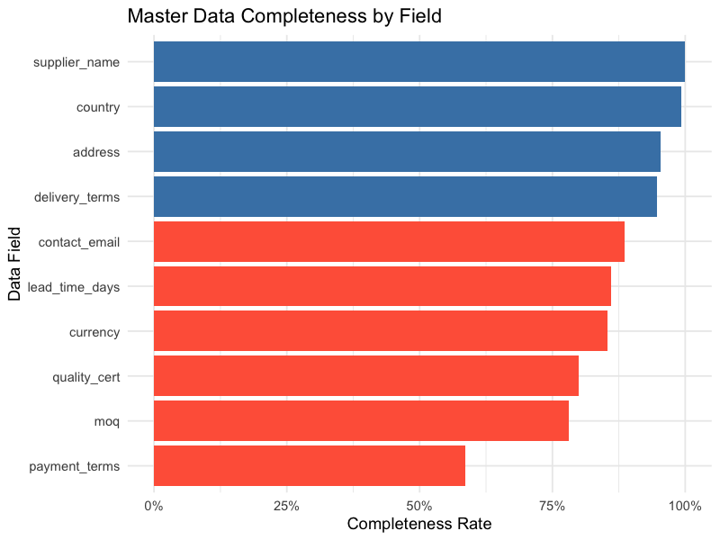
Fields highlighted in red (below 90% completeness) immediately draw attention to where data maintenance efforts should focus.
Visualizing Missing Data Patterns
Beyond simple completeness percentages, understanding the pattern of missing data is crucial. Are the same records missing multiple fields? Are certain combinations of fields consistently incomplete?
Missing Data Heatmap
A matrix plot highlights absent records in red, making patterns of missing data immediately visible across variables and records:
library(naniar)

# Visualize missing data patterns
vis_miss(master_data) +
  labs(title = "Missing Data Overview") +
  theme(axis.text.x = element_text(angle = 45, hjust = 1))
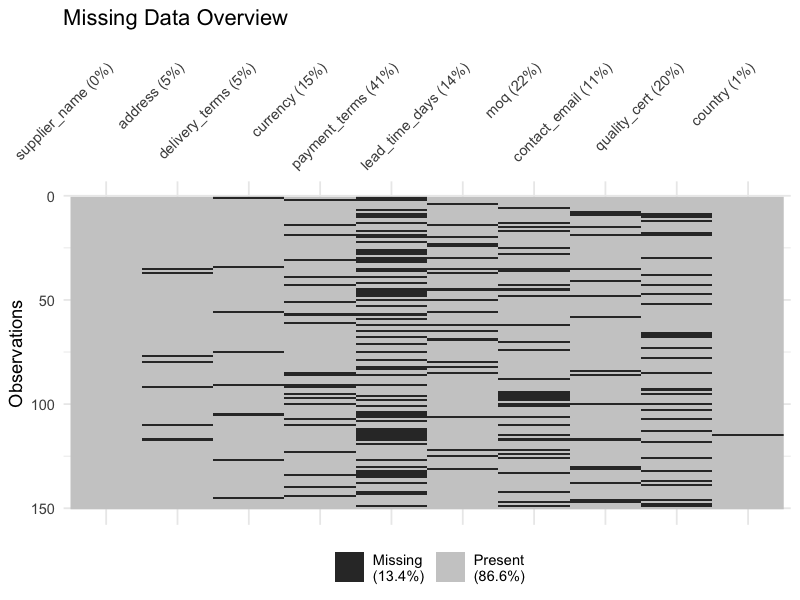
This view reveals whether missing data is scattered randomly (suggesting individual entry errors) or concentrated in blocks (suggesting systematic process gaps).
Combination Matrix
A more detailed view shows which combinations of fields tend to be missing together. This is critical for identifying weak zones in data maintenance processes:
# Upset plot of missing data combinations
gg_miss_upset(master_data, nsets = 10)
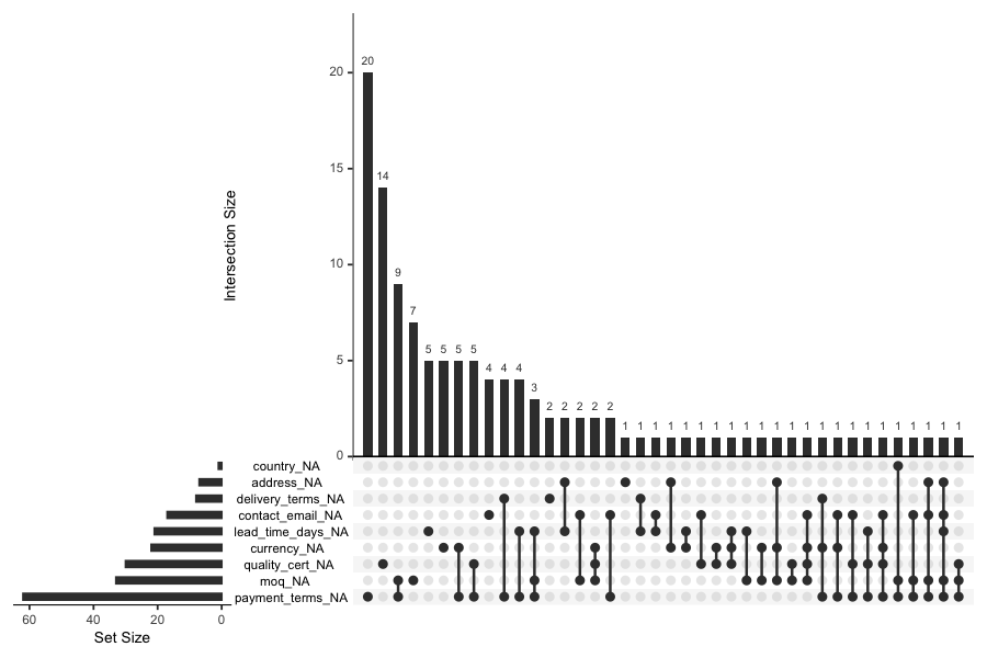
If you see that delivery terms and payment terms are frequently missing together, it suggests a specific step in the supplier onboarding process is being skipped — a targeted fix rather than a broad data cleanup campaign.
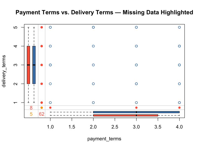
Margin Plots
Margin plots display variable dependencies while marking missing value indicators. They answer the question: does missingness in one field correlate with values in another?
library(VIM)

# Margin plot showing relationship between two variables
# with missing data highlighted
marginplot(master_data[, c("payment_terms", "delivery_terms")],
           col = c("steelblue", "tomato", "orange"),
           main = "Payment Terms vs. Delivery Terms — Missing Data Highlighted")
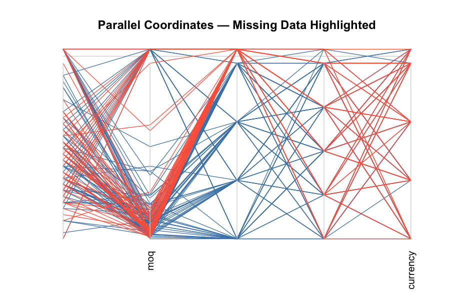
Parallel Coordinate Plots
For a multi-variable view, parallel coordinate plots with missing data marked in red show how data gaps distribute across the full breadth of your master data:
# Parallel coordinate plot with missing values in red
parcoordMiss(master_data,
             highlight = "Payment_Terms",
             col = c("steelblue", "tomato"),
             main = "Parallel Coordinates — Missing Data Highlighted")
A Practical Example: Supplier Master Data
To illustrate these techniques, consider a supplier master data assessment. The following code generates a completeness summary from a supplier dataset:
library(tidyverse)

# Calculate completeness for each field
fields_to_check <- c("supplier_name", "address", "delivery_terms",
                     "currency", "payment_terms")

completeness_table <- supplier_data %>%
  summarise(across(all_of(fields_to_check), ~mean(!is.na(.)))) %>%
  pivot_longer(everything(), names_to = "field", values_to = "completeness") %>%
  arrange(desc(completeness)) %>%
  mutate(completeness_pct = scales::percent(completeness, accuracy = 0.1))

# Add overall completeness (proportion of all cells that are non-NA)
overall <- mean(!is.na(supplier_data[, fields_to_check]))

completeness_table <- bind_rows(
  completeness_table,
  tibble(field = "Overall Completeness",
         completeness = overall,
         completeness_pct = scales::percent(overall, accuracy = 0.1))
)

print(completeness_table)
A typical result might look like this:
| Supplier Name | 100.0%
| Address | 99.2%
| Delivery Terms | 93.8%
| Currency | 87.4%
| Payment Terms | 58.5%
| Overall Completeness | 61.9%
The numbers tell a clear story: while basic identification data is nearly complete, transactional parameters — especially payment terms — have significant gaps. This means that:
- Purchase orders may default to incorrect payment terms
- Cash flow forecasting based on supplier payment terms will be unreliable
- Automated three-way matching could fail for affected suppliers
An overall completeness of only 61.9% signals a systemic issue that likely impacts day-to-day operations.
Building a Systematic Assessment Process
Data quality assessment shouldn’t be a one-time exercise. Here’s a practical framework:
1. Define Critical Fields
Not all master data fields are equally important. Prioritize the fields that directly impact:
- Planning: lead times, safety stock, lot sizes, reorder points
- Procurement: payment terms, delivery terms, MOQs
- Production: routings, BOM structures, work center capacities
- Finance: cost centers, GL accounts, tax codes
2. Set Quality Thresholds
Establish minimum acceptable completeness rates for each field category. For example:
- Identity fields (name, number): > 99%
- Transactional fields (terms, conditions): > 95%
- Planning parameters (lead times, lot sizes): > 90%
3. Automate Regular Monitoring
Schedule weekly or monthly data quality reports that flag fields falling below thresholds. This turns reactive data cleanup into proactive data management.
4. Trace Root Causes
When you find gaps, don’t just fix the data — fix the process that created the gap. Common root causes include:
- Missing mandatory fields in data entry forms
- Incomplete supplier/customer onboarding workflows
- Lack of validation rules in the ERP system
- No clear data ownership or stewardship
Every algorithm, every planning run, every report is only as good as the data feeding it. The visualization techniques shown here transform an abstract „data quality problem“ into a concrete, actionable roadmap — prioritized by impact and traceable to specific process gaps.
Schreibe einen Kommentar