Sales data is among the most frequently visualized data in any organization. Yet it’s also among the most poorly visualized. The default choice — the pie chart — is one of the least effective ways to communicate proportions. Human perception is poor at comparing angles and areas, which means pie charts often obscure the very comparisons they’re meant to reveal.
This post demonstrates more effective alternatives: waffle charts for proportions, seasonal plots for temporal patterns, and interactive dashboards for forecasting and exploration.
Why Not Pie Charts?
Pie charts have well-documented limitations:
- Humans are poor at judging angles and areas accurately
- Comparing slices across multiple pie charts is nearly impossible
- With more than 5-6 categories, pie charts become unreadable
- 3D pie charts (still disturbingly common) actively distort proportions
The alternative? For „parts of a whole“ comparisons, waffle charts represent proportions more accurately and are easier to read at a glance.
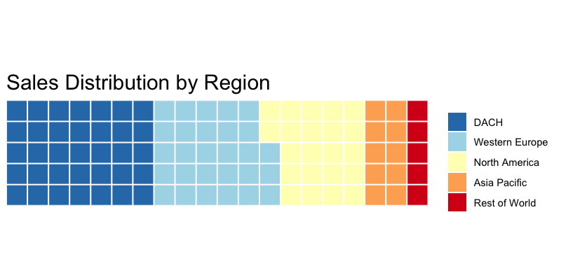
Waffle Charts: Better Proportions
A waffle chart uses a grid of squares (typically 10×10 = 100 squares) where each square represents 1% of the total. Colors indicate categories. Because humans are better at counting discrete units than estimating angles, waffle charts make proportional comparisons more intuitive.
library(waffle)

# Sales by region
sales_by_region <- c(
  "DACH*" = 35,
  "Western Europe" = 28,
  "North America" = 22,
  "Asia Pacific" = 10,
  "Rest of World" = 5
)
# *DACH = Germany (Deutschland), Austria, and Switzerland (Confoederatio Helvetica)
#  — the core German-speaking markets in Central Europe

waffle(sales_by_region, rows = 5, size = 0.5,
       title = "Sales Distribution by Region",
       colors = c("#2c7bb6", "#abd9e9", "#ffffbf", "#fdae61", "#d7191c"))
When to Use Waffle Charts
Waffle charts work best when:
- You have 2-7 categories
- Each category represents at least 1-2% of the total
- You want to emphasize the „parts of a whole“ relationship
- You’re comparing proportions across groups (use multiple waffles side by side)
Seasonal Plots: Revealing Time Patterns
Sales data almost always contains seasonal patterns — but standard line charts often bury seasonality under trend and noise. Seasonal plots and seasonal subseries plots isolate these patterns and make them explicit.
Seasonal Plot
A seasonal plot overlays each year’s data on the same January-December axis, making year-over-year comparisons immediate:
library(forecast)
library(ggplot2)

# Convert to time series
sales_ts <- ts(monthly_sales$revenue, start = c(2015, 1), frequency = 12)

# Seasonal plot — each year as a separate line
ggseasonplot(sales_ts, year.labels = TRUE) +
  labs(title = "Monthly Sales by Year",
       y = "Revenue (EUR)") +
  theme_minimal()
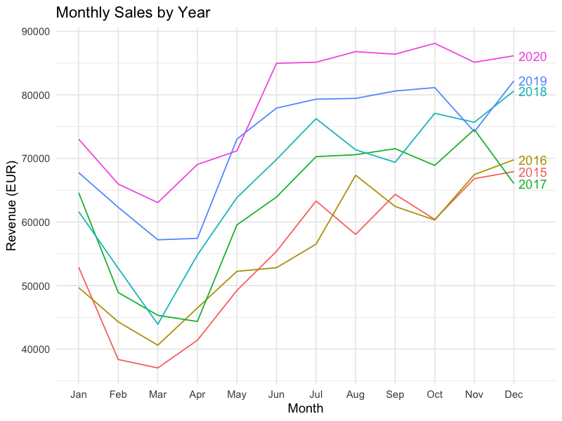
This view immediately answers questions like:
- Is December consistently the strongest month?
- Is the seasonal pattern stable or shifting year over year?
- Did a specific year break the typical pattern (and why)?
Seasonal Subseries Plot
The subseries plot takes a different angle: it groups all January values together, all February values together, and so on. Each month gets its own mini time series showing the trend within that month across years:
ggsubseriesplot(sales_ts) +
  labs(title = "Seasonal Subseries: Monthly Revenue Trends",
       y = "Revenue (EUR)") +
  theme_minimal()
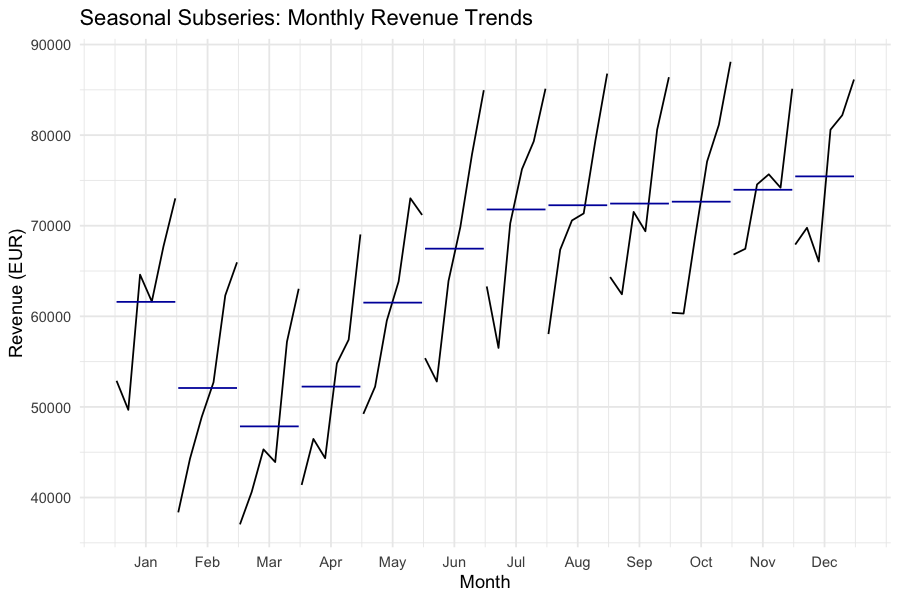
The horizontal blue line in each panel shows the monthly mean, making it easy to see:
- Which months are consistently above or below average
- Whether specific months are trending up or down over time
- How much variability exists within each month
Forecasting Visualization
Once seasonal patterns are understood, the next step is forecasting. Visualizing forecasts with confidence intervals communicates both the expected trajectory and the uncertainty around it.
# Fit a forecasting model
fit <- auto.arima(sales_ts)

# Generate a 12-month forecast
fc <- forecast(fit, h = 12)

# Plot with confidence intervals
autoplot(fc) +
  labs(title = "12-Month Sales Forecast",
       x = "Time",
       y = "Revenue (EUR)") +
  theme_minimal()
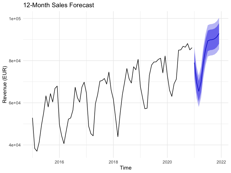
The shaded confidence bands (typically 80% and 95%) are essential — they prevent stakeholders from treating a point forecast as a certainty and encourage range-based planning.
Building an Interactive Dashboard
For ongoing sales monitoring, static charts aren’t enough. An interactive HTML dashboard allows users to explore the data themselves — zooming into specific periods, hovering for exact values, and toggling between views.
Two main approaches in R:
flexdashboard is not an R package you call with library() — it’s an RMarkdown output format. You create a .Rmd file with a special YAML header, and each code chunk renders into a dashboard panel:
---
title: "Sales Dashboard"
output:
  flexdashboard::flex_dashboard:
    orientation: columns
    vertical_layout: fill
---
Within the .Rmd file, use plotly and dygraphs for interactive widgets:
library(plotly)
library(dygraphs)

# Interactive time series with dygraphs
dygraph(sales_ts, main = "Monthly Revenue") %>%
  dyRangeSelector() %>%
  dyOptions(stackedGraph = FALSE, fillGraph = TRUE)

# Interactive seasonal plot with plotly
p <- ggseasonplot(sales_ts, year.labels = TRUE) + theme_minimal()
ggplotly(p)

# Interactive forecast
fc_plot <- autoplot(fc) + theme_minimal()
ggplotly(fc_plot)
Alternatively, Shiny provides full interactivity with server-side computation — useful when users need to filter, drill down, or trigger recalculations.
The flexdashboard approach exports as a standalone HTML file requiring no R installation for the viewer, while Shiny requires a running R session (or Shiny Server/shinyapps.io deployment).
Modern alternative: The
fableecosystem (fable,feasts,tsibble) is the tidyverse-native successor to theforecastpackage. It offers the same forecasting methods with tidy data structures and piped workflows. For new projects, consider starting withfableinstead offorecast.
Chart Selection Guide
Choosing the right chart for your sales data depends on the question you’re answering:
What’s our sales mix by region/product? | Waffle chart or stacked bar
How does this month compare to last year? | Seasonal plot
Is there a trend within specific months? | Seasonal subseries plot
What do we expect next quarter? | Forecast plot with confidence intervals
What’s driving changes over time? | Decomposition plot (trend + seasonal + residual)
How do multiple KPIs relate? | Small multiples or dashboard
Match the chart type to the analytical question: waffle charts for proportions, seasonal plots for temporal patterns, interactive dashboards for exploration and forecasting. The R ecosystem — waffle, forecast (or fable), plotly, flexdashboard, and dygraphs — provides production-ready implementations for each.
Schreibe einen Kommentar