The Problem Every Operations Manager Knows
You designed your production process. You documented it. You trained your team on it. And yet, when you walk the shop floor, things look different. Orders take detours. Some workstations are idle while others have queues. Rework happens in places it should not. Exceptions become the norm.
The gap between your designed process and your actual process is where efficiency dies. The challenge is that this gap is invisible in standard reporting. Your ERP system tracks transactions — when an order was created, when a goods receipt was posted, when an invoice was paid. But it does not show you the flow. It does not show you the path each case actually took, where it waited, where it looped back, or which resource handled it.
This is exactly what process mining does. And bupaR is how you do it in R.
What Is bupaR?
bupaR (Business Process Analysis in R) is an open-source ecosystem of R packages developed at Hasselt University. It takes timestamped event data — the kind your ERP, MES, or workflow system already generates — and reconstructs the actual process flow.
Think of it as an X-ray for your operations. Instead of seeing a static org chart or a process flow diagram drawn in Visio, you see what actually happened: every case, every step, every delay, every deviation.
The ecosystem is installed with a single command:
install.packages("bupaverse")
library(bupaR)
library(edeaR)
library(processmapR)
The core packages give you everything you need:
| bupaR | Event log data structures and manipulation
| edeaR | Metrics — throughput time, processing time, activity frequency, trace coverage
| processmapR | Visual process discovery — process maps, dotted charts, trace explorers
| processcheckR | Conformance checking — did the process follow the rules?
| processanimateR | Animated process maps that show cases flowing through the system
Seeing Your Process for the First Time
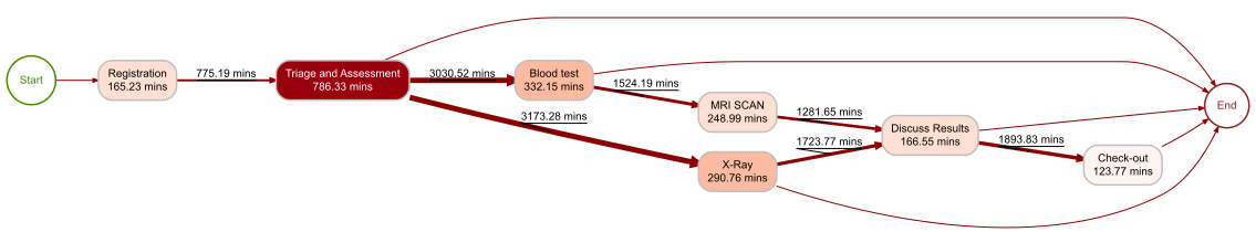
Let us start with bupaR’s built-in patients dataset — 500 emergency department cases with 7 activities. This is the kind of data any operation generates: cases flowing through a sequence of steps with timestamps and resource assignments.
library(eventdataR)
patients %>% process_map(type = frequency("absolute"))
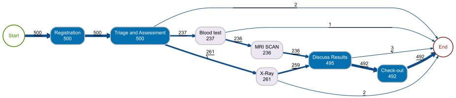
This single line of code produces a complete process map. Each node is an activity with its execution count. Each arrow shows how many cases flowed from one activity to the next. The layout is automatically determined from the data — you did not draw this diagram, your data did.
For an operations manager, this is the first moment of truth. You can immediately see:
- The main flow — Registration → Triage → Clinical Assessment → Treatment → Discharge. This is your designed process.
- The exceptions — Cases that skip steps, loop back, or take unexpected paths. These are the deviations you need to investigate.
- The volume distribution — Which activities handle the most cases? Where does the flow split?
How Long Does It Actually Take?
Throughput time — the total time from a case entering the system to leaving it — is the metric operations managers care about most. bupaR computes it directly from the event log:
patients %>% throughput_time("log") %>% plot()
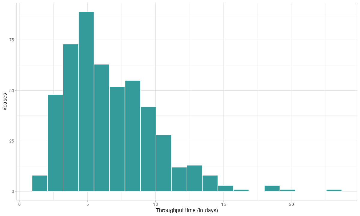
This distribution tells you what no average ever could. You do not just see that the mean throughput is X days — you see the shape of the distribution. A long right tail means some cases get stuck. A bimodal distribution means you have two fundamentally different process paths. Both of these patterns are invisible in a KPI dashboard that only shows averages.
Where Does the Time Go?
Knowing the total throughput is useful. Knowing where the time is spent is actionable. bupaR breaks processing time down by activity:
patients %>% processing_time("activity") %>% plot()
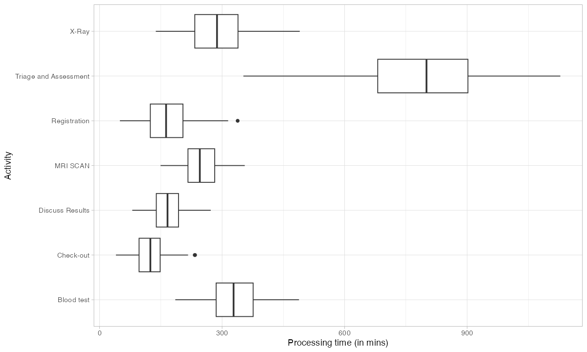
This immediately identifies your bottleneck. The activity with the longest processing time — or the highest variance — is where you should focus improvement efforts first. In a factory context, this could be a particular assembly step, a testing station, or a quality gate.
The distinction between processing time (time actively working) and throughput time (total elapsed time including waiting) is critical. If throughput time is high but processing time is low, your problem is not capacity — it is queuing. You have cases sitting in buffers waiting for the next station. That is a scheduling problem, not a staffing problem.
Which Paths Do Cases Actually Take?
In a well-running operation, most cases should follow the same path. In reality, they do not. bupaR’s trace explorer shows you every unique path (called a „trace variant“) and how often it occurs:
patients %>% trace_explorer(n_traces = 7)
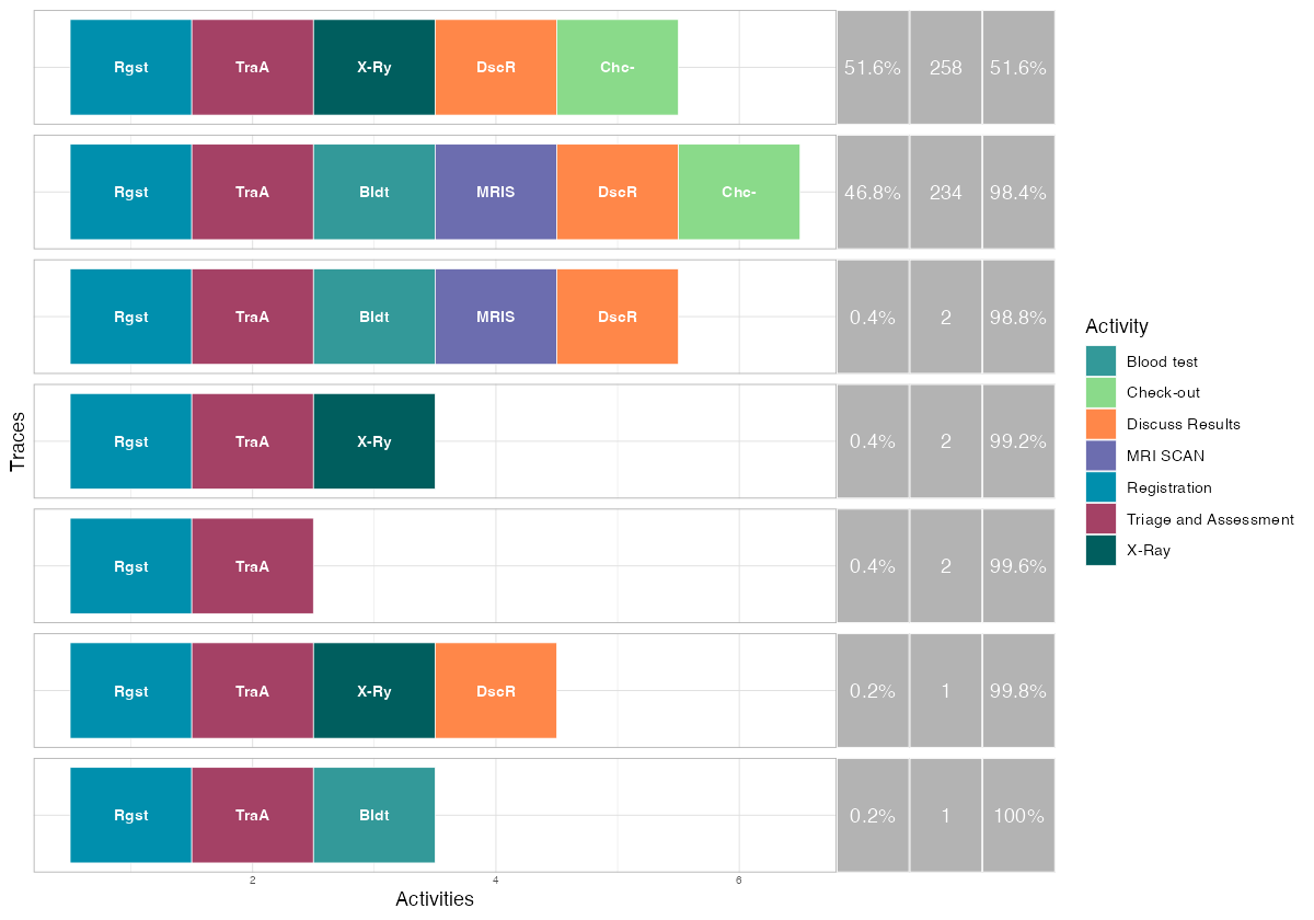
Each row is a distinct process path. The colored blocks represent activities in sequence. The percentage tells you how many cases followed that exact path.
This is where rework becomes visible. If your designed process has 6 steps but a trace variant shows 8 or 9 blocks, cases are looping back through activities they already completed. Every loop is wasted capacity — material, labor, and machine time consumed without producing output.
For a factory manager, the trace explorer answers a direct question: what percentage of my production follows the happy path? If it is 70%, you have a process control problem. If it is 95%, you have a stable process with occasional exceptions that can be managed individually.
How Much of the Variation Matters?
Not every deviation is a problem. Some variation is inherent in complex operations. Trace coverage tells you how many distinct paths you need to cover a given percentage of your cases:
patients %>% trace_coverage("trace") %>% plot()
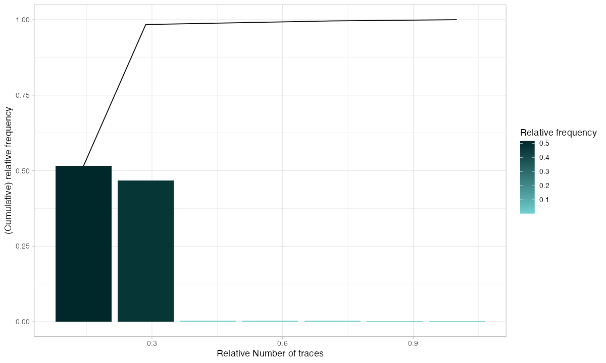
If 3 trace variants cover 90% of your cases, your process is relatively stable — focus your improvement on those 3 paths. If you need 50 variants to cover 90%, your process is chaotic and needs structural intervention before optimization makes sense.
Which Activities Drive the Volume?
Activity frequency shows how often each step executes. In a linear process, every activity should have roughly the same count. Deviations from that baseline reveal rework:
patients %>% activity_frequency("activity") %>% plot()
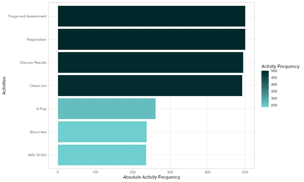
If your quality control step executes 600 times but your assembly step only executes 500 times, 100 cases went through QC twice. That is a 20% rework rate at that station. You now know where to look and roughly how much capacity you are losing.
Who Is Doing the Work?
Resource analysis shows how work is distributed across people, machines, or workstations:
patients %>% resource_frequency("resource") %>% plot()
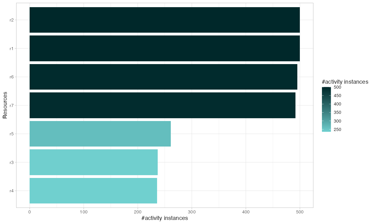
Uneven resource utilization creates bottlenecks even when total capacity is sufficient. If one operator handles 40% of cases while three others split the remaining 60%, you have a single point of failure. When that operator is absent, throughput drops by 40%.
Watching Every Case on a Timeline
The dotted chart is one of bupaR’s most powerful visualizations. Each row is a case. Each dot is an activity. The horizontal axis is time:
patients %>% dotted_chart(x = "relative")
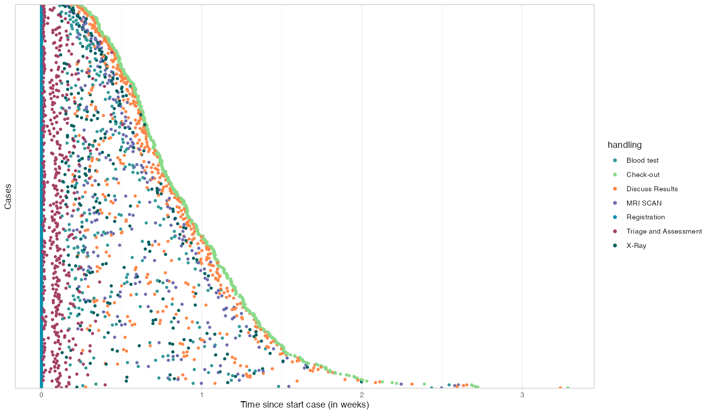
Patterns that are invisible in summary statistics become obvious here:
- Consistent spacing between dots = stable processing rhythm
- Large gaps between dots = cases waiting in queues
- Dots stacking vertically at the same x-position = batch processing or shift-start effects
- Cases with many more dots than others = rework or exceptions
A factory manager looking at this chart can immediately identify which cases had problems, when delays occurred, and whether the issues are systematic or random.
From Frequency to Performance
The same process map can show time instead of counts. Replace frequency() with performance() and you see average processing time on each activity and average waiting time on each arrow:
patients %>% process_map(type = performance())
This is your bottleneck map. Red nodes are slow activities. Long edge times mean cases are waiting between steps. The combination tells you exactly where your process is losing time and whether the problem is at the station (processing) or between stations (transport, queuing, scheduling).
Why This Matters for Your Factory
Process mining with bupaR answers the questions that keep operations managers awake at night:
„Where are my bottlenecks?“ — Processing time analysis and performance maps show which stations constrain throughput. You stop guessing and start measuring.
„How much rework is happening?“ — Trace analysis reveals every loop, every repeated activity, every case that deviated from the designed path. You can quantify rework as a percentage of total capacity — and set reduction targets.
„Are my resources balanced?“ — Resource frequency shows whether work is distributed evenly or concentrated on a few overloaded stations. Rebalancing often costs nothing but delivers immediate throughput improvement.
„What does my process actually look like?“ — The process map replaces the Visio diagram you drew three years ago with reality. The designed process is your intention. The mined process is your truth.
„Which cases need attention?“ — The dotted chart highlights outliers — cases that took too long, had too many steps, or followed unusual paths. Instead of reviewing every case, you review the exceptions.
Getting Your Data Into bupaR
Every ERP and MES system can export the data bupaR needs. You need four columns:
Case ID | Production order number, work order, batch ID
Activity | Operation name, process step, workstation
Timestamp | Start time and/or completion time of each step
Resource | Operator, machine, workstation ID
# Load your own data
event_data <- read.csv("your_mes_export.csv")

# Convert to a bupaR activity log
my_log <- activitylog(
  event_data,
  case_id     = "order_number",
  activity_id = "operation",
  resource_id = "workstation",
  timestamps  = c("start_time", "end_time")
)

# Start analyzing
my_log %>% process_map()
my_log %>% throughput_time("log") %>% plot()
my_log %>% trace_explorer(n_traces = 10)
That is it. Three lines of analysis code and you have a process map, throughput distribution, and trace analysis for your factory.
Where to Go From Here
This post covers the fundamentals. For deeper dives into specific bupaR capabilities, see:
- Interactive Process Mining Dashboard — A standalone dashboard demonstrating process mining KPIs following Stephen Few’s visualization principles.
Your factory generates event data every second. bupaR turns that data into operational intelligence. Install it, point it at your ERP export, and see your process for the first time.
Schreibe einen Kommentar