Your Supply Chain Is a Graph
Every supply chain is a network of relationships: raw material suppliers feed component manufacturers, who supply assembly plants, who ship through distribution centers to end markets. You manage this network every day — but do you actually see it?
Most supply chain visibility tools show you lists. Lists of suppliers, lists of orders, lists of shipments. What they do not show you is the structure — the web of dependencies that determines how a disruption at one node cascades through the entire system.
Network analysis, rooted in graph theory, gives you that structural view. It answers questions that no ERP report can:
- Which supplier is the single point of failure for the most end markets?
- If a key node goes down, how many supply paths are severed?
- Which clusters of suppliers form tightly connected groups — and what does that mean for risk concentration?
R’s igraph package makes this analysis accessible. In this post, we build a multi-tier supply chain network from scratch and apply the methods that reveal hidden vulnerabilities.
Building a Multi-Tier Supply Chain Network
We model a supply chain with five tiers: raw material suppliers, component suppliers, manufacturers, distribution centers, and end markets. The relationships between them are directional — material flows downstream from raw suppliers to markets.
library(igraph)

set.seed(42)

# Define the five tiers
raw_suppliers  <- paste0("Raw-", 1:6)
comp_suppliers <- paste0("Comp-", 1:8)
manufacturers  <- paste0("Mfg-", 1:3)
distributors   <- paste0("DC-", 1:4)
customers      <- paste0("Market-", 1:5)

# Define supply relationships (edges)
edges <- data.frame(
  from = c(
    "Raw-1","Raw-1","Raw-2","Raw-2","Raw-3","Raw-3",
    "Raw-4","Raw-4","Raw-5","Raw-5","Raw-6","Raw-6",
    "Comp-1","Comp-1","Comp-2","Comp-2","Comp-3","Comp-3",
    "Comp-4","Comp-5","Comp-5","Comp-6","Comp-7","Comp-8",
    "Comp-4","Comp-7",
    "Mfg-1","Mfg-1","Mfg-2","Mfg-2","Mfg-3","Mfg-3","Mfg-3",
    "DC-1","DC-1","DC-2","DC-2","DC-3","DC-3","DC-4","DC-4"
  ),
  to = c(
    "Comp-1","Comp-2","Comp-2","Comp-3","Comp-4","Comp-5",
    "Comp-5","Comp-6","Comp-7","Comp-8","Comp-8","Comp-1",
    "Mfg-1","Mfg-2","Mfg-1","Mfg-3","Mfg-2","Mfg-3",
    "Mfg-1","Mfg-2","Mfg-3","Mfg-3","Mfg-1","Mfg-2",
    "Mfg-2","Mfg-3",
    "DC-1","DC-2","DC-2","DC-3","DC-3","DC-4","DC-1",
    "Market-1","Market-2","Market-2","Market-3",
    "Market-3","Market-4","Market-4","Market-5"
  )
)

edges$weight <- sample(10:100, nrow(edges), replace = TRUE)

all_nodes <- c(raw_suppliers, comp_suppliers, manufacturers,
               distributors, customers)

g <- graph_from_data_frame(edges, directed = TRUE,
                           vertices = data.frame(name = all_nodes))
The result is a directed graph with 26 nodes and 41 edges spanning five tiers. Each edge represents a supply relationship, and the weight represents relative volume or importance.
Visualizing the Network Structure
The first step is to see the network as a whole. We color nodes by tier and size edges by volume:
V(g)$tier <- ifelse(grepl("Raw", V(g)$name), "Raw Material",
             ifelse(grepl("Comp", V(g)$name), "Component",
             ifelse(grepl("Mfg", V(g)$name), "Manufacturer",
             ifelse(grepl("DC", V(g)$name), "Distribution",
                    "Market"))))

tier_colors <- c("Raw Material" = "#2196F3", "Component" = "#4CAF50",
                 "Manufacturer" = "#FF9800", "Distribution" = "#9C27B0",
                 "Market" = "#F44336")

V(g)$color <- tier_colors[V(g)$tier]

plot(g,
     layout       = layout_with_sugiyama(g, layers = tier_order)$layout,
     vertex.size  = 18,
     vertex.color = V(g)$color,
     edge.arrow.size = 0.4,
     edge.width   = E(g)$weight / 30,
     main = "Multi-Tier Supply Chain Network")
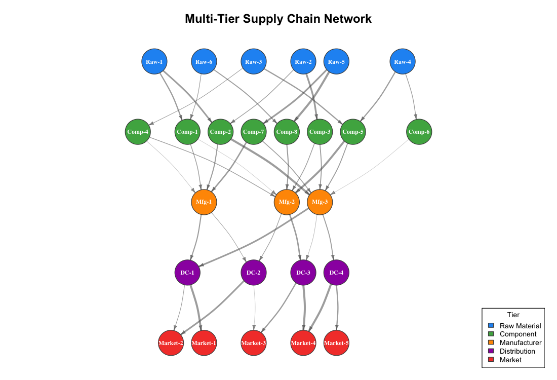
The Sugiyama layout arranges nodes left-to-right by tier, so the material flow direction is immediately visible. Several structural patterns stand out:
- Convergence at the manufacturer tier. Eight component suppliers funnel into just three manufacturers. This is the narrowest point in the network — and the most vulnerable.
- Fan-out at distribution. Three manufacturers feed four DCs, which serve five markets. The downstream network is more resilient because multiple paths exist.
- Uneven connectivity. Some component suppliers (Comp-1, Comp-2, Comp-5) feed multiple manufacturers, while others (Comp-6, Comp-8) connect to only one. The latter are less critical to the network but also less flexible if their single customer fails.
Finding Critical Nodes with Centrality Analysis
Not all nodes in a supply chain are equally important. Betweenness centrality measures how many shortest paths between all pairs of nodes pass through a given node. A node with high betweenness is a chokepoint — if it fails, many supply paths are disrupted.
bet <- betweenness(g, directed = TRUE)
deg <- degree(g, mode = "all")

centrality_df <- data.frame(
  node        = V(g)$name,
  tier        = V(g)$tier,
  degree      = deg,
  betweenness = round(bet, 1)
)

centrality_df[order(-centrality_df$betweenness), ]
        node         tier degree betweenness
     Mfg-3  Manufacturer      8        58.0
     Mfg-1  Manufacturer      6        33.0
     DC-1   Distribution      4        29.0
     Mfg-2  Manufacturer      7        24.0
     DC-3   Distribution      4        20.0
     Comp-1    Component      4        18.0
     DC-2   Distribution      4        16.0
     Comp-7    Component      3        11.0
     DC-4   Distribution      3        11.0
     Comp-2    Component      4         9.0
Mfg-3 dominates the betweenness ranking. It sits at the intersection of the most supply paths — five inbound connections from component suppliers and three outbound connections to distribution centers. This is your most critical node.
We can visualize this by scaling node size to betweenness:
node_size <- 10 + (bet / max(bet)) * 25

plot(g, layout = layout,
     vertex.size  = node_size,
     vertex.color = V(g)$color,
     main = "Betweenness Centrality — Node Size = Criticality")
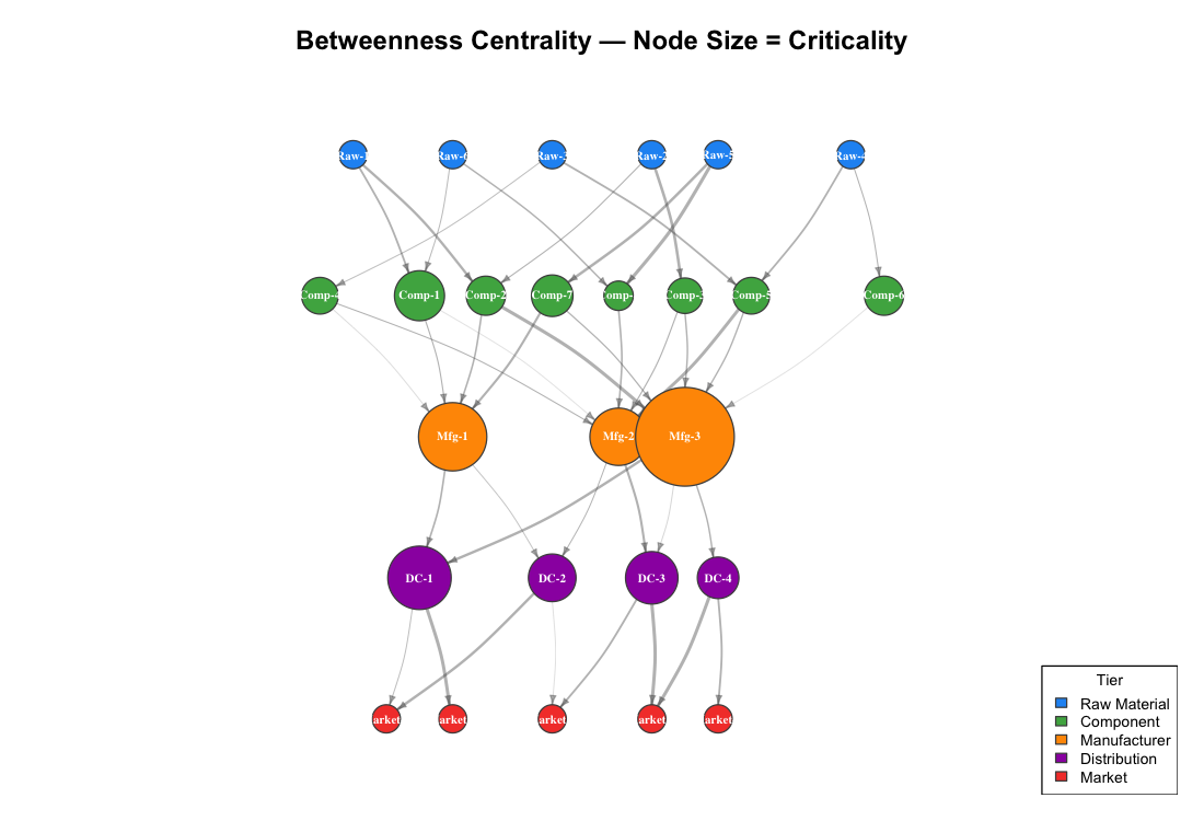
The manufacturers visually dominate the map because they are the chokepoints. Distribution centers also show significant betweenness — they control access to end markets. Raw material suppliers and end markets have zero betweenness because they sit at the network edges.
A bar chart makes the ranking explicit:
library(ggplot2)

top_10 <- centrality_df[order(-centrality_df$betweenness), ][1:10, ]
top_10$node <- factor(top_10$node, levels = rev(top_10$node))

ggplot(top_10, aes(x = node, y = betweenness, fill = tier)) +
  geom_col(width = 0.7) +
  coord_flip() +
  scale_fill_manual(values = tier_colors) +
  labs(title    = "Top 10 Nodes by Betweenness Centrality",
       subtitle = "Higher betweenness = more supply paths depend on this node",
       x = NULL, y = "Betweenness Centrality")
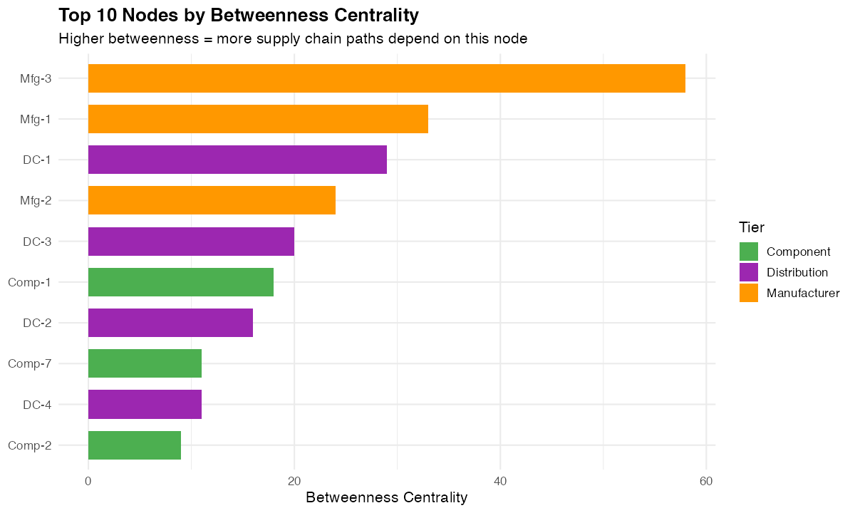
For a procurement manager, this chart is a prioritized risk list. The nodes at the top are where you need backup suppliers, safety stock, or dual-sourcing strategies.
In-Degree and Out-Degree: Who Depends on Whom?
Degree centrality splits into two components in a directed network:
- In-degree — how many suppliers feed this node (dependency)
- Out-degree — how many customers this node serves (influence)
deg_df <- data.frame(
  node       = V(g)$name,
  tier       = V(g)$tier,
  in_degree  = degree(g, mode = "in"),
  out_degree = degree(g, mode = "out")
)

ggplot(deg_df, aes(x = reorder(node, in_degree + out_degree), fill = tier)) +
  geom_col(aes(y = out_degree), width = 0.7, alpha = 0.9) +
  geom_col(aes(y = -in_degree), width = 0.7, alpha = 0.6) +
  coord_flip() +
  scale_fill_manual(values = tier_colors) +
  labs(title = "In-Degree and Out-Degree by Node",
       subtitle = "Right = supplies to | Left = receives from",
       x = NULL, y = "\u2190 In-Degree | Out-Degree \u2192")
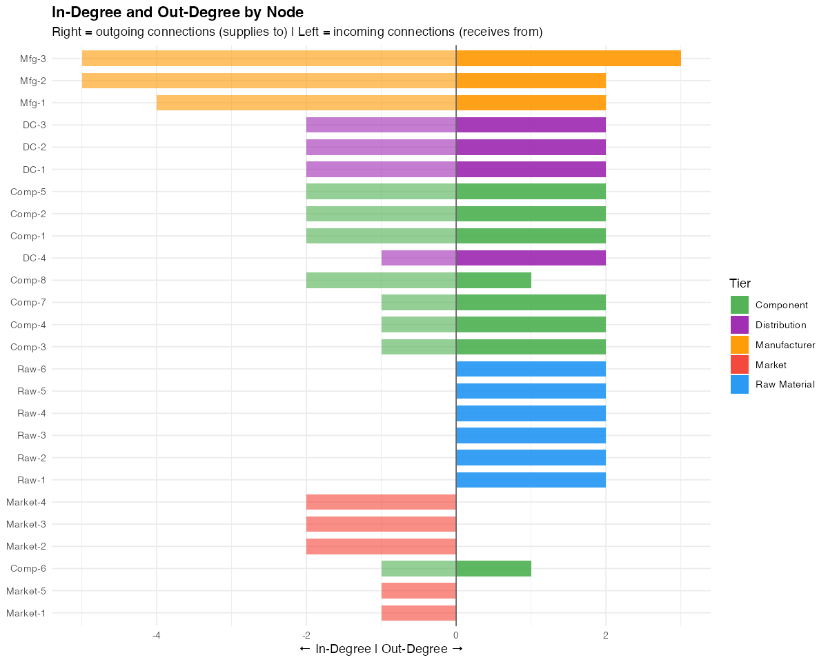
The manufacturers stand out with high values in both directions — they receive from many and supply to many. This dual dependency makes them critical from both the supply and demand side.
A node with high in-degree and low out-degree (like Market-2 or Market-3) is a demand concentrator — losing it means losing a significant share of revenue. A node with high out-degree and zero in-degree (the raw material suppliers) is a supply source — losing it affects everything downstream.
Disruption Simulation: What Happens When a Critical Node Fails?
The real power of network analysis is simulation. We can remove the most critical node (Mfg-3) from the network and measure the impact:
critical_node <- "Mfg-3"  # Highest betweenness

g_disrupted <- delete_vertices(g, critical_node)

plot(g_disrupted,
     layout = layout_with_sugiyama(g_disrupted, layers = layer)$layout,
     vertex.size = 18,
     vertex.color = V(g_disrupted)$color,
     main = paste0("Disruption Scenario: ", critical_node, " Removed"))
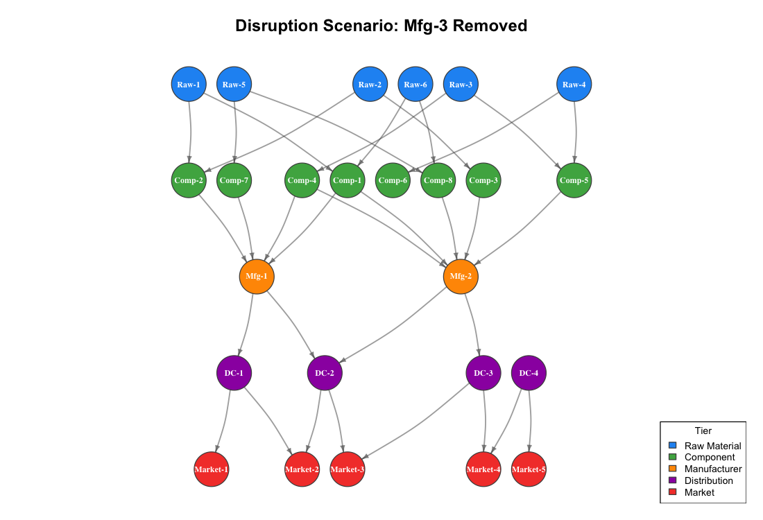
The visual impact is immediate. Five component suppliers (Comp-2, Comp-3, Comp-5, Comp-6, Comp-7) lose one of their downstream paths. Some markets now have fewer supply routes reaching them.
The numbers quantify the damage:
Raw-to-Market paths before disruption: 29
Raw-to-Market paths after disruption:  23
Paths lost: 6
Removing a single manufacturer eliminates 21% of all possible raw-to-market supply paths. This is the kind of insight that justifies dual-sourcing investments, strategic inventory buffers, or qualifying backup manufacturers.
In a real supply chain, you would run this simulation for every node with betweenness above a threshold. The result is a vulnerability matrix that tells you exactly which disruptions would hurt the most and where to invest in resilience.
Community Detection: Finding Natural Clusters
Community detection algorithms identify groups of nodes that are more densely connected to each other than to the rest of the network. In a supply chain context, these clusters often represent natural supply ecosystems — groups of suppliers, manufacturers, and distributors that primarily interact with each other.
g_undirected <- as_undirected(g, mode = "collapse")
communities  <- cluster_louvain(g_undirected)

plot(g,
     layout = layout,
     vertex.size  = 18,
     vertex.color = community_colors[membership(communities)],
     main = paste0("Community Detection (Louvain) — ",
                   max(membership(communities)), " Clusters"))
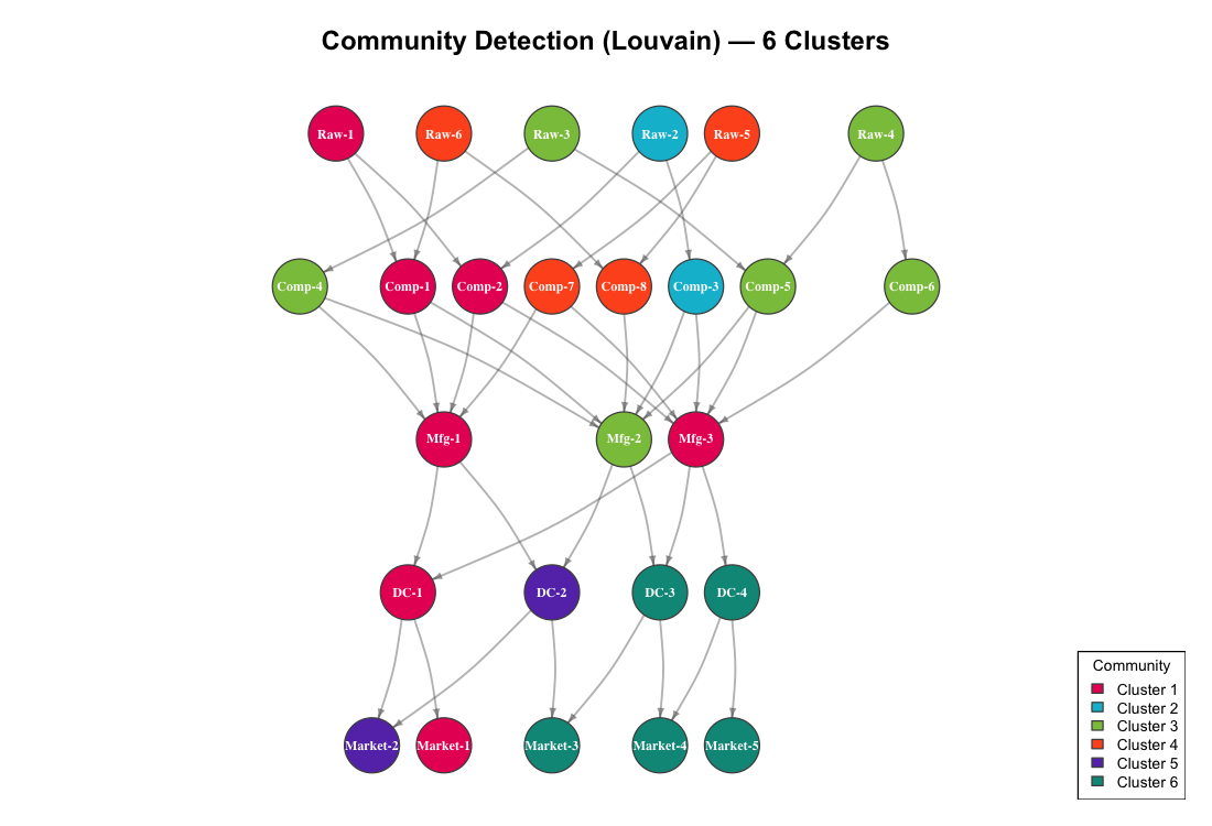
Cluster 1: Raw-1, Comp-1, Comp-2, Mfg-1, Mfg-3, DC-1, Market-1
Cluster 2: Raw-2, Comp-3
Cluster 3: Raw-3, Raw-4, Comp-4, Comp-5, Comp-6, Mfg-2
Cluster 4: Raw-5, Raw-6, Comp-7, Comp-8
Cluster 5: DC-2, Market-2
Cluster 6: DC-3, DC-4, Market-3, Market-4, Market-5
For procurement strategy, these clusters reveal:
- Cluster 1 is the largest and most integrated — it spans all five tiers. A disruption here has the widest blast radius.
- Clusters 2 and 4 are isolated upstream groups. If Raw-2 fails, Comp-3 has no alternative source within its cluster. Similarly, Raw-5 and Raw-6 exclusively feed Comp-7 and Comp-8.
- Cluster 6 is a downstream distribution group. DC-3, DC-4, and three markets form a tightly coupled demand cluster — they depend on the same upstream manufacturers.
This is directly actionable for supplier portfolio management. Clusters with single-source dependencies need diversification. Clusters that span all tiers need monitoring as integrated supply ecosystems.
From Analysis to Action
Network analysis turns your supply chain from a list of suppliers into a strategic map. Here is what to do with these results:
1. Protect the chokepoints. Nodes with high betweenness centrality (Mfg-3, Mfg-1, DC-1) are your single points of failure. Dual-source, buffer inventory, or qualify backup capacity at these locations.
2. Run disruption scenarios quarterly. Remove each critical node from the graph and measure path loss. Compare the results against your current risk mitigation investments. If your highest-betweenness node has no backup plan, that is your top priority.
3. Diversify within clusters. Community detection reveals where your supply base is concentrated. If an entire cluster depends on one raw material supplier, a single disruption cascades through the whole group.
4. Monitor degree changes over time. If a supplier’s in-degree drops (they are losing their own suppliers), that is an early warning signal. If a manufacturer’s out-degree increases (they are taking on more customers), their capacity may become a constraint for you.
5. Map your real network. The synthetic example here has 26 nodes. Your actual supply chain may have hundreds or thousands. The same igraph methods scale — betweenness centrality, community detection, and disruption simulation work on networks of any size. Start with your Tier 1 suppliers and expand upstream as data becomes available.
Getting Started
# Install igraph
install.packages("igraph")
library(igraph)

# Load your own supplier relationship data
edges <- read.csv("supplier_relationships.csv")  # columns: from, to, volume
g <- graph_from_data_frame(edges, directed = TRUE)

# Immediate analysis
betweenness(g, directed = TRUE)     # Find chokepoints
degree(g, mode = "all")             # Find most connected nodes
cluster_louvain(as_undirected(g))   # Find natural clusters

# Visualize
plot(g, vertex.size = 10 + betweenness(g) / max(betweenness(g)) * 20)
You need one CSV file: a list of supply relationships with from and to columns. Every ERP system can export this. Your purchasing records already contain the data — each purchase order connects a supplier to your company, and your BOMs connect components to finished goods.
The network is already there. You just have not drawn it yet.
Interactive Dashboard
Explore the complete analysis in a single view: Supply Chain Network Analysis Dashboard — featuring the full network topology, betweenness centrality ranking, disruption simulation, community structure, and a risk heat map, all following Stephen Few’s dashboard design principles.
Schreibe einen Kommentar