Every manufacturing plant has a designed process — the sequence of steps a product is supposed to follow. And then there is the actual process: the one shaped by equipment failures, rework loops, operator decisions, and queue buildup. Process mining bridges that gap. It takes timestamped event data from production systems and reconstructs what really happened on the shop floor.
In this post, we will use R’s bupaR ecosystem to analyze a fictional mobile phone assembly plant called PhoneTech. We will build a synthetic event log from scratch, discover the real process flow, identify rework patterns, quantify throughput times, and pinpoint which workstations are overloaded. Every line of code is reproducible — no external data sources required.
The bupaR Ecosystem
bupaR is a collection of R packages designed specifically for process mining and event log analysis. The key packages we will use:
- bupaR — core data structures for event logs
- edeaR — exploratory and descriptive analysis (throughput time, activity frequency, trace coverage)
- processmapR — process discovery and visualization (process maps, dotted charts, trace explorers)
Together, these packages give you a complete toolkit for turning raw event data into operational insights.
Creating the PhoneTech Event Log
PhoneTech assembles smartphones through six sequential steps:
- PCB Assembly — Surface-mount technology (SMT) lines solder components onto printed circuit boards
- Display Installation — OLED display panels are bonded to the frame
- Battery & Power Module — Battery cells and power management ICs are installed
- Housing Assembly — Back covers, buttons, and SIM trays are fitted
- Software Flashing — Firmware and OS are loaded onto the device
- Quality Control — Functional testing, cosmetic inspection, and packaging clearance
Around 12% of units fail QC and get sent back for rework at an earlier station. About 3% fail twice. This is a realistic defect rate for consumer electronics assembly.
Here is the R code that generates the complete event log:
library(bupaR)
library(edeaR)
library(processmapR)
library(ggplot2)
library(dplyr)
library(lubridate)

set.seed(42)

activities <- c(
  "PCB Assembly",
  "Display Installation",
  "Battery & Power Module",
  "Housing Assembly",
  "Software Flashing",
  "Quality Control"
)

# Resources per activity
resource_map <- list(
  "PCB Assembly"          = c("SMT-Line-A", "SMT-Line-B", "SMT-Line-C"),
  "Display Installation"  = c("Display-WS-1", "Display-WS-2"),
  "Battery & Power Module"= c("Power-WS-1", "Power-WS-2"),
  "Housing Assembly"      = c("Housing-WS-1", "Housing-WS-2", "Housing-WS-3"),
  "Software Flashing"     = c("Flash-Station-1", "Flash-Station-2"),
  "Quality Control"       = c("QC-Inspector-1", "QC-Inspector-2", "QC-Inspector-3")
)

# Processing time in minutes: mean and standard deviation
time_params <- list(
  "PCB Assembly"          = c(mean = 45, sd = 10),
  "Display Installation"  = c(mean = 30, sd = 8),
  "Battery & Power Module"= c(mean = 25, sd = 6),
  "Housing Assembly"      = c(mean = 35, sd = 9),
  "Software Flashing"     = c(mean = 20, sd = 5),
  "Quality Control"       = c(mean = 15, sd = 4)
)

n_cases <- 500
rework_rate <- 0.12
double_rework_rate <- 0.03

rows <- list()
row_id <- 0
base_time <- ymd_hms("2025-09-01 06:00:00")

for (i in seq_len(n_cases)) {
  case_id <- sprintf("PHONE-%04d", i)

  rng <- runif(1)
  if (rng < double_rework_rate) {
    rework_loops <- 2
  } else if (rng < rework_rate) {
    rework_loops <- 1
  } else {
    rework_loops <- 0
  }

  case_start <- base_time + minutes(round(runif(1, 0, 60 * 24 * 60)))
  current_time <- case_start
  loop <- 0

  repeat {
    if (loop == 0) {
      acts <- activities
    } else {
      rework_target <- sample(1:4, 1)
      acts <- activities[rework_target:6]
    }

    for (act in acts) {
      wait_min <- round(rexp(1, rate = 1/10))
      current_time <- current_time + minutes(wait_min)
      start_ts <- current_time

      params <- time_params[[act]]
      dur <- max(5, round(rnorm(1, params["mean"], params["sd"])))
      end_ts <- start_ts + minutes(dur)

      resource <- sample(resource_map[[act]], 1)
      row_id <- row_id + 1
      rows[[row_id]] <- data.frame(
        case_id  = case_id,
        activity = act,
        resource = resource,
        start    = start_ts,
        complete = end_ts,
        stringsAsFactors = FALSE
      )
      current_time <- end_ts
    }

    loop <- loop + 1
    if (loop > rework_loops) break
  }
}

event_df <- bind_rows(rows)
event_df$activity_instance <- seq_len(nrow(event_df))

phone_log <- activitylog(
  event_df,
  case_id    = "case_id",
  activity_id = "activity",
  resource_id = "resource",
  timestamps  = c("start", "complete")
)
A few design decisions worth noting:
- We use
activitylog()rather thaneventlog(). An activity log stores each activity as a single row with astartandcompletetimestamp, which matches how MES systems typically record production steps. Aneventlog()would store two rows per activity (one for „start,“ one for „complete“). - Queue times between activities are drawn from an exponential distribution with a 10-minute mean, simulating the random delays that occur when a unit waits for the next workstation to become available.
- Rework loops send units back to one of the first four stations (randomly chosen), then the unit repeats every step from that point through QC again. This mirrors real-world rework where a partial disassembly and rebuild is required.
The result is 3,401 activity instances across 500 cases — a dataset large enough to surface meaningful patterns.
Process Discovery: The Process Map
The first thing any process mining analysis should produce is a process map. This is the discovered model — what actually happened, extracted directly from the event log.
library(DiagrammeR)

map <- phone_log %>%
  process_map(type = frequency("absolute"), render = FALSE)

export_graph(map,
             file_name = "https://inphronesys.com/wp-content/uploads/2026/02/bupar_process_map.png",
             file_type = "png")
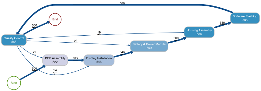
The process map reveals the actual flow of all 500 phone units through the factory. The main „happy path“ is immediately visible: Start to PCB Assembly (500) to Display Installation to Battery & Power Module to Housing Assembly to Software Flashing to Quality Control to End. The numbers on each node represent how many times that activity was executed in total.
The rework loops jump out clearly. From Quality Control, 22 cases loop back to PCB Assembly, 23 go back to Display Installation, and 24 return to Battery & Power Module. Meanwhile, 19 cases return directly to Housing Assembly. The fact that Software Flashing and Quality Control both show 588 executions (compared to 500 for PCB Assembly) confirms that reworked units re-enter the flow at the failed step and repeat everything downstream through QC.
For a plant manager, the key takeaway is that about 88 additional activity executions are generated by rework — roughly a 15% overhead on top of the base 500 units. That is labor, machine time, and materials consumed without producing additional output.
Throughput Time Analysis
Throughput time is the total elapsed time from when a case enters the process to when it exits. It is the metric customers feel directly — it determines lead time promises and delivery reliability.
p <- phone_log %>%
  throughput_time("log") %>%
  plot()

ggsave("Images/bupar_throughput_time.png", p,
       width = 10, height = 7, dpi = 120)
The throughput time histogram shows a clear bimodal pattern. The main cluster sits between 2.5 and 4.5 hours — these are the units that passed through the line without rework. The peak is around 3.5 hours, which aligns with the sum of our six activity means (45 + 30 + 25 + 35 + 20 + 15 = 170 minutes, roughly 2.8 hours) plus queue times.
The long tail extending out to 12+ hours represents reworked units. A single rework loop adds approximately 3 to 4 hours to the throughput time (repeating several activities plus additional queue waits), and the handful of cases with double rework push past 10 hours.
This distribution tells the plant manager exactly what to promise customers: a standard lead time of about 4 hours per unit, with 12% of units requiring up to double that. If the rework rate drops from 12% to 6%, the right tail shrinks proportionally and average throughput time decreases.
Processing Time by Activity
While throughput time measures the total case duration, processing time isolates the actual hands-on work at each station — excluding queue waits.
p <- phone_log %>%
  processing_time("activity") %>%
  plot()

ggsave("https://inphronesys.com/wp-content/uploads/2026/02/bupar_processing_time.png", p,
       width = 10, height = 7, dpi = 120)
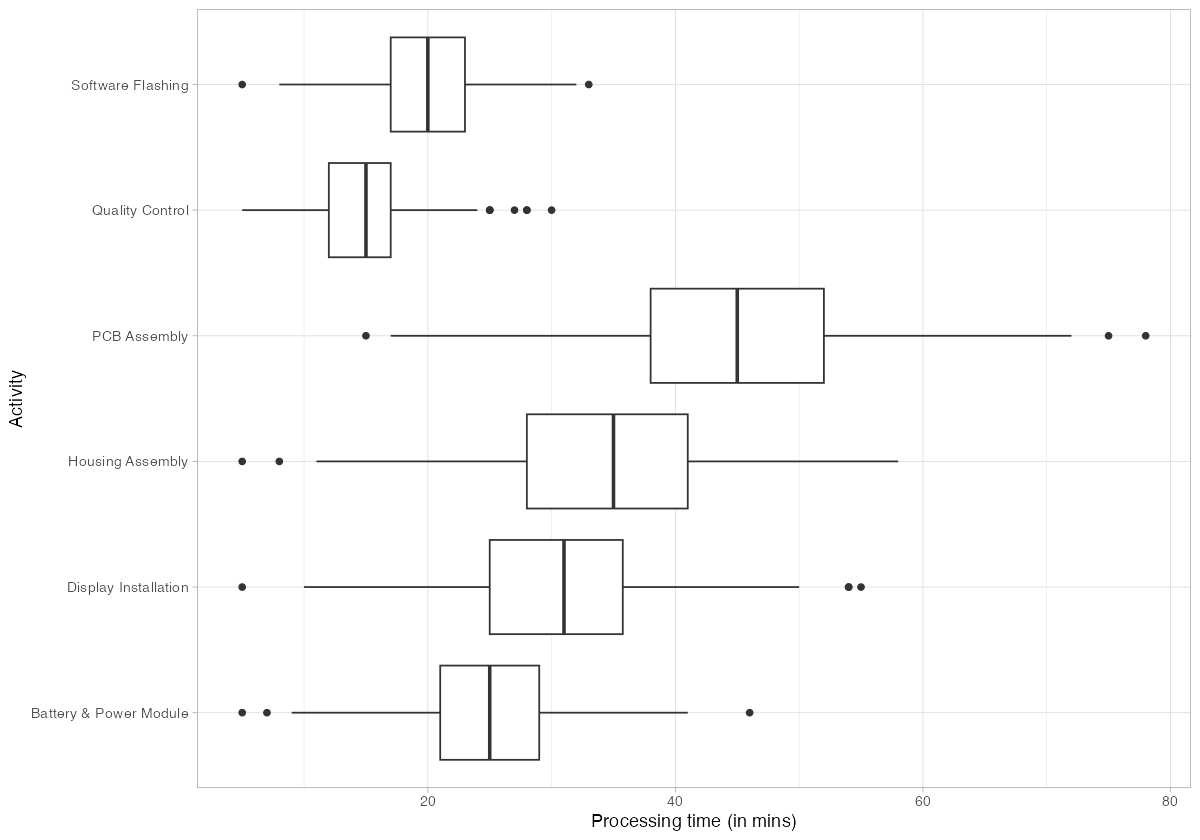
The box plots confirm PCB Assembly as the longest individual activity, with a median around 45 minutes and a wide spread reaching 75+ minutes on the high end. This is the process bottleneck — it has the highest processing time and the largest variance. Quality Control, by contrast, is the fastest activity at roughly 15 minutes median.
Housing Assembly and Display Installation both cluster in the 25-35 minute range with moderate variance. Software Flashing is tightly grouped around 20 minutes, indicating that it is a well-controlled, automated step.
The operational implication: capacity investments should target PCB Assembly first. Reducing its processing time or adding a fourth SMT line would directly lower the bottleneck constraint and improve overall throughput.
Trace Analysis: Identifying Rework Patterns
A trace is the ordered sequence of activities that a case follows. In a perfect process, every case would follow the same trace. In reality, variations — especially rework loops — create multiple distinct trace variants.
Trace Explorer
p <- phone_log %>%
  trace_explorer(n_traces = 15)

ggsave("https://inphronesys.com/wp-content/uploads/2026/02/bupar_trace_explorer.png", p,
       width = 10, height = 7, dpi = 120)
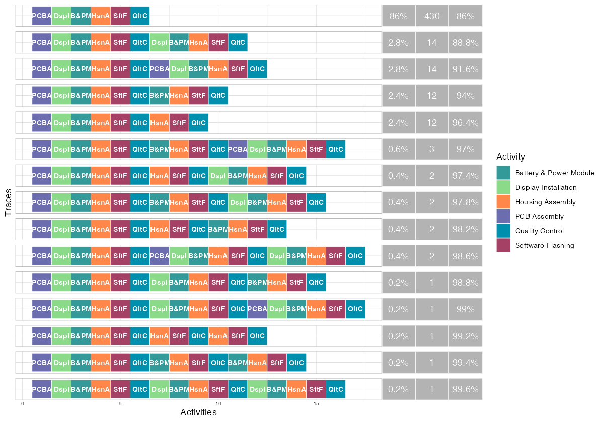
The trace explorer makes the rework problem tangible. The dominant trace — the straight-through „happy path“ (PCBA, DspI, B&PM, HsnA, SftF, QltC) — accounts for 430 of the 500 cases (86%). This is a good sign: the majority of production follows the designed process.
The next four most common traces each appear 12-14 times and represent single rework loops. You can see them clearly — the activity sequence reaches QC, then loops back to an earlier step (Display Installation, PCB Assembly, or Battery & Power Module) before completing QC again. The traces with double rework loops appear further down at 0.2-0.6% frequency.
By the fifth trace variant, cumulative coverage reaches 96.4%. This means the process is relatively structured — you need fewer than 10 trace variants to explain nearly all observed behavior, which is typical for a well-controlled manufacturing environment (as opposed to, say, a hospital process where hundreds of variants might be needed).
Trace Coverage
p <- phone_log %>%
  trace_coverage("trace") %>%
  plot()

ggsave("Images/bupar_trace_coverage.png", p,
       width = 10, height = 7, dpi = 120)
The trace coverage plot reinforces this point from a different angle. The first bar (the happy path) immediately jumps the cumulative frequency line to 86%. Adding just a few more trace variants quickly reaches 95%+. The long tail of rare traces (each covering fewer than 1% of cases) represents the diverse rework paths — different combinations of where QC sends a unit back to and how many rework loops it endures.
For process standardization efforts, this chart tells you that controlling the top 5 trace variants covers 96% of production. The remaining 4% is the rework tail where improvement efforts should focus.
Activity Frequency Analysis
Activity frequency tells you how many times each activity was executed in the entire log. In a rework-free process, every activity would execute exactly 500 times. Deviations from that baseline quantify the rework burden.
p <- phone_log %>%
  activity_frequency("activity") %>%
  plot()

ggsave("https://inphronesys.com/wp-content/uploads/2026/02/bupar_activity_frequency.png", p,
       width = 10, height = 7, dpi = 120)
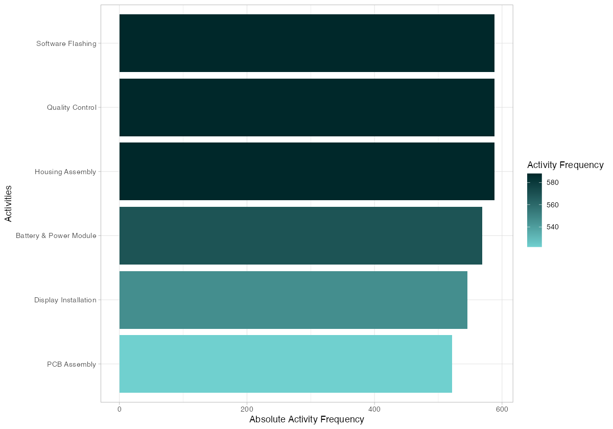
The frequency chart shows a clear gradient. PCB Assembly sits at 522 executions — the lowest — because rework only sometimes sends units all the way back to this first step. Display Installation shows 546, and Battery & Power Module reaches 569. The downstream activities (Housing Assembly, Software Flashing, Quality Control) all hit 588, because every rework path must re-traverse these final steps regardless of where the loop started.
This has direct staffing implications. The downstream workstations handle approximately 17% more volume than the upstream ones. If you staff purely based on the designed process (one pass per unit), you will understaff Housing Assembly, Software Flashing, and QC. Resource planning must account for the rework-amplified demand at later stages.
Resource Frequency Analysis
Breaking frequency down by individual resource (workstation or operator) reveals load imbalances.
p <- phone_log %>%
  resource_frequency("resource") %>%
  plot()

ggsave("Images/bupar_resource_frequency.png", p,
       width = 10, height = 7, dpi = 120)
Flash-Station-1 tops the chart with roughly 300 activity instances, closely followed by Power-WS-2 and Flash-Station-2. These resources handle the highest volume because their corresponding activities (Software Flashing, Battery & Power Module) sit downstream and absorb the full rework-amplified demand.
At the other end, SMT-Line-B and SMT-Line-C handle fewer than 175 instances each. This is because PCB Assembly has three SMT lines splitting its 522 executions roughly evenly — each line handles about 174 units. The two Flash Stations, by contrast, split 588 executions between just two resources, putting each at nearly 295.
The load imbalance between activities with two resources vs. three resources is stark. Housing Assembly, despite having three workstations, shows an uneven distribution: Housing-WS-2 and Housing-WS-3 handle about 195-200 each while Housing-WS-1 drops to roughly 180. This uneven split (caused by random assignment in our simulation, but in real factories often caused by equipment downtime or operator skill differences) is the kind of finding that drives rebalancing decisions.
Dotted Chart: Timeline Analysis
The dotted chart plots every activity instance on a timeline, with cases on the y-axis and calendar time on the x-axis. Each dot is colored by activity type.
p <- phone_log %>%
  dotted_chart()

ggsave("https://inphronesys.com/wp-content/uploads/2026/02/bupar_dotted_chart.png", p,
       width = 10, height = 7, dpi = 120)
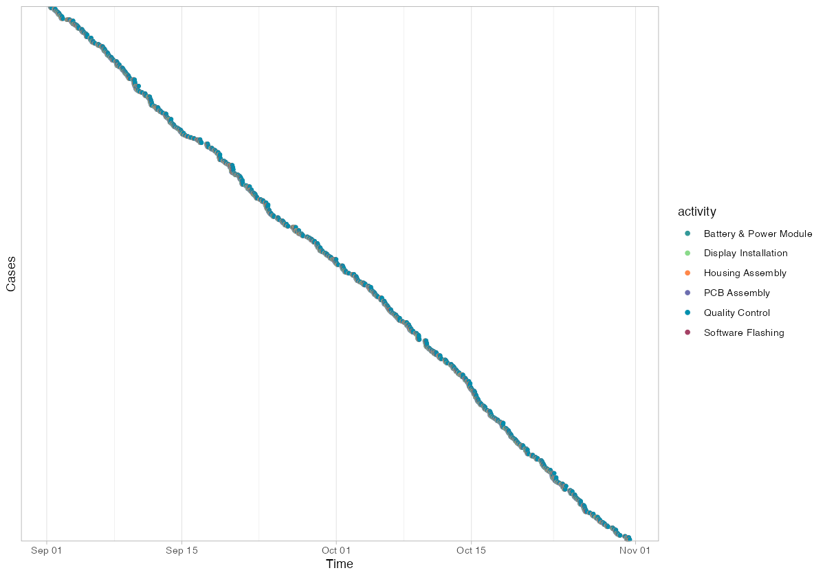
The dotted chart shows 500 cases spread uniformly across the two-month simulation window (September 1 through early November). Cases are ordered by start time on the y-axis, creating the characteristic diagonal pattern where earlier cases appear at the top and later cases at the bottom.
Each horizontal band of dots represents a single case progressing through its activities. The width of each band indicates throughput time — tightly clustered dots mean fast throughput, while widely spaced dots indicate a case that took longer (likely due to rework). You can spot the rework cases as bands that are noticeably wider than their neighbors.
The uniform density of the diagonal confirms that production ran at a steady pace throughout the period — no visible shutdown periods, seasonal slowdowns, or batch processing patterns. In real factory data, gaps in the dotted chart often reveal weekend closures, shift patterns, or production halts.
Actionable Insights for the Plant Manager
This analysis, applied to a real production MES dataset, would yield the following concrete actions:
1. Target rework root causes at the source. The 12% QC failure rate generates 88 additional activity executions (a 15% overhead). A root cause analysis on the rework cases — specifically what QC found wrong and which upstream station was responsible — should be the top priority. Cutting rework from 12% to 6% would save approximately 44 activity repetitions per 500 units, recovering roughly 100 hours of production time.
2. Add capacity at the bottleneck. PCB Assembly is the longest activity at 45 minutes median with high variance. A fourth SMT line or a focused cycle-time reduction project (setup optimization, solder paste standardization) would increase overall line throughput. The other five stations have enough headroom to absorb increased flow.
3. Rebalance downstream staffing. Software Flashing, Quality Control, and Housing Assembly each handle 17% more volume than the 500-unit baseline suggests. Staff schedules and equipment maintenance windows must reflect the rework-amplified demand, not the designed process volume.
4. Investigate Flash-Station-1 load. It handles the most activity instances of any single resource. If this is a real bottleneck (rather than a random assignment artifact), adding a third flash station or optimizing firmware image sizes to reduce flash time would lower queue buildup.
5. Use trace variants for defect classification. The trace explorer reveals exactly which rework paths occur and how frequently. Mapping these traces to defect codes from the QC station creates a direct link between process deviations and quality failures — the foundation for predictive quality models.
Getting Started with Your Own Data
To apply this analysis to your factory, you need a dataset with four columns: a case identifier, an activity name, a resource identifier, and timestamps (start and complete). Most MES and ERP systems can export this data. The bupaR activitylog() constructor handles the rest.
The full R script used in this post is available for download. Replace the synthetic data generation with a CSV import of your own event log, and every visualization shown here will work without modification.
# Replace synthetic data with your own CSV:
event_df <- read.csv("your_mes_export.csv")
event_df$start    <- ymd_hms(event_df$start)
event_df$complete <- ymd_hms(event_df$complete)

phone_log <- activitylog(
  event_df,
  case_id     = "case_id",
  activity_id = "activity",
  resource_id = "resource",
  timestamps  = c("start", "complete")
)

# Then run any of the analyses shown above
phone_log %>% process_map()
phone_log %>% throughput_time("log") %>% plot()
phone_log %>% trace_explorer(n_traces = 10)
Process mining turns your existing production data into a diagnostic tool. You do not need new sensors, new software, or a data science team — just an event log and a few lines of R.
Interactive Dashboard
Want to see all of these metrics in a single view? Explore the PhoneTech Process Mining Dashboard — a standalone interactive dashboard built with the same data, featuring process maps, bullet graphs, trace analysis, resource heatmaps, and a dotted chart timeline.
Schreibe einen Kommentar