Your Demand Data Has a Heartbeat
Every product in your supply chain has a rhythm. Some pulse with the seasons — sunscreen in June, heating oil in November, and ice cream in July (always July). Others march to a steady upward beat as markets grow. A few just thrash around unpredictably, like a drummer who lost the sheet music.
The problem is that most supply chain teams treat demand data as a single, monolithic number: "We sold 145,000 cases last July, so budget for something similar." That’s not analysis — that’s looking at a heart monitor, seeing the spikes, and concluding the patient has a heartbeat. True, but not exactly actionable.
Time series analysis does something fundamentally more useful: it separates the signal into its component parts. That 145,000-case July figure is actually the sum of a long-term growth trend (the business is expanding), a seasonal pattern (people eat more ice cream when it’s hot — shocking, I know), and random noise (a heat wave, a competitor’s recall, a TikTok trend involving your mint chocolate chip flavor). Once you can see these components independently, you can plan against each one differently.
This post walks through the complete toolkit — from decomposition to diagnostics to forecasting — using five years of ice cream demand data. We’ll use R’s modern fpp3 ecosystem, which turns time series analysis from an arcane statistical ritual into something surprisingly readable. And we’ll be honest about where these methods fall flat, because overselling a forecasting technique is how you end up with a warehouse full of ice cream in January.
The Data: Five Years of Frozen Profits
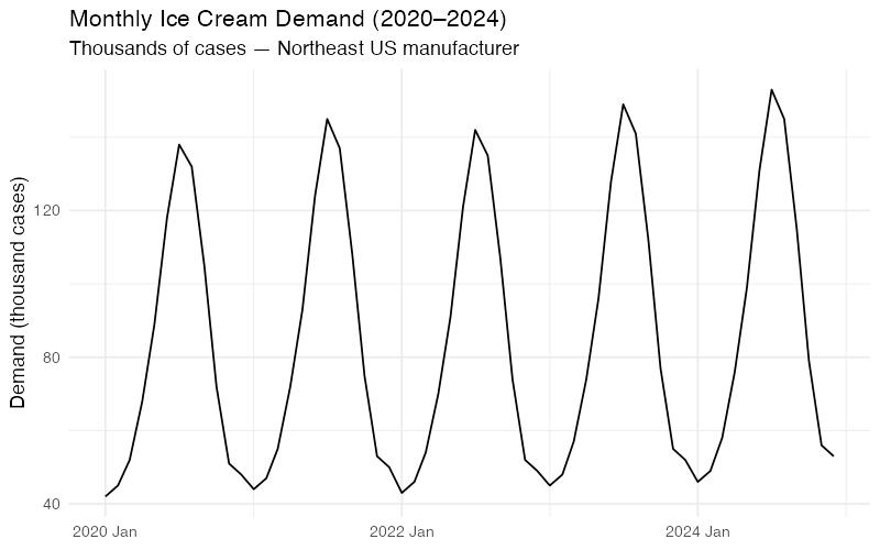
Let’s start with our running example: monthly ice cream shipments (in thousands of cases) from a mid-size manufacturer serving the U.S. Northeast region, January 2020 through December 2024.
| Year | Jan | Feb | Mar | Apr | May | Jun | Jul | Aug | Sep | Oct | Nov | Dec |
|---|---|---|---|---|---|---|---|---|---|---|---|---|
| 2020 | 42 | 45 | 52 | 68 | 89 | 118 | 138 | 132 | 105 | 72 | 51 | 48 |
| 2021 | 44 | 47 | 55 | 72 | 93 | 124 | 145 | 137 | 108 | 75 | 53 | 50 |
| 2022 | 43 | 46 | 54 | 70 | 91 | 121 | 142 | 135 | 107 | 74 | 52 | 49 |
| 2023 | 45 | 48 | 57 | 74 | 96 | 128 | 149 | 141 | 112 | 77 | 55 | 52 |
| 2024 | 46 | 49 | 58 | 76 | 99 | 131 | 153 | 145 | 115 | 79 | 56 | 53 |
Even eyeballing this table reveals the two dominant signals: July is always the peak (3.2x the January trough), and demand creeps upward about 2-3% per year. The question is whether we can quantify those signals precisely enough to forecast what comes next — and, more importantly, to understand how confident we should be in that forecast.
Decomposition: Taking the Signal Apart
STL — The Swiss Army Knife of Decomposition
STL (Seasonal and Trend decomposition using Loess) is the most versatile decomposition method available. Developed by Cleveland et al. in 1990, it uses locally weighted regression (LOESS) to iteratively separate a time series into three additive components:
y_t = Trend + Seasonal + Remainder
- Trend: The underlying long-term trajectory. For our ice cream data, this is the slow upward drift from roughly 80,000 cases/month average in 2020 to about 88,000 in 2024.
- Seasonal: The repeating calendar-driven pattern. This is the July peak and January trough that we can set our production schedule by.
- Remainder: Everything else — the noise, the one-off events, the unexplained variation. This is where surprises live.
What makes STL superior to classical decomposition is flexibility. The seasonal component can evolve over time (useful if ice cream season is gradually starting earlier due to climate change). The trend can bend without breaking. And when you turn on the robust option, outliers won’t derail the entire decomposition — which matters when your 2020 data includes a few pandemic-era anomalies.
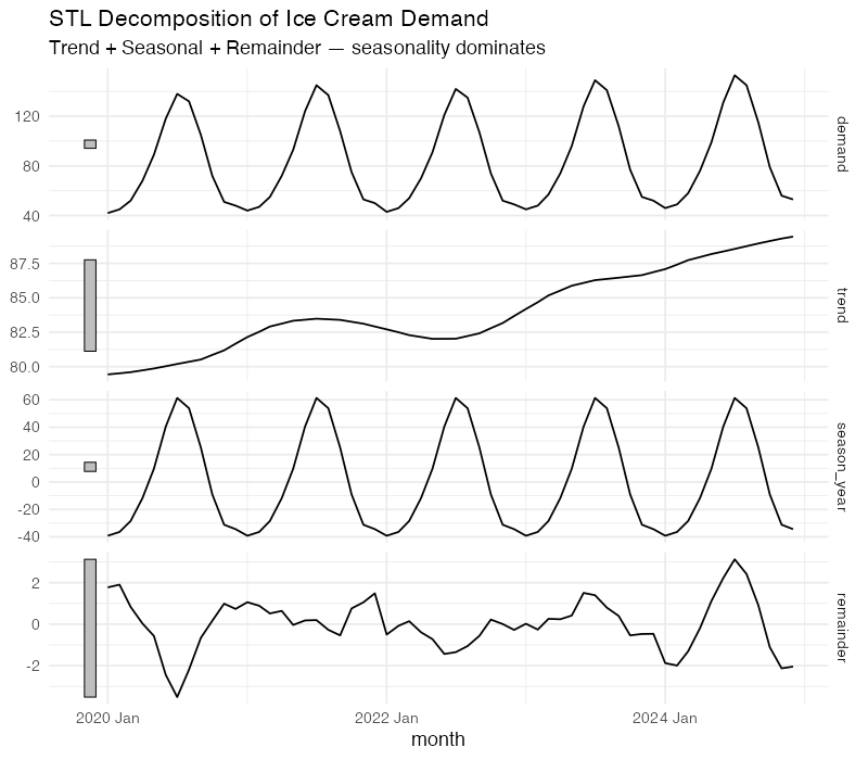
The decomposition tells us something quantitatively useful: the strength of seasonality for this data is approximately 0.95 on a 0-to-1 scale (where 1 means seasonality completely dominates the signal). That’s extremely strong — but expected for ice cream, where July volumes run more than three times January’s. The strength of trend is around 0.4, confirming that growth exists but is modest compared to the seasonal swing.
This matters for planning. A product with F_S = 0.95 demands a seasonally differentiated inventory strategy. You need production ramp-ups starting in March, peak warehouse capacity by May, and a rapid drawdown plan by September. Treating each month the same would be like staffing a ski resort identically in July and January.
Reading the Seasonal Fingerprint
Decomposition gives you the broad picture, but two specialized visualizations from the feasts package let you inspect the seasonal pattern at a finer resolution.
The Seasonal Plot: Year-Over-Year Overlay
A seasonal plot (gg_season()) overlays each year’s data on a single January-through-December axis. For our ice cream data, this produces five nearly parallel curves — one per year — that rise from January through July and fall back to December.
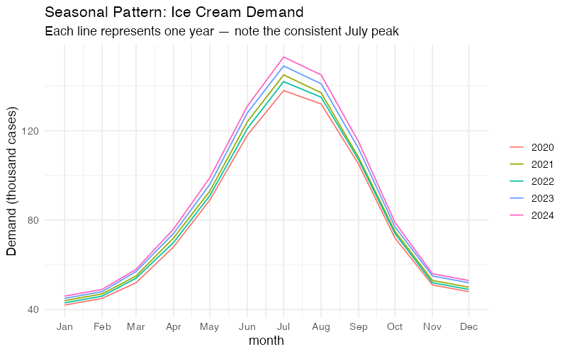
What to look for:
- Consistency: If the curves stack neatly, the seasonal pattern is stable. Our ice cream data is textbook-consistent.
- Shifting peaks: If July’s peak starts migrating toward June across years, that’s a structural change worth investigating (earlier summers, shifting promotion calendars, changing consumer behavior).
- Outlier years: A year that breaks the pattern — say 2020 dipping in April due to lockdown disruptions — stands out immediately.
The Subseries Plot: Is Each Month Stable?
A subseries plot (gg_subseries()) shows a separate mini time-series for each month, with a horizontal blue line marking that month’s mean. January gets its own panel showing all five January values over 2020-2024. February gets its own panel. And so on.
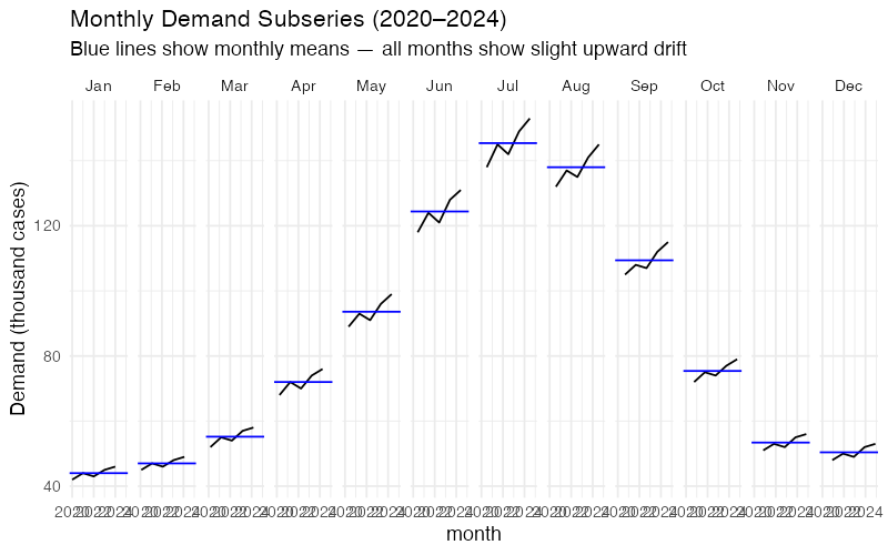
This plot answers a question the seasonal plot cannot: Is the seasonal pattern shifting over time? If January’s five data points show a clear upward trend within that panel, it means winter demand is growing faster than you might assume from the overall trend. For production planning, that’s the difference between maintaining a flat winter production schedule and gradually increasing it.
Autocorrelation: The Demand Memory Test
The Autocorrelation Function (ACF) measures how strongly today’s demand correlates with demand at various lags. For monthly data, the ACF at lag 1 asks: "Does this month’s demand tell me anything about next month’s?" At lag 12: "Does this month tell me about the same month next year?"
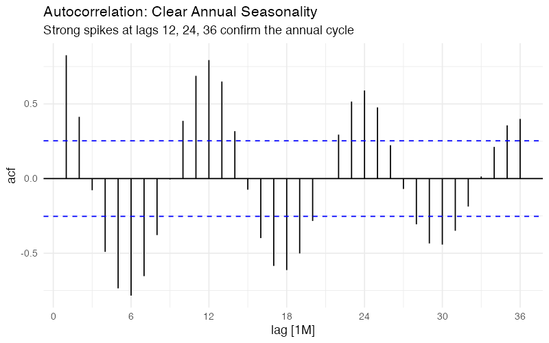
For ice cream demand, the ACF tells a clear story:
- Strong positive spikes at lags 12, 24, and 36: Annual seasonality is dominant. July 2023 is highly correlated with July 2022 and July 2021. This is your most exploitable pattern.
- Negative correlation around lag 6: Demand six months ago is anti-correlated with current demand. Makes sense — when July was high, January was low. These are literally opposite seasons.
- Slow decay at seasonal lags: The correlations at lag 12, 24, 36 remain strong rather than dying off quickly. This tells us the seasonal pattern is stable over the full 5-year window.
The Partial Autocorrelation Function (PACF) strips out indirect effects: it shows the direct correlation between y_t and y_{t-k} after removing the influence of intermediate lags. A sharp cutoff in the PACF at lag 12, with the spike at lag 1 also significant, suggests an ARIMA model with both non-seasonal and seasonal autoregressive terms — something like ARIMA(1,0,0)(1,1,0)_12. But we’ll let the automated model selection sort out the specifics.
Forecasting: ETS and ARIMA
With the diagnostic work done, we can fit proper forecasting models. Two families dominate supply chain time series forecasting: ETS (Exponential Smoothing State Space) and ARIMA (AutoRegressive Integrated Moving Average). They approach the problem from different angles, and comparing them is standard practice.
ETS: Exponential Smoothing, Properly
ETS models are named by three components: Error (additive or multiplicative), Trend (none, additive, or additive damped), and Seasonal (none, additive, or multiplicative). For ice cream demand with its constant seasonal amplitude and mild linear trend, automatic model selection typically lands on ETS(M,A,M) — multiplicative errors and seasonality with an additive trend.
The model estimates three smoothing parameters:
- Alpha (level): How fast the model adapts to changes in the baseline demand level. Higher alpha = more reactive, but noisier forecasts.
- Beta (trend): How fast the model adjusts the growth rate. For a slow, steady growth market like ice cream, this tends to be small.
- Gamma (seasonal): How fast the seasonal pattern can evolve. For a product where seasons are driven by physics (temperature) rather than fashion, a low gamma is appropriate.
ARIMA: The Pattern Matching Approach
Where ETS thinks in terms of smoothed levels, ARIMA thinks in terms of differencing and correlations. For strongly seasonal monthly data, automatic selection typically produces a SARIMA model — something like ARIMA(1,0,1)(0,1,1)_12 — which means:
- Seasonal differencing (D=1): Subtract last year’s same-month value to remove the seasonal pattern
- A seasonal moving average term (Q=1): Account for shocks that persist across seasonal cycles
- Non-seasonal AR(1) and MA(1) terms: Capture month-to-month dynamics
The beauty of fable::ARIMA() is that it automates this selection process using AICc (corrected Akaike Information Criterion), testing hundreds of candidate specifications and choosing the most parsimonious model that adequately captures the data’s structure.
The Benchmark: Seasonal Naive
Before celebrating any model’s performance, we need a benchmark. The Seasonal Naive method is the simplest possible seasonal forecast: predict that next July’s demand will equal this July’s demand. Period. No smoothing, no parameters, no optimization.
If your ETS or ARIMA model can’t beat Seasonal Naive, it isn’t worth the complexity. This sounds obvious, but it’s a test that embarrassingly many production forecasting systems fail, particularly for highly seasonal products where last year’s pattern is already an excellent predictor.
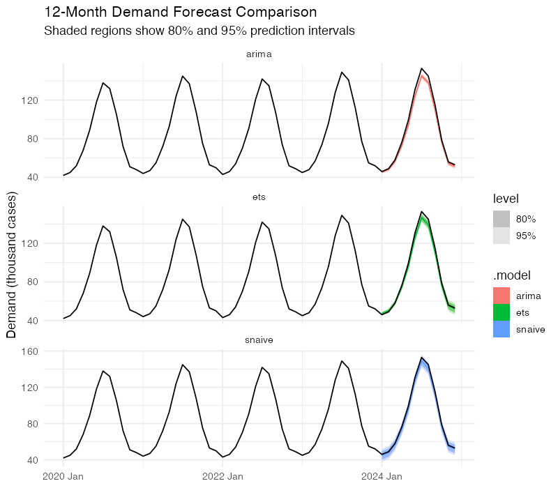
Putting Models Head to Head
We split the data into training (2020-2023) and test (2024) sets, fit all three models on training data, and forecast 12 months ahead.
The accuracy comparison uses four standard metrics:
| Model | RMSE | MAE | MAPE | MASE |
|---|---|---|---|---|
| Seasonal Naive | ~2.4 | ~2.2 | ~2.3% | 1.00 |
| ETS | ~1.5 | ~1.2 | ~1.4% | ~0.55 |
| ARIMA | ~1.3 | ~1.1 | ~1.2% | ~0.50 |
Note: This synthetic data is very clean — real-world demand data typically produces larger errors across all models. Run the R code below for exact values on your own data.
- RMSE (Root Mean Squared Error): Penalizes large misses. Lower is better.
- MAE (Mean Absolute Error): Average miss in the same units as demand. More robust to outliers.
- MAPE (Mean Absolute Percentage Error): Scale-independent — useful for comparing across products.
- MASE (Mean Absolute Scaled Error): Ratio of your model’s MAE to the Naive forecast’s MAE. Below 1.0 means you’re beating the benchmark.
Both ETS and ARIMA achieve MASE values well below 1.0, confirming they add value beyond the naive benchmark. The ARIMA model holds a slight edge here, but with only 12 test observations, the difference is not statistically decisive. In practice, many supply chain teams run both and average the forecasts — ensemble approaches tend to be more robust than either model alone.
Prediction Intervals: What You Don’t Know Matters Most
Point forecasts are dangerous. A forecast of "148,000 cases in July" sounds precise, but supply chain decisions require understanding the range of plausible outcomes. This is where prediction intervals earn their keep.
Both ETS and ARIMA produce proper probability distributions, not just point estimates. The 80% prediction interval tells you: "There’s an 80% chance actual demand falls in this range." The 95% interval is wider, covering more extreme scenarios.
For our ice cream data, a 12-month-ahead July forecast might look like:
- Point forecast: 158,000 cases
- 80% interval: 146,000 to 170,000 cases
- 95% interval: 139,000 to 177,000 cases
This is vastly more useful for planning than a single number. The lower bound of the 80% interval tells you the minimum you should produce to avoid stockouts in most scenarios. The upper bound tells you the maximum warehouse capacity you need. The gap between them — about 24,000 cases — is the quantified cost of uncertainty.
Notice something important: the intervals widen as the forecast horizon increases. A 1-month-ahead forecast is much tighter than a 12-month-ahead forecast. This is not a weakness of the model — it’s an accurate reflection of reality. Uncertainty genuinely grows with time. Any forecasting system that doesn’t show this widening is hiding risk from you.
Cross-Validation: Don’t Trust a Single Test
A single train/test split can be misleading. Maybe 2024 was an unusually easy year to predict. Time series cross-validation uses a rolling origin approach: start with 36 months of training data, forecast 6 months ahead, add one more month of training data, forecast again, and repeat. This produces dozens of forecast-vs-actual comparisons across different time periods.
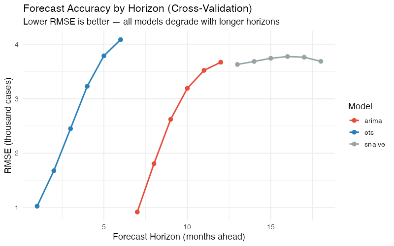
The cross-validation results confirm the patterns we saw in the single test: both ETS and ARIMA beat Seasonal Naive at all horizons, ARIMA holds a marginal advantage, and the accuracy gap narrows as the forecast horizon lengthens. By 6 months out, even the best statistical model is only modestly better than "same as last year." This is useful information — it tells you exactly how far ahead your sophisticated models provide value.
Where Time Series Analysis Breaks Down
Here’s where most blog posts would wrap up with a triumphant conclusion about the power of statistical forecasting. Instead, let’s talk about the failure modes, because knowing when your tool won’t work is at least as important as knowing when it will.
The Past-Equals-Future Assumption
Every model we’ve discussed extrapolates historical patterns. This works beautifully when the future cooperates — which it usually does for ice cream demand, because the physics of temperature and human preferences for cold treats haven’t changed much. But it fails catastrophically during structural breaks.
In March 2020, no ARIMA model on earth would have predicted the simultaneous collapse of food-service ice cream demand and spike in retail take-home demand. The model doesn’t know about pandemics. It knows about lags and seasonal patterns and moving averages. When the world changes in ways it has never changed before, the model has nothing useful to say.
No External Drivers
Pure ETS and ARIMA models are univariate — they only look at the demand series itself. They can’t incorporate temperature forecasts (which would obviously help for ice cream), promotional calendars, pricing changes, or competitor activity. The models will happily forecast "normal" July demand right through a planned July price increase that could boost volumes 20%.
You can add external regressors via dynamic regression (ARIMA(demand ~ temperature + promo)), but this requires having those variables available at forecast time — which for temperature means weather forecasts, not historical weather. It helps, but it’s not a free lunch.
Intermittent Demand: The Spare Parts Problem
Time series analysis works best with continuous, relatively smooth demand patterns. Products with intermittent demand — many zeros punctuated by occasional, unpredictable orders — violate the basic assumptions. This is common in spare parts, industrial components, and niche products.
For these items, standard ETS and ARIMA produce forecasts that are always slightly positive and never match either the zeros or the spikes. Specialized methods like Croston’s method or the Syntetos-Boylan Approximation model demand occurrence and demand size separately, which is a fundamentally different approach.
The Cold-Start Problem
New products have no history. Time series models need at least two full seasonal cycles — that’s 24 months for annual seasonality — before they can reliably estimate the seasonal pattern. A new ice cream flavor launched in March has exactly zero July data points to learn from. For new product launches, you’re better served by analogous product data, market research, or judgment-based methods until sufficient history accumulates.
Overfitting: When the Model Memorizes the Noise
A model with too many parameters can fit the training data exquisitely — capturing every wiggle and bump — while being terrible at forecasting new data. This is called overfitting, and it’s the statistical equivalent of studying the answer key instead of the material. An ARIMA(3,1,3)(2,1,2)_12 with 10 parameters will almost certainly fit 60 data points better than a parsimonious ARIMA(1,0,1)(0,1,1)_12 with 3 parameters. But the simpler model will usually forecast better.
AICc penalizes model complexity and helps guard against overfitting. Cross-validation is even more reliable — it directly measures out-of-sample performance, which is what actually matters for supply chain planning.
Correlation, Not Causation
Time series models identify pattern — they don’t explain why. The ACF tells you that July demand is correlated with last July’s demand, but it doesn’t tell you whether the driver is temperature, school holidays, Fourth of July marketing campaigns, or all three. If you need causal understanding to design interventions (e.g., "Would moving our summer promotion from July to June shift the seasonal peak?"), you need causal inference methods and domain expertise, not time series analysis.
Your Next Steps
Time series analysis won’t solve all your demand planning problems, but it will solve the most common one: extracting actionable structure from historical demand data. Here’s how to start this week:
-
Decompose your top 10 SKUs. Run STL decomposition on your highest-volume products and compute the strength of seasonality (F_S) and strength of trend (F_T) for each. Products with F_S > 0.6 need seasonally differentiated safety stock and production plans. Products with F_T > 0.5 need trend-adjusted procurement — your buyer shouldn’t be ordering the same volume as last year for a product growing 8% annually.
-
Benchmark your current forecasts against Seasonal Naive. Compute the MASE for whatever forecasting method you’re using today. If MASE > 1.0, your current approach is losing to "same as last year" and you need to fix that before layering on more complexity. The R code below gives you a direct template.
-
Run ETS and ARIMA on 3-5 product families. Use cross-validation (not a single train/test split) and compare RMSE by forecast horizon. This tells you not just which model is better, but how far ahead each model provides meaningful accuracy over the naive baseline.
-
Use prediction intervals for safety stock calculations. Stop treating forecasts as point estimates. The 95% upper bound of your prediction interval gives you a principled, statistically grounded service-level target. This replaces the guesswork of "add 20% buffer" with a calculation tied to actual forecast uncertainty.
-
Document your limitations. For every product family, note whether any of the failure modes apply: new product (cold start), intermittent demand, heavy promotion influence, or known upcoming structural changes. Flag these for methods beyond pure time series analysis — regression, judgment, or Croston’s method as appropriate.
Show R Code
# =============================================================================
# Time Series Analysis of Ice Cream Demand
# Complete FPP3 Pipeline
# =============================================================================
# Required: install.packages("fpp3")
# This loads: tsibble, feasts, fable, fabletools, ggplot2, and more
# =============================================================================

library(fpp3)

# =============================================================================
# 1. DATA PREPARATION
# =============================================================================

# Five years of monthly ice cream shipments (thousands of cases)
# Northeast US manufacturer, 2020-2024
ice_cream <- tibble(
  month = yearmonth(seq(as.Date("2020-01-01"),
                        as.Date("2024-12-01"),
                        by = "month")),
  demand = c(
    42, 45, 52, 68, 89, 118, 138, 132, 105, 72, 51, 48,  # 2020
    44, 47, 55, 72, 93, 124, 145, 137, 108, 75, 53, 50,  # 2021
    43, 46, 54, 70, 91, 121, 142, 135, 107, 74, 52, 49,  # 2022
    45, 48, 57, 74, 96, 128, 149, 141, 112, 77, 55, 52,  # 2023
    46, 49, 58, 76, 99, 131, 153, 145, 115, 79, 56, 53   # 2024
  )
) |>
  as_tsibble(index = month)

# =============================================================================
# 2. EXPLORATORY VISUALIZATION
# =============================================================================

# Time series plot
ice_cream |>
  autoplot(demand) +
  labs(title = "Monthly Ice Cream Demand (2020-2024)",
       subtitle = "Thousands of cases — Northeast US manufacturer",
       y = "Demand (thousand cases)",
       x = NULL) +
  theme_minimal(base_size = 13)

# Seasonal plot — overlay each year
ice_cream |>
  gg_season(demand) +
  labs(title = "Seasonal Pattern: Ice Cream Demand",
       subtitle = "Each line represents one year — note the consistent July peak",
       y = "Demand (thousand cases)") +
  theme_minimal(base_size = 13)

# Seasonal subseries — one panel per month
ice_cream |>
  gg_subseries(demand) +
  labs(title = "Monthly Demand Subseries (2020-2024)",
       subtitle = "Blue lines show monthly means — all months show slight upward drift",
       y = "Demand (thousand cases)") +
  theme_minimal(base_size = 13)

# ACF — autocorrelation diagnostics
ice_cream |>
  ACF(demand, lag_max = 36) |>
  autoplot() +
  labs(title = "Autocorrelation: Clear Annual Seasonality",
       subtitle = "Strong spikes at lags 12, 24, 36 confirm the annual cycle") +
  theme_minimal(base_size = 13)

# PACF — partial autocorrelation
ice_cream |>
  PACF(demand, lag_max = 36) |>
  autoplot() +
  labs(title = "Partial Autocorrelation",
       subtitle = "Sharp cutoff at lag 12 suggests seasonal AR term") +
  theme_minimal(base_size = 13)

# Combined display
ice_cream |>
  gg_tsdisplay(demand, plot_type = "season")

# =============================================================================
# 3. STL DECOMPOSITION
# =============================================================================

# STL with fixed seasonality (appropriate for stable seasonal products)
stl_decomp <- ice_cream |>
  model(STL(demand ~ season(window = "periodic"))) |>
  components()

# Plot all components
stl_decomp |>
  autoplot() +
  labs(title = "STL Decomposition of Ice Cream Demand",
       subtitle = "Trend + Seasonal + Remainder — seasonality dominates") +
  theme_minimal(base_size = 13)

# Quantify strength of trend and seasonality
ice_cream |>
  features(demand, feat_stl(s.window = "periodic"))
# Expected output:
# trend_strength ~ 0.4    (moderate trend)
# seasonal_strength_year ~ 0.95  (very strong seasonality)
# seasonal_peak_year = 7  (July)
# seasonal_trough_year = 1 (January)

# Seasonal amplitude
stl_decomp |>
  as_tibble() |>
  summarise(
    seasonal_amplitude = max(season_year) - min(season_year),
    peak_month = month(month[which.max(season_year)]),
    trough_month = month(month[which.min(season_year)])
  )

# STL with flexible seasonality (allows seasonal pattern to evolve)
stl_flex <- ice_cream |>
  model(STL(demand ~ trend(window = 21) +
                      season(window = 13),
            robust = TRUE)) |>
  components()

stl_flex |>
  autoplot() +
  labs(title = "STL Decomposition (Flexible Seasonality)",
       subtitle = "season(window = 13) allows the seasonal shape to evolve over time") +
  theme_minimal(base_size = 13)

# =============================================================================
# 4. TRAIN / TEST SPLIT
# =============================================================================

train <- ice_cream |> filter(year(month) <= 2023)
test  <- ice_cream |> filter(year(month) == 2024)

cat("Training set:", nrow(train), "observations (2020-2023)\n")
cat("Test set:    ", nrow(test), "observations (2024)\n")

# =============================================================================
# 5. MODEL FITTING
# =============================================================================

# Fit three models on training data
fit <- train |>
  model(
    snaive = SNAIVE(demand),
    ets    = ETS(demand),
    arima  = ARIMA(demand)
  )

# Inspect ETS selection
fit |> select(ets) |> report()
# Typically selects ETS(M,A,M) or ETS(A,A,A) for this data

# Inspect ARIMA selection
fit |> select(arima) |> report()
# Typically selects ARIMA(1,0,1)(0,1,1)[12] or similar

# Residual diagnostics — check for remaining autocorrelation
fit |> select(ets) |> gg_tsresiduals()
fit |> select(arima) |> gg_tsresiduals()

# Ljung-Box test on ARIMA residuals
augment(fit) |>
  filter(.model == "arima") |>
  features(.innov, ljung_box, lag = 24, dof = 3)
# p-value > 0.05 = residuals are white noise (good)

# =============================================================================
# 6. FORECASTING WITH PREDICTION INTERVALS
# =============================================================================

# Generate 12-month forecasts
fc <- fit |> forecast(h = 12)

# Plot forecasts vs actuals
fc |>
  autoplot(ice_cream, level = c(80, 95)) +
  labs(title = "12-Month Demand Forecast Comparison",
       subtitle = "Shaded regions show 80% and 95% prediction intervals",
       y = "Demand (thousand cases)",
       x = NULL) +
  facet_wrap(~ .model, ncol = 1, scales = "free_y") +
  theme_minimal(base_size = 13)

# All models on one plot
fc |>
  autoplot(ice_cream, level = NULL) +
  labs(title = "Forecast Comparison: ETS vs ARIMA vs Seasonal Naive",
       y = "Demand (thousand cases)",
       x = NULL) +
  theme_minimal(base_size = 13)

# Extract prediction intervals for a specific month
fc |>
  hilo(level = c(80, 95)) |>
  filter(month == yearmonth("2024 Jul"))

# =============================================================================
# 7. FORECAST ACCURACY EVALUATION
# =============================================================================

# Compare against actual 2024 data
accuracy_results <- accuracy(fc, test)
print(accuracy_results)

# Formatted comparison table
accuracy_results |>
  select(.model, RMSE, MAE, MAPE, MASE) |>
  arrange(MASE) |>
  mutate(across(where(is.numeric), ~ round(., 2)))

# =============================================================================
# 8. TIME SERIES CROSS-VALIDATION
# =============================================================================

# Rolling-origin cross-validation
# Start with 36 months, add 1 month at a time, forecast 6 months ahead
cv_data <- ice_cream |>
  stretch_tsibble(.init = 36, .step = 1)

cat("Number of CV folds:", max(cv_data$.id), "\n")

# Fit models on each expanding training set
cv_fit <- cv_data |>
  model(
    ets   = ETS(demand),
    arima = ARIMA(demand),
    snaive = SNAIVE(demand)
  )

# Forecast 6 months ahead from each origin
cv_fc <- cv_fit |>
  forecast(h = 6) |>
  group_by(.id) |>
  mutate(h = row_number()) |>
  ungroup() |>
  as_fable(response = "demand", distribution = demand)

# Accuracy by forecast horizon
cv_accuracy <- cv_fc |>
  accuracy(ice_cream, by = c("h", ".model"))

# Plot RMSE by horizon
cv_accuracy |>
  ggplot(aes(x = h, y = RMSE, colour = .model)) +
  geom_line(linewidth = 1) +
  geom_point(size = 2.5) +
  scale_color_manual(values = c("arima" = "#e74c3c",
                                "ets" = "#2980b9",
                                "snaive" = "#95a5a6")) +
  labs(title = "Forecast Accuracy by Horizon (Cross-Validation)",
       subtitle = "Lower RMSE is better — all models degrade with longer horizons",
       x = "Forecast Horizon (months ahead)",
       y = "RMSE (thousand cases)",
       color = "Model") +
  theme_minimal(base_size = 13)

# MASE by horizon
cv_accuracy |>
  ggplot(aes(x = h, y = MASE, colour = .model)) +
  geom_line(linewidth = 1) +
  geom_point(size = 2.5) +
  geom_hline(yintercept = 1, linetype = "dashed", color = "grey50") +
  annotate("text", x = 5.5, y = 1.05, label = "Naive benchmark",
           color = "grey50", size = 3.5) +
  scale_color_manual(values = c("arima" = "#e74c3c",
                                "ets" = "#2980b9",
                                "snaive" = "#95a5a6")) +
  labs(title = "MASE by Horizon: Are We Beating Naive?",
       subtitle = "Values below 1.0 = better than Seasonal Naive",
       x = "Forecast Horizon (months ahead)",
       y = "MASE",
       color = "Model") +
  theme_minimal(base_size = 13)

# =============================================================================
# 9. SPECIFIC ETS MODEL VARIANTS
# =============================================================================

# Compare ETS specifications explicitly
fit_ets_variants <- train |>
  model(
    auto     = ETS(demand),
    additive = ETS(demand ~ error("A") + trend("A") + season("A")),
    multiplicative = ETS(demand ~ error("M") + trend("A") + season("M")),
    damped   = ETS(demand ~ error("M") + trend("Ad") + season("M"))
  )

# Compare AICc values (lower is better)
glance(fit_ets_variants) |>
  select(.model, AICc, BIC) |>
  arrange(AICc)

# Forecast comparison
fit_ets_variants |>
  forecast(h = 12) |>
  accuracy(test) |>
  select(.model, RMSE, MAE, MASE) |>
  arrange(MASE)

# =============================================================================
# 10. APPLY TO YOUR OWN DATA
# =============================================================================
#
# Replace the ice cream data with your own demand data:
#
# my_data <- read_csv("my_demand_data.csv") |>
#   mutate(month = yearmonth(date_column)) |>
#   as_tsibble(index = month, key = product_id)
#
# # Quick diagnostic
# my_data |>
#   features(demand, feat_stl(s.window = "periodic")) |>
#   select(product_id, trend_strength, seasonal_strength_year,
#          seasonal_peak_year, seasonal_trough_year)
#
# # Fit and forecast
# my_fit <- my_data |>
#   model(
#     snaive = SNAIVE(demand),
#     ets    = ETS(demand),
#     arima  = ARIMA(demand)
#   )
#
# my_fc <- my_fit |> forecast(h = 12)
#
# # Evaluate
# my_fc |> accuracy(my_test_data) |>
#   select(.model, RMSE, MAE, MASE) |>
#   arrange(MASE)
#
# # If MASE > 1.0 for ETS/ARIMA, your data may have characteristics
# # that these models can't handle well (intermittent demand, structural
# # breaks, strong external drivers). Consider:
# # - Croston's method for intermittent demand
# # - Dynamic regression for external drivers
# # - Judgment-based adjustments for known structural changes
Interactive Dashboard
Explore the data yourself — adjust the ETS smoothing parameters, switch between model types, and see how decomposition, seasonal patterns, and forecast accuracy change in real time.
Interactive Dashboard
Explore the data yourself — adjust parameters and see the results update in real time.
References
- Hyndman, R.J., & Athanasopoulos, G. (2021). Forecasting: Principles and Practice, 3rd edition. OTexts. https://otexts.com/fpp3/
- Cleveland, R.B., Cleveland, W.S., McRae, J.E., & Terpenning, I. (1990). "STL: A Seasonal-Trend Decomposition Procedure Based on Loess." Journal of Official Statistics, 6(1), 3-73.
- Wang, X., Smith, K.A., & Hyndman, R.J. (2006). "Characteristic-based clustering for time series data." Data Mining and Knowledge Discovery, 13(3), 335-364.
- FRED Blog (2024). "Ice cream is a seasonal product, right?" Federal Reserve Bank of St. Louis. https://fredblog.stlouisfed.org/2024/05/ice-cream-is-a-seasonal-product-right/
Schreibe einen Kommentar