The Quote That Looks Too Good to Refuse
You’re a procurement manager at a mid-size electronics manufacturer. It’s Tuesday morning, and your inbox contains two quotes for a critical component — a custom circuit board that goes into your best-selling product. Supplier A offers $80 per unit for small orders, dropping to $69 for quantities above seven. Supplier B quotes $82 at the low end but offers $66 per unit for larger volumes.
Your boss glances at the numbers and says: „Go with Supplier B at the top tier — $66 beats $69, and we save three dollars per board.“
It sounds logical. It’s also wrong.
Not because $66 isn’t less than $69 — basic arithmetic still works on Tuesdays. The problem is that quoted unit prices are not what you actually pay per additional unit when you step into a higher tier. In all-units discount schedules (by far the most common structure in B2B procurement), crossing a price break changes the cost of every unit in the order, not just the ones above the threshold. This creates a hidden cost landscape where the cheapest-looking quote can be the most expensive choice, and where ordering more units can actually raise your average cost.
Quantity Discount Analysis (QDA) is the technique that unpacks this. And once you see how it works, you’ll never look at a supplier quote the same way again.
What Is Quantity Discount Analysis?
QDA is a structured method for evaluating supplier quantity discount schedules by computing the true incremental cost of each additional unit at every tier break. Instead of comparing quoted prices — the headline numbers suppliers put in front of you — QDA compares what you actually pay for the next batch of units when you move from one tier to the next.
There are two fundamentally different discount structures, and confusing them is the first mistake most buyers make:
All-Units Discounts
The discounted price applies to every unit in the order, not just those above the breakpoint. If the price drops from $80 to $70 at quantity 4, all units cost $70 — including the first three. This is the dominant structure in B2B procurement.
Example: 6 units at $70 each = $420 total. Not $240 (first 3 at $80) + $210 (next 3 at $70).
Incremental (Tiered) Discounts
Each tier’s price applies only to the units within that tier. The first 3 units cost $80 regardless of how many more you order. Units 4 through 6 cost $70 each. Units 7 through 10 cost $69 each. This is common in SaaS pricing and consumer e-commerce but less prevalent in industrial procurement.
The distinction matters enormously. In an all-units scheme, crossing a price break creates a discontinuity in the total cost curve — total cost can actually decrease when you order one more unit, because the lower price retroactively applies to all preceding units. This is where the hidden traps and opportunities live.
For the rest of this post, we’ll focus on all-units discounts, because that’s what most procurement professionals deal with daily.
The Math: Average Price vs. Incremental Cost
Let’s work through Supplier A’s quote step by step.
Supplier A’s discount schedule:
| Tier | Quantity Range | Quoted Price/Unit |
|---|---|---|
| 1 | 1–3 units | $80.00 |
| 2 | 4–6 units | $70.00 |
| 3 | 7–10 units | $69.00 |
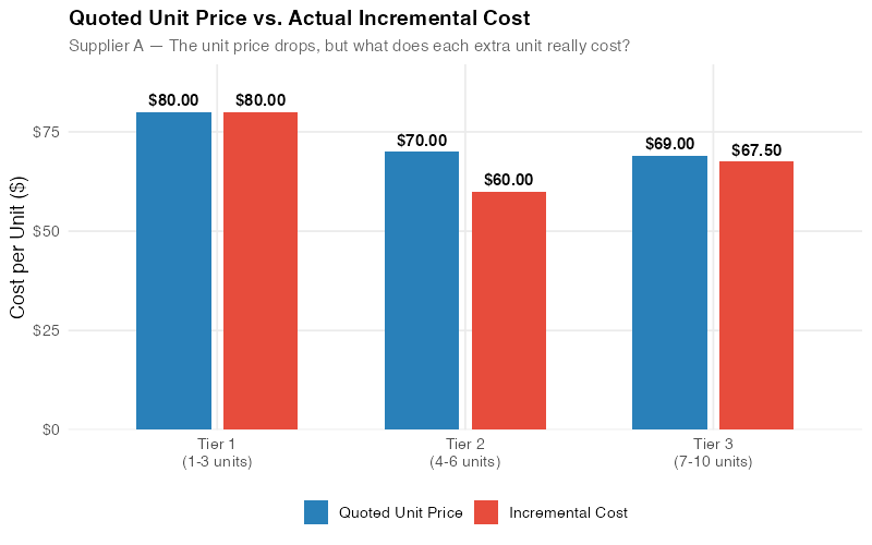
The quoted prices look clean and steadily declining. Now let’s compute what actually happens to your total cost at each tier boundary, and — critically — what each incremental batch of units costs you.
Total cost at tier boundaries:
- At 3 units (top of Tier 1): 3 × $80 = $240
- At 6 units (top of Tier 2): 6 × $70 = $420
- At 10 units (top of Tier 3): 10 × $69 = $690
Incremental cost per unit for each tier step:
The incremental cost asks: „What did the additional units in this tier actually cost me, given the all-units price change?“
- Tier 1 → Tier 2: ($420 − $240) / 3 additional units = $60.00 per incremental unit
- Tier 2 → Tier 3: ($690 − $420) / 4 additional units = $67.50 per incremental unit
Here’s the full picture:
| Tier | Qty Range | Quoted Price | Total Cost at Tier Max | Incremental Units | Incremental Cost/Unit |
|---|---|---|---|---|---|
| 1 | 1–3 | $80.00 | $240 | 3 | $80.00 |
| 2 | 4–6 | $70.00 | $420 | 3 | $60.00 |
| 3 | 7–10 | $69.00 | $690 | 4 | $67.50 |
Look at that incremental cost column. The quoted price declines steadily: $80, $70, $69. But the incremental cost — what you actually pay for each additional unit — goes $80, $60, then back up to $67.50.
The third tier’s quoted price is the lowest. Its incremental cost is higher than the second tier’s.
This is not an error. It’s the mathematical consequence of all-units pricing. When you cross from Tier 2 to Tier 3, the price drops from $70 to $69 — just a $1 reduction. But that $1 discount now applies to all 10 units, saving you only $10 on the base while you’re committing to 4 additional units at the new price. The net effect: each of those 4 extra units costs you $67.50 in real incremental terms, not the $69 on the quote sheet.
The Roller-Coaster Effect
When the incremental cost doesn’t decrease monotonically — when it drops, then rises — we get what’s called the roller-coaster effect. Unlike the amusement park version, nobody screams with delight on this ride. The chart below makes the pattern unmistakable.
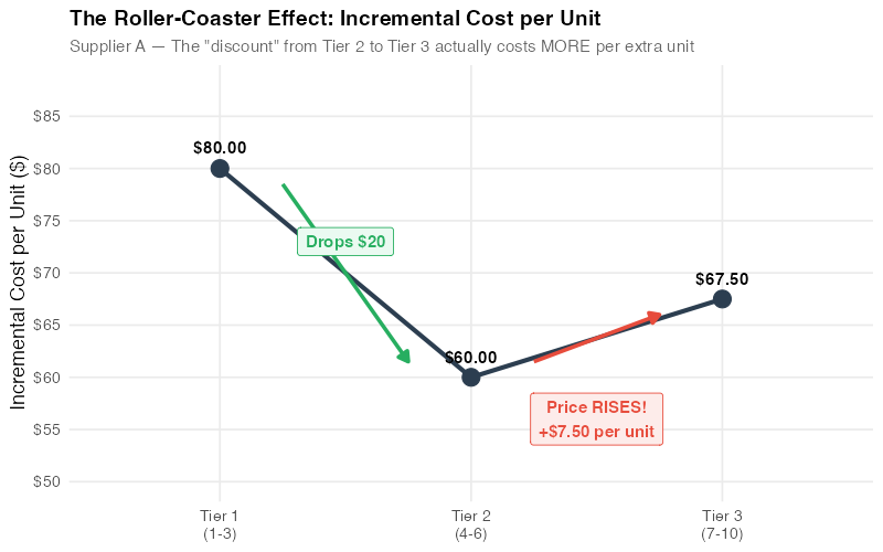
Why does this matter? Because the roller-coaster effect signals that the discount schedule’s structure is punishing you for ordering more. In Supplier A’s case, the jump from 6 to 10 units yields a worse per-unit deal than the jump from 3 to 6. A procurement professional looking only at quoted prices sees a consistent decline and concludes „more is cheaper.“ The incremental cost analysis reveals the opposite.
The roller-coaster effect is surprisingly common. It occurs whenever a tier boundary’s price drop is too small relative to the number of additional units required. Specifically, the incremental cost rises when:
IC_new > IC_previous
where:
IC = (Q_new × P_new − Q_prev × P_prev) / (Q_new − Q_prev)
In procurement negotiations, spotting a roller-coaster pattern gives you concrete leverage: „Your Tier 3 pricing actually costs us more per incremental unit than Tier 2. Can you adjust the breakpoint or the price to fix this?“
Total Cost Perspective
The incremental cost analysis tells you about the marginal economics. But procurement decisions also depend on total spend, particularly when budgets are fixed or when you’re optimizing across multiple components.
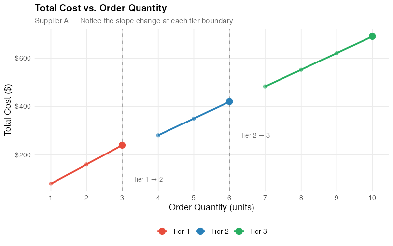
The total cost curve for an all-units discount schedule has a distinctive sawtooth shape. Within each tier, total cost rises linearly. At each tier boundary, there’s a sharp downward discontinuity — because the new, lower price retroactively applies to all units.
This creates an interesting tactical opportunity: at certain quantities, ordering one more unit actually reduces your total cost. Right at the Tier 2 breakpoint, going from 3 units ($240) to 4 units ($280) costs you only $40 for that fourth unit — effectively a $40 unit when the quoted price is $70. At the Tier 3 breakpoint, going from 6 units ($420) to 7 units ($483) costs $63 for the seventh unit — below the $69 quoted price.
Smart procurement teams use this insight to time purchases: if you need 3 units now and will need another 2 within the planning horizon, buying 6 upfront locks in the Tier 2 pricing and yields an incremental cost of just $60 per additional unit. Whether the carrying cost of those extra units justifies the savings is a classic EOQ trade-off — but now you have the real numbers to make that calculation.
Comparing Two Suppliers
Now let’s add Supplier B to the mix and see how the analysis changes everything.
Supplier B’s discount schedule:
| Tier | Quantity Range | Quoted Price/Unit |
|---|---|---|
| 1 | 1–3 units | $82.00 |
| 2 | 4–6 units | $72.00 |
| 3 | 7–10 units | $66.00 |
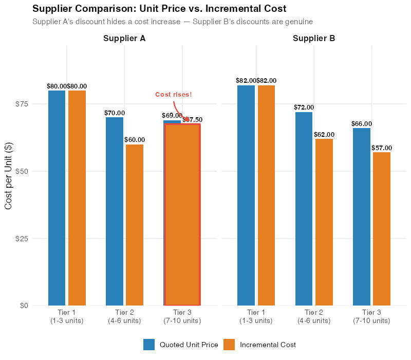
Supplier B quotes higher prices for Tiers 1 and 2, but undercuts Supplier A on Tier 3 ($66 vs. $69). A quick comparison of quoted prices suggests Supplier B wins at high volumes and Supplier A wins at low volumes. The reality is more nuanced.
Side-by-side analysis:
| Metric | Supplier A | Supplier B |
|---|---|---|
| Tier 1 quoted price | $80.00 | $82.00 |
| Tier 2 quoted price | $70.00 | $72.00 |
| Tier 3 quoted price | $69.00 | $66.00 |
| Total cost at 3 units | $240 | $246 |
| Total cost at 6 units | $420 | $432 |
| Total cost at 10 units | $690 | $660 |
| Tier 2 incremental cost | $60.00 | $62.00 |
| Tier 3 incremental cost | $67.50 | $57.00 |
The incremental cost profiles are fundamentally different:
- Supplier A: $80 → $60 → $67.50 (roller-coaster — incremental cost rises at Tier 3)
- Supplier B: $82 → $62 → $57.00 (clean descent — each tier is genuinely cheaper)
Supplier A’s Tier 3 discount is a mirage. The quoted price drops only $1 (from $70 to $69), which means each additional unit in the 7–10 range carries a higher incremental cost than units in the 4–6 range. Supplier B’s Tier 3 discount is real: the price drops $6 (from $72 to $66), enough to make each additional unit genuinely cheaper than the tier before.
The strategic implications are clear:
- For orders of 1–6 units: Supplier A is cheaper in total cost ($240 vs. $246 at 3 units; $420 vs. $432 at 6 units).
- For orders of 7–10 units: Supplier B is cheaper ($660 vs. $690 at 10 units) and has a better incremental cost structure.
- For scaling beyond 10 units: Supplier B’s clean downward trajectory suggests that higher tiers will continue to offer genuinely better value, while Supplier A’s roller-coaster pattern may recur.
The recommendation? It depends on your volume. But the analysis gives you something a raw quote sheet never could: the ability to make that decision with numbers instead of intuition.
Using QDA in Negotiations
Quantity Discount Analysis doesn’t just help you choose between suppliers — it transforms how you negotiate with them. Here’s how procurement professionals use these insights at the table.
Expose the Roller-Coaster
Walk into the negotiation with your incremental cost chart printed on paper. (Yes, paper. Slides get clicked past; a single sheet on the table stays visible for the entire meeting.) Most sales representatives have never seen their own pricing analyzed this way. Saying „Your Tier 3 incremental cost is $67.50, which is higher than Tier 2’s $60.00 — can you explain why ordering more costs us more per unit?“ puts the supplier on the defensive with math, not emotion.
Request Breakpoint Adjustments
If the roller-coaster effect stems from a tier boundary being in the wrong place, propose moving it. In Supplier A’s case, dropping the Tier 3 price from $69 to $66 — a $4 per-unit concession instead of $1 — would bring the Tier 3 incremental cost down to $60, matching Tier 2 exactly and eliminating the roller-coaster. That’s a concrete, data-backed ask that removes the structural penalty for ordering more.
Use Incremental Costs for Split-Award Strategies
If you need 10 units, consider a split award: buy 6 from Supplier A (exploiting their strong Tier 2 incremental cost of $60) and 4 from Supplier B at a negotiated spot price. Total cost: $420 + (4 × negotiated price). If you can get Supplier B below $67.50 for those 4 units, you beat both suppliers‘ single-source 10-unit quotes.
Build Scenario Models
The R code below and the interactive dashboard let you plug in any supplier’s discount schedule and instantly see the incremental cost landscape. Run scenarios before every major negotiation: „What if the Tier 2 breakpoint moved from 4 to 5 units? What if Tier 3 pricing dropped another $2?“ When your analysis is faster than the supplier’s, you control the conversation.
Connect to Total Cost of Ownership
Incremental cost analysis is one piece of the puzzle. For a complete picture, layer in carrying costs (warehousing those extra units), quality costs (does the cheaper supplier have a higher defect rate?), logistics costs (does one supplier offer better freight terms?), and lead time impacts. QDA gives you the procurement price truth; TCO gives you the business decision.
Key Takeaways
- Quoted prices lie by omission. All-units discount schedules create a gap between the listed price and the actual incremental cost. The only way to see the real economics is to compute the incremental cost at every tier boundary. A 2-minute spreadsheet calculation can save you thousands.
- The roller-coaster effect is a red flag. When incremental costs rise at higher tiers, the discount structure is penalizing you for ordering more. This occurs when the price drop between tiers is too small relative to the number of additional units. The pattern is more common than most buyers expect — once you start checking, you’ll find it in a surprising share of the quotes sitting in your inbox right now.
- Supplier comparison requires incremental analysis, not price-list scanning. Supplier A looks cheaper at low volumes; Supplier B looks cheaper at high volumes. But the incremental cost profiles reveal fundamentally different pricing philosophies: Supplier A front-loads the discount; Supplier B back-loads it. Your decision should depend on your actual order volumes, not on who has the lowest Tier 3 headline number.
- Use the math in negotiations. Bringing incremental cost charts to a supplier meeting is the procurement equivalent of bringing data to a debate. Most suppliers don’t expect buyers to analyze their pricing this deeply. Those who do earn better terms.
- Automate and explore. The R code and the interactive dashboard below let you run QDA on any discount schedule in seconds. Build it into your standard quote evaluation process — once it’s a habit, you’ll never miss a roller-coaster again.
Your Next Steps
- Pull your last three supplier quotes and compute incremental costs. It takes five minutes per quote. Use the formula: (Total cost at tier max − Total cost at previous tier max) / number of additional units. The R code below automates this, but a spreadsheet works fine too.
- Flag any roller-coasters. If incremental cost rises at a higher tier, you’ve found a discount structure that penalizes you for ordering more. Highlight it — literally, in red — and bring it to your next supplier review meeting.
- Reframe your next negotiation around incremental costs. Instead of the usual „Can you sharpen your pencil on pricing?“, try: „Your Tier 3 incremental cost is $67.50 — that’s higher than Tier 2’s $60.00. What can we do about that?“ The specificity changes the dynamic entirely.
- Build QDA into your standard quote evaluation process. The interactive dashboard below lets you plug in any discount schedule and see the incremental cost landscape instantly. Run it on every quote, and roller-coasters will never sneak past you again.
Interactive Dashboard
Explore the data yourself — plug in your own supplier quotes and see the incremental cost analysis update in real time.
Interactive Dashboard
Explore the data yourself — adjust parameters and see the results update in real time.
Show R Code
# =============================================================================
# Quantity Discount Analysis (QDA)
# =============================================================================
# A complete R script for analyzing supplier quantity discount schedules,
# computing incremental costs, detecting roller-coaster effects, and
# comparing suppliers side by side.
#
# To adapt to your own data:
# 1. Modify the discount schedules in the DATA SETUP section below
# 2. Each schedule is a data frame with columns: tier, qty_min, qty_max, price
# 3. Run the full script — all charts update automatically
#
# Required packages: ggplot2, dplyr, tidyr, scales, patchwork
# =============================================================================

library(ggplot2)
library(dplyr)
library(tidyr)
library(scales)
library(patchwork)

# --- Theme for all plots ---
theme_qda <- theme_minimal(base_size = 13) +
  theme(
    plot.title = element_text(face = "bold", size = 14),
    plot.subtitle = element_text(color = "grey40", size = 11),
    panel.grid.minor = element_blank(),
    legend.position = "bottom"
  )

# =============================================================================
# 1. DATA SETUP — Modify these for your own suppliers
# =============================================================================

# Supplier A: All-units discount schedule
supplier_a <- data.frame(
  supplier = "Supplier A",
  tier = 1:3,
  qty_min = c(1, 4, 7),
  qty_max = c(3, 6, 10),
  price = c(80, 70, 69)
)

# Supplier B: All-units discount schedule
supplier_b <- data.frame(
  supplier = "Supplier B",
  tier = 1:3,
  qty_min = c(1, 4, 7),
  qty_max = c(3, 6, 10),
  price = c(82, 72, 66)
)

# =============================================================================
# 2. INCREMENTAL COST COMPUTATION
# =============================================================================

compute_incremental_costs <- function(schedule) {
  # Computes the incremental cost per unit for each tier in an all-units

  # discount schedule.
  #
  # Args:
  #   schedule: data frame with columns tier, qty_min, qty_max, price
  #
  # Returns:
  #   The input data frame with added columns:
  #     total_cost  — total cost at the tier's maximum quantity
  #     incr_units  — number of units added in this tier
  #     incr_cost   — incremental cost per unit for this tier
  #     roller_coaster — TRUE if incremental cost rises from previous tier

  schedule <- schedule %>%
    arrange(tier) %>%
    mutate(
      # Total cost at the top of each tier (all-units pricing)
      total_cost = qty_max * price,

      # Number of incremental units in this tier
      incr_units = qty_max - lag(qty_max, default = 0),

      # Incremental cost per unit
      incr_cost = (total_cost - lag(total_cost, default = 0)) / incr_units,

      # Detect roller-coaster: incremental cost rises from previous tier
      roller_coaster = incr_cost > lag(incr_cost, default = Inf)
    )

  schedule
}

# Compute for both suppliers
sa <- compute_incremental_costs(supplier_a)
sb <- compute_incremental_costs(supplier_b)

# Print results
cat("=== Supplier A ===\n")
print(sa %>% select(tier, qty_min, qty_max, price, total_cost, incr_cost, roller_coaster))

cat("\n=== Supplier B ===\n")
print(sb %>% select(tier, qty_min, qty_max, price, total_cost, incr_cost, roller_coaster))

# Check for roller-coaster
if (any(sa$roller_coaster, na.rm = TRUE)) {
  cat("\n⚠ Supplier A has a ROLLER-COASTER effect at tier(s):",
      sa$tier[sa$roller_coaster], "\n")
}
if (any(sb$roller_coaster, na.rm = TRUE)) {
  cat("\n⚠ Supplier B has a ROLLER-COASTER effect at tier(s):",
      sb$tier[sb$roller_coaster], "\n")
}

# =============================================================================
# 3. CHART 1 — Quoted Price vs. Incremental Cost (Supplier A)
# =============================================================================

sa_long <- sa %>%
  select(tier, price, incr_cost) %>%
  pivot_longer(cols = c(price, incr_cost),
               names_to = "metric",
               values_to = "value") %>%
  mutate(metric = ifelse(metric == "price",
                         "Quoted Unit Price",
                         "Incremental Cost"))

p1 <- ggplot(sa_long, aes(x = factor(tier), y = value, fill = metric)) +
  geom_col(position = position_dodge(width = 0.6), width = 0.5) +
  geom_text(aes(label = dollar(value, accuracy = 0.01)),
            position = position_dodge(width = 0.6),
            vjust = -0.5, size = 3.8, fontface = "bold") +
  scale_fill_manual(values = c("Quoted Unit Price" = "#2980b9",
                                "Incremental Cost" = "#e74c3c")) +
  scale_y_continuous(labels = dollar_format(), limits = c(0, 95)) +
  labs(
    title = "Supplier A: Quoted Price vs. Incremental Cost",
    subtitle = "The quoted price falls steadily — but incremental cost tells a different story",
    x = "Discount Tier",
    y = "Cost per Unit ($)",
    fill = NULL
  ) +
  theme_qda

ggsave("https://inphronesys.com/wp-content/uploads/2026/02/qda_unit_vs_incremental.png", p1,
       width = 8, height = 5, dpi = 100, bg = "white")

# =============================================================================
# 4. CHART 2 — Roller-Coaster Effect (Incremental Costs Only)
# =============================================================================

sa_rc <- sa %>%
  mutate(
    tier_label = paste0("Tier ", tier, "\n(", qty_min, "–", qty_max, " units)"),
    fill_color = ifelse(roller_coaster, "Increase (Roller-Coaster)", "Decrease")
  )

p2 <- ggplot(sa_rc, aes(x = factor(tier), y = incr_cost, fill = fill_color)) +
  geom_col(width = 0.5) +
  geom_text(aes(label = dollar(incr_cost, accuracy = 0.01)),
            vjust = -0.5, size = 4, fontface = "bold") +
  # Add connecting line to show the roller-coaster shape
  geom_line(aes(x = tier, y = incr_cost, group = 1),
            linewidth = 1.2, color = "grey30", linetype = "dashed") +
  geom_point(aes(x = tier, y = incr_cost), color = "grey30", size = 3) +
  # Arrow annotation for the rise
  annotate("segment", x = 2.3, xend = 2.7, y = 62, yend = 66,
           arrow = arrow(length = unit(0.2, "cm")), color = "#e74c3c", linewidth = 1) +
  annotate("text", x = 2.8, y = 64, label = "Cost rises!\nRoller-coaster\neffect",
           color = "#e74c3c", size = 3.5, fontface = "bold", hjust = 0) +
  scale_fill_manual(values = c("Decrease" = "#27ae60", "Increase (Roller-Coaster)" = "#e74c3c")) +
  scale_y_continuous(labels = dollar_format(), limits = c(0, 90)) +
  scale_x_discrete(labels = c("Tier 1\n(1–3 units)", "Tier 2\n(4–6 units)",
                               "Tier 3\n(7–10 units)")) +
  labs(
    title = "The Roller-Coaster Effect: Supplier A's Incremental Costs",
    subtitle = "Ordering more units in Tier 3 costs MORE per unit than Tier 2",
    x = NULL,
    y = "Incremental Cost per Unit ($)",
    fill = NULL
  ) +
  theme_qda

ggsave("https://inphronesys.com/wp-content/uploads/2026/02/qda_rollercoaster.png", p2,
       width = 8, height = 5, dpi = 100, bg = "white")

# =============================================================================
# 5. CHART 3 — Total Cost Curve with Tier Breakpoints
# =============================================================================

# Build a unit-by-unit total cost curve for Supplier A
build_total_cost_curve <- function(schedule, max_qty = NULL) {
  if (is.null(max_qty)) max_qty <- max(schedule$qty_max)

  data.frame(qty = 1:max_qty) %>%
    rowwise() %>%
    mutate(
      # Find which tier this quantity falls into
      tier_idx = max(which(schedule$qty_min <= qty)),
      price = schedule$price[tier_idx],
      total_cost = qty * price
    ) %>%
    ungroup()
}

tc_a <- build_total_cost_curve(supplier_a) %>% mutate(supplier = "Supplier A")
tc_b <- build_total_cost_curve(supplier_b) %>% mutate(supplier = "Supplier B")

# Tier boundary annotations for Supplier A
tier_breaks_a <- data.frame(
  qty = c(3, 6),
  label = c("Tier 1→2\nbreak", "Tier 2→3\nbreak")
)

p3 <- ggplot(tc_a, aes(x = qty, y = total_cost)) +
  geom_line(linewidth = 1.2, color = "#2980b9") +
  geom_point(size = 2.5, color = "#2980b9") +
  # Mark the tier boundaries with vertical lines
  geom_vline(xintercept = 3.5, linetype = "dotted", color = "grey50") +
  geom_vline(xintercept = 6.5, linetype = "dotted", color = "grey50") +
  # Highlight the discontinuity at tier breaks
  annotate("point", x = 4, y = 4 * 70, size = 4, color = "#e74c3c") +
  annotate("point", x = 3, y = 3 * 80, size = 4, color = "#e74c3c") +
  annotate("segment", x = 3, xend = 4, y = 3 * 80, yend = 4 * 70,
           linetype = "dashed", color = "#e74c3c", linewidth = 0.8) +
  annotate("text", x = 3.5, y = 250, label = "Only +$40\nfor 4th unit",
           color = "#e74c3c", size = 3.2, fontface = "italic") +
  annotate("point", x = 7, y = 7 * 69, size = 4, color = "#e74c3c") +
  annotate("point", x = 6, y = 6 * 70, size = 4, color = "#e74c3c") +
  annotate("segment", x = 6, xend = 7, y = 6 * 70, yend = 7 * 69,
           linetype = "dashed", color = "#e74c3c", linewidth = 0.8) +
  annotate("text", x = 6.5, y = 450, label = "Only +$63\nfor 7th unit",
           color = "#e74c3c", size = 3.2, fontface = "italic") +
  # Tier labels
  annotate("text", x = 2, y = 680, label = "Tier 1\n$80/unit",
           color = "grey40", size = 3) +
  annotate("text", x = 5, y = 680, label = "Tier 2\n$70/unit",
           color = "grey40", size = 3) +
  annotate("text", x = 8.5, y = 680, label = "Tier 3\n$69/unit",
           color = "grey40", size = 3) +
  scale_x_continuous(breaks = 1:10) +
  scale_y_continuous(labels = dollar_format()) +
  labs(
    title = "Supplier A: Total Cost Curve with Tier Breakpoints",
    subtitle = "Note the near-flat jumps at tier boundaries — the 4th and 7th units are bargains",
    x = "Order Quantity (units)",
    y = "Total Cost ($)"
  ) +
  theme_qda

ggsave("https://inphronesys.com/wp-content/uploads/2026/02/qda_total_cost_curve.png", p3,
       width = 8, height = 5, dpi = 100, bg = "white")

# =============================================================================
# 6. CHART 4 — Supplier Comparison (Incremental Costs)
# =============================================================================

comparison <- bind_rows(sa, sb) %>%
  select(supplier, tier, qty_min, qty_max, price, incr_cost, roller_coaster)

comp_long <- comparison %>%
  select(supplier, tier, incr_cost) %>%
  mutate(tier_label = case_when(
    tier == 1 ~ "Tier 1\n(1–3 units)",
    tier == 2 ~ "Tier 2\n(4–6 units)",
    tier == 3 ~ "Tier 3\n(7–10 units)"
  ))

p4 <- ggplot(comp_long, aes(x = tier_label, y = incr_cost, fill = supplier)) +
  geom_col(position = position_dodge(width = 0.6), width = 0.5) +
  geom_text(aes(label = dollar(incr_cost, accuracy = 0.01)),
            position = position_dodge(width = 0.6),
            vjust = -0.5, size = 3.5, fontface = "bold") +
  # Add connecting lines to show trend
  geom_line(aes(x = tier, y = incr_cost, color = supplier, group = supplier),
            linewidth = 1, linetype = "dashed", show.legend = FALSE) +
  geom_point(aes(x = tier, y = incr_cost, color = supplier),
             size = 2.5, show.legend = FALSE) +
  # Annotate roller-coaster for Supplier A
  annotate("text", x = 3.3, y = 70, label = "↑ Roller-coaster",
           color = "#e74c3c", size = 3.5, fontface = "bold") +
  # Annotate clean descent for Supplier B
  annotate("text", x = 3.3, y = 53, label = "↓ Clean descent",
           color = "#27ae60", size = 3.5, fontface = "bold") +
  scale_fill_manual(values = c("Supplier A" = "#e74c3c", "Supplier B" = "#27ae60")) +
  scale_color_manual(values = c("Supplier A" = "#e74c3c", "Supplier B" = "#27ae60")) +
  scale_y_continuous(labels = dollar_format(), limits = c(0, 95)) +
  labs(
    title = "Supplier Comparison: Incremental Cost per Tier",
    subtitle = "Supplier A's costs rise at Tier 3 (roller-coaster) while Supplier B's decline steadily",
    x = NULL,
    y = "Incremental Cost per Unit ($)",
    fill = NULL
  ) +
  theme_qda

ggsave("https://inphronesys.com/wp-content/uploads/2026/02/qda_supplier_comparison.png", p4,
       width = 8, height = 5, dpi = 100, bg = "white")

# =============================================================================
# 7. SUMMARY OUTPUT
# =============================================================================

cat("\n========================================\n")
cat("QUANTITY DISCOUNT ANALYSIS SUMMARY\n")
cat("========================================\n\n")

cat("SUPPLIER A:\n")
cat(sprintf("  Tier 1: %d–%d units @ $%.2f → Total $%.0f, Incremental $%.2f/unit\n",
            sa$qty_min[1], sa$qty_max[1], sa$price[1], sa$total_cost[1], sa$incr_cost[1]))
cat(sprintf("  Tier 2: %d–%d units @ $%.2f → Total $%.0f, Incremental $%.2f/unit\n",
            sa$qty_min[2], sa$qty_max[2], sa$price[2], sa$total_cost[2], sa$incr_cost[2]))
cat(sprintf("  Tier 3: %d–%d units @ $%.2f → Total $%.0f, Incremental $%.2f/unit\n",
            sa$qty_min[3], sa$qty_max[3], sa$price[3], sa$total_cost[3], sa$incr_cost[3]))
cat(sprintf("  Roller-coaster detected: %s\n",
            ifelse(any(sa$roller_coaster, na.rm = TRUE), "YES", "NO")))

cat("\nSUPPLIER B:\n")
cat(sprintf("  Tier 1: %d–%d units @ $%.2f → Total $%.0f, Incremental $%.2f/unit\n",
            sb$qty_min[1], sb$qty_max[1], sb$price[1], sb$total_cost[1], sb$incr_cost[1]))
cat(sprintf("  Tier 2: %d–%d units @ $%.2f → Total $%.0f, Incremental $%.2f/unit\n",
            sb$qty_min[2], sb$qty_max[2], sb$price[2], sb$total_cost[2], sb$incr_cost[2]))
cat(sprintf("  Tier 3: %d–%d units @ $%.2f → Total $%.0f, Incremental $%.2f/unit\n",
            sb$qty_min[3], sb$qty_max[3], sb$price[3], sb$total_cost[3], sb$incr_cost[3]))
cat(sprintf("  Roller-coaster detected: %s\n",
            ifelse(any(sb$roller_coaster, na.rm = TRUE), "YES", "NO")))

cat("\nRECOMMENDATION:\n")
cat("  Orders 1–6 units: Supplier A (lower total cost)\n")
cat("  Orders 7–10 units: Supplier B (lower total cost + clean incremental structure)\n")

# =============================================================================
# 8. APPLY TO YOUR OWN DATA
# =============================================================================
#
# To analyze your own supplier quotes:
#
# 1. Create a discount schedule data frame:
#
#    my_supplier <- data.frame(
#      supplier = "My Supplier",
#      tier     = 1:4,
#      qty_min  = c(1, 50, 200, 500),
#      qty_max  = c(49, 199, 499, 1000),
#      price    = c(12.50, 11.00, 9.75, 9.25)
#    )
#
# 2. Run the analysis:
#
#    result <- compute_incremental_costs(my_supplier)
#    print(result)
#
# 3. Check for roller-coaster:
#
#    if (any(result$roller_coaster, na.rm = TRUE)) {
#      cat("WARNING: Roller-coaster effect detected!\n")
#      cat("Tiers affected:", result$tier[result$roller_coaster], "\n")
#    }
#
# 4. Generate charts by adapting the ggplot code above.
Schreibe einen Kommentar