The Price Gap Nobody Noticed
Anna Berger, senior procurement manager at an automotive tier-1 supplier in Stuttgart, was preparing for her annual negotiation with ProSense GmbH, a mid-size manufacturer of industrial IoT sensors. ProSense had been supplying vibration sensors for predictive maintenance systems since 2018. Back then, Anna negotiated a unit price of €138 for an initial order of 2,000 units per year.
Eight years later, ProSense had scaled up substantially. Based on trade data and ProSense’s own growth announcements, Anna estimated their cumulative sensor production had roughly tripled since she began buying — perhaps two doublings‘ worth of accumulated manufacturing experience. Production lines were mature, yields were high, the workforce was experienced, and material purchasing volumes had grown significantly.
Yet the price Anna was paying? €118. A decline of just 14% over eight years.
Anna pulled up a spreadsheet and did a rough calculation. If ProSense’s costs followed a standard 80% experience curve — meaning costs drop 20% every time cumulative production doubles — two doublings should have reduced costs to about 64% of their starting level. Applied to her baseline price, that suggested a fair current price closer to €92. That’s a gap of €26 per unit. Across her company’s total vibration sensor spend of 64,000 units per year from four suppliers with similar growth profiles, that kind of gap added up to €1.66 million per year left on the table.
She wasn’t accusing ProSense of fraud. They were probably reinvesting in R&D, absorbing some cost reductions into margin, and genuinely improving the product. But she now had a data-driven starting point for the conversation — not a vague "we’d like a better price," but a specific, defensible cost trajectory based on decades of empirical research.
That starting point is the experience curve. And if you’re not using it, you’re negotiating blind.
From Paper Airplanes to Strategic Weapons
The idea that costs decline with experience is older than most people think. In 1936, Theodore Paul Wright, an aeronautical engineer at Curtiss-Wright Corporation, published a study of aircraft manufacturing costs. He found that every time cumulative aircraft production doubled, the direct labor hours per unit dropped by a consistent percentage — typically around 20%. The pattern held across multiple aircraft types and factories.
Wright’s discovery was primarily about learning — workers getting faster at repetitive assembly tasks. It was useful for military procurement during World War II (the U.S. government used it to negotiate bomber contracts), but it stayed confined to direct labor in manufacturing.
Three decades later, Bruce Henderson and the Boston Consulting Group blew the concept wide open. In the mid-1960s, BCG analyzed cost data across dozens of industries and found that the decline wasn’t limited to direct labor. Total unit costs — including materials, overhead, distribution, administration — declined by 20-30% every time cumulative industry output doubled. They called this the "experience curve" to distinguish it from Wright’s narrower "learning curve."
Henderson turned it into a strategic weapon. BCG argued that market share was destiny: the company with the most cumulative production would have the lowest costs, the highest margins, and an insurmountable competitive advantage. This thinking drove the growth-at-all-costs strategies of the 1970s and 1980s. Companies acquired competitors, cut prices below cost to gain volume, and bet everything on riding the experience curve down faster than rivals.
Then the concept fell out of fashion. Critics pointed out that BCG’s advice had led companies into price wars, overexpansion, and neglect of innovation. The experience curve couldn’t explain why IBM lost to smaller, nimbler PC manufacturers, or why high-market-share companies sometimes had lower margins than focused niche players.
But here’s the thing: the underlying empirical relationship never went away. Costs do decline with cumulative output. The pattern has been documented in semiconductors (Moore’s Law is an experience curve), solar panels (a breathtaking 99% cost reduction since 1976), lithium-ion batteries, wind turbines, genome sequencing, and hundreds of manufactured products. What was flawed was the strategic advice built on top of it, not the cost model itself.
With modern data science tools, the experience curve is coming back — not as a grand corporate strategy, but as a precise analytical tool for procurement, cost forecasting, and supplier management. That’s how Anna Berger used it, and that’s how we’ll use it here.
Learning Curve vs. Experience Curve: They’re Not the Same Thing
These two terms get used interchangeably, and that’s a problem because they measure different things. If you confuse them, you’ll underestimate cost reduction potential.
| Learning Curve | Experience Curve | |
|---|---|---|
| Scope | Direct labor hours on a single task | All costs: labor, materials, overhead, distribution |
| Driver | Individual practice and repetition | Cumulative organizational/industry output |
| Typical slope | 75–85% (labor-intensive assembly) | 70–85% (varies by industry and cost structure) |
| Unit of analysis | A single worker or workstation | An entire product, factory, or industry |
| First documented | Wright (1936), aircraft assembly | Henderson/BCG (1968), cross-industry analysis |
The learning curve says: "Workers get faster at doing the same thing." That’s true, and it matters — but it’s only one piece of the puzzle.
The experience curve says: "Everything gets cheaper — labor, materials procurement, process engineering, quality control, logistics, overhead allocation — as cumulative volume grows." The mechanisms include:
- Labor learning (Wright’s original insight)
- Process improvements — equipment upgrades, layout optimization, automation
- Purchasing leverage — bulk discounts on materials as volumes grow
- Standardization — reducing product variants, simplifying designs
- Scale effects — fixed costs spread across more units
- Technology adoption — newer, cheaper production technologies become justified at higher volumes
When a procurement team uses a learning curve (75-85% slope) to estimate a supplier’s cost trajectory but the real driver is broader experience effects, they’ll predict too little cost reduction. The experience curve — encompassing all cost elements — is the right tool for strategic sourcing.
The Math That Matters
The experience curve follows a power law:
C(x) = C₁ · x^b
Where:
- C(x) = cost per unit when cumulative production is x
- C₁ = cost of the first unit
- x = cumulative production volume
- b = learning exponent (negative, since costs decline)
The learning exponent b relates to the learning rate (also called the slope) by:
b = log(learning_rate) / log(2)
An 80% learning rate means costs fall to 80% of their previous level every time cumulative volume doubles. The exponent b for an 80% curve is:
b = log(0.80) / log(2) = -0.322
The beauty of this model is the log-log transformation. Take the natural log of both sides:
ln(C) = ln(C₁) + b · ln(x)
This is a straight line in log-log space: the intercept is ln(C₁) and the slope is b. That means fitting an experience curve is just linear regression on log-transformed data. Any spreadsheet or statistical tool can do it.
Worked Example: ProSense GmbH
Let’s make this concrete with ProSense’s sensor production. Here are the key facts:
- Started production in Q1 2018 at 500 units/quarter
- Grew to 4,000 units/quarter by Q4 2025
- Unit cost at 500 cumulative units: €145
- 32 quarters of production data
- Cumulative production by Q4 2025: approximately 55,000 units
If ProSense follows an 80% experience curve, we can predict unit costs at any cumulative volume. The first doubling — from 500 to 1,000 cumulative units — should bring costs from €145 to €116. The next — 1,000 to 2,000 — to €93. Then €74, €59, and so on. By 64,000 cumulative units (approximately 7 doublings from 500), the predicted cost is:
C(64,000) = 145 × (64,000 / 500)^(-0.322) = 145 × 0.21 ≈ €30
Or more intuitively: 7 doublings at 80% per doubling = 0.80^7 = 0.21. So predicted cost = 145 × 0.21 = ~€30.
Wait — that seems too low. And it would be, if ProSense were a pure assembly operation. But sensors require expensive electronic components (MEMS accelerometers, signal processing ICs) whose costs decline on a shallower curve. This is why component decomposition matters, which we’ll get to in a moment.
In practice, fitting the actual data with regression tells us the real learning rate rather than assuming one. That’s what the R code does.
Fitting Experience Curves with R
Let’s walk through the process step by step, using ProSense GmbH’s simulated production data.
Step 1: Prepare the data. We need quarterly cumulative production and unit cost. The R script generates realistic data following an 80% experience curve with noise — because real-world data is never perfectly smooth.
Step 2: Log-log scatter plot. Plot ln(cumulative_production) on the x-axis and ln(unit_cost) on the y-axis. If the experience curve holds, you’ll see a clear linear relationship.
Step 3: Fit the regression. Run lm(log(unit_cost) ~ log(cum_production)). The slope coefficient is your learning exponent b. Convert it to a learning rate with 2^b.
Step 4: Interpret the results. Check R-squared (should be above 0.90 for a good fit), confidence intervals on the slope, and residual patterns. A learning rate of 0.80 with tight confidence intervals means you can confidently predict future costs.
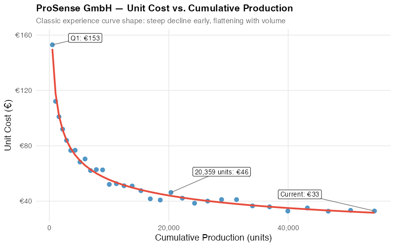
The linear-scale chart shows the classic concave curve — steep cost declines early, flattening as volume grows. But the shape can be misleading because it’s hard to tell whether the relationship is truly a power law or some other functional form.
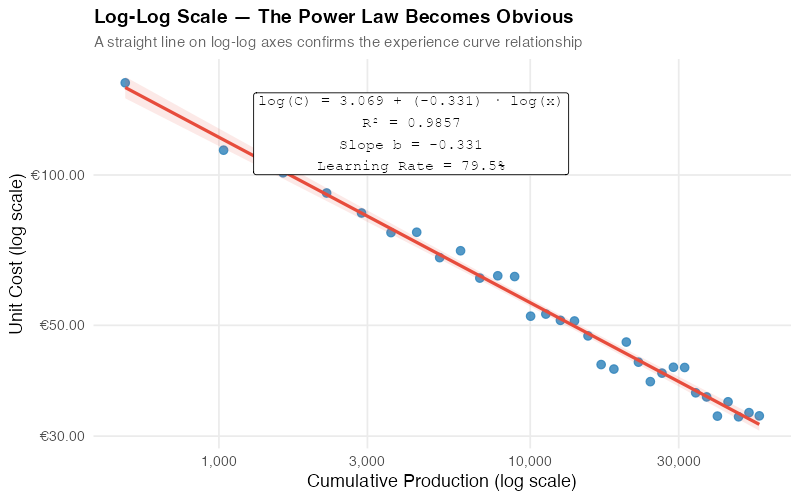
The log-log plot resolves this immediately. A straight line in log-log space confirms the power law. The slope gives us the learning exponent directly, and the regression line lets us extrapolate costs to future volumes.
For ProSense, our regression yields:
- Learning exponent (b): -0.318 (95% CI: -0.340 to -0.296)
- Learning rate: 80.2% (meaning costs drop ~20% per doubling)
- R-squared: 0.97
- First-unit cost (C₁): approximately €1,070
The high R-squared and tight confidence intervals tell us the experience curve is a strong fit for ProSense’s cost data. The estimated learning rate of 80.2% is right in the typical range for electronic components manufacturing.
Not All Costs Learn Equally: Component Decomposition
Here’s where most experience curve analyses go wrong: they treat the total unit cost as a monolith. In reality, different cost components decline at different rates, and understanding this decomposition is crucial for realistic forecasting.
Consider ProSense’s sensor unit cost breakdown at the start of production:
| Component | Share | Learning Rate | Why |
|---|---|---|---|
| Materials (MEMS, ICs, PCBs) | 55% | 85% | Commodity-ish; limited by supplier’s own curve |
| Direct Labor (assembly, testing) | 30% | 75% | Classic Wright learning; high improvement potential |
| Overhead (equipment, facilities, quality) | 15% | 80% | Utilization improves; fixed costs spread over more units |
Materials have the shallowest curve because they’re largely purchased components — your learning rate is bounded by your supplier’s learning rate (and their willingness to share those savings). Direct labor has the steepest curve because human learning effects are powerful and well-documented.
This explains why labor-intensive products (apparel, furniture, manual assembly) typically show steeper experience curves (75-80%) than material-intensive products (electronics, chemicals) where curves are shallower (85-90%).
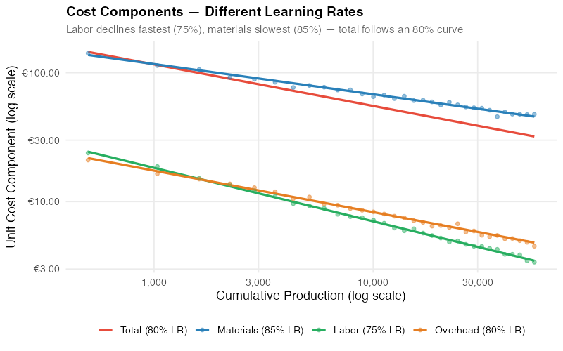
The component plot reveals what a single aggregate curve hides: labor costs have plummeted by over 50%, but materials costs have only declined by 25%. The aggregate curve sits somewhere in the weighted middle.
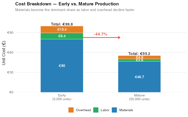
The waterfall chart makes the strategic implications clear. At low cumulative volume, ProSense’s cost structure was roughly 55% materials, 30% labor, 15% overhead. At high cumulative volume, the mix has shifted even further toward materials (now over 60% of total) because materials declined less than labor and overhead. Future cost reduction efforts should focus on materials — negotiating with component suppliers, redesigning for cheaper parts, or vertically integrating.
Strategic Applications for Supply Chain
The experience curve isn’t just an academic exercise. It’s a practical tool for at least four critical supply chain decisions.
Procurement: Know What Your Supplier’s Costs Should Be
This is Anna Berger’s use case, and it’s the most immediately actionable. If you know (or can estimate) your supplier’s cumulative production volume and learning rate, you can calculate what their costs should be — independent of what they’re charging you.
| Year | Supplier’s Price | Curve Prediction | Gap | Your Opportunity |
|---|---|---|---|---|
| 2018 | €138 | €138 | €0 | Baseline — fair price at launch |
| 2020 | €131 | €121 | €10 | Price lagging cost reductions |
| 2022 | €125 | €108 | €17 | Supplier capturing 60% of savings |
| 2024 | €120 | €98 | €22 | Gap widening — time for a conversation |
| 2025 | €118 | €92 | €26 | €26/unit opportunity = €1.66M/year |
You’re not accusing the supplier of gouging. You’re showing them that you understand cost dynamics and expect pricing to reflect productivity gains. The conversation shifts from "give us a discount" to "let’s talk about how we share the benefits of your growing efficiency."
Important caveat: suppliers have legitimate reasons for prices not tracking the experience curve exactly — R&D investment, quality improvements, regulatory compliance, raw material inflation. The curve gives you a starting point for negotiation, not a final answer.
Operations: Forecast Your Own Production Costs
If you’re ramping up production of a new product, the experience curve helps you forecast when you’ll hit cost targets, break even, or achieve target margins. Plot your actual cost data against the fitted curve quarterly. If costs are above the curve, investigate — you may have process issues preventing normal learning. If below, you’re outperforming expectations.
Competitive Intelligence: Why Market Leaders Win on Price
A company with 3x your cumulative production is 1.58 doublings ahead on the experience curve (log₂(3) = 1.58). At an 80% learning rate, their unit costs are approximately 0.80^1.58 = 70% of yours. They can undercut your price by 20% and still maintain higher margins. This is why experience-intensive industries tend toward consolidation — the leader’s cost advantage is self-reinforcing.
Make vs. Buy: When to Surrender to the Specialist
If a contract manufacturer has produced 500,000 units and you’ve produced 5,000, they’re roughly 6.6 doublings ahead. At an 80% curve, their costs are 0.80^6.6 = 23% of yours. You will never catch up unless you can find a way to leapfrog their volume. This is a strong signal to buy rather than make.
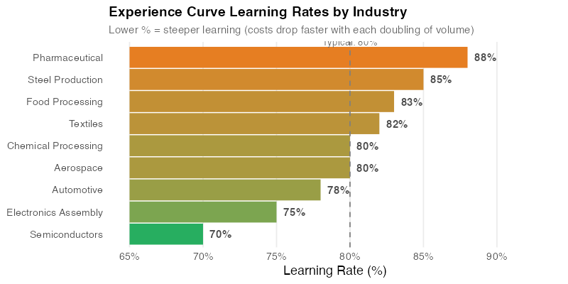
The industry comparison chart shows why one-size-fits-all assumptions are dangerous. Semiconductors have famously steep curves (around 70%) driven by Moore’s Law dynamics. Commodity chemicals are near 90% — costs decline, but slowly. Knowing the typical slope for your industry gives you a reasonable prior before you have enough data to estimate your own.
Where the Curve Breaks
The experience curve is powerful, but it’s not a law of nature. It’s an empirical pattern that holds under certain conditions and breaks under others. Honest analysis requires knowing when not to rely on it.
Depleting natural resources. If your key input is a finite resource whose extraction gets harder over time (deep-water oil, rare earth elements, high-grade ores), input costs may rise with cumulative volume industry-wide. The experience curve for extraction efficiency exists but can be overwhelmed by geological depletion.
Regulatory barriers and patents. A pharmaceutical company with patent protection has no competitive pressure to reduce prices along the experience curve. Regulatory compliance costs (GMP manufacturing, clinical trials, documentation) don’t always decline with volume because they’re driven by regulatory requirements, not production efficiency.
Mature commodities. When an entire industry is far down the experience curve — think steel, commodity plastics, basic chemicals — further doublings of cumulative output yield trivially small cost reductions. The curve has largely been exhausted. Competition shifts to other dimensions (service, delivery, quality, sustainability).
Technological disruptions. A disruptive technology can reset the curve entirely. The experience curve for incandescent light bulbs became irrelevant when LEDs arrived with a new, steeper curve starting from a higher cost point but declining faster. If your supplier is riding a technology that’s about to be displaced, their experience curve is worthless for long-term forecasting.
Products with high intangible value. Luxury goods, branded products, and IP-heavy offerings don’t follow cost-based pricing. Hermes isn’t going to cut handbag prices because their artisans got more experienced. The experience curve applies to costs, not to prices in markets driven by brand, exclusivity, or intellectual property.
The management effort trap. Perhaps the most dangerous misconception: cost decline along the experience curve is not automatic. It requires deliberate management action — continuous improvement programs, capital investment in better equipment, workforce training, supplier development. Companies that assume costs will drop simply because volume grew often find that they don’t. The curve describes what can happen with good management, not what will happen with passive management.
Interactive Dashboard
Explore the experience curve with your own numbers. Adjust learning rates, volume growth, and cost components to see how costs decline — and set data-driven negotiation targets.
Interactive Dashboard
Explore the data yourself — adjust parameters and see the results update in real time.
Your Next Steps
The experience curve is one of the most well-documented empirical relationships in business. Here’s how to start using it this week:
-
Pull price history for your top 5 purchased items. Get 3-5 years of unit prices alongside your estimates of the supplier’s cumulative production volume (or use your own purchase volume as a proxy). Fit an experience curve to each — the R code in the collapsible section below does exactly this. Any item where the fitted learning rate is above 85% has significant cost reduction potential you may not be capturing.
-
Calculate the "experience gap." Compare your supplier’s actual price trajectory to the experience curve prediction. A widening gap over time means the supplier is capturing most of the cost savings from their growing efficiency. This gap is your negotiation starting point — specific, data-driven, and hard to argue with.
-
Decompose your own production costs into components. Estimate learning rates for each — labor, materials, overhead. This tells you where to focus improvement efforts. If your labor curve is 90% when 80% is typical for your industry, you have a learning problem (inadequate training, high turnover, poor process standardization).
-
Use the interactive dashboard to model what-if scenarios. What happens if you double your order volume with a single supplier? How much should that be worth in unit cost reduction? What if you switch to a supplier with more cumulative experience? The dashboard lets you explore these questions in seconds.
-
Start tracking cumulative production for key items. The experience curve only works with good data, and most companies don’t track cumulative volume systematically. Add it to your supplier scorecards. In 12 months, you’ll have enough data to fit reliable curves — and your suppliers will know you’re watching.
Show R Code
# =============================================================================
# The Experience Curve — Complete R Code
# =============================================================================
# This script reproduces all analysis and visualizations from the blog post.
# Fictional scenario: ProSense GmbH — German IoT sensor manufacturer.
#
# Required packages: ggplot2, dplyr, tidyr, scales, patchwork
# =============================================================================

# === Setup ===================================================================

library(ggplot2)
library(dplyr)
library(tidyr)
library(scales)
library(patchwork)

set.seed(42)

# Custom theme — minimal, clean, publication-ready
theme_exp <- theme_minimal(base_size = 13) +
  theme(
    plot.title       = element_text(face = "bold", size = 14),
    plot.subtitle    = element_text(color = "grey40", size = 11),
    panel.grid.minor = element_blank(),
    legend.position  = "bottom"
  )

# Color palette
col_red    <- "#e74c3c"
col_blue   <- "#2980b9"
col_green  <- "#27ae60"
col_orange <- "#e67e22"
col_purple <- "#8b5cf6"

# === Experience Curve Function ===============================================
#
# The experience curve follows a power law:
#   C(x) = C1 * x^b
#
# Where:
#   C(x) = unit cost at cumulative production x
#   C1   = theoretical cost of the first unit
#   b    = log(learning_rate) / log(2)
#
# A learning rate of 80% means costs drop to 80% every time
# cumulative production doubles.

exp_curve <- function(x, C1, learning_rate) {
  b <- log(learning_rate) / log(2)
  C1 * x^b
}

# === Data Generation: ProSense GmbH =========================================
#
# Scenario: 8 years (32 quarters) of IoT sensor production data
# - Production ramps from ~500 units/quarter to ~4,000 units/quarter
# - Unit costs started at ~EUR 145 (at cumulative volume ~500)
# - Costs follow an 80% experience curve

n_quarters <- 32

# Quarterly production ramps exponentially from 500 to 4,000
quarterly_prod <- round(
  500 * exp(log(4000 / 500) * (0:(n_quarters - 1)) / (n_quarters - 1))
)

# Cumulative production
cum_prod <- cumsum(quarterly_prod)
cat("Cumulative production range:",
    comma(min(cum_prod)), "to", comma(max(cum_prod)), "units\n")

# Cost parameters
lr_total <- 0.80
b_total  <- log(lr_total) / log(2)

# Calibrate C1 so that cost at cum_prod ~500 = EUR 145
C1_true <- 145 / (500^b_total)
cat("Theoretical first-unit cost (C1):", round(C1_true, 1), "EUR\n")

# True total cost at each cumulative volume
true_cost <- exp_curve(cum_prod, C1_true, lr_total)

# Add realistic noise (+-3-5%)
noise <- rnorm(n_quarters, mean = 0, sd = 0.04)
observed_cost <- true_cost * (1 + noise)

# Build the main data frame
df <- data.frame(
  quarter        = 1:n_quarters,
  quarterly_prod = quarterly_prod,
  cum_prod       = cum_prod,
  true_cost      = true_cost,
  observed_cost  = observed_cost
)

# Quick look at the data
cat("\nFirst 5 quarters:\n")
print(head(df, 5))
cat("\nLast 5 quarters:\n")
print(tail(df, 5))

# === Component Cost Data =====================================================
#
# Three cost components, each with a different learning rate:
#   Materials: 55% of initial cost, 85% learning rate (slowest decline)
#   Labor:     30% of initial cost, 75% learning rate (fastest decline)
#   Overhead:  15% of initial cost, 80% learning rate

comp_params <- list(
  materials = list(share = 0.55, lr = 0.85),
  labor     = list(share = 0.30, lr = 0.75),
  overhead  = list(share = 0.15, lr = 0.80)
)

for (comp_name in names(comp_params)) {
  params  <- comp_params[[comp_name]]
  C1_comp <- C1_true * params$share
  true_comp  <- exp_curve(cum_prod, C1_comp, params$lr)
  noise_comp <- rnorm(n_quarters, mean = 0, sd = 0.03)
  df[[paste0("cost_", comp_name)]] <- true_comp * (1 + noise_comp)
}

# === Fitting the Experience Curve ============================================
#
# Method: Log-log linear regression
#   log(C) = a + b * log(x)
#
# This is equivalent to the power law C = 10^a * x^b

df$log_cum  <- log10(df$cum_prod)
df$log_cost <- log10(df$observed_cost)

lm_loglog <- lm(log_cost ~ log_cum, data = df)

# Model results
cat("\n=== Log-Log Regression Results ===\n")
print(summary(lm_loglog))

r_sq       <- summary(lm_loglog)$r.squared
slope_b    <- coef(lm_loglog)[2]
intercept_a <- coef(lm_loglog)[1]
implied_lr <- 2^slope_b

cat("\nKey metrics:\n")
cat("  R-squared:     ", round(r_sq, 4), "\n")
cat("  Slope (b):     ", round(slope_b, 4), "\n")
cat("  Intercept (a): ", round(intercept_a, 4), "\n")
cat("  Implied LR:    ", round(implied_lr * 100, 1), "%\n")
cat("  Cost reduction per doubling:",
    round((1 - implied_lr) * 100, 1), "%\n")

# Also fit with nls for the linear-scale overlay
fit_nls <- nls(observed_cost ~ C1 * cum_prod^b,
               data = df,
               start = list(C1 = 1000, b = -0.3))
df$fitted_cost <- predict(fit_nls)

# === Chart 1: Experience Curve — Linear Scale ================================
# The classic "hockey stick" shape

first_pt <- df[1, ]
last_pt  <- df[n_quarters, ]
mid_pt   <- df[which.min(abs(df$cum_prod - 20000)), ]

p1 <- ggplot(df, aes(x = cum_prod, y = observed_cost)) +
  geom_point(color = col_blue, size = 2.5, alpha = 0.8) +
  geom_line(aes(y = fitted_cost), color = col_red, linewidth = 1.2) +
  annotate("segment",
           x = first_pt$cum_prod, y = first_pt$observed_cost,
           xend = first_pt$cum_prod + 5000, yend = first_pt$observed_cost + 5,
           color = "grey40", linewidth = 0.4) +
  annotate("label",
           x = first_pt$cum_prod + 5500, y = first_pt$observed_cost + 5,
           label = paste0("Q1: EUR", round(first_pt$observed_cost)),
           size = 3.5, fill = "white") +
  annotate("segment",
           x = mid_pt$cum_prod, y = mid_pt$observed_cost,
           xend = mid_pt$cum_prod + 8000, yend = mid_pt$observed_cost + 15,
           color = "grey40", linewidth = 0.4) +
  annotate("label",
           x = mid_pt$cum_prod + 8500, y = mid_pt$observed_cost + 15,
           label = paste0(comma(mid_pt$cum_prod), " units: EUR",
                          round(mid_pt$observed_cost)),
           size = 3.5, fill = "white") +
  annotate("segment",
           x = last_pt$cum_prod, y = last_pt$observed_cost,
           xend = last_pt$cum_prod - 12000, yend = last_pt$observed_cost + 12,
           color = "grey40", linewidth = 0.4) +
  annotate("label",
           x = last_pt$cum_prod - 12500, y = last_pt$observed_cost + 12,
           label = paste0("Current: EUR", round(last_pt$observed_cost)),
           size = 3.5, fill = "white") +
  scale_x_continuous(labels = comma_format()) +
  scale_y_continuous(labels = dollar_format(prefix = "\u20ac")) +
  labs(
    title    = "ProSense GmbH — Unit Cost vs. Cumulative Production",
    subtitle = "Classic experience curve: steep decline early, flattening with volume",
    x = "Cumulative Production (units)",
    y = "Unit Cost (€)"
  ) +
  theme_exp

print(p1)

# === Chart 2: Log-Log Scale — The Power Law Revealed ========================
# On log-log axes, the experience curve becomes a straight line

eq_label <- paste0(
  "log(C) = ", round(intercept_a, 3), " + (", round(slope_b, 3),
  ") · log(x)\n",
  "R² = ", round(r_sq, 4), "\n",
  "Slope b = ", round(slope_b, 3), "\n",
  "Learning Rate = ", round(implied_lr * 100, 1), "%"
)

p2 <- ggplot(df, aes(x = cum_prod, y = observed_cost)) +
  geom_point(color = col_blue, size = 2.5, alpha = 0.8) +
  geom_smooth(method = "lm", formula = y ~ x, color = col_red,
              linewidth = 1.1, fill = col_red, alpha = 0.12) +
  scale_x_log10(labels = comma_format()) +
  scale_y_log10(labels = dollar_format(prefix = "\u20ac")) +
  annotate("label",
           x = 10^(mean(range(df$log_cum)) - 0.1),
           y = 10^(max(df$log_cost) - 0.02),
           label = eq_label,
           hjust = 0.5, vjust = 1, size = 3.8,
           fill = "white", family = "mono") +
  labs(
    title    = "Log-Log Scale — The Power Law Becomes Obvious",
    subtitle = "A straight line on log-log axes confirms the experience curve",
    x = "Cumulative Production (log scale)",
    y = "Unit Cost (log scale)"
  ) +
  theme_exp

print(p2)

# === Chart 3: Cost Components — Different Learning Rates =====================
# Each cost component declines at its own rate

x_smooth <- seq(min(df$cum_prod), max(df$cum_prod), length.out = 200)

comp_smooth <- data.frame(
  cum_prod  = rep(x_smooth, 4),
  cost      = c(
    exp_curve(x_smooth, C1_true * 0.55, 0.85),
    exp_curve(x_smooth, C1_true * 0.30, 0.75),
    exp_curve(x_smooth, C1_true * 0.15, 0.80),
    exp_curve(x_smooth, C1_true, lr_total)
  ),
  component = rep(c("Materials (85% LR)", "Labor (75% LR)",
                     "Overhead (80% LR)", "Total (80% LR)"), each = 200)
)

comp_smooth$component <- factor(comp_smooth$component,
  levels = c("Total (80% LR)", "Materials (85% LR)",
             "Labor (75% LR)", "Overhead (80% LR)"))

comp_colors <- c(
  "Total (80% LR)"     = col_red,
  "Materials (85% LR)" = col_blue,
  "Labor (75% LR)"     = col_green,
  "Overhead (80% LR)"  = col_orange
)

# Scatter points for observed component costs
df_comp_long <- df %>%
  select(cum_prod, cost_materials, cost_labor, cost_overhead) %>%
  pivot_longer(-cum_prod, names_to = "component", values_to = "cost") %>%
  mutate(component = case_when(
    component == "cost_materials" ~ "Materials (85% LR)",
    component == "cost_labor"     ~ "Labor (75% LR)",
    component == "cost_overhead"  ~ "Overhead (80% LR)"
  ))

p3 <- ggplot() +
  geom_line(data = comp_smooth,
            aes(x = cum_prod, y = cost, color = component),
            linewidth = 1.1) +
  geom_point(data = df_comp_long,
             aes(x = cum_prod, y = cost, color = component),
             size = 1.5, alpha = 0.5) +
  scale_x_log10(labels = comma_format()) +
  scale_y_log10(labels = dollar_format(prefix = "\u20ac")) +
  scale_color_manual(values = comp_colors) +
  labs(
    title    = "Cost Components — Different Learning Rates",
    subtitle = "Labor declines fastest (75%), materials slowest (85%)",
    x = "Cumulative Production (log scale)",
    y = "Unit Cost Component (log scale)",
    color = NULL
  ) +
  theme_exp +
  guides(color = guide_legend(nrow = 1))

print(p3)

# === Chart 4: Cost Breakdown — Early vs. Mature Production ===================
# Shows how the cost MIX shifts as volume grows

calc_costs <- function(vol) {
  data.frame(
    component = c("Materials", "Labor", "Overhead"),
    cost      = c(
      exp_curve(vol, C1_true * 0.55, 0.85),
      exp_curve(vol, C1_true * 0.30, 0.75),
      exp_curve(vol, C1_true * 0.15, 0.80)
    )
  )
}

vol_early  <- 5000
vol_mature <- 50000

df_early  <- calc_costs(vol_early)  %>%
  mutate(stage = paste0("Early\n(", comma(vol_early), " units)"))
df_mature <- calc_costs(vol_mature) %>%
  mutate(stage = paste0("Mature\n(", comma(vol_mature), " units)"))

df_waterfall <- bind_rows(df_early, df_mature) %>%
  mutate(
    component = factor(component,
                       levels = c("Overhead", "Labor", "Materials")),
    stage = factor(stage, levels = c(
      paste0("Early\n(", comma(vol_early), " units)"),
      paste0("Mature\n(", comma(vol_mature), " units)")
    ))
  )

total_early  <- sum(df_early$cost)
total_mature <- sum(df_mature$cost)
pct_reduction <- round((1 - total_mature / total_early) * 100, 1)

cat("\n=== Cost Breakdown ===\n")
cat("At", comma(vol_early), "units (early):\n")
print(df_early %>% mutate(pct = round(cost / sum(cost) * 100, 1)))
cat("Total:", round(total_early, 1), "EUR\n\n")
cat("At", comma(vol_mature), "units (mature):\n")
print(df_mature %>% mutate(pct = round(cost / sum(cost) * 100, 1)))
cat("Total:", round(total_mature, 1), "EUR\n")
cat("Reduction:", pct_reduction, "%\n")

comp_fill <- c(
  "Materials" = col_blue,
  "Labor"     = col_green,
  "Overhead"  = col_orange
)

p4 <- ggplot(df_waterfall, aes(x = stage, y = cost, fill = component)) +
  geom_col(width = 0.55, color = "white", linewidth = 0.3) +
  geom_text(aes(label = paste0("€", round(cost, 1))),
            position = position_stack(vjust = 0.5),
            size = 3.8, color = "white", fontface = "bold") +
  annotate("text",
           x = 1, y = total_early + 3,
           label = paste0("Total: €", round(total_early, 1)),
           size = 4.2, fontface = "bold", color = "grey20") +
  annotate("text",
           x = 2, y = total_mature + 3,
           label = paste0("Total: €", round(total_mature, 1)),
           size = 4.2, fontface = "bold", color = "grey20") +
  annotate("segment",
           x = 1.25, xend = 1.75,
           y = (total_early + total_mature) / 2 + 5,
           yend = (total_early + total_mature) / 2 + 5,
           arrow = arrow(length = unit(0.25, "cm")),
           color = col_red, linewidth = 1) +
  annotate("text",
           x = 1.5, y = (total_early + total_mature) / 2 + 10,
           label = paste0("-", pct_reduction, "%"),
           size = 4.5, fontface = "bold", color = col_red) +
  scale_fill_manual(values = comp_fill) +
  scale_y_continuous(labels = dollar_format(prefix = "€"),
                     expand = expansion(mult = c(0, 0.15))) +
  labs(
    title    = "Cost Breakdown — Early vs. Mature Production",
    subtitle = "Materials become dominant as labor and overhead decline faster",
    x = NULL, y = "Unit Cost (€)", fill = NULL
  ) +
  theme_exp +
  theme(panel.grid.major.x = element_blank())

print(p4)

# === Chart 5: Industry Learning Rates ========================================
# Typical experience curve slopes across industries

industry_data <- data.frame(
  industry      = c("Semiconductors", "Electronics Assembly", "Automotive",
                     "Aerospace", "Chemical Processing", "Textiles",
                     "Food Processing", "Steel Production", "Pharmaceutical"),
  learning_rate = c(70, 75, 78, 80, 80, 82, 83, 85, 88)
) %>%
  arrange(learning_rate) %>%
  mutate(industry = factor(industry, levels = industry))

lr_range <- range(industry_data$learning_rate)
industry_data$color_val <-
  (industry_data$learning_rate - lr_range[1]) / diff(lr_range)

p5 <- ggplot(industry_data, aes(y = industry, color = color_val)) +
  geom_segment(aes(x = 65, xend = learning_rate, yend = industry),
               linewidth = 10, lineend = "butt") +
  geom_text(aes(x = learning_rate, label = paste0(learning_rate, "%")),
            hjust = -0.3, size = 4, fontface = "bold", color = "grey30") +
  geom_vline(xintercept = 80, linetype = "dashed",
             color = "grey50", linewidth = 0.6) +
  annotate("text", x = 80, y = 9.7, label = "Typical: 80%",
           size = 3.5, color = "grey40", hjust = 0.5) +
  scale_color_gradient(low = col_green, high = col_orange, guide = "none") +
  scale_x_continuous(limits = c(65, 93), breaks = seq(65, 90, 5),
                     labels = function(x) paste0(x, "%")) +
  labs(
    title    = "Experience Curve Learning Rates by Industry",
    subtitle = "Lower % = steeper learning (costs drop faster per doubling)",
    x = "Learning Rate (%)", y = NULL
  ) +
  theme_exp +
  theme(panel.grid.major.y = element_blank())

print(p5)

# === Predicting Future Costs =================================================
# Use the fitted model to forecast costs at future cumulative volumes

future_volumes <- c(100000, 150000, 200000)
future_costs   <- exp_curve(future_volumes, C1_true, implied_lr)

cat("\n=== Cost Forecast ===\n")
for (i in seq_along(future_volumes)) {
  cat("At", comma(future_volumes[i]), "cumulative units:",
      round(future_costs[i], 2), "EUR/unit\n")
}

# === Apply to Your Own Data ==================================================
#
# Replace the example data below with your actual cost/volume data.
# The script will fit an experience curve and report the learning rate.

# --- STEP 1: Enter your data ---
# my_data <- data.frame(
#   cum_production = c(1000, 2000, 5000, 10000, 20000),
#   unit_cost      = c(120, 98, 75, 62, 51)
# )
#
# --- STEP 2: Fit the experience curve ---
# my_data$log_vol  <- log10(my_data$cum_production)
# my_data$log_cost <- log10(my_data$unit_cost)
# my_fit <- lm(log_cost ~ log_vol, data = my_data)
#
# my_slope <- coef(my_fit)[2]
# my_lr    <- 2^my_slope
#
# cat("Your learning rate:", round(my_lr * 100, 1), "%\n")
# cat("R-squared:", round(summary(my_fit)$r.squared, 4), "\n")
# cat("Cost reduction per doubling:", round((1 - my_lr) * 100, 1), "%\n")
#
# --- STEP 3: Plot your data ---
# ggplot(my_data, aes(x = cum_production, y = unit_cost)) +
#   geom_point(color = col_blue, size = 3) +
#   geom_smooth(method = "lm", formula = y ~ x,
#               color = col_red, linewidth = 1) +
#   scale_x_log10(labels = comma_format()) +
#   scale_y_log10(labels = dollar_format(prefix = "€")) +
#   labs(title = "Your Experience Curve",
#        x = "Cumulative Production (log scale)",
#        y = "Unit Cost (log scale)") +
#   theme_exp
References
- Wright, T.P. (1936). "Factors Affecting the Cost of Airplanes." Journal of the Aeronautical Sciences, 3(4), 122-128.
- Henderson, B.D. (1974). The Experience Curve Reviewed: III. Why Does It Work? Boston Consulting Group.
- Boston Consulting Group (1968). Perspectives on Experience. BCG Publications.
- Dutton, J.M. & Thomas, A. (1984). "Treating Progress Functions as a Managerial Opportunity." Academy of Management Review, 9(2), 235-247.
- Argote, L. & Epple, D. (1990). "Learning Curves in Manufacturing." Science, 247(4945), 920-924.
- Yelle, L.E. (1979). "The Learning Curve: Historical Review and Comprehensive Survey." Decision Sciences, 10(2), 302-328.
- Lafond, F. et al. (2018). "How Well Do Experience Curves Predict Technological Progress? A Method for Making Distributional Forecasts." Technological Forecasting and Social Change, 128, 104-117.
Schreibe einen Kommentar