Yesterday, I argued that Excel’s FORECAST.LINEAR is the supply chain equivalent of navigating with a paper map in 2026. The response told me two things: a lot of you agreed — and most of you have no idea where to start.
Fair enough. “Install R” is easy advice to give and surprisingly confusing advice to follow. There’s CRAN, there’s RStudio, there’s something called Posit now, and about forty Stack Overflow threads arguing about which one to download first. If you’ve ever abandoned an R installation halfway through because you weren’t sure if you needed “base R” or “R for macOS” or “Rtools” or all three — you’re not alone. And you’re not stupid. The onboarding experience is genuinely terrible.
This post fixes that. By the end of it, you will have R installed, RStudio running, the fpp3 forecasting package loaded, and an actual forecast on your screen. Real data, real model, real prediction intervals — not a screenshot, not a promise, the actual thing running on your machine.
Fifteen minutes. I timed it.
What Is R? (The 30-Second Version)
R is a free, open-source programming language designed for statistical computing. It was created by statisticians, for statisticians, which means it’s exceptionally good at the things supply chain professionals need: time series analysis, forecasting, data visualization, and statistical modeling.
That’s the textbook answer. Here’s the practical one: R is a calculator that never forgets its work. Every analysis you run in R is saved as code. You can rerun it next month with new data. You can hand it to a colleague. You can audit exactly what happened and why. Try doing that with a spreadsheet where someone’s VLOOKUP references a deleted tab.
R is free. It runs on Windows, Mac, and Linux. It has over 23,000 packages (think of them as plugins) for everything from basic statistics to machine learning to reading directly from your SAP database. And unlike Excel, it doesn’t crash when your dataset exceeds a million rows.
What Is RStudio? (And Why You Need It)
If R is the engine, RStudio is the car. You can run an engine by itself — but you wouldn’t enjoy the experience.
R on its own gives you a bare console: a blinking cursor that accepts commands and returns results. It works, but it’s like editing a spreadsheet in Notepad. RStudio wraps that console in a proper working environment with four panels:
- Source (top left): where you write and save your code — like an Excel worksheet, but for R scripts
- Console (bottom left): where R actually runs your commands and shows results
- Environment (top right): shows your data, variables, and models — a live inventory of everything R currently “knows”
- Files/Plots/Help (bottom right): your file browser, chart output, and documentation — all in one place
The company behind RStudio renamed itself to Posit in 2022 (as in “posit a hypothesis”), reflecting their expansion beyond R into Python and other languages. Don’t let the name change confuse you — you still download “RStudio Desktop” and it still works exactly the same way. Posit is the company, RStudio is the product. If the naming seems needlessly confusing, welcome to software. At least they didn’t call it “Meta.”
The free version of RStudio Desktop is all you need. There’s a paid “Pro” version for enterprise teams, but it adds server-level features that are irrelevant for individual forecasting work. Don’t let the pricing page trick you into thinking the free version is a demo — it’s the full product.
What Is FPP3? (Your Forecasting Toolkit)
FPP3 stands for Forecasting: Principles and Practice, 3rd edition — a textbook by Rob Hyndman and George Athanasopoulos that is freely available online at otexts.com/fpp3. But it’s more than a book. The fpp3 R package bundles together an entire forecasting ecosystem called the tidyverts that gives you everything you need to go from raw data to publishable forecast.
Here’s what’s inside:

| Package | What It Does | Think of It As… |
|---|---|---|
| tsibble | Turns your data into a proper time series format | The spreadsheet that understands dates |
| feasts | Decomposition, ACF plots, seasonal diagnostics | The magnifying glass — shows what’s hiding inside your data |
| fable | Builds and compares forecasting models (ETS, ARIMA, etc.) | The forecasting engine |
| fpp3 | Loads all of the above plus core tidyverse packages with one command | The “install everything” button |
When you type install.packages("fpp3"), R downloads all of these — plus core tidyverse components like ggplot2 (plotting), dplyr (data wrangling), and tidyr (reshaping), which handle data cleaning, filtering, and visualization. One install command, one ecosystem, zero configuration.
Installation: Three Steps, Ten Minutes
No IT ticket required. No admin password. No license key. If you can install Spotify, you can install R.
Step 1: Install R
Go to cloud.r-project.org and click the link for your operating system:
- Windows: Click “Download R for Windows” → “base” → “Download R-4.x.x for Windows.” Run the installer, click Next through everything. Done.
- Mac: Click “Download R for macOS” → download the
.pkgfile that matches your chip (Apple Silicon for M1 or later, Intel for older Macs). Double-click, install. Done. - Linux: You already know what you’re doing.
That’s it. Don’t open R yet — it will show you the bare console, which is like opening a car hood and staring at the engine. We want the dashboard.
Step 2: Install RStudio
Go to posit.co/download/rstudio-desktop/ and download the free version for your OS. Install it the same way — next, next, finish.
Now open RStudio (not R — look for the RStudio icon, which has a blue circle with an “R” in it). You should see four panels. The bottom-left one is the Console — that’s where you’ll type your first commands.
If you see four panels and a blinking cursor, congratulations. You’ve done the hard part. Everything from here is just typing.
Step 3: Install fpp3
In the RStudio console (bottom-left panel), type this and press Enter:
install.packages("fpp3")
R will download about 70 packages. This takes 2–5 minutes depending on your internet speed. You’ll see a lot of text scrolling by — that’s normal. It’s downloading the tidyverts, core tidyverse components, and all their dependencies. Go refill your coffee.
Two things that might happen (and shouldn’t worry you):
- If R asks “Do you want to install from sources the package which needs compilation? (Yes/no/cancel)” — type
noand press Enter. The pre-built version works perfectly fine. - If R asks you to choose a CRAN mirror — pick any one close to your location. They all have the same packages.
When it’s done, you’ll see the cursor blinking again with no error messages. If you see red text that says Warning — that’s usually fine (warnings are suggestions, not failures). If you see red text that says Error — something went wrong. The most common fix: close RStudio, reopen it, and try again. The second most common fix: update R to the latest version from CRAN.
To verify everything worked:
library(fpp3)
If you see a message listing the loaded packages (tsibble, fable, feasts, and friends) with no errors — you’re in. The entire professional-grade forecasting toolkit is now on your machine. For free. While your ERP vendor is still emailing you about their “advanced analytics module” that costs six figures.
Your First Session: From Zero to Forecast
Let’s use that toolkit. We’re going to load a real dataset, visualize it, and produce a forecast with prediction intervals — all in about ten lines of code.
Look at Real Data
The fpp3 package comes with dozens of built-in datasets from real sources. We’ll use aus_production, which contains quarterly Australian beer production in megalitres. Why beer? Because it has beautiful seasonality (Australians brew more beer in Q4, their summer), a clear long-term trend, and it’s the kind of production planning data supply chain professionals deal with every day.
Also: beer.
library(fpp3)

aus_production |> select(Quarter, Beer)
The |> symbol is called a pipe. Read it as “and then.” So this line says: “Take aus_production, and then select the Quarter and Beer columns.” If you’ve ever chained Excel formulas inside each other like =ROUND(AVERAGE(IF(...))) and wanted to scream, pipes are the readable version of that idea.
Make Your First Plot
Here’s where it gets fun:
aus_production |>
  autoplot(Beer) +
  labs(title = "Australian Quarterly Beer Production",
       y = "Megalitres")
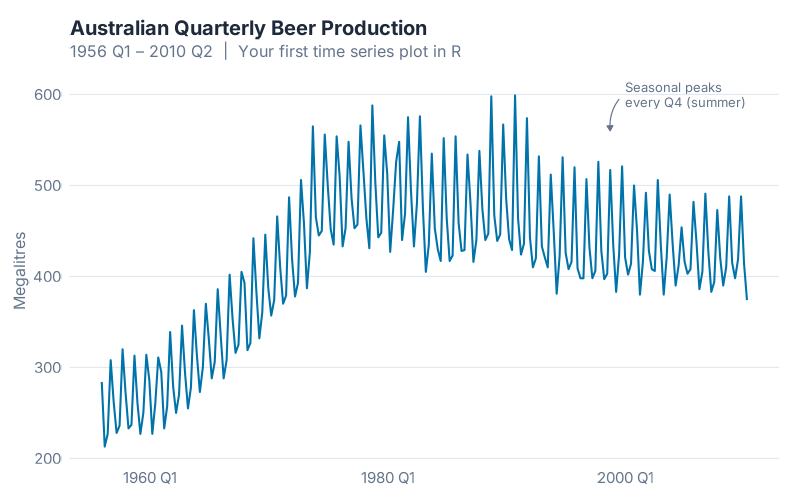
One line of actual plotting code — autoplot(Beer) — and R gives you a publication-quality time series chart. The seasonal pattern jumps off the screen: production peaks every Q4 (Australian summer) and dips every Q2 (winter). You can see the boom years through the mid-1970s, the structural shift as drinking habits changed, and the gradual decline into the 2000s. Decades of production history, instantly visible.
In Excel, getting a chart this clean would take you ten minutes of formatting: adjusting axes, removing gridlines, fixing the date labels, fighting with the legend placement. In R, it took one function call.
Run Your First Forecast
Now the moment you’ve been waiting for. Let’s take the data from 1992 onward (the more stable recent period) and ask R to forecast three years ahead:
beer <- aus_production |>
  filter(year(Quarter) >= 1992) |>
  select(Quarter, Beer)

fit <- beer |>
  model(ETS(Beer))

fit |>
  forecast(h = "3 years") |>
  autoplot(beer) +
  labs(title = "Australian Beer Production: 3-Year Forecast",
       subtitle = "ETS model with 80% and 95% prediction intervals",
       y = "Megalitres")
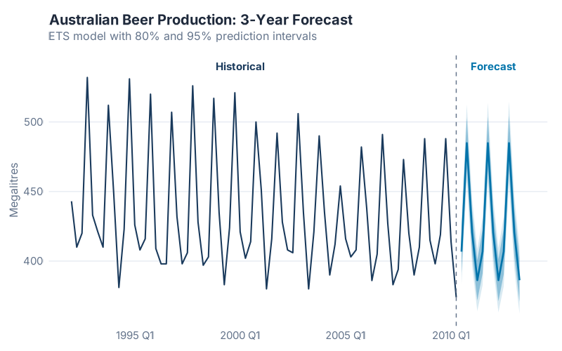
That’s it. Five lines of real code, and you have a forecast with:
- A seasonal pattern that R detected automatically — peak in Q4, trough in Q2, year after year
- Prediction intervals — the shaded bands showing where production is 80% and 95% likely to fall
- A named model — this is an ETS(A,N,A) model: Additive errors, No trend, Additive seasonality
Let’s unpack what each line did:
| Line | What It Does | Excel Equivalent |
|---|---|---|
filter(year(Quarter) >= 1992) |
Keep only data from 1992 onward | Deleting old rows manually |
select(Quarter, Beer) |
Keep only the columns we need | Hiding columns |
model(ETS(Beer)) |
Fit an ETS forecasting model | There is no Excel equivalent |
forecast(h = "3 years") |
Predict 3 years into the future | =FORECAST.LINEAR (but worse) |
autoplot(beer) |
Plot forecast with intervals | 30 minutes of chart formatting |
The line that matters most is model(ETS(Beer)). That single function call estimates the optimal smoothing parameters, selects the best error-trend-seasonality combination using the Akaike Information Criterion, and fits the model to your data. Behind the scenes, R just evaluated 30 candidate models and picked the winner. Excel doesn’t even know those 30 models exist.
What Just Happened?
Take a breath. You just:
- Installed a professional statistical computing environment
- Loaded a curated forecasting toolkit used by thousands of practitioners worldwide
- Visualized a real production time series with one line of code
- Produced an honest-to-goodness ETS forecast with prediction intervals
And you didn’t write a single VLOOKUP. Not one INDEX(MATCH()). No circular references. No broken chart axes. No mysterious #REF! errors cascading through seventeen worksheets.
If you’re feeling a mix of “that was surprisingly easy” and “I have no idea what ETS actually does” — that’s exactly where you should be. You don’t need to understand the mathematics of exponential smoothing to use it effectively, just like you don’t need to understand combustion engineering to drive a car. The understanding will come with practice. For now, the important thing is that it works and you made it work.
Your Turn
Don’t close RStudio. Try these:
1. Change the forecast horizon. Replace "3 years" with "5 years" or "1 year". Watch how the prediction intervals widen as you forecast further out — that’s R being honest about increasing uncertainty. Excel’s linear forecast doesn’t get wider. It should.
2. Try a different dataset. The aus_production table also has Cement, Electricity, and Gas columns. Replace Beer with any of them:
aus_production |>
  autoplot(Cement) +
  labs(title = "Australian Cement Production", y = "Tonnes ('000)")
3. Compare two models. This is where R starts to pull away from everything else. (If you’ve restarted RStudio since the forecast section, re-run the code from “Run Your First Forecast” first to recreate the beer variable.)
beer |>
  model(
    ETS   = ETS(Beer),
    ARIMA = ARIMA(Beer)
  ) |>
  forecast(h = "3 years") |>
  autoplot(beer, level = 80) +
  labs(title = "ETS vs ARIMA: Who Forecasts Beer Better?",
       y = "Megalitres")
Two models, one chart, six lines. Try doing that in Excel. I’ll wait.
4. Check the numbers. Want to know which model actually wins?
beer |>
  model(
    ETS    = ETS(Beer),
    ARIMA  = ARIMA(Beer),
    SNAIVE = SNAIVE(Beer)
  ) |>
  accuracy() |>
  select(.model, RMSE, MAE, MAPE)
This prints a clean table comparing Root Mean Squared Error, Mean Absolute Error, and MAPE across all three models. No manual calculation. No helper columns. No pivot tables. Just the answer.
What’s Next
You’ve got the tools installed and your first forecast on screen.
Next, we go deep. We’ll take a real multi-SKU supply chain dataset through the complete fpp3 workflow: cleaning messy data, decomposing time series to understand their hidden structure, fitting multiple models, cross-validating properly (not just eyeballing the chart and hoping for the best), and comparing accuracy metrics the way statisticians actually do it. If today was “start the car and drive around the block,” next time is “take it on the highway.”
You’ll walk away with a reusable R script template you can plug your own ERP data into — the same workflow I use for production forecasting.
If you haven’t installed R yet: do it now. Not tomorrow. Not “when things calm down” (things never calm down — you work in supply chain). Right now. The install takes 10 minutes, and everything we cover from here on out assumes you have a working setup.
And if you get stuck — on installation, on a confusing error message, on anything — drop it in the comments. I’ve debugged more R install issues than I’ve debugged supply chain disruptions, and I’ve debugged a lot of supply chain disruptions.
See you next time.
References
- Hyndman, R.J., & Athanasopoulos, G. (2021). Forecasting: Principles and Practice, 3rd edition. OTexts. Available free online at otexts.com/fpp3.
- R Core Team (2026). R: A Language and Environment for Statistical Computing. R Foundation for Statistical Computing, Vienna, Austria. r-project.org.
- Grabowski, J.-P. (2024). R For Purchasing Professionals (RFPP). A practical guide to using R for supply chain data analysis.
Leave a Reply