A vendor once told me their forecast was 92% accurate.
I asked which metric. They said accuracy. That was the moment the meeting ended.
"Accuracy" is not a forecast metric. It is a word people use when they want you to stop asking questions. It carries the self-evident authority of a round number — 92% sounds rigorous, sounds measured, sounds like someone ran a calculation and got a good result. But it could mean anything. It could mean the percentage of periods where the forecast was within 10% of actual. It could mean the percentage of SKUs where the direction was correct. It could mean the person subtracted their MAPE from 100 and called that "accuracy."
Every one of those definitions will give you a different number. Every one of them can be gamed. And every one of them will look fantastic on a vendor slide until the day your warehouse is stuffed with stock nobody ordered and empty of everything customers actually want.
Good forecasting requires a scorecard. Not a single number, not a marketing figure, but a set of diagnostic tools that each answer a specific question about forecast quality. The problem is that most supply chain professionals were never taught which tools exist, what they measure, or when each one lies to you.
That is what this post fixes.
We will cover:
- The benchmark every forecast must beat before any metric matters
- Four metrics — MAE, RMSE, MAPE, MASE — and the specific situations where each one misleads you
- A decision matrix for picking the right metric for your situation
- Residual diagnostics: the three charts that reveal whether your model is hiding something
- The train/test split: why in-sample accuracy is almost always a lie
By the end, you will be able to look at any forecast — your own, your team’s, your vendor’s — and ask the questions that actually matter. Let’s build the toolbox.
The Benchmark That Catches Liars: Naive and Seasonal Naive
Before we talk about metrics, we need to talk about yardsticks.
A metric measures how far off your forecast was. A benchmark tells you whether that distance is impressive or embarrassing. You need both. Without a benchmark, any metric is just a number with no frame of reference.
The most important benchmark in supply chain forecasting is the seasonal naive forecast. It is exactly what it sounds like: take last year’s value for the same period, and use it as the forecast. October’s forecast is last October’s actual. The forecast for week 23 of this year is the actual from week 23 of last year.
That’s it. No model. No parameters. No training. An intern could build it in Excel in twenty minutes.
And here is the embarrassing truth: on real supply chain data, it beats sophisticated models more often than anyone likes to admit.
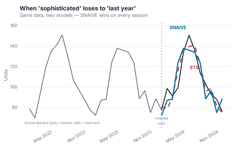
In this chart, both models were trained on the same historical data. The ETS model is doing something genuinely clever — it’s estimating trend, level, and seasonal components simultaneously and updating them as errors arrive. The Seasonal Naive model is doing nothing except copying last year. On the training data, ETS wins comfortably. On the hold-out test period — the only accuracy that matters — Seasonal Naive edges ahead.
This is not unusual. It is, in fact, the Hyndman & Athanasopoulos curriculum’s way of making a blunt point: a complex model that overfits the training data is not better than a simple model that generalises. The benchmark is the tribunal that makes this visible.
The rule: before you report any accuracy metric, always compute the same metric against a naive or seasonal naive baseline. If your model doesn’t beat the baseline, you don’t have a model — you have a more expensive version of doing nothing. The fpp3 package makes this effortless: SNAIVE() and NAIVE() are first-class model types in fable, fit and evaluated exactly like ETS or ARIMA.
The naive benchmark is not the ceiling you aspire to. It is the floor you must clear. Once you’ve cleared it, the metrics below tell you by how much.
Four Metrics, Four Personalities
Forecast accuracy metrics are not interchangeable. Each one measures something different, emphasises different kinds of errors, and breaks down under different conditions. Here are the four metrics that matter most in supply chain — what each one does, what it hides, and when it will lie to you.
MAE — The Honest Average Miss
MAE stands for Mean Absolute Error. In plain English: take every forecast error (actual minus forecast), ignore whether it’s positive or negative, and average them. The result is in the same units as your demand — pieces, pallets, euros, kilograms.
What it tells you: "On average, how many units did I miss by?" If your MAE is 45 units and you produce in batches of 200, you are probably fine. If your MAE is 45 units and your batch size is 50, you have a serious problem. The units-level interpretation is MAE’s greatest strength — it is immediately operationally meaningful.
What it hides: The averaging is symmetric and linear. A forecast that misses by 100 units in January and nails February and March perfectly has the same MAE as one that misses by 33 units every single month. These are very different demand patterns, but MAE treats them identically. It also hides the direction of bias — you can’t tell from MAE alone whether you are systematically over-forecasting, under-forecasting, or just noisy. For that, you would look at ME (Mean Error) separately, or examine the residual plot (more on that below).
When to use it: MAE is the right default for high-volume, stable SKUs where demand is well above zero and you care primarily about average operational impact. It is the most intuitive metric for operations teams and S&OP conversations — straightforward to explain, hard to misinterpret, impossible to game through rescaling. It is the reference metric that MASE is defined against, which is a strong vote of confidence from the people who invented the alternatives.
RMSE — The Metric That Hates Outliers
RMSE stands for Root Mean Squared Error. The "squared" part is where the action is: instead of taking the absolute value of each error, you square it before averaging, then take the square root at the end. This has one important consequence: large errors get punished much more heavily than small ones.
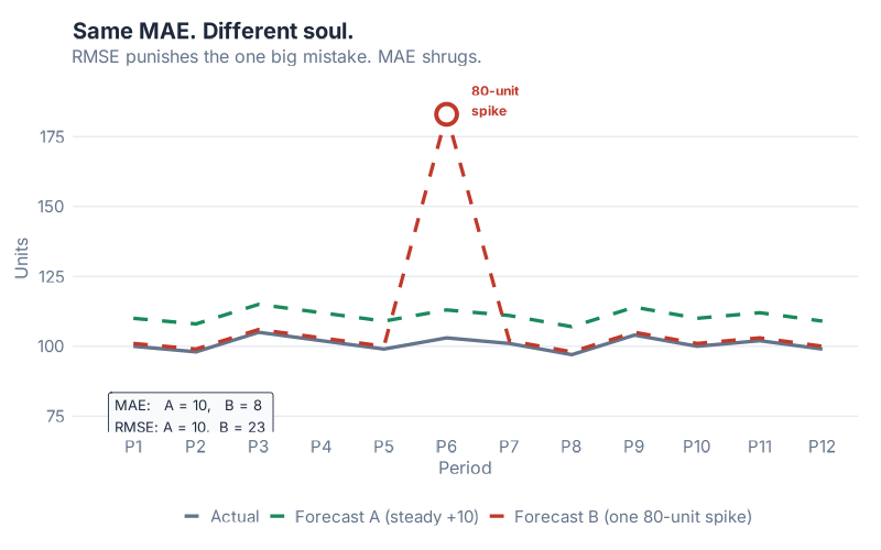
In this chart, both Forecast A and Forecast B have exactly the same MAE. Their average miss in absolute terms is identical. But look at the error distribution: Forecast A has consistently moderate errors spread across the period. Forecast B is accurate most of the time — and then catastrophically wrong in one period, with a miss several times larger than anything Forecast A produces.
If you evaluate both forecasts using MAE, they look equally good. If you evaluate them using RMSE, Forecast B looks significantly worse, because that one enormous miss gets squared before averaging. RMSE "sees" the outlier. MAE does not.
When does this matter? Think about the cost structure of your operation. For perishables, a single large over-forecast means spoilage — not proportionally worse than a moderate miss, but catastrophically worse. For critical spare parts in capital equipment, a single large under-forecast means a production line going down. In both cases, the penalty for a big miss is non-linear — one huge error costs far more than many small ones of the same total size. RMSE models that cost structure. MAE does not.
What RMSE hides: Because outlier periods dominate the RMSE calculation, the metric can be misleading if your historical data contains a few anomalous periods (promotions, pandemic disruptions, one-time customer orders). Those periods inflate RMSE in ways that don’t reflect typical operating conditions. If you compare models on RMSE and the dominant signal is one or two extraordinary months, you may end up selecting for robustness to those specific months rather than general forecasting skill.
Use RMSE when big misses are genuinely more costly than their size suggests, and when your data is clean of one-off outliers that you don’t need your model to handle.
MAPE — The Percentage Everyone Quotes, the Metric That Lies on Slow Movers
MAPE stands for Mean Absolute Percentage Error. It takes the absolute error for each period and expresses it as a percentage of the actual demand for that period, then averages those percentages. This is why supply chain managers love it: "Our MAPE is 12%" communicates something intuitive, scale-free, and easy to put in a board presentation.
It is also the most dangerous metric to use on slow-moving and intermittent demand.
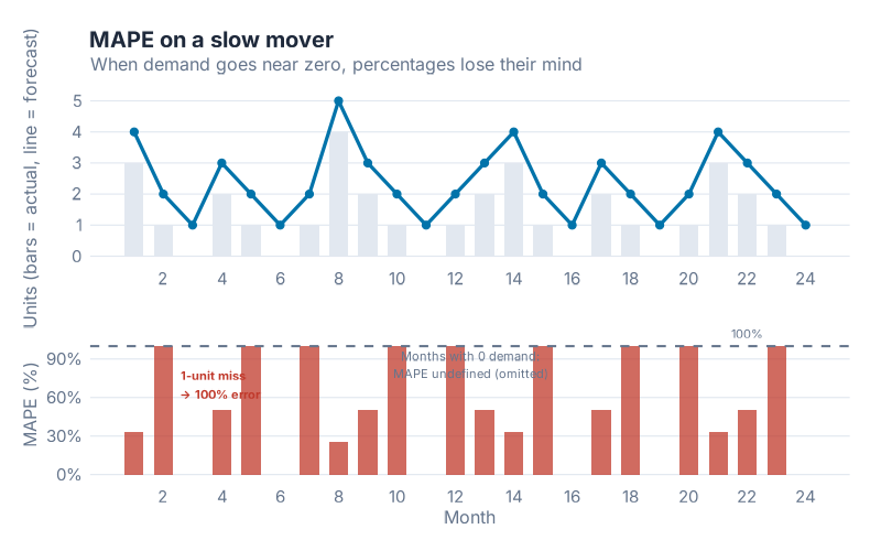
Here’s what goes wrong. The MAPE calculation divides the error by the actual demand. When actual demand is 100 units and you missed by 10, the percentage error is 10% — sensible. When actual demand is 2 units and you missed by 2, the percentage error is 100% — painful but interpretable. When actual demand is 1 unit and you missed by 2 (a very common scenario for slow movers), the percentage error is 200%. When actual demand is 0 and any forecast at all is non-zero, you are dividing by zero — and MAPE becomes undefined or, in some implementations, infinity.
Dividing by something close to zero makes the percentage explode. A single period of near-zero demand can dominate the entire MAPE calculation, making an otherwise reasonable forecast look catastrophic. Worse, because you’re dividing by the actual (not the forecast), over-forecasting and under-forecasting are penalised asymmetrically: a forecast of 100 when actual is 1 gives 9,900% error, while a forecast of 0 when actual is 100 gives 100% error. The same absolute miss creates wildly different MAPE values depending on direction.
What MAPE is genuinely good for: High-volume, well-above-zero demand with no intermittent periods. Items like fast-moving consumer goods, core catalogue items with stable high demand, or categories where zero-demand periods simply don’t occur. In those settings, MAPE is intuitive, scale-free, and easy to communicate. The number means what it sounds like.
What MAPE hides on everything else: Slow movers, spare parts, seasonal items with deep troughs, anything with intermittent demand — MAPE will misrepresent every one of them. If your portfolio contains a mix of fast and slow movers, averaging MAPE across the portfolio is mathematically meaningless, because the slow-mover percentages will swamp the fast-mover ones regardless of which model performs better overall.
You will see MAPE in almost every vendor dashboard and S&OP report. That does not make it right. It makes it familiar.
MASE — The Scale-Free One Rob Hyndman Wishes You’d Use
MASE stands for Mean Absolute Scaled Error. It was introduced by Rob Hyndman and Anne Koehler in 2006 precisely because MAPE was — their words — "widely used, but can be infinite or undefined, and it is not meaningful if actual values are close to zero."
MASE solves this by changing the denominator. Instead of dividing each error by the actual demand (which causes the explosion on slow movers), MASE divides by the average error that a seasonal naive forecast would have made on the training data. The result is a ratio: above 1 means your model made larger errors than seasonal naive, below 1 means your model beat it.
In plain English: MASE below 1 means you beat naive. MASE above 1 means you should fire the model and use naive instead.
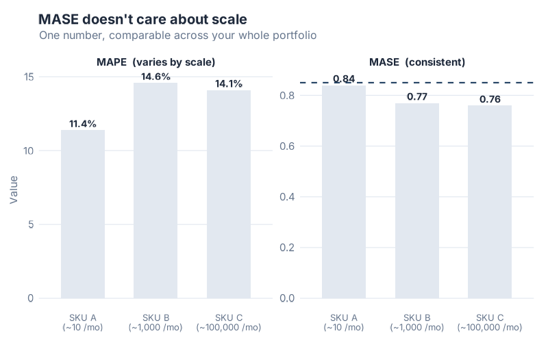
This chart shows the same forecast model applied to three SKUs with very different demand volumes: a slow mover averaging 10 units/month, a medium-volume item at 1,000 units/month, and a fast mover at 100,000 units/month. MAPE produces wildly different numbers for each — not because the model performs differently, but because MAPE is sensitive to the volume scale. MASE produces similar values across all three, because it is always measuring relative to seasonal naive on that specific SKU’s own scale. You can meaningfully average MASE across a mixed-volume portfolio. You cannot do that with MAPE.
What makes MASE special: It handles zero-demand periods gracefully (no division by zero problem), it is scale-free (meaningful across SKUs of any volume), it has a built-in interpretation threshold (1.0), and it automatically adjusts for seasonality. The denominator is calculated using the seasonal period of your data, so a monthly model uses a 12-period lag, a weekly model uses a 52-period lag — no configuration required.
The honest caveat: MASE is harder to explain to stakeholders who’ve only ever seen MAPE. "Our MASE is 0.78" doesn’t communicate intuitively to a category manager the way "12% MAPE" does. This is a communication problem, not a statistical one. Use MASE for model selection and portfolio benchmarking. Keep MAPE for high-volume SKU dashboards where it’s honest. Explain the distinction.
Which Metric When
The four metrics each shine in different situations. Here’s the framework:
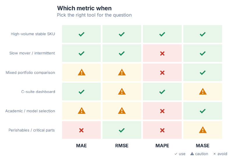
A few patterns worth noting:
The mixed-portfolio trap. If you have 500 SKUs ranging from slow movers to fast movers and you want to know which forecast method performs best across the portfolio, MASE is the only valid aggregation. Every other metric will be dominated by volume-outlier SKUs or, in MAPE’s case, by slow movers with near-zero demand.
The stakeholder communication problem. MASE is hard to explain. For a C-suite dashboard, MAPE or MAE are more intuitive — but only compute them on the SKUs where they’re valid. Never show MAPE averaged across a mixed portfolio. Consider showing MAE in units alongside MASE as the "honest" metric, so stakeholders get both interpretability and rigour.
The perishables exception. RMSE is the right instinct when your cost function is non-linear — when one large miss costs much more than many small ones. But RMSE inflates when historical data contains event-driven outliers. If you use RMSE for perishables model selection, clean the anomalous periods from your training data first.
The default. When in doubt, compute all four. The fpp3 accuracy() function returns MAE, RMSE, MAPE, and MASE simultaneously — there is no reason to compute only one metric when you can compute all four in a single line.
Residual Diagnostics — Reading the Model’s Conscience
Accuracy metrics tell you how far off the forecast was. Residual diagnostics tell you why — or more precisely, whether the model has anything left to learn from the data.
Residuals are the difference between what the model predicted and what actually happened, calculated on the training data where the model had access to each observation. If a model has learned everything there is to learn from the historical pattern, the residuals should look like random noise: no structure, no drift, nothing your eye can grab onto. If there is visible structure in the residuals, that structure is signal the model missed — and it probably means the forecasts will be systematically wrong in predictable ways.
The three-panel residual diagnostic plot is your standard tool for this check.
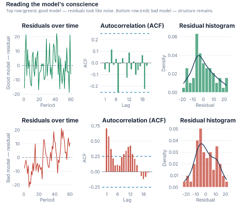
Panel 1 — Residuals over time. This is simply the residuals plotted as a time series. What you’re looking for is nothing — a flat cloud of points with no visible trend, cycle, or seasonal pattern. If you can see a pattern (drifting upward, oscillating, or with one distinct shift), the model has missed some structure. Common violations in supply chain data: residuals that drift after a structural break (a product launch, a logistics change, a major new customer), or residuals that show seasonal structure (which tells you the model’s seasonal component is wrong).
Panel 2 — ACF (Autocorrelation Function). The ACF plot shows whether current residuals are correlated with past residuals at various time lags. In a well-specified model, residuals at lag 1, lag 2, lag 3… should all be approximately zero — knowing what happened last month shouldn’t help you predict this month’s residual. White noise is the technical term for this ideal state. In the ACF plot, white noise looks like bars all staying inside the blue confidence bands. If bars stick out above the bands at any lag, that lag is significant — there is autocorrelation in the residuals, which means there is exploitable signal the model hasn’t captured. This is the forecasting equivalent of leaving money on the table.
Panel 3 — Histogram. The histogram shows the distribution of residuals. You’re looking for something roughly bell-shaped and centred near zero. A distribution centred near zero means the model is unbiased — it’s not systematically over- or under-forecasting. A distribution skewed to the right means the model regularly over-forecasts. Skewed left means systematic under-forecasting. A well-shaped distribution suggests the residuals are plausibly random; a heavily skewed one tells you the forecast will be wrong in a predictable direction.
The Ljung-Box test is the statistical judge that formalises what your eye sees in the ACF. It tests whether the residuals are legally allowed to be called noise — that is, whether the observed autocorrelation pattern could plausibly have arisen by chance. A high p-value (> 0.05) means you cannot reject the "this is noise" hypothesis. A low p-value means there is statistically significant autocorrelation — the residuals are not noise, the model has missed something. In fpp3, gg_tsresiduals() produces all three panels in one call, and you can run the formal test with Box.test() on the residuals vector or with features(.resid, ljung_box, lag = 12) on the augmented tibble.
Residual diagnostics are not pass/fail in practice. Almost no real-world model produces perfectly white noise residuals on messy supply chain data. The question is: how much structure is left? Is it economically meaningful? A slight first-lag autocorrelation on monthly demand might be statistically significant but operationally negligible. A strong seasonal pattern in the residuals of what was supposed to be a seasonal model is never negligible.
Look at the residuals. Always.
The Train/Test Split — The Only Honest Accuracy Test
Here is a statistic that should make you uncomfortable: every forecasting model ever fitted to historical data will look better on that same historical data than on any future data it has never seen.
This is not a flaw of bad models. It is a mathematical certainty for all models. When a model is fitted to a dataset, it adjusts its parameters to explain the observed history as well as possible — and it will always do this at least a little too well, capturing some of the random noise in that specific history as if it were real signal. Apply the model to new data, and those "signals" are just noise — and the model is wrong in ways the training accuracy didn’t predict.
In-sample accuracy is not accuracy. It is a description of the past.
The only honest test of forecast skill is holding out data the model has never seen — fitting the model on an earlier period, then measuring performance on a later period that was deliberately excluded from fitting.
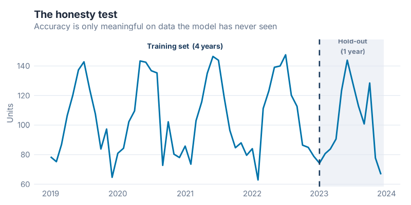
The mechanics are simple. Take your full time series and split it at a cutoff date. Everything before the cutoff becomes the training set — the model sees this data and learns from it. Everything after the cutoff is the test set (sometimes called the hold-out set) — the model is evaluated here, but these observations were never available during fitting. The accuracy metrics you compute on the test set are what you report. The accuracy on the training set is, at best, a sanity check.
How much data to hold out? The standard guidance is to use a test set at least as long as the forecast horizon you care about. If you want 12-month forecasts, hold out at least 12 months. Longer is generally better — a hold-out of 6 periods gives you a noisier accuracy estimate than a hold-out of 24 periods. But your training set also needs enough data to fit the model reliably, particularly for seasonal models that need to observe several full seasonal cycles.
In fpp3, filter_index() makes this split clean and readable in a single pipe — see the collapsible R code at the end of the post for the full pipeline.
A preview of what’s coming. The single train/test split is the honest test. But it has a weakness: the result depends on where you draw the line. A model that happened to perform well during 2023 might have performed very differently if you’d held out 2021 instead. Time series cross-validation — running the honest test many times, at many cutoff points, and averaging the results — is the rigorous solution to this problem. That is the technique we’ll use in the next post to pit six models against each other and pick a winner.
Interactive Dashboard
The four metrics only become intuitive once you’ve felt what they do on different demand profiles. You can read about MAPE exploding on slow movers — or you can turn a slider and watch it happen.
Interactive Dashboard
Explore the data yourself — adjust parameters and see the results update in real time.
What’s Next
This post handed you the toolbox.
You can now look at any forecast and ask the right questions: What benchmark does this beat? Which metric is being quoted, and is it the honest one for this SKU type? What do the residuals look like? Was this accuracy measured in-sample or on a real hold-out?
The next post swings the hammer.
"I Ran 6 Models on Real Demand Data — Here’s How I Picked the Winner" takes a single real demand series and runs six models against it — Naive, Seasonal Naive, MEAN, ETS, STL+ETS, and ARIMA — using a proper train/test split and time series cross-validation to crown a winner. The metric I use to pick it? MASE. Everything you learned today is the reason that choice makes sense.
Show R Code
# ==============================================================================
# Is Your Forecast Any Good? The Forecaster's Toolbox
# Generates 7 images for the blog post
# Run from project root: Rscript Scripts/generate_toolbox_accuracy_images.R
# ==============================================================================

library(fpp3)
library(patchwork)
library(scales)

source("Scripts/theme_inphronesys.R")

set.seed(42)

# ─────────────────────────────────────────────────────────────────────────────
# 1. Synthetic monthly demand series (12 years, trend + seasonality + noise)
# ─────────────────────────────────────────────────────────────────────────────

n_months <- 144  # 12 years

demand_sim <- tibble(
  month  = yearmonth(seq(as.Date("2012-01-01"), by = "month", length.out = n_months)),
  demand = 1200 +                                    # base level
    seq(0, 400, length.out = n_months) +             # upward trend
    200 * sin(2 * pi * (1:n_months) / 12) +          # annual seasonality
    rnorm(n_months, 0, 80)                           # noise
) |>
  mutate(demand = pmax(demand, 50)) |>               # floor at 50
  as_tsibble(index = month)

# Train/test split: last 12 months held out
train <- demand_sim |> filter_index(. ~ "2022 Dec")
test  <- demand_sim |> filter_index("2023 Jan" ~ .)

# ─────────────────────────────────────────────────────────────────────────────
# IMAGE 1: toolbox_snaive_beats_ets.png
# ETS vs SNAIVE on hold-out — SNAIVE wins
# ─────────────────────────────────────────────────────────────────────────────

fit_bench <- train |>
  model(
    ETS    = ETS(demand),
    SNAIVE = SNAIVE(demand)
  )

fc_bench <- fit_bench |> forecast(h = 12)

# Compute accuracy on test set
acc_bench <- accuracy(fc_bench, demand_sim)

# Extract forecasts for plotting
fc_wide <- fc_bench |>
  as_tibble() |>
  select(month, .model, .mean) |>
  pivot_wider(names_from = .model, values_from = .mean)

# Build the plot
p_bench <- demand_sim |>
  as_tibble() |>
  mutate(period = if_else(month >= yearmonth("2023 Jan"), "Test", "Train")) |>
  ggplot(aes(x = month, y = demand)) +
  # shaded test region background
  annotate("rect",
    xmin = yearmonth("2023 Jan"), xmax = max(demand_sim$month),
    ymin = -Inf, ymax = Inf,
    fill = iph_colors$lightgrey, alpha = 0.4
  ) +
  geom_line(color = iph_colors$navy, linewidth = 0.6) +
  # SNAIVE forecast
  geom_line(
    data = fc_wide,
    aes(x = month, y = SNAIVE),
    color = iph_colors$blue, linewidth = 1.0, linetype = "dashed"
  ) +
  # ETS forecast
  geom_line(
    data = fc_wide,
    aes(x = month, y = ETS),
    color = iph_colors$red, linewidth = 1.0, linetype = "dashed"
  ) +
  annotate("text", x = yearmonth("2023 Apr"), y = 2050,
    label = "Seasonal Naive", color = iph_colors$blue, size = 3.5, fontface = "bold",
    hjust = 0) +
  annotate("text", x = yearmonth("2023 Apr"), y = 1900,
    label = "ETS", color = iph_colors$red, size = 3.5, fontface = "bold",
    hjust = 0) +
  annotate("text", x = yearmonth("2023 Mar"), y = max(demand_sim$demand) * 0.97,
    label = "← Test period", color = "grey50", size = 3.2, hjust = 0.5) +
  labs(
    title    = "Seasonal Naive Beats ETS on the Hold-Out",
    subtitle = "A simpler model wins on unseen data",
    x        = NULL,
    y        = "Monthly demand (units)"
  ) +
  theme_inphronesys(grid = "y")

ggsave("https://inphronesys.com/wp-content/uploads/2026/04/toolbox_snaive_beats_ets-2.png", p_bench,
       width = 8, height = 5, dpi = 100, bg = "white")

# ─────────────────────────────────────────────────────────────────────────────
# IMAGE 2: toolbox_mae_vs_rmse.png
# Two forecasts: identical MAE, different RMSE (one has a huge outlier miss)
# ─────────────────────────────────────────────────────────────────────────────

# 12 periods; craft errors so MAE is equal
errors_A <- c(20, -18, 15, -22, 19, -17, 21, -20, 18, -16, 22, -14)  # avg abs ~ 18.5
errors_B <- c(2, -3, 1, -2, 3, -1, 2, -3, 140, -2, 1, -3)

# Force both to identical MAE
target_mae <- 16
errors_A <- errors_A * (target_mae / mean(abs(errors_A)))
errors_B_scaled <- errors_B
errors_B_scaled[9] <- 0  # zero out outlier temporarily
mean_abs_rest <- mean(abs(errors_B_scaled[-9]))
errors_B_scaled[-9] <- errors_B_scaled[-9] * (target_mae * 12 / 11) / mean(abs(errors_B_scaled[-9]))
errors_B_scaled[9] <- target_mae * 12 - sum(abs(errors_B_scaled[-9]))

period <- 1:12
df_errors <- tibble(
  period   = rep(period, 2),
  error    = c(errors_A, errors_B_scaled),
  forecast = rep(c("Forecast A\n(uniform errors)", "Forecast B\n(one huge miss)"), each = 12)
)

# MAE and RMSE labels
mae_A  <- mean(abs(errors_A))
mae_B  <- mean(abs(errors_B_scaled))
rmse_A <- sqrt(mean(errors_A^2))
rmse_B <- sqrt(mean(errors_B_scaled^2))

label_df <- tibble(
  forecast = c("Forecast A\n(uniform errors)", "Forecast B\n(one huge miss)"),
  label    = c(
    sprintf("MAE = %.0f  |  RMSE = %.0f", mae_A, rmse_A),
    sprintf("MAE = %.0f  |  RMSE = %.0f", mae_B, rmse_B)
  )
)

p_mae_rmse <- df_errors |>
  ggplot(aes(x = period, y = error,
             fill = if_else(abs(error) > 80, "highlight", "normal"))) +
  geom_col(width = 0.7, show.legend = FALSE) +
  geom_hline(yintercept = 0, color = "grey50", linewidth = 0.4) +
  scale_fill_manual(values = c("highlight" = iph_colors$red, "normal" = iph_colors$blue)) +
  geom_text(
    data = label_df,
    aes(x = 6.5, y = Inf, label = label),
    inherit.aes = FALSE,
    vjust = 2, size = 3.3, fontface = "bold", color = iph_colors$navy
  ) +
  facet_wrap(~forecast, nrow = 1) +
  scale_x_continuous(breaks = 1:12, labels = paste0("M", 1:12)) +
  labs(
    title    = "Same MAE, Very Different RMSE",
    subtitle = "RMSE punishes the outlier miss that MAE misses",
    x        = "Period",
    y        = "Forecast error (units)"
  ) +
  theme_inphronesys(grid = "y")

ggsave("https://inphronesys.com/wp-content/uploads/2026/04/toolbox_mae_vs_rmse-2.png", p_mae_rmse,
       width = 8, height = 5, dpi = 100, bg = "white")

# ─────────────────────────────────────────────────────────────────────────────
# IMAGE 3: toolbox_mape_explodes.png
# MAPE on low-volume SKU — percentage errors blow up near zero demand
# ─────────────────────────────────────────────────────────────────────────────

set.seed(99)
slow_mover <- tibble(
  period   = 1:24,
  actual   = c(rpois(24, lambda = 1.8)),
  forecast = c(rpois(24, lambda = 2.2))
) |>
  mutate(
    abs_error = abs(actual - forecast),
    pct_error = if_else(actual > 0, abs_error / actual * 100, NA_real_)
  )

# dual-axis style: bar for actual demand, line for pct error
p_mape <- ggplot(slow_mover) +
  geom_col(aes(x = period, y = actual),
           fill = iph_colors$lightgrey, width = 0.7) +
  geom_line(aes(x = period, y = pct_error / 4),
            color = iph_colors$red, linewidth = 1.1, na.rm = TRUE) +
  geom_point(aes(x = period, y = pct_error / 4),
             color = iph_colors$red, size = 2.5, na.rm = TRUE) +
  # label a few exploding points
  geom_text(
    data = slow_mover |> filter(pct_error > 150, !is.na(pct_error)),
    aes(x = period, y = pct_error / 4, label = paste0(round(pct_error, 0), "%")),
    vjust = -0.8, size = 3, color = iph_colors$red, fontface = "bold"
  ) +
  scale_y_continuous(
    name     = "Actual demand (units)",
    sec.axis = sec_axis(~ . * 4, name = "MAPE (%)")
  ) +
  labs(
    title    = "MAPE Explodes on Slow Movers",
    subtitle = "Near-zero demand turns moderate misses into extreme percentages",
    x        = "Period"
  ) +
  theme_inphronesys(grid = "y")

ggsave("https://inphronesys.com/wp-content/uploads/2026/04/toolbox_mape_explodes-2.png", p_mape,
       width = 8, height = 5, dpi = 100, bg = "white")

# ─────────────────────────────────────────────────────────────────────────────
# IMAGE 4: toolbox_mase_scalefree.png
# Same model on 3 SKU scales — MAPE varies wildly, MASE stays comparable
# ─────────────────────────────────────────────────────────────────────────────

make_sku <- function(base_level, seed_val) {
  set.seed(seed_val)
  n <- 36
  tibble(
    month  = yearmonth(seq(as.Date("2020-01-01"), by = "month", length.out = n)),
    demand = base_level +
      base_level * 0.15 * sin(2 * pi * (1:n) / 12) +
      rnorm(n, 0, base_level * 0.08)
  ) |>
    mutate(demand = pmax(demand, 1)) |>
    as_tsibble(index = month)
}

sku_list <- list(
  "SKU A\n(~10 units/month)"       = make_sku(10,     1),
  "SKU B\n(~1,000 units/month)"    = make_sku(1000,   2),
  "SKU C\n(~100,000 units/month)"  = make_sku(100000, 3)
)

get_metrics <- function(ts_data, sku_label) {
  tr <- ts_data |> filter_index(. ~ "2022 Jun")
  te <- ts_data |> filter_index("2022 Jul" ~ .)

  fit <- tr |> model(ETS = ETS(demand))
  fc  <- fit |> forecast(h = 6)
  acc <- accuracy(fc, ts_data)

  tibble(
    sku  = sku_label,
    MAPE = round(acc$MAPE, 1),
    MASE = round(acc$MASE, 2)
  )
}

metrics_df <- purrr::imap_dfr(sku_list, get_metrics)

# Side-by-side bar comparison
p_mase_data <- metrics_df |>
  pivot_longer(c(MAPE, MASE), names_to = "metric", values_to = "value")

# Normalise MAPE to share axis with MASE for display (just show them in facets)
p_mase <- p_mase_data |>
  ggplot(aes(x = sku, y = value, fill = metric)) +
  geom_col(width = 0.55, show.legend = FALSE) +
  geom_text(aes(label = value), vjust = -0.4, size = 3.2, fontface = "bold",
            color = iph_colors$navy) +
  geom_hline(data = tibble(metric = "MASE", yintercept = 1),
             aes(yintercept = yintercept),
             linetype = "dashed", color = iph_colors$red, linewidth = 0.7) +
  scale_fill_manual(values = c("MAPE" = iph_colors$lightgrey, "MASE" = iph_colors$blue)) +
  facet_wrap(~metric, scales = "free_y") +
  labs(
    title    = "MASE Stays Stable Across Volume Scales — MAPE Doesn't",
    subtitle = "MASE = 1 (dashed) is the naive threshold: below = beats naive, above = worse than naive",
    x        = NULL,
    y        = "Metric value"
  ) +
  theme_inphronesys(grid = "y")

ggsave("https://inphronesys.com/wp-content/uploads/2026/04/toolbox_mase_scalefree-2.png", p_mase,
       width = 8, height = 5, dpi = 100, bg = "white")

# ─────────────────────────────────────────────────────────────────────────────
# IMAGE 5: toolbox_metric_decision_matrix.png
# Visual decision matrix (metric × use case) as styled grid
# ─────────────────────────────────────────────────────────────────────────────

use_cases <- c(
  "High-volume stable SKU",
  "Slow mover / intermittent",
  "Mixed portfolio comparison",
  "C-suite dashboard",
  "Academic / model selection",
  "Penalise large misses"
)

decision_long <- expand_grid(
  use_case = factor(use_cases, levels = rev(use_cases)),
  metric   = c("MAE", "RMSE", "MAPE", "MASE")
) |>
  mutate(
    rating = case_when(
      use_case == "High-volume stable SKU"       & metric %in% c("MAE","RMSE","MAPE","MASE") ~ "good",
      use_case == "Slow mover / intermittent"    & metric == "MAPE"                          ~ "bad",
      use_case == "Slow mover / intermittent"    & metric %in% c("MAE","RMSE","MASE")        ~ "good",
      use_case == "Mixed portfolio comparison"   & metric == "MAPE"                          ~ "bad",
      use_case == "Mixed portfolio comparison"   & metric %in% c("MAE","RMSE")               ~ "caution",
      use_case == "Mixed portfolio comparison"   & metric == "MASE"                          ~ "good",
      use_case == "C-suite dashboard"            & metric %in% c("MAE","MAPE")               ~ "good",
      use_case == "C-suite dashboard"            & metric %in% c("RMSE","MASE")              ~ "caution",
      use_case == "Academic / model selection"   & metric == "MAPE"                          ~ "bad",
      use_case == "Academic / model selection"   & metric %in% c("MAE","RMSE")                ~ "caution",
      use_case == "Academic / model selection"   & metric == "MASE"                          ~ "good",
      use_case == "Penalise large misses"        & metric == "RMSE"                          ~ "good",
      use_case == "Penalise large misses"        & metric == "MAPE"                          ~ "bad",
      use_case == "Penalise large misses"        & metric %in% c("MAE","MASE")               ~ "caution",
      TRUE ~ "caution"
    ),
    label = case_when(
      rating == "good"    ~ "✓",
      rating == "caution" ~ "⚠",
      rating == "bad"     ~ "✗"
    )
  )

p_matrix <- decision_long |>
  ggplot(aes(x = metric, y = use_case, fill = rating)) +
  geom_tile(color = "white", linewidth = 1.5) +
  geom_text(aes(label = label), size = 6, color = "white", fontface = "bold") +
  scale_fill_manual(
    values = c(
      "good"    = iph_colors$blue,
      "caution" = iph_colors$orange,
      "bad"     = iph_colors$red
    ),
    labels = c("good" = "Recommended ✓", "caution" = "Use with caution ⚠", "bad" = "Avoid ✗"),
    name = NULL
  ) +
  labs(
    title    = "Which Accuracy Metric for Which Situation?",
    subtitle = "No single metric is best everywhere",
    x        = NULL,
    y        = NULL
  ) +
  theme_inphronesys(grid = "none") +
  theme(
    legend.position = "bottom",
    axis.text.x     = element_text(face = "bold", size = 13)
  )

ggsave("https://inphronesys.com/wp-content/uploads/2026/04/toolbox_metric_decision_matrix-2.png", p_matrix,
       width = 8, height = 5, dpi = 100, bg = "white")

# ─────────────────────────────────────────────────────────────────────────────
# IMAGE 6: toolbox_residual_diagnostics.png
# 3-panel residual diagnostics: good model (left) vs bad model (right)
# 800×700px (multi-panel)
# ─────────────────────────────────────────────────────────────────────────────

# Good model: well-specified ETS on the synthetic demand
fit_good <- train |> model(ETS = ETS(demand))
resid_good <- augment(fit_good) |> pull(.resid)

# Bad model: MEAN() on seasonal data — will have strong autocorrelation
fit_bad <- train |> model(MEAN = MEAN(demand))
resid_bad <- augment(fit_bad) |> pull(.resid)

# Helper: 3-panel residual plot from a vector of residuals
make_resid_panels <- function(resids, title_prefix) {
  n <- length(resids)
  df <- tibble(t = 1:n, r = resids)

  # Panel 1: residuals over time
  p1 <- df |>
    ggplot(aes(x = t, y = r)) +
    geom_hline(yintercept = 0, color = "grey60", linewidth = 0.5) +
    geom_line(color = iph_colors$blue, linewidth = 0.6) +
    labs(title = paste0(title_prefix, ": Residuals over time"), x = NULL, y = "Residual") +
    theme_inphronesys(grid = "y")

  # Panel 2: ACF
  acf_vals <- acf(resids, plot = FALSE, lag.max = 20)
  acf_df   <- tibble(lag = acf_vals$lag[-1], acf = acf_vals$acf[-1])
  ci        <- qnorm(0.975) / sqrt(n)

  p2 <- acf_df |>
    ggplot(aes(x = lag, y = acf,
               fill = abs(acf) > ci)) +
    geom_col(width = 0.7, show.legend = FALSE) +
    geom_hline(yintercept = c(-ci, ci), linetype = "dashed",
               color = iph_colors$navy, linewidth = 0.5) +
    scale_fill_manual(values = c("FALSE" = iph_colors$lightgrey, "TRUE" = iph_colors$red)) +
    labs(title = paste0(title_prefix, ": ACF"), x = "Lag", y = "ACF") +
    theme_inphronesys(grid = "y")

  # Panel 3: histogram
  p3 <- df |>
    ggplot(aes(x = r)) +
    geom_histogram(bins = 20, fill = iph_colors$blue, color = "white", alpha = 0.85) +
    geom_vline(xintercept = 0, color = iph_colors$red, linetype = "dashed", linewidth = 0.8) +
    labs(title = paste0(title_prefix, ": Distribution"), x = "Residual", y = "Count") +
    theme_inphronesys(grid = "y")

  list(p1, p2, p3)
}

panels_good <- make_resid_panels(resid_good, "Good model (ETS)")
panels_bad  <- make_resid_panels(resid_bad,  "Bad model (MEAN)")

p_diag <- wrap_plots(
  panels_good[[1]], panels_bad[[1]],
  panels_good[[2]], panels_bad[[2]],
  panels_good[[3]], panels_bad[[3]],
  ncol = 2
)

ggsave("https://inphronesys.com/wp-content/uploads/2026/04/toolbox_residual_diagnostics-2.png", p_diag,
       width = 8, height = 7, dpi = 100, bg = "white")

# ─────────────────────────────────────────────────────────────────────────────
# IMAGE 7: toolbox_train_test_split.png
# Time series with training and test hold-out period shaded
# ─────────────────────────────────────────────────────────────────────────────

cutoff <- yearmonth("2023 Jan")

p_split <- demand_sim |>
  as_tibble() |>
  ggplot(aes(x = month, y = demand)) +
  annotate("rect",
    xmin = cutoff, xmax = max(demand_sim$month),
    ymin = -Inf, ymax = Inf,
    fill = iph_colors$blue, alpha = 0.12
  ) +
  geom_line(color = iph_colors$navy, linewidth = 0.75) +
  annotate("segment",
    x = cutoff, xend = cutoff,
    y = min(demand_sim$demand) * 0.95, yend = max(demand_sim$demand) * 1.05,
    color = iph_colors$blue, linewidth = 1.0, linetype = "dashed"
  ) +
  annotate("text",
    x = yearmonth("2019 Jan"), y = max(demand_sim$demand) * 1.03,
    label = "Training set (model learns here)",
    hjust = 0.5, size = 3.4, color = iph_colors$navy, fontface = "bold"
  ) +
  annotate("text",
    x = yearmonth("2023 Jul"), y = max(demand_sim$demand) * 1.03,
    label = "Test set\n(accuracy measured here)",
    hjust = 0.5, size = 3.4, color = iph_colors$blue, fontface = "bold"
  ) +
  labs(
    title    = "The Only Honest Accuracy Test",
    subtitle = "Fit on training data. Evaluate on unseen test data.",
    x        = NULL,
    y        = "Monthly demand (units)"
  ) +
  theme_inphronesys(grid = "y")

ggsave("https://inphronesys.com/wp-content/uploads/2026/04/toolbox_train_test_split-2.png", p_split,
       width = 8, height = 4, dpi = 100, bg = "white")

# ─────────────────────────────────────────────────────────────────────────────
# Full accuracy comparison (for reference / bonus sanity check)
# ─────────────────────────────────────────────────────────────────────────────

fit_all <- train |>
  model(
    ETS      = ETS(demand),
    SNAIVE   = SNAIVE(demand),
    NAIVE    = NAIVE(demand),
    MEAN     = MEAN(demand)
  )

fc_all <- fit_all |> forecast(h = 12)
accuracy(fc_all, demand_sim) |>
  select(.model, MAE, RMSE, MAPE, MASE) |>
  arrange(MASE) |>
  print()

# ─────────────────────────────────────────────────────────────────────────────
# MAPE on low-volume demonstration (raw numbers, for context)
# ─────────────────────────────────────────────────────────────────────────────

# MAPE formula: |actual - forecast| / actual * 100
# When actual = 0: undefined / Inf
# When actual = 1, miss of 2: 200%
# When actual = 100, miss of 2: 2%

demo_mape <- tibble(
  actual   = c(100, 10, 2, 1, 0),
  forecast = c(102, 12, 4, 3, 2),
  miss     = abs(actual - forecast)
) |>
  mutate(
    MAPE = if_else(actual > 0, miss / actual * 100, Inf)
  )

cat("\nMAPE demonstration on different volume levels:\n")
print(demo_mape)

# Ljung-Box test on ETS residuals
resid_tsibble <- augment(fit_good) |>
  select(month, .resid)

lb_result <- Box.test(resid_tsibble$.resid, lag = 12, type = "Ljung-Box")
cat(sprintf(
  "\nLjung-Box test on ETS residuals (lag 12): X² = %.2f, p-value = %.4f\n",
  lb_result$statistic, lb_result$p.value
))
cat("Interpretation: p > 0.05 means residuals are consistent with white noise.\n")

cat("\nAll 7 images saved to Images/toolbox_*.png\n")
References
- Hyndman, R.J. & Athanasopoulos, G. (2021). Forecasting: Principles and Practice (3rd ed.). Chapter 5. https://otexts.com/fpp3/accuracy.html
- Hyndman, R.J. & Koehler, A.B. (2006). "Another look at measures of forecast accuracy." International Journal of Forecasting, 22(4), 679–688.
- Hyndman, R.J. blog post: "Errors on percentage errors." https://robjhyndman.com/hyndsight/smape/
Schreibe einen Kommentar