
Three numbers, one leash
Ask a plant manager to name the state of their line and you’ll usually get three numbers: how much they’re producing, how much work sits on the floor, and how long a job takes to get through. Throughput, work in process, cycle time. Most people treat them as three separate dials. Turn one, leave the others alone.
They can’t. Those three numbers are chained together by a rule simple enough to fit on a napkin, and the chain ignores your improvement program. Push more work onto a full line and cycle time climbs. Every time. The floor obeys laws, not slogans.
That’s the premise of Factory Physics, and it’s why I keep coming back to it. Lean tells you what good looks like. Factory Physics tells you why it works, in equations you can check against your own MES data. Below are five of those laws with worked numbers, and you can re-run every figure in the interactive dashboard at the end.
What Factory Physics actually is
Factory Physics is a body of theory assembled by Wallace Hopp and Mark Spearman in their book of the same name (3rd edition, Waveland Press, 2011). The pitch is direct: a factory is a system with measurable, predictable behavior, and that behavior follows from a handful of relationships between flow, inventory, and variability.
It isn’t a fad, and it isn’t a rebrand of lean. It’s the analytical layer underneath lean. Where a kaizen board says "reduce WIP," Factory Physics tells you what that does to lead time, and when cutting WIP will starve your line instead. Once you have the vocabulary, a lot of shop-floor arguments just end.
Little’s Law: the napkin equation
Start with the one law nobody gets to argue with.
WIP = Throughput × Cycle Time.
Average inventory equals the rate work flows through times how long each unit spends inside. John Little proved this holds for any stable queue, whatever the arrival pattern or service order (Little, 1961). It’s the closest thing operations has to a conservation law.
Say a fulfillment center ships 1,200 orders a day, and the average order takes 3.5 days from click to doorstep. How many orders are live in the building at any moment? Multiply: 1,200 × 3.5 = 4,200 orders in process. You never counted a tote. You inferred it.
Now run it backwards, because the law works in every direction. An accounts payable team is sitting on 2,400 open invoices and clears 300 a day. Average age of an invoice? 2,400 ÷ 300 = 8 days. Same equation. It applies to invoices, patients, and steel just the same.
Here’s the part that earns its keep. Measure two of the three and you get the third for free. Most factories can count WIP and completions without a time study. So they already know their cycle time. They just haven’t done the division.
Critical WIP: why more inventory stops helping
Little’s Law says the three are linked. It doesn’t say the shape of the link. For that, Hopp and Spearman use a toy line called the Penny Fab: four stations, two hours of work each. Raw process time is 8 hours (that’s T₀, the time one lonely job takes with the whole line to itself). The slowest station caps flow, the bottleneck rate, at 0.5 jobs per hour (that’s r_b). Multiply the two for the critical WIP: W₀ = 4 jobs.
Critical WIP is the magic number. It’s the exact amount of work the line needs to stay fed without piling up. Below it, you starve stations. Above it, you just add a queue.
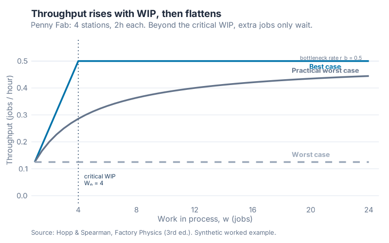
Watch what throughput does as you add WIP. Up to four jobs, more work means more output. Past four, the line is already flat out at 0.5 jobs per hour and extra jobs do nothing but wait. The best case flattens hard at the bottleneck rate. The surprise is the middle line, the practical worst case, which is what a real line with ordinary variability looks like. At the critical WIP of four jobs, it delivers only 0.286 jobs per hour, 57.1% of the bottleneck rate. Same machines. Same WIP. Nearly half the output vanishes into variability.
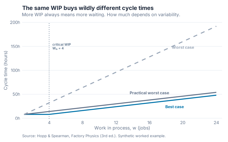
Cycle time tells the darker half of the story. In the practical worst case, four jobs means a 14-hour cycle time. Ten jobs, 26 hours. Twenty jobs, 46 hours. Doubling WIP from 10 to 20 lifts throughput by just 13% while cycle time balloons 77%. You paid for a mountain of inventory to buy a sliver of output. The worst case never beats 0.125 jobs per hour, flat, because everything moves as one giant batch.
The lesson isn’t "less WIP is always better." There’s a right amount, it equals the bottleneck rate times raw process time, and past it you’re buying delay by the truckload.
The utilization wall
Now the law that ruins the most business cases. Managers love high utilization. A machine running 95% of the time feels efficient, thrifty, well-run. It’s a trap.
Sir John Kingman gave us the approximation that explains it (Kingman, 1961). Queue time at a workstation scales with a variability term times a utilization term:
CT_q = ((c_a² + c_e²) / 2) × (u / (1 − u)) × t_e
Ignore the algebra and stare at the middle piece: u / (1 − u). As utilization u creeps toward 1, the denominator shrinks toward zero and the whole thing runs to infinity. A wall, not a slope.
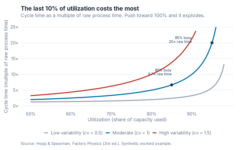
Put numbers on it. Take a station with a two-hour effective process time and moderate variability. At 85% utilization, cycle time sits at 13.33 hours, about 6.7 times the raw process time. Bump it to 95%, ten points, and cycle time jumps to 40.00 hours, 20 times raw process time. That ten-point push roughly triples cycle time.
I’ll say the quiet part out loud: chasing 95% machine utilization is usually a mistake, and the people who order it rarely understand what they’re buying. The last ten points are the most expensive lead time you’ll ever purchase. Sometimes you want that trade, for a monument-sized asset you can’t afford to idle. Usually you don’t, and nobody did the math.
Variability decides how tall the wall is. Kingman’s formula splits it into two coefficients of variation, one for arrivals, one for service. As a rule of thumb, a CV below 0.75 counts as low, 0.75 to 1.33 as moderate, above 1.33 as high. Cut variability and the whole curve drops. That’s the real reason SMED, standardized work, and preventive maintenance pay off: they don’t add capacity, they lower the CV, and a lower CV lets you run closer to the wall.
Batching: the U you keep missing
Ask which batch size is best and you’ll hear two confident, opposite answers. Big batches amortize setups. Small batches cut waiting. Both camps are half right, so both are wrong. The truth is a U.
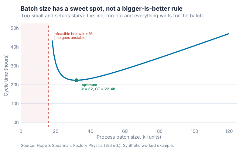
Consider a process with a one-hour setup, six minutes of run time per piece, and jobs arriving six per hour. Below a certain batch size the setups eat so much capacity the line can’t keep up. The smallest feasible batch is 16 units. Try to run smaller and utilization crosses 100%, the queue goes unstable, and cycle time runs to infinity. That’s the left cliff of the U.
Push batches too big and every unit waits for its slowest neighbors before the batch even moves. That’s the right slope. The sweet spot at the bottom lands at a batch of 32 units with a cycle time around 22.4 hours. Run batches of 60 instead and cycle time climbs to about 28.2 hours. Cutting from 60 down to 32 shaves roughly 21% off cycle time, no new equipment, just a smaller number in the batch field.
Bigger isn’t better and neither is smaller. The bottom of the curve moves when your setup time moves. Cut the setup and the whole U slides left. That’s the entire point of SMED.
Push, pull, and the case for a WIP cap
Here’s where theory meets a policy you can actually flip. A push system releases work on a schedule, as fast as the plan says, ready or not. A pull system releases work only when the floor signals it has room. CONWIP (constant work in process) is the cleanest version: cap the jobs allowed on the line, and let a new one in only when a finished one leaves.
Run both policies through the same four-station line with the same random luck. Push releases jobs at 90% of the bottleneck rate. CONWIP caps WIP at 8.
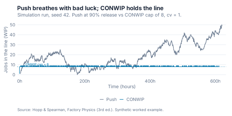
The results, from a simulation run, seed 42:
| Metric | Push | CONWIP (cap 8) |
|---|---|---|
| Throughput (jobs/h) | 0.822 | 0.730 |
| Mean cycle time (h) | 25.68 | 10.94 |
| 95th-percentile cycle time (h) | 50.48 | 17.75 |
| Average WIP | 23.36 | 8.50 |
Read that table twice. Push squeezes out about 12% more throughput and pays for it with about 2.7 times the WIP and 2.3 times the mean cycle time. Worse, look at the 95th percentile: push has a tail past 50 hours, while CONWIP’s worst jobs finish inside 18. Push doesn’t just run slower on average. It runs unpredictably, breathing in and out with every run of bad luck, while CONWIP holds the line flat.
That’s the argument for pull in one chart. Not "pull is philosophically pure," but "a WIP cap trades a little throughput for a lot of predictability." Predictability is what lets you promise a date and hit it.
The buffering law: pick your poison
The last law makes all the others honest. Variability doesn’t vanish when you ignore it. It gets buffered, and you only choose the currency. Hopp and Spearman put it plainly: variability in a system is buffered by some combination of inventory, capacity, and time. Those are the only three options. There is no fourth.
Run the buffering model on a line taking one order a day with ordinary variability, held at 85% utilization. Cycle time settles at 5.67 days of pure time buffer. Want to run hotter? There’s a ceiling. Past a point, the queue swamps the actual work, and for this variability level that ceiling sits at u* = 0.50. Refuse to buffer with time or capacity, and you buffer with inventory instead: protecting a 100-unit-a-day demand stream needs roughly 390 units of safety stock, about 3.9 days of demand.
Notice you never escaped the variability. You moved it. Extra inventory, extra capacity, extra lead time, that’s the whole menu, and every operation is paying in at least one of them right now whether finance named it or not.
Interactive Dashboard
Every figure here is a lever you can pull. Change the bottleneck rate, drag utilization toward the wall, resize the batch, cap the WIP, and watch the numbers move in real time. The laws stop being charts and start being your line.
Interactive Dashboard
Explore the data yourself — adjust parameters and see the results update in real time.
What to do this week
Skip the transformation program. Do these five things instead, in order:
- Run Little’s Law on one value stream today. Count average WIP, count daily completions, divide. You now have a cycle time you never had to time-study. Compare it to what you tell customers.
- Find your critical WIP. Multiply the bottleneck rate (slowest station’s output per hour) by raw process time (sum of station times). If your floor holds far more, you’re carrying pure delay. Cut it and watch cycle time fall.
- Plot your real utilization against the wall. Mark where your bottleneck runs. Past 90%, you’re on the steep part of the curve. Decide, on purpose, whether that trade is worth it.
- Recompute one batch size from the U-curve, not from habit. Take a job with a real setup and check whether a smaller batch cuts lead time without going unstable. That number is probably a decade old.
- Pilot a CONWIP cap on one line for two weeks. Set the cap near your critical WIP, release a new job only when one finishes, and measure the 95th-percentile cycle time before and after. The predictability will surprise you.
The equations sit in the collapsible R code below. Swap in your own numbers and re-run.
References
- Hopp, W. J., & Spearman, M. L. (2011). Factory Physics (3rd ed.). Waveland Press.
- Little, J. D. C. (1961). A Proof for the Queuing Formula: L = λW. Operations Research, 9(3), 383–387. https://doi.org/10.1287/opre.9.3.383
- Kingman, J. F. C. (1961). The single server queue in heavy traffic. Mathematical Proceedings of the Cambridge Philosophical Society, 57(4), 902–904. https://doi.org/10.1017/S0305004100036094
Show R Code
# =============================================================================
# Factory Physics — Image Generation
# =============================================================================
# Generates all 5 static visualizations for the post
#   "Factory Physics: the laws of the factory floor"
# (Hopp & Spearman, Factory Physics, 3rd ed., Waveland Press, 2011).
#
# Output: Images/fp_*.png  (800px wide, white background, dpi = 100)
#
# All numbers here are the SOURCE OF TRUTH for the blog and dashboard.
# Run from the project root:
#   Rscript Scripts/generate_factoryphysics_images.R
# =============================================================================

source("Scripts/theme_inphronesys.R")

library(ggplot2)
library(dplyr)
library(tidyr)
library(scales)

# --- Case colors (per data contract) ------------------------------------
col_best  <- iph_colors$blue    # best case / CONWIP  (#0073aa)
col_pwc   <- iph_colors$grey    # practical worst case / push (#64748b)
col_worst <- "#9aa7b8"          # worst case (light slate, dashed) — readable "light grey"

# Helper to append a common caption
fp_caption <- "Source: Hopp & Spearman, Factory Physics (3rd ed.). Synthetic worked example."

# =============================================================================
# 0. LITTLE'S LAW (console check only — no chart)
# =============================================================================
cat("=== Little's Law ===\n")
cat(sprintf("  Fulfillment: TH=1200/day x CT=3.5 days -> WIP = %.0f orders\n", 1200 * 3.5))
cat(sprintf("  Accounts payable: WIP=2400 / TH=300/day -> CT = %.0f days\n\n", 2400 / 300))

# =============================================================================
# CHART 1 & 2: PENNY FAB — Throughput and Cycle Time vs WIP
# =============================================================================
# Four-station line, each station te = 2h -> T0 = 8h, rb = 1/te = 0.5 jobs/h,
# critical WIP W0 = rb * T0 = 4.
rb <- 0.5; T0 <- 8; W0 <- 4

TH_best  <- function(w) pmin(w / T0, rb)          # best case
TH_pwc   <- function(w) w / (W0 - 1 + w) * rb     # practical worst case
TH_worst <- function(w) rep(1 / T0, length(w))    # worst case (all WIP one batch)

CT_best  <- function(w) pmax(T0, w / rb)          # best case
CT_pwc   <- function(w) T0 + (w - 1) / rb         # practical worst case
CT_worst <- function(w) w * T0                    # worst case

w_seq <- seq(1, 24, by = 0.5)
penny <- tibble(w = w_seq) %>%
  mutate(
    TH_Best = TH_best(w),  TH_PWC = TH_pwc(w),  TH_Worst = TH_worst(w),
    CT_Best = CT_best(w),  CT_PWC = CT_pwc(w),  CT_Worst = CT_worst(w)
  )

cat("=== Penny Fab (rb=0.5, T0=8, W0=4) ===\n")
for (w in c(4, 10, 20)) {
  cat(sprintf("  w=%2d: TH_best=%.3f CT_best=%.1f | TH_PWC=%.3f CT_PWC=%.1f | TH_worst=%.3f CT_worst=%.1f\n",
              w, TH_best(w), CT_best(w), TH_pwc(w), CT_pwc(w), TH_worst(w), CT_worst(w)))
}
cat(sprintf("  PWC at w=4 = %.1f%% of rb\n", TH_pwc(4) / rb * 100))
cat(sprintf("  w=10->20: TH %+.0f%%, CT %+.0f%%\n\n",
            (TH_pwc(20) / TH_pwc(10) - 1) * 100, (CT_pwc(20) / CT_pwc(10) - 1) * 100))

# ---- Chart 1: Throughput vs WIP ----
th_long <- penny %>%
  select(w, Best = TH_Best, PWC = TH_PWC, Worst = TH_Worst) %>%
  pivot_longer(-w, names_to = "Case", values_to = "TH")

p_th <- ggplot(th_long, aes(w, TH, color = Case, linetype = Case)) +
  geom_hline(yintercept = rb, color = iph_colors$lightgrey, linewidth = 0.5) +
  annotate("text", x = 23.5, y = rb + 0.012, label = "bottleneck rate r_b = 0.5",
           hjust = 1, size = 3, color = iph_colors$grey, family = "Inter") +
  geom_vline(xintercept = W0, color = iph_colors$navy, linetype = "dotted", linewidth = 0.6) +
  annotate("text", x = W0 + 0.4, y = 0.06, label = "critical WIP\nW₀ = 4",
           hjust = 0, size = 3.2, color = iph_colors$navy, family = "Inter", lineheight = 0.9) +
  geom_line(linewidth = 1.2) +
  annotate("text", x = 21, y = TH_best(21) - 0.02, label = "Best case",
           color = col_best, fontface = "bold", size = 3.6, family = "Inter") +
  annotate("text", x = 21, y = TH_pwc(21) + 0.028, label = "Practical worst case",
           color = col_pwc, fontface = "bold", size = 3.6, family = "Inter") +
  annotate("text", x = 20, y = TH_worst(20) + 0.028, label = "Worst case",
           color = col_worst, fontface = "bold", size = 3.6, family = "Inter") +
  scale_color_manual(values = c(Best = col_best, PWC = col_pwc, Worst = col_worst)) +
  scale_linetype_manual(values = c(Best = "solid", PWC = "solid", Worst = "dashed")) +
  scale_x_continuous(breaks = seq(0, 24, 4), expand = expansion(mult = c(0.01, 0.03))) +
  scale_y_continuous(limits = c(0, 0.56), breaks = seq(0, 0.5, 0.1)) +
  labs(
    title = "Throughput rises with WIP, then flattens",
    subtitle = "Penny Fab: 4 stations, 2h each. Beyond the critical WIP, extra jobs only wait.",
    x = "Work in process, w (jobs)", y = "Throughput (jobs / hour)",
    caption = fp_caption
  ) +
  theme_inphronesys(grid = "y") + theme(legend.position = "none")

ggsave("https://inphronesys.com/wp-content/uploads/2026/07/fp_penny_th_wip.png", p_th, width = 8, height = 5, dpi = 100, bg = "white")

# ---- Chart 2: Cycle Time vs WIP ----
ct_long <- penny %>%
  select(w, Best = CT_Best, PWC = CT_PWC, Worst = CT_Worst) %>%
  pivot_longer(-w, names_to = "Case", values_to = "CT")

p_ct <- ggplot(ct_long, aes(w, CT, color = Case, linetype = Case)) +
  geom_vline(xintercept = W0, color = iph_colors$navy, linetype = "dotted", linewidth = 0.6) +
  annotate("text", x = W0 + 0.4, y = 150, label = "critical WIP\nW₀ = 4",
           hjust = 0, size = 3.2, color = iph_colors$navy, family = "Inter", lineheight = 0.9) +
  geom_line(linewidth = 1.2) +
  annotate("text", x = 20, y = CT_worst(18.5), label = "Worst case",
           color = col_worst, fontface = "bold", size = 3.6, family = "Inter") +
  annotate("text", x = 16, y = CT_pwc(16) + 15, label = "Practical worst case",
           color = col_pwc, fontface = "bold", size = 3.6, family = "Inter") +
  annotate("text", x = 19, y = CT_best(19) - 14, label = "Best case",
           color = col_best, fontface = "bold", size = 3.6, family = "Inter") +
  scale_color_manual(values = c(Best = col_best, PWC = col_pwc, Worst = col_worst)) +
  scale_linetype_manual(values = c(Best = "solid", PWC = "solid", Worst = "dashed")) +
  scale_x_continuous(breaks = seq(0, 24, 4), expand = expansion(mult = c(0.01, 0.03))) +
  scale_y_continuous(labels = comma_format(suffix = "h")) +
  labs(
    title = "The same WIP buys wildly different cycle times",
    subtitle = "More WIP always means more waiting. How much depends on variability.",
    x = "Work in process, w (jobs)", y = "Cycle time (hours)",
    caption = fp_caption
  ) +
  theme_inphronesys(grid = "y") + theme(legend.position = "none")

ggsave("https://inphronesys.com/wp-content/uploads/2026/07/fp_penny_ct_wip.png", p_ct, width = 8, height = 5, dpi = 100, bg = "white")

# =============================================================================
# CHART 3: THE VUT WALL (Kingman's approximation)
# =============================================================================
# CT / te = 1 + V * u/(1-u), with V = (ca^2 + ce^2)/2 = cv^2 (ca = ce = cv).
te <- 2
V_levels <- c(0.25, 1, 2.25)          # cv = 0.5, 1.0, 1.5
cv_labels <- c("0.25" = "Low variability (cv = 0.5)",
               "1"    = "Moderate (cv = 1)",
               "2.25" = "High variability (cv = 1.5)")

u_seq <- seq(0.5, 0.98, by = 0.005)
vut <- expand_grid(V = V_levels, u = u_seq) %>%
  mutate(mult = 1 + V * (u / (1 - u)),
         Vlab = factor(cv_labels[as.character(V)], levels = unname(cv_labels)))

cat("=== VUT wall (Kingman, te=2, ca=ce=1) ===\n")
CTq <- function(u) ((1 + 1) / 2) * (u / (1 - u)) * te
cat(sprintf("  u=0.85: CTq=%.2fh, CT=%.2fh (%.1fx te)\n", CTq(0.85), CTq(0.85) + te, (CTq(0.85) + te) / te))
cat(sprintf("  u=0.95: CTq=%.2fh, CT=%.2fh (%.1fx te)\n", CTq(0.95), CTq(0.95) + te, (CTq(0.95) + te) / te))
cat(sprintf("  ratio CT(0.95)/CT(0.85) = %.2fx\n\n", (CTq(0.95) + te) / (CTq(0.85) + te)))

# annotation points on the cv = 1 curve
pts <- tibble(
  u = c(0.85, 0.95),
  mult = 1 + 1 * (c(0.85, 0.95) / (1 - c(0.85, 0.95)))
)

p_vut <- ggplot(vut, aes(u, mult, color = Vlab)) +
  geom_line(linewidth = 1.2) +
  geom_point(data = pts, aes(u, mult), inherit.aes = FALSE,
             color = iph_colors$navy, size = 2.6) +
  annotate("text", x = 0.85, y = 6.7 + 3, label = "85% busy\n6.7× raw time",
           hjust = 1, vjust = 0, size = 3.1, color = iph_colors$navy,
           family = "Inter", lineheight = 0.9) +
  annotate("text", x = 0.9, y = 21, label = "95% busy\n20× raw time",
           hjust = 1, vjust = 0.5, size = 3.1, color = iph_colors$navy,
           family = "Inter", lineheight = 0.9) +
  scale_color_manual(values = c(col_worst, iph_colors$blue, iph_colors$red), name = NULL) +
  scale_x_continuous(labels = percent_format(accuracy = 1),
                     breaks = seq(0.5, 0.95, 0.1)) +
  scale_y_continuous(labels = function(x) paste0(x, "×"),
                     limits = c(0, 25), breaks = seq(0, 25, 5)) +
  labs(
    title = "The last 10% of utilization costs the most",
    subtitle = "Cycle time as a multiple of raw process time. Push toward 100% and it explodes.",
    x = "Utilization (share of capacity used)",
    y = "Cycle time (multiple of raw process time)",
    caption = fp_caption
  ) +
  theme_inphronesys(grid = "y") +
  theme(legend.position = "bottom")

ggsave("https://inphronesys.com/wp-content/uploads/2026/07/fp_vut_wall.png", p_vut, width = 8, height = 5, dpi = 100, bg = "white")

# =============================================================================
# CHART 4: THE BATCHING U-CURVE
# =============================================================================
# Process batch of size k, setup ts=1h, per-piece run t0=0.1h, arrivals ra=6/h, cv=1.
# u(k) = ra*(ts + k*t0)/k  (must be < 1 for stability)
# CT(k) = (k-1)/(2*ra)                       [wait-to-batch]
#       + cv^2 * (u/(1-u)) * (ts + k*t0)     [queue at the batch process]
#       + (ts + k*t0)                        [process the batch]
ts <- 1; t0 <- 0.1; ra <- 6; cv <- 1
u_k  <- function(k) ra * (ts + k * t0) / k
CT_k <- function(k) {
  u <- u_k(k)
  (k - 1) / (2 * ra) + cv^2 * (u / (1 - u)) * (ts + k * t0) + (ts + k * t0)
}
# smallest integer batch with utilization STRICTLY below 1 (line stable).
# At k=15, u = 6*(1+1.5)/15 = 1.0 exactly -> unstable; k=16 gives u=0.975.
# Search avoids the exact-boundary rounding trap of ceiling(ra*ts/(1-ra*t0)).
k_min <- min(which(u_k(seq_len(500)) < 1))

k_seq <- 16:120
batch <- tibble(k = k_seq, CT = CT_k(k_seq))
k_opt <- batch$k[which.min(batch$CT)]
ct_opt <- min(batch$CT)

cat("=== Batching U-curve (ts=1, t0=0.1, ra=6, cv=1) ===\n")
cat(sprintf("  min feasible k = %d (u<1)\n", k_min))
cat(sprintf("  optimal k = %d, CT = %.2fh\n", k_opt, ct_opt))
cat(sprintf("  CT(60) = %.2fh ; moving 60 -> %d cuts CT %.0f%%\n\n",
            CT_k(60), k_opt, (CT_k(k_opt) / CT_k(60) - 1) * 100))

p_batch <- ggplot(batch, aes(k, CT)) +
  # infeasible region k < k_min
  annotate("rect", xmin = 0, xmax = k_min, ymin = 0, ymax = Inf,
           fill = iph_colors$red, alpha = 0.06) +
  geom_vline(xintercept = k_min, color = iph_colors$red, linetype = "dashed", linewidth = 0.6) +
  annotate("text", x = k_min + 3, y = 46, label = "infeasible below k = 16\n(line goes unstable)",
           hjust = 0, size = 3.1, color = iph_colors$red, family = "Inter", lineheight = 0.9) +
  geom_line(linewidth = 1.3, color = iph_colors$blue) +
  geom_point(data = tibble(k = k_opt, CT = ct_opt), aes(k, CT),
             color = iph_colors$green, size = 3.4) +
  annotate("text", x = k_opt + 3, y = ct_opt - 3.5,
           label = sprintf("optimum\nk = %d, CT ≈ 22.4h", k_opt),
           hjust = 0, size = 3.2, color = iph_colors$green, family = "Inter",
           fontface = "bold", lineheight = 0.9) +
  scale_x_continuous(breaks = seq(0, 120, 20), limits = c(0, 122),
                     expand = expansion(mult = c(0, 0.02))) +
  scale_y_continuous(labels = comma_format(suffix = "h"), limits = c(0, 50)) +
  labs(
    title = "Batch size has a sweet spot, not a bigger-is-better rule",
    subtitle = "Too small and setups starve the line; too big and everything waits for the batch.",
    x = "Process batch size, k (units)", y = "Cycle time (hours)",
    caption = fp_caption
  ) +
  theme_inphronesys(grid = "y") + theme(legend.position = "none")

ggsave("https://inphronesys.com/wp-content/uploads/2026/07/fp_batch_ucurve.png", p_batch, width = 8, height = 5, dpi = 100, bg = "white")

# =============================================================================
# CHART 5: PUSH vs CONWIP SIMULATION
# =============================================================================
# 4-station tandem line, each station mean te = 1h (rb = 1 job/h, T0 = 4, W0 = 4).
# Lognormal process times, cv = 1. Push: Poisson-like lognormal arrivals at
# 0.9 jobs/h (cv = 1). CONWIP: cap 8, job i enters when job i-cap departs.
# Completion recursion: C[i,s] = max(C[i,s-1], C[i-1,s]) + service.
set.seed(42)

N        <- 600          # jobs simulated
n_stat   <- 4            # stations
te_stn   <- 1            # mean service per station (hours)
cv_proc  <- 1            # process-time CV
push_rate <- 0.9         # push release rate (jobs / hour)
cap      <- 8            # CONWIP WIP cap
warmup   <- 100          # jobs discarded from stats
cooldown <- 50           # trailing jobs excluded from stats / plot (drain)

# lognormal parameters for a given mean and cv
ln_par <- function(m, cvv) {
  s2 <- log(1 + cvv^2)
  list(meanlog = log(m) - s2 / 2, sdlog = sqrt(s2))
}
sp <- ln_par(te_stn, cv_proc)

# shared service-time matrix so both policies face the SAME luck
S <- matrix(rlnorm(N * n_stat, sp$meanlog, sp$sdlog), nrow = N, ncol = n_stat)

# ---- Simulate a line given per-job entry times ----
simulate_line <- function(entry, S) {
  N <- length(entry); ns <- ncol(S)
  C <- matrix(0, nrow = N, ncol = ns)
  for (i in seq_len(N)) {
    prev_stage <- entry[i]                       # C[i, s-1], starts at entry time
    for (s in seq_len(ns)) {
      prev_job <- if (i > 1) C[i - 1, s] else 0  # server free time
      C[i, s]  <- max(prev_stage, prev_job) + S[i, s]
      prev_stage <- C[i, s]
    }
  }
  list(entry = entry, depart = C[, ns])
}

# ---- PUSH: exogenous lognormal interarrivals, mean 1/push_rate ----
ap <- ln_par(1 / push_rate, 1)
inter <- rlnorm(N, ap$meanlog, ap$sdlog)
arrive <- cumsum(inter)
push <- simulate_line(arrive, S)

# ---- CONWIP: first `cap` jobs at t=0; job i enters when job i-cap departs ----
entry_cw <- numeric(N)
C_cw <- matrix(0, nrow = N, ncol = n_stat)
for (i in seq_len(N)) {
  entry_cw[i] <- if (i <= cap) 0 else C_cw[i - cap, n_stat]
  prev_stage <- entry_cw[i]
  for (s in seq_len(n_stat)) {
    prev_job <- if (i > 1) C_cw[i - 1, s] else 0
    C_cw[i, s] <- max(prev_stage, prev_job) + S[i, s]
    prev_stage <- C_cw[i, s]
  }
}
conwip <- list(entry = entry_cw, depart = C_cw[, n_stat])

# ---- Post-warm-up statistics (drop warmup and cooldown; push drifts upward
#      over the window at 0.9 release with cv=1 — that is the teaching point) ----
idx <- (warmup + 1):(N - cooldown)
line_stats <- function(sim, idx) {
  ct <- sim$depart[idx] - sim$entry[idx]
  t_start <- min(sim$depart[idx]); t_end <- max(sim$depart[idx])
  th <- (length(idx) - 1) / (t_end - t_start)          # completions per hour
  # time-average WIP over the window via direct event integration
  ev <- rbind(
    data.frame(t = sim$entry,  d = 1),
    data.frame(t = sim$depart, d = -1)
  )
  ev <- ev[order(ev$t), ]
  ev$wip <- cumsum(ev$d)
  # sample WIP on the window and integrate
  grid <- seq(t_start, t_end, length.out = 4000)
  wip_at <- approx(ev$t, ev$wip, xout = grid, method = "constant", rule = 2)$y
  wbar <- mean(wip_at)
  list(th = th, ct_mean = mean(ct), ct_p95 = as.numeric(quantile(ct, 0.95)), wip = wbar)
}
ps <- line_stats(push, idx)
cs <- line_stats(conwip, idx)

cat("=== Push vs CONWIP simulation (seed 42, R) ===\n")
cat(sprintf("  PUSH  : TH=%.3f jobs/h | mean CT=%.2fh | p95 CT=%.2fh | avg WIP=%.2f\n",
            ps$th, ps$ct_mean, ps$ct_p95, ps$wip))
cat(sprintf("  CONWIP: TH=%.3f jobs/h | mean CT=%.2fh | p95 CT=%.2fh | avg WIP=%.2f\n\n",
            cs$th, cs$ct_mean, cs$ct_p95, cs$wip))

# ---- WIP-over-time trajectory for the plot (trim end-of-run drain) ----
wip_trace <- function(sim, t_max) {
  ev <- rbind(
    data.frame(t = sim$entry,  d = 1),
    data.frame(t = sim$depart, d = -1)
  )
  ev <- ev[order(ev$t), ]
  ev$wip <- cumsum(ev$d)
  ev[ev$t <= t_max, ]
}
# plot window: cut at the last job ENTRY inside the window, so the trailing
# drain (only departures, WIP falling to zero) is excluded from both lines.
t_plot_max <- min(max(push$entry[idx]), max(conwip$entry[idx]))
push_tr <- wip_trace(push,   t_plot_max) %>% mutate(Policy = "Push")
cw_tr   <- wip_trace(conwip, t_plot_max) %>% mutate(Policy = "CONWIP")
trace   <- bind_rows(push_tr, cw_tr) %>%
  mutate(Policy = factor(Policy, levels = c("Push", "CONWIP")))

p_sim <- ggplot(trace, aes(t, wip, color = Policy)) +
  geom_hline(yintercept = cap, color = iph_colors$blue, linetype = "dotted", linewidth = 0.6) +
  annotate("text", x = t_plot_max * 0.02, y = cap + 2.5, label = "CONWIP cap = 8",
           hjust = 0, size = 3, color = iph_colors$blue, family = "Inter") +
  geom_step(linewidth = 0.6, alpha = 0.9) +
  scale_color_manual(values = c(Push = col_pwc, CONWIP = col_best), name = NULL) +
  scale_x_continuous(labels = comma_format(suffix = "h"),
                     expand = expansion(mult = c(0.01, 0.02))) +
  scale_y_continuous(breaks = pretty_breaks(6)) +
  labs(
    title = "Push breathes with bad luck; CONWIP holds the line",
    subtitle = sprintf("Simulation run, seed 42. Push at %.0f%% release vs CONWIP cap of %d, cv = %d.",
                       push_rate * 100, cap, cv_proc),
    x = "Time (hours)", y = "Jobs in the line (WIP)",
    caption = fp_caption
  ) +
  theme_inphronesys(grid = "y") + theme(legend.position = "bottom")

ggsave("https://inphronesys.com/wp-content/uploads/2026/07/fp_pushpull_sim.png", p_sim, width = 8, height = 4, dpi = 100, bg = "white")

# =============================================================================
# 6. VARIABILITY BUFFERING MODEL (console check only — no chart)
# =============================================================================
# One production order per day, te = u days, cv = 1, V = 1.
V_buf <- 1; u_buf <- 0.85; cv_buf <- 1; d_day <- 100
CT_buf <- V_buf * u_buf^2 / (1 - u_buf) + u_buf
u_star <- 1 / (1 + V_buf)
ss <- 1.64 * cv_buf * d_day * sqrt(CT_buf)
cat("=== Variability buffering ===\n")
cat(sprintf("  u=0.85: CT = %.2f days\n", CT_buf))
cat(sprintf("  capacity ceiling (queue <= touch): u* = %.2f\n", u_star))
cat(sprintf("  safety stock (d=100/day) = %.0f units (%.1f days of demand)\n\n", ss, ss / d_day))

cat("All charts written to Images/fp_*.png\n")

# =============================================================================
# APPLY TO YOUR OWN DATA
# =============================================================================
# Swap in your own shop-floor numbers and re-run:
#
#   rb        <- <bottleneck rate, jobs per hour>
#   T0        <- <raw process time, sum of station times, hours>
#   te        <- <mean effective process time at the bottleneck, hours>
#   ca, ce    <- <arrival CV, service CV>  (VUT wall: CTq = ((ca^2+ce^2)/2)*(u/(1-u))*te)
#   ts, t0    <- <setup time, per-piece run time>  (batching U-curve)
#   ra        <- <arrival rate into the batch station>
#   push_rate <- <your release rate>;  cap <- <a candidate CONWIP cap>
#
# Little's Law is the fastest win: measure your average WIP and your daily
# completion rate, then CT = WIP / TH. No MES query, no time study.
# =============================================================================
Leave a Reply