A room full of smart people met for three hours. Sales, operations, finance, the planning team, two directors. They argued, traded spreadsheets, and walked out with one number everybody had signed: 12,400 units a month for the product family.
The number was wrong. Over the next year it ran 8.2% high, missed in 10 months out of 12, and quietly burned through expedite budget every time the warehouse came up short.
Nobody lied. Nobody was lazy. They ran the meeting by the book. That’s the uncomfortable part. A consensus forecast tells you the room agrees. It tells you nothing about whether the room is right.
This post is about that gap. First, what a clean Sales & Operations Planning cycle actually looks like, because the textbook version is genuinely good and worth knowing. Then the trap inside it. Then four moves you can make next month if your planning life is closer to a fire drill than a five-step cadence.
What S&OP is supposed to be
Sales & Operations Planning is the monthly process that forces three plans into one. Sales wants to sell as much as possible. Operations can only build so much. Finance has a budget the business committed to. Left alone, these three teams run on three different numbers and blame each other when reality lands between them.
The fix is structure. S&OP puts them in the same room on a schedule and makes them reconcile. The output is a single consensus plan that covers a rolling horizon of roughly 18 months, refreshed every cycle. Dick Ling at Oliver Wight built the approach in the mid-1980s, and the practitioner playbook most teams still follow is Tom Wallace and Bob Stahl’s How-To Handbook (Wallace & Stahl, 2008).
The classic monthly cadence runs in five steps:
- Product / portfolio review. What’s launching, what’s dying, what changed in the lineup.
- Demand review. Sales and marketing build the unconstrained demand plan: what we could sell.
- Supply review. Operations checks that against capacity, materials, and labor: what we can actually build.
- Pre-S&OP reconciliation. Planners close the gaps between demand, supply, and the financial plan, and tee up the decisions that need an executive.
- Executive S&OP. Leadership signs the one number and owns the trade-offs.
The APICS/ASCM Dictionary frames S&OP as a process for building tactical plans that let management run the business by reconciling customer-facing demand plans with supply capability and the resulting financials. One plan. One number. One direction.
Not everyone runs it at the same level, and that’s expected. Larry Lapide’s maturity model (Lapide, 2005) sorts teams into four stages, from Marginal up through Rudimentary and Classic to Ideal. The clean monthly cadence above is roughly the Classic stage. Most teams sit a rung or two below it, which is exactly the problem this post is about.
What one healthy cycle looks like
Here’s a single cycle for one product family, traced across the four review stages.
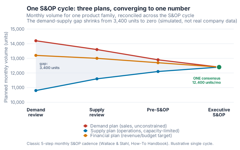
What I like about this chart is how visible the work is. At the demand review, sales wants 14,200 and operations can only commit 10,800. That’s a 3,400-unit gap. It’s the grey band, and the whole reason the meeting exists.
Then the band closes. By the supply review the gap is down to 2,000 as operations frees up capacity and sales trims optimism. By pre-S&OP it’s 800. By executive S&OP it’s zero, and all three plans land on 12,400 units a month. That’s the consensus number. Demand, supply, and finance now run on the same figure instead of three competing ones.
This is S&OP working exactly as designed. The gap surfaced early, got debated, and closed before it became a stockout or a write-off. If your organization can run this cleanly every month, you don’t need the rest of this post. Keep doing it.
Most teams can’t. And here’s the thing the textbook is quiet about.
The trap: agreement is not accuracy
A signed-off number feels like a settled number. It went through five steps. Three departments blessed it. A director put their name on it. Surely it’s right.
Watch what happened to our 12,400.
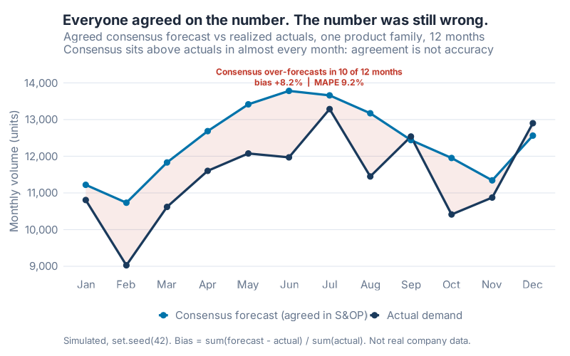
The blue line is the consensus everyone agreed on. The dark line is what actually happened. The consensus sits on top in almost every month. Over the year the agreed plan totaled 148,800 units; real demand came in at 137,562. That’s a signed bias of +8.2%, a MAPE of 9.2%, and over-forecasting in 10 of 12 months.
Read those two error numbers together, because they say different things. The MAPE of 9.2% is the size of the average miss. The bias of +8.2% is the direction. That’s the one that hurts. A forecast that’s 9% off but random nets out over time. A forecast that’s 8% high every single month doesn’t net out. It stocks the warehouse, ties up cash, and forces the markdown later.
This is the part the five-step cadence won’t catch on its own. Consensus measures whether the room agrees. It says nothing about whether the room is collectively optimistic. And rooms are usually optimistic, because sales targets, budget commitments, and the natural human urge to plan for a good year all push the same direction: up.
There’s evidence this is structural, not just bad luck. Fildes, Goodwin, Lawrence, and Nikolopoulos (2009) studied more than 60,000 forecasts across four supply-chain companies and found that upward judgmental adjustments carry an optimism bias and improve accuracy far less often than downward ones. Morlidge (2013), looking at eight consumer and industrial businesses, found that roughly 52% of their forecasts failed to beat a naive forecast. So the next time a planner objects that the team "discussed it thoroughly," remember: discussion is not a debiasing tool. Measurement is.
My view, stated plainly: if your S&OP scoreboard publishes a forecast accuracy number, it’s probably publishing MAPE, and MAPE is the wrong headline. Publish bias first. Bias is the number that tells you whether you’re about to overstock for the fourth quarter running.
When you can’t run the textbook version
Now the honest part. Most planning teams I’d write this for don’t live in the calm world the five-step cadence assumes. They live in interruptions. The demand review gets cancelled because three people are on a customer escalation. The supply numbers arrive an hour before the meeting. Half the agenda is yesterday’s fire, not next quarter’s plan.
If that’s your reality, "run perfect monthly S&OP" is useless advice. You’re not going to. Telling a firefighting team to adopt an 18-month rolling reconciliation process is like telling someone bailing water to install better gutters.
So forget perfect. The win was never the full process. The win is a few disciplined moves that surface the demand-supply gap early and cheaply, and that survive a chaotic week. Here are the four I’d reach for, in order.
Quick win 1: run an exception-based agenda
Stop reviewing all 40 SKUs. Review the ones that disagree.
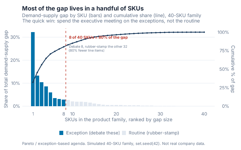
This is a textbook 80/20, and it’s the single highest-leverage change on the list. Rank the 40 SKUs in the family by the size of their demand-supply gap. Eight of them carry 80% of the total gap. The top SKU alone is 32.2% of it; the top five together are 70.6%.
The other 32 SKUs? Demand and supply already roughly agree. There’s nothing to debate. So don’t. Debate the 8 exceptions, rubber-stamp the rest, and you’ve cut 80% of the line items out of the meeting. The agenda shrinks to the decisions that actually move the plan. That alone can turn a three-hour slog into a 45-minute working session.
Quick win 2: enforce one number
Kill the dueling spreadsheets. Sales has a number, ops has a number, finance has a third, and the "S&OP forecast" is a fourth that nobody actually uses. That’s not a process, it’s a negotiation with no referee.
Pick one consensus number per family, sign it, and make every downstream plan inherit from it. The 12,400 from the first chart is the whole point: one figure that demand, supply, and finance all commit to. If a department wants to plan against a different number, that’s a conversation for the meeting, not a private spreadsheet.
Quick win 3: review what changed, not everything
You don’t need a full replan every month. You need to know what moved.
Run a short "what changed since last cycle" review instead of rebuilding the plan from scratch. New customer order? Capacity dropped on line 2? A SKU’s forecast jumped? Those are the deltas. Everything stable stays stable and gets no airtime. A rolling review that only touches the changes is faster to run and far easier to keep alive when the week goes sideways, which is the real test of any process.
Quick win 4: publish a visible scoreboard
Measure two things every cycle and post them where the team can see them: forecast bias and plan attainment.
Bias because, as the second chart showed, a signed-off number can be quietly optimistic for a year before anyone notices. Attainment because it tells you whether the plan you committed to is the plan you delivered. Put both on a wall or a dashboard, update them every cycle, and the conversation changes. "We agreed on it" stops being good enough. "We agreed on it and we were 8% high again" is a problem the team can actually fix.
What the four moves are worth
None of this is a transformation program. It’s four habits. Here’s the lift a stressed team can expect from adopting them.
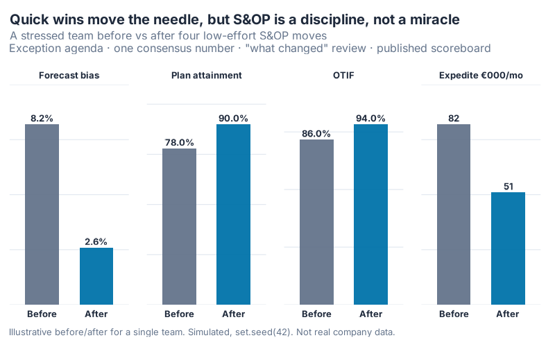
Forecast bias drops from +8.2% to +2.6%. Plan attainment climbs from 78% to 90%. On-time-in-full goes from 86% to 94%. Expedite cost falls from €82,000 to €51,000 a month, which is €31,000 a month you stop spending to rush-ship around your own bad forecast. That’s a number a CFO will read twice.
Notice what didn’t happen. Bias didn’t go to zero. It went to +2.6%, because some optimism is baked into how businesses plan and no amount of process scrubs it out entirely. Attainment didn’t hit 100%. This is the realistic version, not the vendor-slide version. S&OP, even done well, is a discipline that bends the numbers in the right direction. It is not a machine that makes them perfect.
I’d rather promise you 8.2 to 2.6 and deliver it than promise zero and watch you stop believing the scoreboard by March.
Where this breaks
A few honest limits, because overselling this would be its own kind of optimism bias.
The exception agenda assumes your demand-supply gaps are concentrated. Most product families follow the 80/20 shape, but a family of near-identical SKUs with evenly spread gaps won’t, and then you’re back to reviewing more of the list. Check the Pareto before you trust it.
The scoreboard only works if someone owns it. A bias metric nobody is accountable for is decoration. Tie it to a person and a cycle, or skip it.
And bias correction has a failure mode. Once a team sees it’s been 8% high, the temptation is to just cut every forecast by 8%. Resist it. A flat haircut treats every SKU as equally optimistic, and they aren’t. Fildes and colleagues found that ad hoc judgmental tweaks often hurt accuracy more than they help, which is a caution against reflexive across-the-board adjusting. Correct the bias where you understand its cause, SKU by SKU, not with one blanket number.
Your next steps this week
- Pull your last 12 months of consensus-versus-actual for one family and compute the signed bias. Sum the forecasts, sum the actuals, take
(forecast − actual) / actual. If it’s positive and large, you’re systematically optimistic. The R code below has asop_accuracy()function that does it in one line. - Rank that family’s SKUs by demand-supply gap and find your 80% point. The
exception_agenda()function in the code returns exactly which SKUs to debate. Bet it’s a small handful. - Cut your next S&OP agenda down to those exceptions. Walk in with the short list. Rubber-stamp the rest out loud so everyone knows it was a choice, not an oversight.
- Start a one-line scoreboard. Two cells: bias and plan attainment, this cycle. Post it. Update it next cycle. That’s the entire build.
- Replace one full replan with a "what changed" review. Just once, as an experiment. Time both. You’ll feel the difference immediately.
Run the interactive dashboard below first if you want to see how the gap, the bias, and the exception count move when you change the inputs. Then go pull your own numbers. The bias is sitting in your history right now, whether or not anyone has measured it.
Interactive Dashboard
Explore the reconciliation, the consensus bias, and the exception Pareto yourself. Adjust the capacity ceiling, the optimism bias, and the exception threshold, and watch the consensus number, the accuracy readout, and the line-item count update in real time.
Interactive Dashboard
Explore the data yourself — adjust parameters and see the results update in real time.
Show R Code
# =============================================================================
# generate_sop_images.R
# Blog post: "Sales & Operations Planning (S&OP) — What a Perfect Process
#             Looks Like, and What to Do When You Can't Run It"
#
# The contrarian spine: the textbook 5-step monthly S&OP assumes a calm world
# most planners don't live in. The win isn't running perfect S&OP; it's a few
# disciplined moves that surface the demand/supply gap early and cheaply.
#
# This script builds a REALISTIC SIMULATION (not real company data) of ONE
# mid-size manufacturer running S&OP for a single product family, and produces
# four charts that serve the three story beats.
#
# Run from: /Users/jpgrabowski/Documents/03_AI_Projects/08_Blog_Site/
#   Rscript Scripts/generate_sop_images.R
#
# Produces (all 800px wide, white bg, theme_inphronesys):
#   https://inphronesys.com/wp-content/uploads/2026/06/sop_reconciliation.png         (800 x 500)  HERO
#   https://inphronesys.com/wp-content/uploads/2026/06/sop_forecast_vs_actuals.png    (800 x 500)
#   https://inphronesys.com/wp-content/uploads/2026/06/sop_exception_pareto.png       (800 x 500)
#   https://inphronesys.com/wp-content/uploads/2026/06/sop_quickwins_before_after.png (800 x 500)
# =============================================================================

source("Scripts/theme_inphronesys.R")

suppressPackageStartupMessages({
  library(ggplot2)
  library(dplyr)
  library(tidyr)
  library(scales)
})

set.seed(42)

# =============================================================================
# CHART 1 (HERO) — sop_reconciliation.png
# One S&OP cycle: three plans that start divergent and converge to ONE number.
# Units = monthly volume (units) for a single product family. The Financial
# plan is expressed as the volume implied by the revenue/budget target so all
# three are comparable on one axis. These are DESIGNED, deterministic stage
# values illustrating "what one cycle actually looks like".
# =============================================================================

stage_levels <- c("Demand\nreview", "Supply\nreview",
                  "Pre-S&OP", "Executive\nS&OP")

recon <- data.frame(
  stage_idx = 1:4,
  stage     = factor(stage_levels, levels = stage_levels),
  Demand    = c(14200, 13600, 12900, 12400),   # unconstrained, optimistic
  Supply    = c(10800, 11600, 12100, 12400),   # capacity-constrained, lower
  Financial = c(13200, 13000, 12700, 12400)    # revenue/budget target (in volume)
)

consensus_volume  <- recon$Demand[4]               # 12,400 — the one consensus number
gap_demand_supply <- recon$Demand - recon$Supply   # 3400, 2000, 800, 0

recon_long <- recon %>%
  pivot_longer(c(Demand, Supply, Financial),
               names_to = "plan", values_to = "volume") %>%
  mutate(plan = factor(plan, levels = c("Demand", "Supply", "Financial")))

plan_cols <- c("Demand"    = iph_colors$red,
               "Supply"    = iph_colors$blue,
               "Financial" = iph_colors$orange)

# A ribbon to make the shrinking demand-vs-supply gap visible
gap_band <- data.frame(
  stage_idx = 1:4,
  ymin = recon$Supply,
  ymax = recon$Demand
)

p1 <- ggplot() +
  geom_ribbon(data = gap_band,
              aes(x = stage_idx, ymin = ymin, ymax = ymax),
              fill = iph_colors$lightgrey, alpha = 0.6) +
  geom_line(data = recon_long,
            aes(x = stage_idx, y = volume, color = plan),
            linewidth = 1.2) +
  geom_point(data = recon_long,
             aes(x = stage_idx, y = volume, color = plan),
             size = 2.6) +
  # gap callout at the first stage
  annotate("text", x = 1.06, y = mean(c(recon$Demand[1], recon$Supply[1])),
           label = "gap:\n3,400 units", hjust = 0, family = "Inter",
           size = 3.1, fontface = "bold", color = iph_colors$grey,
           lineheight = 0.9) +
  annotate("point", x = 4, y = consensus_volume, size = 5,
           shape = 21, stroke = 1.1,
           fill = iph_colors$green, color = "white") +
  annotate("text", x = 3.98, y = consensus_volume - 900,
           label = "ONE consensus\n12,400 units/mo", hjust = 0.9,
           family = "Inter", size = 3.2, fontface = "bold",
           color = iph_colors$green, lineheight = 0.9) +
  scale_color_manual(values = plan_cols, name = NULL,
                     labels = c("Demand plan (sales, unconstrained)",
                                "Supply plan (operations, capacity-limited)",
                                "Financial plan (revenue/budget target)")) +
  scale_x_continuous(breaks = 1:4, labels = stage_levels,
                     expand = expansion(mult = c(0.05, 0.08))) +
  scale_y_continuous(labels = comma_format(),
                     limits = c(10000, 14800)) +
  labs(
    title    = "One S&OP cycle: three plans, converging to one number",
    subtitle = "Monthly volume for one product family, reconciled across the S&OP cycle\nThe demand-supply gap shrinks from 3,400 units to zero (simulated, not real company data)",
    x = NULL, y = "Planned monthly volume (units)",
    caption  = "Classic 5-step monthly S&OP cadence (Wallace & Stahl, How-To Handbook). Illustrative single cycle."
  ) +
  theme_inphronesys(base_size = 13, grid = "y") +
  theme(axis.text.x = element_text(face = "bold", size = 11,
                                   color = iph_colors$dark,
                                   lineheight = 0.9),
        legend.position = "bottom",
        legend.direction = "vertical",
        legend.margin = margin(t = 2))

ggsave("https://inphronesys.com/wp-content/uploads/2026/06/sop_reconciliation.png", p1, width = 8, height = 5,
       dpi = 100, bg = "white")

# =============================================================================
# CHART 2 — sop_forecast_vs_actuals.png
# The agreed consensus forecast vs realized actuals over 12 months. A consensus
# everyone signed off on is not automatically accurate: persistent upward bias.
# =============================================================================

# Seasonal shape normalised to mean 1 so consensus mean stays ~12,400
season <- c(0.92, 0.88, 0.97, 1.04, 1.10, 1.13,
            1.12, 1.08, 1.02, 0.98, 0.93, 1.03)
season <- season / mean(season)

consensus <- round(consensus_volume * season)

# Actuals run systematically BELOW the consensus (optimism bias) + month noise
bias_factor <- 0.875                      # actuals ~87.5% of forecast on average
actual <- round(consensus * bias_factor * exp(rnorm(12, 0, 0.07)))

fa <- data.frame(month_idx = 1:12, month = month.abb,
                 Consensus = consensus, Actual = actual)

# Bias % = sum(forecast - actual) / sum(actual) * 100  (signed, directional)
forecast_bias  <- sum(fa$Consensus - fa$Actual) / sum(fa$Actual) * 100
# MAPE
mape_consensus <- mean(abs(fa$Actual - fa$Consensus) / fa$Actual) * 100
# How often forecast > actual (over-forecast hit rate)
over_months    <- sum(fa$Consensus > fa$Actual)

fa_long <- fa %>%
  pivot_longer(c(Consensus, Actual), names_to = "series", values_to = "volume") %>%
  mutate(series = factor(series, levels = c("Consensus", "Actual")))

series_cols <- c("Consensus" = iph_colors$blue, "Actual" = iph_colors$navy)

p2 <- ggplot(fa_long, aes(x = month_idx, y = volume, color = series, group = series)) +
  # shade the persistent over-forecast gap
  geom_ribbon(data = fa,
              aes(x = month_idx, ymin = Actual, ymax = Consensus),
              inherit.aes = FALSE,
              fill = iph_colors$red, alpha = 0.10) +
  geom_line(linewidth = 1.1) +
  geom_point(size = 2.3) +
  annotate("text", x = 6.5, y = max(consensus) + 380,
           label = sprintf("Consensus over-forecasts every month\nbias +%.1f%%  |  MAPE %.1f%%",
                           forecast_bias, mape_consensus),
           family = "Inter", size = 3.2, fontface = "bold",
           color = iph_colors$red, lineheight = 0.95) +
  scale_color_manual(values = series_cols, name = NULL,
                     labels = c("Consensus forecast (agreed in S&OP)",
                                "Actual demand")) +
  scale_x_continuous(breaks = 1:12, labels = month.abb) +
  scale_y_continuous(labels = comma_format()) +
  labs(
    title    = "Everyone agreed on the number. The number was still wrong.",
    subtitle = "Agreed consensus forecast vs realized actuals, one product family, 12 months\nConsensus sits above actuals in every month: a signed-off forecast is not an accurate one",
    x = NULL, y = "Monthly volume (units)",
    caption  = "Simulated, set.seed(42). Bias = sum(forecast - actual) / sum(actual). Not real company data."
  ) +
  theme_inphronesys(base_size = 13, grid = "y") +
  theme(legend.position = "bottom")

ggsave("https://inphronesys.com/wp-content/uploads/2026/06/sop_forecast_vs_actuals.png", p2, width = 8, height = 5,
       dpi = 100, bg = "white")

# =============================================================================
# CHART 3 — sop_exception_pareto.png
# 40 SKUs in the family; a handful carry most of the demand/supply gap. The
# quick win: the exec meeting debates those few exceptions, not all 40.
# =============================================================================

n_sku <- 40
# Heavy-tailed gap magnitudes -> a few SKUs dominate
raw_gap   <- rlnorm(n_sku, meanlog = 0, sdlog = 1.95)
gap_share <- sort(raw_gap, decreasing = TRUE)
gap_share <- gap_share / sum(gap_share)            # share of total gap
cum_share <- cumsum(gap_share)

n_80       <- which(cum_share >= 0.80)[1]          # SKUs to reach 80% of gap
share_top  <- cum_share[n_80] * 100                # actual cumulative % at n_80
pct_items  <- n_80 / n_sku * 100                   # % of the portfolio
attention_cut <- (1 - n_80 / n_sku) * 100          # % fewer line items to debate

pareto <- data.frame(
  rank  = 1:n_sku,
  share = gap_share * 100,
  cum   = cum_share * 100,
  exception = factor(ifelse(1:n_sku <= n_80,
                            "Exception (debate these)", "Routine (rubber-stamp)"),
                     levels = c("Exception (debate these)", "Routine (rubber-stamp)"))
)

bar_cols <- c("Exception (debate these)" = iph_colors$blue,
              "Routine (rubber-stamp)"   = iph_colors$lightgrey)

# scale cumulative line (0-100%) onto the bar axis (max share)
scl <- max(pareto$share) / 100

p3 <- ggplot(pareto, aes(x = rank)) +
  geom_col(aes(y = share, fill = exception), width = 0.8) +
  geom_line(aes(y = cum * scl), color = iph_colors$navy, linewidth = 0.9) +
  geom_point(aes(y = cum * scl), color = iph_colors$navy, size = 0.9) +
  geom_vline(xintercept = n_80 + 0.5, linetype = "dashed",
             color = iph_colors$red, linewidth = 0.6) +
  annotate("text", x = n_80 + 1.2, y = max(pareto$share) * 0.93,
           label = sprintf("%d of %d SKUs = %.0f%% of the gap",
                           n_80, n_sku, share_top),
           hjust = 0, family = "Inter", size = 3.4, fontface = "bold",
           color = iph_colors$red) +
  annotate("text", x = n_80 + 1.2, y = max(pareto$share) * 0.78,
           label = sprintf("Debate %d, rubber-stamp the other %d\n(%.0f%% fewer line items)",
                           n_80, n_sku - n_80, attention_cut),
           hjust = 0, family = "Inter", size = 3.0,
           color = iph_colors$grey, lineheight = 0.95) +
  scale_fill_manual(values = bar_cols, name = NULL) +
  scale_y_continuous(
    name = "Share of total demand-supply gap",
    labels = function(x) paste0(round(x), "%"),
    sec.axis = sec_axis(~ . / scl, name = "Cumulative % of gap",
                        labels = function(x) paste0(round(x), "%"))
  ) +
  scale_x_continuous(name = "SKUs in the product family, ranked by gap size",
                     breaks = c(1, n_80, seq(10, n_sku, 10))) +
  labs(
    title    = "Most of the gap lives in a handful of SKUs",
    subtitle = "Demand-supply gap by SKU (bars) and cumulative share (line), 40-SKU family\nThe quick win: spend the executive meeting on the exceptions, not the routine",
    caption  = "Pareto / exception-based agenda. Simulated 40-SKU family, set.seed(42). Not real company data."
  ) +
  theme_inphronesys(base_size = 13, grid = "y") +
  theme(legend.position = "bottom")

ggsave("https://inphronesys.com/wp-content/uploads/2026/06/sop_exception_pareto.png", p3, width = 8, height = 5,
       dpi = 100, bg = "white")

# =============================================================================
# CHART 4 — sop_quickwins_before_after.png
# KPI panel: a stressed team before vs after adopting the quick wins. Deltas
# are realistic, not miraculous (S&OP is a discipline, not a silver bullet).
# "Before" forecast bias is tied to Chart 2's computed bias for consistency.
# =============================================================================

before_bias <- round(forecast_bias, 1)            # from Chart 2 (the same team)
after_bias  <- 2.6                                # bias shrinks, not eliminated

kpi <- tribble(
  ~metric,              ~order, ~Before,     ~After,     ~unit,
  "Forecast bias",      1,      before_bias, after_bias, "%",
  "Plan attainment",    2,      78,          90,         "%",
  "OTIF",               3,      86,          94,         "%",
  "Expedite €000/mo",   4,      82,          51,         ""
)

kpi_long <- kpi %>%
  pivot_longer(c(Before, After), names_to = "phase", values_to = "value") %>%
  mutate(phase  = factor(phase, levels = c("Before", "After")),
         metric = factor(metric, levels = kpi$metric[order(kpi$order)]),
         lab    = ifelse(unit == "%", sprintf("%.1f%%", value),
                         sprintf("%.0f", value)))

phase_cols <- c("Before" = iph_colors$grey, "After" = iph_colors$blue)

p4 <- ggplot(kpi_long, aes(x = phase, y = value, fill = phase)) +
  geom_col(width = 0.62, alpha = 0.95) +
  geom_text(aes(label = lab), vjust = -0.4, family = "Inter",
            fontface = "bold", size = 3.5, color = iph_colors$dark) +
  facet_wrap(~ metric, scales = "free_y", nrow = 1) +
  scale_fill_manual(values = phase_cols, name = NULL) +
  scale_y_continuous(expand = expansion(mult = c(0, 0.22))) +
  labs(
    title    = "Quick wins move the needle, but S&OP is a discipline, not a miracle",
    subtitle = "A stressed team before vs after four low-effort S&OP moves\nException agenda · one consensus number · \"what changed\" review · published scoreboard",
    x = NULL, y = NULL,
    caption  = "Illustrative before/after for a single team. Simulated, set.seed(42). Not real company data."
  ) +
  theme_inphronesys(base_size = 13, grid = "y") +
  theme(axis.text.x = element_text(face = "bold", size = 10,
                                   color = iph_colors$dark),
        axis.text.y = element_blank(),
        strip.text = element_text(face = "bold", size = 10,
                                  color = iph_colors$dark),
        panel.spacing = unit(1.3, "lines"),
        legend.position = "none")

ggsave("https://inphronesys.com/wp-content/uploads/2026/06/sop_quickwins_before_after.png", p4, width = 8, height = 5,
       dpi = 100, bg = "white")

# =============================================================================
# APPLY TO YOUR OWN DATA
# (A) Score your consensus forecast for systematic bias and MAPE.
# (B) Build your exception agenda: find the few SKUs that carry most of the gap.
# =============================================================================

sop_accuracy <- function(data, actual = "actual", forecast = "consensus") {
  a <- data[[actual]]; f <- data[[forecast]]
  data.frame(
    bias_pct  = round(sum(f - a) / sum(a) * 100, 1),   # + = over-forecast
    mape_pct  = round(mean(abs(a - f) / a) * 100, 1),
    n_periods = length(a)
  )
}

exception_agenda <- function(data, sku = "sku", gap = "gap", threshold = 0.80) {
  d <- data[order(-abs(data[[gap]])), ]
  d$share <- abs(d[[gap]]) / sum(abs(d[[gap]]))
  d$cum   <- cumsum(d$share)
  n_focus <- which(d$cum >= threshold)[1]
  list(
    focus_skus  = d[[sku]][seq_len(n_focus)],
    n_focus     = n_focus,
    n_total     = nrow(d),
    pct_items   = round(n_focus / nrow(d) * 100, 1),
    gap_covered = round(d$cum[n_focus] * 100, 1)
  )
}
References
- Wallace, T. F., & Stahl, R. A. (2008). Sales and Operations Planning: The How-To Handbook (3rd ed.). T. F. Wallace & Co. ISBN 978-0-9674884-5-5.
- Ling, R. C., & Goddard, W. E. (1988). Orchestrating Success: Improve Control of the Business with Sales & Operations Planning. Oliver Wight Library / Wiley. ISBN 978-0-471-13227-1.
- Lapide, L. (2005). An S&OP Maturity Model. The Journal of Business Forecasting, 24(3), 15–19. (Stages: Marginal, Rudimentary, Classic, Ideal.)
- APICS / ASCM. APICS Dictionary (16th ed.), now the ASCM Supply Chain Dictionary. Definition of Sales & Operations Planning (paraphrased). https://www.ascm.org/apics-dictionary-16th-edition/
- Fildes, R., Goodwin, P., Lawrence, M., & Nikolopoulos, K. (2009). Effective forecasting and judgmental adjustments: an empirical evaluation and strategies for improvement in supply-chain planning. International Journal of Forecasting, 25(1), 3–23. DOI: 10.1016/j.ijforecast.2008.11.010.
- Morlidge, S. (2013). How Good Is a "Good" Forecast? Forecast Errors and Their Avoidability. Foresight: The International Journal of Applied Forecasting, 30, 5–11.
Leave a Reply