
The Game That Has Been Humbling Smart People Since the 1960s
The Beer Game is a rite of passage. MIT’s Sloan School built it in the early 1960s to teach one lesson, and it has been teaching that same lesson to executives, engineers, and MBA students ever since. The rules fit on an index card. Four players form a supply chain: a retailer, a wholesaler, a distributor, and a factory. Beer flows downstream toward the customer. Orders flow upstream toward the factory. Each week you check your inventory, guess how much to order, and pass it up the line.
That’s it. No spreadsheets. No forecasting software. Four people trying not to run out of beer or drown in it.
Almost every time, the chain melts down. Inventory swings wildly. The factory ends up building a mountain of beer nobody wants, weeks after a tiny bump in customer demand. The players didn’t misbehave. They played the incentives in front of them, and the structure did the rest. That structural failure has a name, and it’s the most expensive recurring mistake in supply chain management: the bullwhip effect.
So I asked a question the original designers never could. What happens when the players aren’t tired humans, but AI agents? And if I’m paying for the agent, does buying a smarter one actually fix the chain?
What the Beer Game Is Really Testing
The Beer Game looks like a game about beer. It’s a game about information.
Each player sees only their own corner of the world. The retailer knows what customers bought. The factory, four links away, sees nothing but the orders coming from the distributor. By the time a demand signal travels up the chain, every player has piled their own guesswork on top: a little extra safety stock here, a panic order there, a cancellation when the warehouse fills up. Small ripples at the customer end become tidal waves at the factory. A modest bump in demand can turn into a swing several times larger upstream.
The classic fix isn’t a smarter person in the factory chair. It’s better information. If everyone could see actual customer demand instead of guessing from the noisy orders in front of them, the whole chain calms down. That idea is decades old. What nobody had tested is whether a modern AI agent, dropped into that same chair, behaves any differently.
The Setup: Five Years, 260 Weeks, Real Chaos
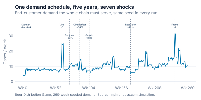
A 36-week toy simulation proves nothing. Real supply chains live through seasons, trends, viral spikes, and recessions. So I ran the Beer Game over a 260-week horizon (five full years) on a single seeded demand schedule, identical across every run, built to punish anyone who assumes next week looks like last week.
The schedule fires seven named events, each a different kind of stress test:
- Week 5: the classic Sterman step change (demand doubles from 4 to 8).
- Week 62: a viral spike (demand triples for three weeks).
- Week 74: a summer ramp of +35%, recurring every year after.
- Week 90: an Oktoberfest surge of +80%, also recurring yearly (this is a beer game, after all).
- Week 105: a growth trend kicks in, so the chain can’t settle into a steady state.
- Week 170: a recession that cuts demand 40% for a quarter.
- Week 240: a promo that doubles demand for two weeks, the kind of self-inflicted wound trade promotions cause.
Every tier runs the same order-up-to logic underneath. The only things that change are who makes the weekly order decision and what they get to see.
One note before the numbers, because it matters. Every dollar in this post is an in-game cost: 50 cents per case per week for inventory you’re holding, one dollar per case per week for orders you can’t fill. That game money has nothing to do with what the AI models cost to run. I’ll keep those two ideas in separate boxes, and so should you.
Four Ways to Play Each Chair
I tested each supply chain tier under a few different brains.
The dumb formula. A simple demand-smoothing policy. No memory, no strategy. It reacts to what it saw last week and orders accordingly. This is the baseline, and it’s roughly how a lot of real reorder points actually behave.
The AI agent. A large language model in the chair, reading its situation in plain language each week and deciding how much to order. I ran two models. Claude Sonnet 5 is Anthropic’s cheaper mid-tier model (roughly $3 per million input tokens and $15 per million output tokens). Claude Fable 5 is the flagship, the most capable and by far the most expensive model in the lineup, priced above even Opus at about $10 and $50 per million tokens, more than triple Sonnet’s rate. If raw intelligence tames the bullwhip, the pricier model should pull ahead.
Then I crossed each agent with the variable that actually matters:
Blind. The agent sees only its own local numbers: its inventory, its backlog, the orders it receives. Same tunnel vision the human players suffer.
Shared. The agent also sees the true end-customer demand history. Same brain, now able to look past the noise and watch the real signal.
That gives a clean contest. Does a smarter model beat a cheaper one? Does seeing real demand beat flying blind? And if you can fix only one thing, which lever should you pull?
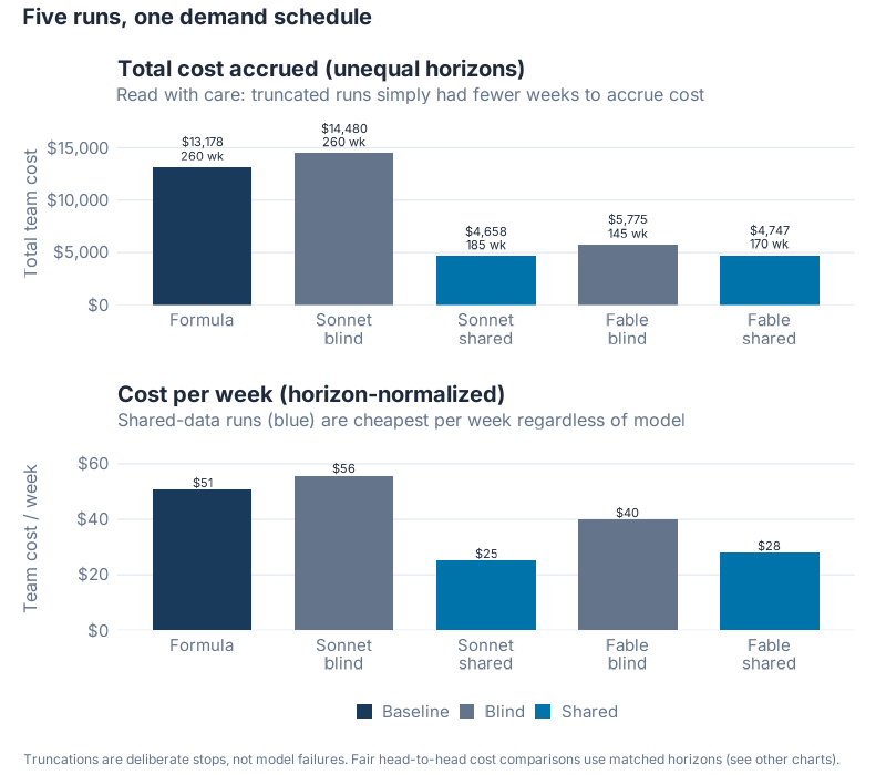
One housekeeping detail, because I’d rather you hear it from me than spot it in the charts. The runs reached different lengths. The dumb formula and the blind Sonnet agent ran the full 260 weeks. The other three stopped earlier, some by my choice and some because the run reached its budget, at weeks 185, 170, and 145. That means I never compare full totals head to head, because a run that lasts longer racks up more cost just by existing. Every comparison below is matched-horizon: two runs are compared only over the weeks they both actually completed. It’s the honest way to score an unfinished race.
The Result Nobody in the Room Bet On
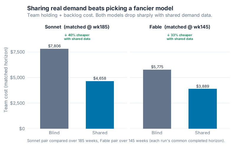
Here’s what happened when I flipped a single agent from blind to shared, holding the model fixed.
| Model | Blind | Shared | Reduction |
|---|---|---|---|
| Sonnet 5 (matched @ wk185) | $7,806 | $4,659 | 40.3% |
| Fable 5 (matched @ wk145) | $5,775 | $3,889 | 32.7% |
Look at what didn’t change and what did. Same model. Same weights. Same price per token. The only difference between the two columns is whether the agent could see real customer demand. Sonnet got 40.3% cheaper with shared data. Fable got 32.7% cheaper. Both, dramatically, from information alone.
I’ll say it plainly. The information you feed an agent matters more than the intelligence you pay for.
And the blind agents weren’t quietly beating the dumb formula behind the scenes, either. Over the weeks all three blind players completed, the smoothing rule held its own.
| Chair (matched @ wk145) | In-game cost | vs. formula |
|---|---|---|
| Fable 5, blind | $5,775 | 1.3% cheaper |
| Formula (dumb rule) | $5,852 | baseline |
| Sonnet 5, blind | $6,553 | 12.0% worse |
A frontier model, flying blind, barely edged a smoothing formula in one case and lost to it outright in the other. Intelligence with no view of the real signal isn’t dependably better than a rule you could write on a napkin. That’s the uncomfortable half of the finding, and it sets up the useful half.
Why Visibility Beats Raw Intelligence
This is the bullwhip effect, and it explains the whole result.
When an agent is blind, it’s reacting to orders that have already been distorted by everyone downstream. It’s trying to forecast a signal that’s mostly noise, built from other people’s safety stock and panic. A smarter model in that seat just makes more confident wrong decisions. It can’t out-think missing information.
Give that same agent the real demand history, and the problem changes shape. Now it can tell the difference between a genuine shift in customer behavior and an artificial spike caused by the tier below it ordering ahead. It stops chasing ghosts.
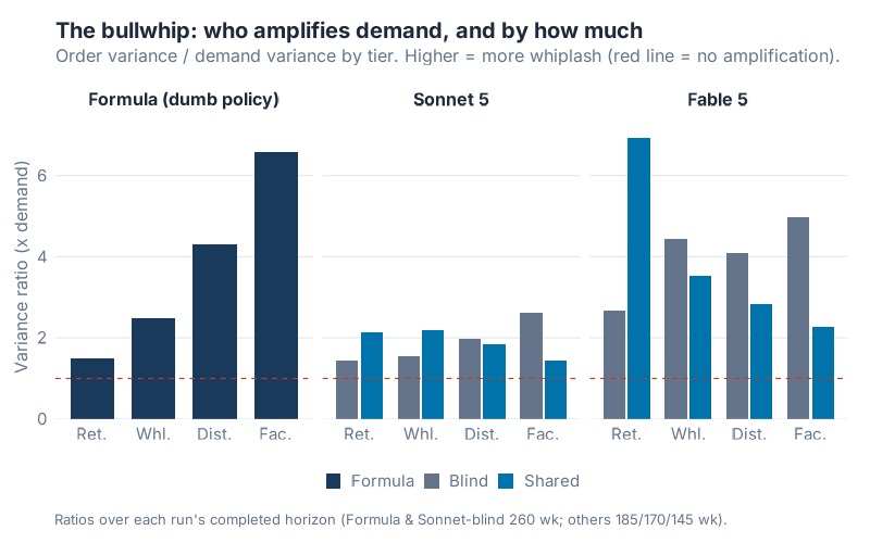
The bullwhip numbers make it concrete. The dumb formula shows the textbook pattern: variance amplifies at every step upstream, from 1.49 at the retailer to 2.48, then 4.30, then 6.57 at the factory. That’s the whip cracking. The shared-data agents flip it. Sonnet with shared data peaks near the retailer at 2.13 and then collapses to 1.45 at the factory. The factory, normally the worst victim, becomes the calmest link in the chain. Read that again. Sharing the signal didn’t just shrink the bullwhip. It reversed its direction.
The Upset: The Cheaper Model Came Out Ahead
Now the part I didn’t see coming.
With both agents given shared data, I compared them over the 170 weeks they both completed. The winner on cost wasn’t the flagship.
| Chair (matched @ wk170) | In-game cost |
|---|---|
| Sonnet 5, shared | $4,093 |
| Fable 5, shared | $4,747 |
| Formula (dumb rule), reference | $6,909 |
| Sonnet 5, blind, reference | $7,230 |
Sonnet, the cheaper model, came in 13.8% below Fable, the pricier flagship. Both crushed the formula and the blind agent. But the premium model lost the head-to-head.
Why? The decision logs tell the story better than any summary statistic. Same week, week 64, both agents looking at the same viral spike in real customer demand. Sonnet’s retailer:
"End-customer demand has held near 25/week for three straight weeks (not a one-off blip), but my supply line of 56 was sized for the old ~8/week demand… Ordering 45 (well above the 22 I sent last week) closes that gap without swinging so hard it creates a second whiplash wave upstream."
Fable’s retailer, same week, same data:
"Ordering 90 closes that gap in one clear pipeline-fill signal, after which I will drop back to steady ~25/week orders to avoid amplifying the bullwhip."
Both agents named the bullwhip. Both said they wanted to avoid it. Sonnet capped its order at 45. Fable fired a single 90-case order. That one overreaction shows up in Fable’s retailer variance ratio of 6.93, the highest of any tier in any shared run, and it’s the reason Fable’s shared team cost more than Sonnet’s.
I expected the flagship to win. My read now is that the task simply stopped rewarding extra horsepower once both agents could see the real signal. The Beer Game with full information isn’t a hard reasoning problem. It’s a disciplined bookkeeping problem. Both models were plenty smart enough, so the marginal intelligence you pay a premium for had almost nothing left to add. Past a certain capability bar, buying a smarter model is the wrong lever. Spend on closing the information gap instead.
Where This Breaks
I don’t want to oversell a simulation, so here’s the honest boundary of what I ran.
This is a single seeded demand schedule, not a Monte Carlo sweep over thousands of scenarios. The exact dollar figures are tied to this particular five years of events. A different demand path would shift the numbers. The direction of the headline finding, though, is exactly what forty years of bullwhip research predicts, so I’d be surprised if it reversed.
The horizons are uneven, and that’s a real limitation, not a footnote. Three of the five runs stopped short, so I lean on matched-horizon comparisons and cost-per-week to keep things fair. On a per-week basis the pattern holds cleanly: the shared-data runs cost about $25 and $28 per week, while the blind runs and the formula sit at $40, $51, and $56. Both shared runs are cheapest per week regardless of model. There’s a small piece of narrative luck in the data too: Fable’s shared run froze at week 170, the exact week the recession begins, so it never had to ride out the downturn. Its last completed decision is a retailer calmly holding position right at the cliff edge.
One more caveat worth naming. The Sonnet-versus-Fable gap was 13.8% over one demand path. That’s meaningful, but I wouldn’t stake a procurement decision on that single number. The finding that holds is the big one, information versus intelligence, not the narrow one about which model nosed ahead.
And "shared information" in my setup means perfect, instant visibility into true demand. Real point-of-sale sharing is laggier and dirtier than that. Treat the shared numbers as the optimistic ceiling, not the figure you’ll hit next quarter.
What This Is Worth in the Real World
Translate the simulation back to a real chain and the logic holds. The mechanism that cut cost by up to 40% here is the one Lee, Padmanabhan, and Whang (1997) named "demand signal processing": every tier reacts to the distorted orders in front of it instead of true end-customer demand. Sharing point-of-sale data removes exactly that distortion. I walked through the amplification in far more detail, with worked examples like the COVID toilet paper crisis and the Cisco inventory write-down, in the Bullwhip Effect post on this blog.
The AI angle just changes the price of admission. You no longer need a full demand-sensing platform to put a competent decision-maker in every chair. You need two things: an agent good enough to follow the logic, and a pipe that feeds it real demand. My results say the second one is where the money is.
Interactive Dashboard
Play it yourself. Adjust the model, flip between blind and shared information, watch the bullwhip build across the five years of events, then take a seat and try to beat the AI at its own game.
Interactive Dashboard
Explore the data yourself — adjust parameters and see the results update in real time.
Your Next Steps
You don’t need a simulation to act on this. Here’s what to do this week:
-
Find your blind tiers. Walk your chain and ask at each link: does this planner see actual end-customer demand, or just the order from the tier below? Every blind link is a bullwhip amplifier. List them.
-
Measure the amplification. Pull twelve months of order data and compute the variance of orders divided by the variance of true demand at each tier. Much above 1.0 means you’re amplifying. The R code below runs this on your own data.
-
Share the real signal before you buy anything. Prioritize getting point-of-sale or true-demand data to your upstream planners over any new forecasting tool. My run says visibility is the higher-return move by a wide margin.
-
If you’re piloting AI agents, right-size the model. Test the mid-tier model first. Only pay up for the flagship if a head-to-head on your actual task shows it earning the premium. For a well-specified planning task with good data, it often won’t.
-
Run the game. Use the R code and the dashboard to model your own demand pattern and event calendar. Bring the cost chart to your next S&OP meeting. Numbers move decisions, and a 40% cost gap is a number leadership understands.
Show R Code
# =============================================================================
# generate_beergame_5yr_images.R
# Charts for the "AI Beer Game" 5-year (260-week) rebuild post.
#
# Study design (all runs share ONE seeded 260-week demand schedule):
#   formula        — dumb smoothing policy, full 260 weeks
#   sonnet_blind   — Claude Sonnet 5, local info only, full 260 weeks
#   sonnet_shared  — Claude Sonnet 5, sees end-customer POS, 185 wks (stopped early)
#   fable_blind    — Claude Fable 5, local info only, 145 wks (hit credit wall)
#   fable_shared   — Claude Fable 5, sees end-customer POS, 170 wks (hit credit wall)
#
# NOTE ON FRAMING: Claude Fable 5 is Anthropic's FLAGSHIP / most expensive model
# ($10/$50 per Mtok). Sonnet 5 is the cheaper mid-tier. In-game team cost below is
# holding/backlog cost in $ and has nothing to do with API pricing.
#
# All cost comparisons are MATCHED-HORIZON (truncated runs compared only over the
# weeks both legs actually completed) so no run is unfairly credited for weeks it
# never ran.
#
# Run from project root:  Rscript Scripts/generate_beergame_5yr_images.R
# =============================================================================

source("Scripts/theme_inphronesys.R")

suppressPackageStartupMessages({
  library(ggplot2)
  library(dplyr)
  library(tidyr)
  library(scales)
  library(patchwork)
})

set.seed(42)  # no randomness here, but per house convention

DATA_DIR <- "Research/beer_game_results"
OUT_DIR  <- "Images"
dollar0  <- scales::label_dollar(accuracy = 1)

# --- Load all run state CSVs -------------------------------------------------
runs <- list(
  formula       = "run_formula_5yr_state.csv",
  sonnet_blind  = "run_sonnet_blind_5yr_state.csv",
  sonnet_shared = "run_sonnet_shared_5yr_state.csv",
  fable_blind   = "run_fable_blind_5yr_state.csv",
  fable_shared  = "run_fable_shared_5yr_state.csv"
)
state <- lapply(runs, function(f) read.csv(file.path(DATA_DIR, f), stringsAsFactors = FALSE))
run_weeks <- sapply(state, function(d) max(d$week))
cat("Weeks per run:\n"); print(run_weeks)

# --- Helpers -----------------------------------------------------------------
# Team cost = sum of every tier's weekly cost up to (and including) `cutoff` week
team_cost <- function(df, cutoff = Inf) sum(df$cost_week[df$week <= cutoff])

# Population variance (matches the simulation's numpy var, denominator = N)
var_pop <- function(x) mean((x - mean(x))^2)

tier_order <- c("retailer", "wholesaler", "distributor", "factory")

# =============================================================================
# CHART 1 — 260-week end-customer demand with named events
# =============================================================================
demand <- state$formula %>%
  filter(tier == "retailer") %>%
  transmute(week, demand = customer_demand)

events <- data.frame(
  week  = c(5, 62, 74, 90, 105, 170, 240),
  label = c("Sterman\nstep 4>8", "Viral\nx3", "Summer\n+35%",
            "Oktoberfest\n+80%", "Growth\ntrend", "Recession\n-40%",
            "Promo\nx2"),
  ytop  = c(38, 38, 31, 38, 31, 38, 38)   # stagger clustered labels vertically
)

p1 <- ggplot(demand, aes(week, demand)) +
  geom_vline(data = events, aes(xintercept = week),
             color = iph_colors$grey, linetype = "dashed", linewidth = 0.35) +
  geom_line(color = iph_colors$blue, linewidth = 0.7) +
  geom_text(data = events, aes(x = week, y = ytop, label = label),
            inherit.aes = FALSE, family = "Inter", size = 2.5,
            color = iph_colors$navy, lineheight = 0.85, vjust = 1) +
  scale_x_continuous(breaks = seq(0, 260, 52),
                     labels = paste0("Wk ", seq(0, 260, 52))) +
  scale_y_continuous(limits = c(0, 39), breaks = seq(0, 30, 10)) +
  labs(
    title = "One demand schedule, five years, seven shocks",
    subtitle = "End-customer demand the whole chain must serve, same seed in every run",
    x = NULL, y = "Cases / week",
    caption = "Beer Distribution Game, 260-week seeded demand. Source: inphronesys.com simulation."
  ) +
  theme_inphronesys(grid = "y")

ggsave(file.path(OUT_DIR, "beergame_demand_timeline.png"), p1,
       width = 8, height = 4, dpi = 100, bg = "white")

# =============================================================================
# CHART 2 — HEADLINE: value of information sharing (matched horizons)
# Sonnet pair compared @wk185, Fable pair compared @wk145.
# =============================================================================
info <- tibble::tribble(
  ~model,   ~condition, ~horizon, ~cost,
  "Sonnet", "Blind",    185, team_cost(state$sonnet_blind,  185),
  "Sonnet", "Shared",   185, team_cost(state$sonnet_shared, 185),
  "Fable",  "Blind",    145, team_cost(state$fable_blind,   145),
  "Fable",  "Shared",   145, team_cost(state$fable_shared,  145)
) %>%
  mutate(
    model     = factor(model, levels = c("Sonnet", "Fable")),
    condition = factor(condition, levels = c("Blind", "Shared")),
    facet     = factor(paste0(model, "  (matched @ wk", horizon, ")"),
                       levels = c("Sonnet  (matched @ wk185)",
                                  "Fable  (matched @ wk145)"))
  )

# per-model % reduction from sharing, for annotation
info_lab <- info %>%
  group_by(model, facet) %>%
  summarise(drop = (cost[condition == "Blind"] - cost[condition == "Shared"]) /
                     cost[condition == "Blind"], .groups = "drop")

p2 <- ggplot(info, aes(condition, cost, fill = condition)) +
  geom_col(width = 0.62) +
  geom_text(aes(label = dollar0(cost)), vjust = -0.5,
            family = "Inter", size = 3.4, color = iph_colors$dark) +
  geom_text(data = info_lab, inherit.aes = FALSE,
            aes(x = 1.5, y = Inf, label = paste0("v ", percent(drop, accuracy = 1),
                                                 " cheaper\nwith shared data")),
            vjust = 1.4, family = "Inter", size = 3.0, color = iph_colors$green,
            fontface = "bold", lineheight = 0.9) +
  facet_wrap(~facet) +
  scale_fill_manual(values = c(Blind = iph_colors$grey, Shared = iph_colors$blue)) +
  scale_y_continuous(labels = dollar0, expand = expansion(mult = c(0, 0.22))) +
  labs(
    title = "Sharing real demand beats picking a fancier model",
    subtitle = "Team holding + backlog cost. Both models drop sharply with shared demand data.",
    x = NULL, y = "Team cost (matched horizon)", fill = NULL,
    caption = "Sonnet pair compared over 185 weeks, Fable pair over 145 weeks (each run's common completed horizon)."
  ) +
  theme_inphronesys(grid = "y") +
  theme(legend.position = "none")

ggsave(file.path(OUT_DIR, "beergame_info_sharing.png"), p2,
       width = 8, height = 5, dpi = 100, bg = "white")

# =============================================================================
# CHART 3 — All five runs, transparent about truncation
# Left: full-horizon total team cost (week count labeled).
# Right: cost per week (fair-ish normalization given unequal horizons).
# =============================================================================
overview <- tibble::tibble(
  run   = names(state),
  label = c("Formula", "Sonnet\nblind", "Sonnet\nshared", "Fable\nblind", "Fable\nshared"),
  cond  = c("Baseline", "Blind", "Shared", "Blind", "Shared"),
  weeks = as.integer(run_weeks[names(state)]),
  total = sapply(state, team_cost)
) %>%
  mutate(
    per_week = total / weeks,
    label    = factor(label, levels = label),
    cond     = factor(cond, levels = c("Baseline", "Blind", "Shared"))
  )

fill_cond <- c(Baseline = iph_colors$navy, Blind = iph_colors$grey, Shared = iph_colors$blue)

p3a <- ggplot(overview, aes(label, total, fill = cond)) +
  geom_col(width = 0.7) +
  geom_text(aes(label = paste0(dollar0(total), "\n", weeks, " wk")),
            vjust = -0.3, family = "Inter", size = 2.9,
            color = iph_colors$dark, lineheight = 0.9) +
  scale_fill_manual(values = fill_cond) +
  scale_y_continuous(labels = dollar0, expand = expansion(mult = c(0, 0.20))) +
  labs(title = "Total cost accrued (unequal horizons)",
       subtitle = "Read with care: truncated runs simply had fewer weeks to accrue cost",
       x = NULL, y = "Total team cost", fill = NULL) +
  theme_inphronesys(grid = "y") +
  theme(legend.position = "none")

p3b <- ggplot(overview, aes(label, per_week, fill = cond)) +
  geom_col(width = 0.7) +
  geom_text(aes(label = dollar0(per_week)), vjust = -0.3,
            family = "Inter", size = 2.9, color = iph_colors$dark) +
  scale_fill_manual(values = fill_cond) +
  scale_y_continuous(labels = dollar0, expand = expansion(mult = c(0, 0.18))) +
  labs(title = "Cost per week (horizon-normalized)",
       subtitle = "Shared-data runs (blue) are cheapest per week regardless of model",
       x = NULL, y = "Team cost / week", fill = NULL) +
  theme_inphronesys(grid = "y") +
  theme(legend.position = "bottom")

p3 <- p3a / p3b +
  plot_annotation(
    title = "Five runs, one demand schedule",
    caption = "Truncations are deliberate stops, not model failures. Fair head-to-head cost comparisons use matched horizons (see other charts).",
    theme = theme(
      plot.title = element_text(family = "Inter", face = "bold",
                                size = 15, color = iph_colors$dark),
      plot.caption = element_text(family = "Inter", size = 9,
                                  color = iph_colors$grey, hjust = 0)
    )
  )

ggsave(file.path(OUT_DIR, "beergame_cost_overview.png"), p3,
       width = 8, height = 7, dpi = 100, bg = "white")

# =============================================================================
# CHART 4 — Bullwhip: order-variance amplification by tier
# Variance ratio = var(orders at tier) / var(end-customer demand), per run horizon.
# Faceted by model group; blind vs shared side by side; formula as baseline.
# =============================================================================
bullwhip <- lapply(names(state), function(nm) {
  d  <- state[[nm]]
  dv <- var_pop(d$customer_demand[d$tier == "retailer"])   # demand var over this horizon
  d %>%
    group_by(tier) %>%
    summarise(ratio = var_pop(order_placed) / dv, .groups = "drop") %>%
    mutate(run = nm)
}) %>% bind_rows()

bullwhip <- bullwhip %>%
  mutate(
    model = case_when(run == "formula" ~ "Formula (dumb policy)",
                      grepl("sonnet", run) ~ "Sonnet 5",
                      grepl("fable",  run) ~ "Fable 5"),
    condition = case_when(run == "formula" ~ "Formula",
                          grepl("blind",  run) ~ "Blind",
                          grepl("shared", run) ~ "Shared"),
    tier  = factor(tier, levels = tier_order,
                   labels = c("Retailer", "Wholesaler", "Distributor", "Factory")),
    model = factor(model, levels = c("Formula (dumb policy)", "Sonnet 5", "Fable 5")),
    condition = factor(condition, levels = c("Formula", "Blind", "Shared"))
  )

fill_bw <- c(Formula = iph_colors$navy, Blind = iph_colors$grey, Shared = iph_colors$blue)

p4 <- ggplot(bullwhip, aes(tier, ratio, fill = condition)) +
  geom_col(position = position_dodge(width = 0.8), width = 0.72) +
  geom_hline(yintercept = 1, color = iph_colors$red, linetype = "dashed",
             linewidth = 0.4) +
  facet_wrap(~model) +
  scale_fill_manual(values = fill_bw) +
  scale_x_discrete(labels = c("Ret.", "Whl.", "Dist.", "Fac.")) +
  scale_y_continuous(expand = expansion(mult = c(0, 0.08))) +
  labs(
    title = "The bullwhip: who amplifies demand, and by how much",
    subtitle = "Order variance / demand variance by tier. Higher = more whiplash (red line = no amplification).",
    x = NULL, y = "Variance ratio (x demand)", fill = NULL,
    caption = "Ratios over each run's completed horizon (Formula & Sonnet-blind 260 wk; others 185/170/145 wk)."
  ) +
  theme_inphronesys(grid = "y")

ggsave(file.path(OUT_DIR, "beergame_bullwhip.png"), p4,
       width = 8, height = 5, dpi = 100, bg = "white")
References
- Sterman, J.D. (1989). "Modeling Managerial Behavior: Misperceptions of Feedback in a Dynamic Decision Making Experiment." Management Science, 35(3), 321-339. DOI: 10.1287/mnsc.35.3.321. https://pubsonline.informs.org/doi/10.1287/mnsc.35.3.321
- Lee, H.L., Padmanabhan, V., & Whang, S. (1997). "Information Distortion in a Supply Chain: The Bullwhip Effect." Management Science, 43(4), 546-558. DOI: 10.1287/mnsc.43.4.546. https://pubsonline.informs.org/doi/10.1287/mnsc.43.4.546
- Forrester, J.W. (1961). Industrial Dynamics. MIT Press, Cambridge, MA. ISBN: 0-262-06003-5.
- Anthropic. "Pricing." https://www.anthropic.com/pricing
- Inphronesys. "The Bullwhip Effect: Why a 10% Demand Blip Becomes a 400% Supply Chain Earthquake." https://inphronesys.com/2026/02/22/the-bullwhip-effect-why-a-10-demand-blip-becomes-a-400-supply-chain-earthquake/
Leave a Reply