The $1.77 Trillion Spreadsheet Problem
Here’s a number that should make every supply chain professional uncomfortable: $1.77 trillion. That’s the estimated annual cost of inventory distortion worldwide — overstocks, stockouts, and shrinkage — according to the IHL Group’s 2023 study. And a staggering share of that waste traces back to one root cause: bad forecasts.
Now here’s the uncomfortable part. Most of those forecasts are built in Excel.
Excel is a brilliant tool for what it was designed to do. But using it for demand forecasting is like performing surgery with a butter knife. The typical Excel forecasting workflow goes something like this: someone copies last year’s numbers into a new tab, adds a growth factor they got from a sales meeting, eyeballs a seasonal pattern, and calls it a forecast. There’s no model comparison. No accuracy measurement. No decomposition. No prediction intervals. Just a single point estimate floating in a sea of conditional formatting, protected by nothing but faith and a locked cell.
Meanwhile, Rob Hyndman and his team have spent decades building something better. It’s called fpp3 — a complete forecasting framework for R that can do in three lines of code what takes a seasoned Excel analyst three days of error-prone manual work. And it’s free.
What Is FPP3? (And Why Should You Care?)
FPP3 is the companion R package to Forecasting: Principles and Practice, the definitive forecasting textbook by Rob Hyndman and George Athanasopoulos, now in its third edition and available free online. If you’ve ever Googled a forecasting question, you’ve probably landed on their content. Hyndman is also the creator of the forecast package — the most downloaded forecasting package in R’s history — and fpp3 is its modernized successor.
But fpp3 isn’t just one package. It’s a curated ecosystem called the tidyverts — three packages that work together like a well-coordinated supply chain:
| Package | Role | Supply Chain Analogy |
|---|---|---|
| tsibble | Structures your data as tidy time series | Your ERP master data — clean, indexed, queryable |
| feasts | Features, decomposition, and visualization | Your BI dashboard — shows what’s happening and why |
| fable | Model fitting, forecasting, and evaluation | Your planning engine — generates and compares forecasts |
The design philosophy is radically different from most forecasting tools. Instead of forcing you to pick a method upfront (“Are we doing ARIMA or exponential smoothing?”), fpp3 lets you fit all of them simultaneously and pick the winner based on measured accuracy. It’s model selection by competition, not by opinion.
# This is not pseudocode. This actually works.
library(fpp3)

fit <- demand_data |>
  model(
    ets    = ETS(demand),
    arima  = ARIMA(demand),
    snaive = SNAIVE(demand)
  )

accuracy(fit)  # Compare all models head-to-head
Six lines. Three models fitted, compared, and ranked. In Excel, this would take three separate worksheets, manual formula entry for each method, hand-calculated error metrics, and a prayer that nobody accidentally overwrote a cell.
Excel vs. FPP3: A Brutally Honest Comparison
Let’s be specific about what you’re gaining and giving up.
| Capability | Excel | FPP3 |
|---|---|---|
| Model fitting | Manual formula entry, one method at a time | Automatic parameter optimization, multiple models simultaneously |
| Model comparison | Build separate sheets, manually calculate errors | One function: accuracy() compares all models |
| Decomposition | Not practical — requires manual calculation | STL() in one line, publication-quality plots |
| Prediction intervals | Usually absent or hand-waved as “forecast +/- 10%” | Statistically derived, model-specific, automatically calculated |
| Cross-validation | Nearly impossible to implement correctly | Built-in stretch_tsibble() + pipeline |
| Residual diagnostics | Who does this in Excel? | gg_tsresiduals() — three diagnostic plots, one line |
| Scalability | One product at a time, copy-paste workflow | Thousands of SKUs in a single pipeline with group_by() |
| Reproducibility | “Who changed the formula in cell G47?” | Version-controlled R script, same result every time |
| Learning curve | Low (everyone knows Excel) | Moderate (requires R basics) |
| Cost | Included with Office | Free and open source |
The learning curve is real — I won’t pretend otherwise. If you’ve never used R, there’s a ramp-up period. But the time you invest learning fpp3 pays itself back on the second forecast cycle. Every subsequent forecast reuses the same script with new data. In Excel, you start from scratch every time. Or worse, you inherit someone else’s spreadsheet and spend a week trying to figure out what they did.
FPP3 vs. Prophet: Framework vs. Specialized Tool
If you read our previous post on Prophet, you might be wondering: “Why do I need fpp3 if I already have Prophet?”
Great question. Think of it this way:
Prophet is a specialized tool designed for one specific job — decomposable time series forecasting with trend, seasonality, and holidays. It does that job remarkably well, especially for messy business data. It’s the power drill in your toolbox: purpose-built, easy to use, and excellent at making holes.
FPP3 is the entire workshop. It gives you access to every major forecasting methodology — ETS (exponential smoothing), ARIMA, seasonal naive, dynamic regression, Croston’s method for intermittent demand, and more — through a single, consistent interface. It lets you compare them objectively and pick the right tool for each specific time series.
| Prophet | FPP3 | |
|---|---|---|
| Philosophy | One smart model with great defaults | Framework for comparing many models |
| Methods available | Decomposable model (trend + seasonality + holidays) | ETS, ARIMA, SNAIVE, TSLM, NNETAR, Croston’s, combination models, and more |
| Automatic selection | No — it’s always Prophet’s model | Yes — accuracy() selects the best performer |
| Holiday handling | First-class feature with pre-built holiday calendars | Possible via dummy variables, but not as polished |
| Intermittent demand | Struggles | Croston’s method available natively via fable |
| Decomposition | Built-in component plots | STL and classical decomposition |
| Best for | Quick, good-enough forecasts with minimal tuning | Rigorous model comparison and selection |
The practical answer? Use both. Prophet is your go-to for quick operational forecasts where you need a good answer fast. FPP3 is what you pull out when you need to prove which method works best for a specific product, build a scalable forecasting pipeline across thousands of SKUs, or do serious forecast evaluation with proper cross-validation.
FPP3 in Action: Forecasting Industrial Packaging Demand
Enough selling — let’s see it work. We’ll forecast monthly demand for industrial packaging materials at a mid-size distributor. The data covers 36 months (January 2023 through December 2025).
The Data
Our distributor supplies corrugated boxes, shrink wrap, and palletizing materials to manufacturing plants across the U.S. Midwest. Demand follows patterns that any supply chain professional will recognize:
- Base demand starting around 2,200 units/month, rising steadily to ~2,800 over three years
- Strong summer seasonality — manufacturing output peaks May through August, pulling packaging demand up by 200-320 units above trend
- Winter trough — November through January demand drops 160-220 units below trend as plants slow for holidays and maintenance shutdowns
- Steady linear growth from an expanding customer base
- Typical business noise — SD of about 60 units from order timing and project variability
| Year | Jan | Feb | Mar | Apr | May | Jun | Jul | Aug | Sep | Oct | Nov | Dec |
|---|---|---|---|---|---|---|---|---|---|---|---|---|
| 2023 | 2,089 | 2,027 | 2,304 | 2,381 | 2,523 | 2,608 | 2,572 | 2,459 | 2,329 | 2,215 | 2,096 | 2,039 |
| 2024 | 2,233 | 2,292 | 2,517 | 2,612 | 2,738 | 2,825 | 2,759 | 2,665 | 2,555 | 2,457 | 2,338 | 2,310 |
| 2025 | 2,437 | 2,479 | 2,660 | 2,765 | 2,926 | 2,988 | 2,968 | 2,868 | 2,777 | 2,663 | 2,556 | 2,521 |
That summer surge isn’t a coincidence — when manufacturing plants run at peak capacity, they burn through packaging materials. And the winter dip? Half your customers are running reduced shifts, the other half are doing annual maintenance shutdowns. The demand data tells the same story every year, shifted slightly upward by steady growth.
Step 1: See Your Data Clearly
Before fitting any model, fpp3 helps you see what’s in your data. The raw time series immediately reveals the seasonal rhythm and upward trend:
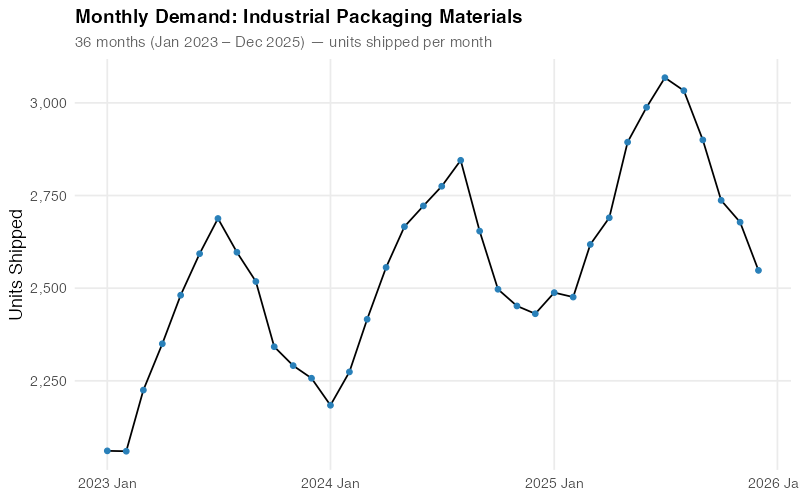
The human eye is pretty good at spotting patterns — you can already see the summer peaks and winter troughs. But your eye can’t quantify how much of the variation is seasonal versus trend versus noise. For that, you need decomposition.
Step 2: Decompose the Signal
STL decomposition (Seasonal and Trend decomposition using Loess) surgically separates your data into its additive components:
Demand = Trend + Seasonal + Remainder
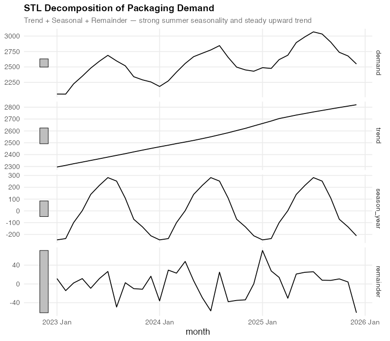
This decomposition tells you three things that a raw time series plot cannot:
- Trend: Steady, almost perfectly linear growth from ~2,200 to ~2,800 over three years. No sudden jumps, no plateaus — just reliable expansion. When your procurement team says “we need a 3-year contract at higher volumes,” the trend component is your evidence.
- Seasonal: A consistent summer peak of +260 to +320 units above trend (peaking in June-July), and a winter trough of -160 to -220 units below (bottoming in December-January). This pattern is remarkably stable year-over-year, which means you can plan inventory builds and workforce scheduling around it with confidence.
- Remainder: The “everything else” — random fluctuations of roughly +/- 60 units that don’t follow any pattern. This is your irreducible uncertainty. If your forecast error is consistently below this noise floor, you’re overfitting.
For a demand planner, this decomposition is a planning document in disguise. The trend tells operations “expect ~200 more units per year.” The seasonal component tells warehousing “build inventory starting in April, draw down through October.” The remainder tells everyone “stop trying to explain every month-to-month blip — some of it is just noise.”
Step 3: The Seasonal Fingerprint
FPP3’s gg_season() gives you something no Excel chart can: a clear overlay of each year’s seasonal pattern on a single plot.
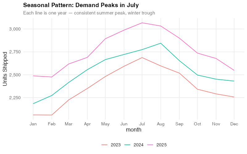
Each line is one year. The fact that they stack almost perfectly — with each successive year shifted upward by the trend — tells you the seasonality is extremely stable. This is gold for a demand planner. Stable seasonality means your seasonal indices are trustworthy. You can confidently tell your warehouse team: “Build starting in April, peak in June-July, draw down through November.” The pattern has held for three years running.
Step 4: The Model Showdown
Here’s where fpp3 really shines. Instead of betting your inventory on a single forecasting method, you let the methods compete:
fit <- train |>
  model(
    SNAIVE = SNAIVE(demand),
    ETS    = ETS(demand),
    ARIMA  = ARIMA(demand)
  )
Three models, fitted simultaneously, each automatically optimized:
- ETS (Error, Trend, Seasonal): Exponential smoothing with automatic selection of the best error type, trend type, and seasonal type. The workhorse of business forecasting.
- ARIMA: Auto-regressive integrated moving average with automatic order selection. The statistician’s favorite.
- SNAIVE (Seasonal Naive): Simply repeats last year’s values. Sounds dumb — but it’s a surprisingly tough benchmark. If your fancy model can’t beat “just use last year’s numbers,” you have a problem.
We train on 2023-2024 (24 months) and test on 2025 (12-month holdout). Let’s see how they stack up:
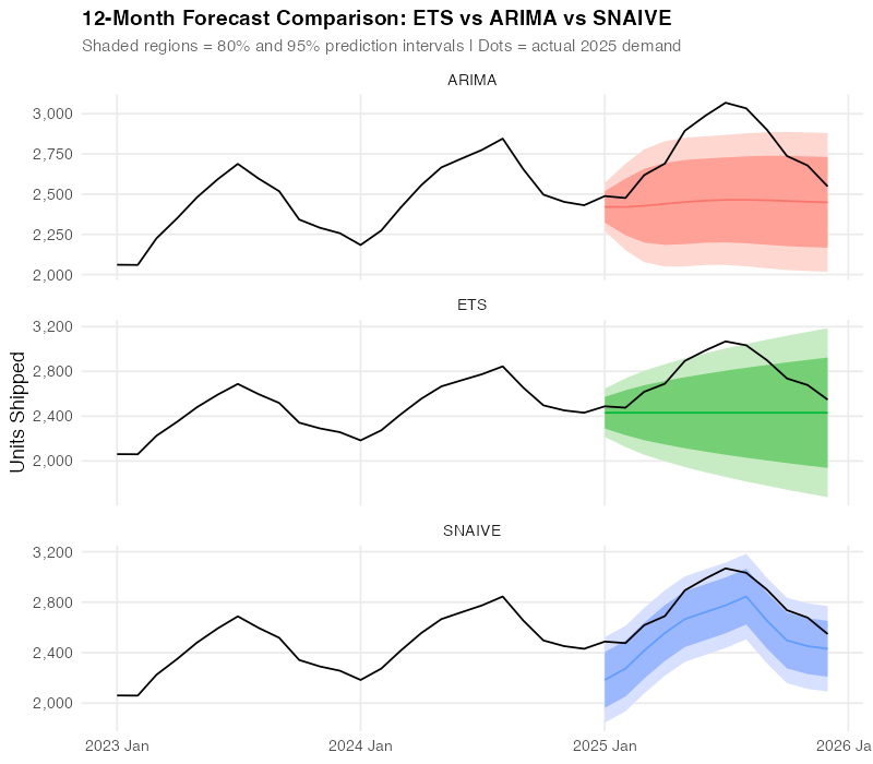
All three models capture the seasonal pattern, but they differ in how closely they track the actual 2025 data points. The visual tells a story — but we need numbers to be sure.
Step 5: Let the Numbers Decide (And Prepare to Be Surprised)
FPP3’s accuracy() function computes every standard forecast accuracy metric in one call:
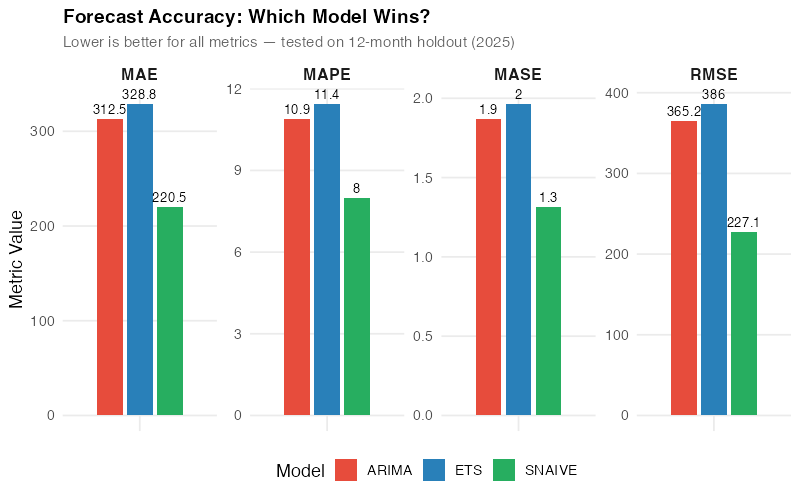
| Model | RMSE | MAE | MAPE | MASE |
|---|---|---|---|---|
| SNAIVE | 227.1 | 220.5 | 8.0% | 1.3 |
| ARIMA | 365.2 | 312.5 | 10.9% | 1.9 |
| ETS | 386.0 | 328.8 | 11.4% | 2.0 |
Wait — the simplest model won?
Yes. And this is the single most important lesson in this entire post.
SNAIVE — “just use last year’s numbers” — outperformed both ETS and ARIMA on this dataset. Lower RMSE (better at avoiding big misses), lower MAE (better on average), and a MAPE of 8.0% versus 10.9-11.4% for the “sophisticated” methods.
Here’s why: with only 3 years of data and very stable, repeating seasonality, the complex models don’t have enough history to learn the seasonal pattern better than simply replaying last year. ETS and ARIMA are estimating parameters from limited data, introducing estimation error that SNAIVE avoids entirely by making no assumptions at all.
This is exactly why model comparison matters. If you’d picked ETS because “exponential smoothing is the standard” or ARIMA because “it’s what the statistics textbook recommends,” you’d be using a model that’s 30-40% less accurate than the simplest possible baseline. Without accuracy() to force a head-to-head comparison, you’d never know.
This comparison took one line of code. In Excel, calculating RMSE, MAE, MAPE, and MASE across three methods would take the rest of your afternoon. And most Excel forecasters never compare against a naive baseline at all — they just assume the fancy method is better. FPP3 puts the benchmark front and center and sometimes the answer is humbling.
Step 6: Trust But Verify — Residual Diagnostics
Even though SNAIVE won on accuracy, we still check the ETS residuals to understand what the model is doing. If the residuals show patterns, there might be structure in the data that a different model could capture.
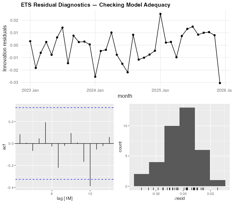
For our ETS model, the diagnostics look reasonably clean:
- Residuals over time: No visible trend or systematic pattern — they bounce around zero randomly. Good.
- ACF (autocorrelation function): No significant spikes outside the blue confidence bounds — meaning today’s error doesn’t predict tomorrow’s. Good.
- Histogram: Roughly bell-shaped and centered on zero — the errors are approximately normally distributed. Good.
The diagnostics confirm that ETS isn’t broken — it’s just not as sharp as SNAIVE for this particular dataset. The residuals look like white noise, which means ETS has extracted all the learnable signal. It simply can’t learn the seasonal pattern as precisely as last year’s actuals when it only has three years to work with.
One line of code — gg_tsresiduals() — produces all three diagnostic plots. In Excel, you’d need to calculate residuals manually, build a correlogram (good luck), and create a histogram. Most Excel forecasters skip this entirely, which means they never know if their model is systematically biased.
The Real Insight: It’s Not About the Fanciest Model
Let’s be blunt about what just happened. We ran three models through a rigorous, measured competition, and the simplest one won. This isn’t a failure of fpp3 — it’s the entire point of fpp3.
Most forecasting tools — Excel, Prophet, even sophisticated ML pipelines — encourage you to pick a method and commit to it. FPP3 is the only widely-used framework that makes model comparison the default workflow. And when you compare honestly, sometimes the humbling answer is: “just use last year’s numbers.”
That said, SNAIVE won’t always win. With longer history (5+ years), more complex patterns (trend shifts, evolving seasonality), or messy data (missing values, outliers), ETS and ARIMA will pull ahead. The beauty of fpp3 is that you don’t have to guess — you measure, and the data decides.
The Surprising Part: Scale
Everything we just did for one product? FPP3 can do it for every product in your portfolio simultaneously:
# Forecast 500 SKUs, all models, in one pipeline
all_forecasts <- full_catalog |>
  group_by(sku) |>
  model(
    ets    = ETS(demand),
    arima  = ARIMA(demand),
    snaive = SNAIVE(demand)
  ) |>
  forecast(h = 12)
That’s the same code structure we used for one product, with one added line: group_by(sku). FPP3 fits each SKU’s best model independently, selects optimal parameters for each, and generates forecasts with proper prediction intervals — all in a single, reproducible pipeline.
And here’s the kicker: for some SKUs, ETS will win. For others, ARIMA. For the ones with stable, short histories like our packaging data, SNAIVE. FPP3 lets you pick the right model for each product rather than forcing the same method on everything. That per-SKU optimization is where the real accuracy gains come from.
Try doing that in Excel across 500 SKUs. Actually, don’t try. Life is short.
Where FPP3 Falls Short
No tool is perfect, and fpp3 has real limitations you should know before committing to it.
Short history favors simple methods. As we just saw, with only 2-3 years of monthly data, parametric models may not have enough information to outperform simple baselines. FPP3 will honestly tell you this — but you need at least 4-5 years of clean data for ETS and ARIMA to consistently shine.
The R learning curve is real. FPP3 requires basic R fluency — data frames, piping, ggplot. For a team of Excel-native planners, this is a genuine barrier. Budget 2-4 weeks of learning time for someone comfortable with data manipulation. The free FPP3 textbook is the best possible learning resource, but it’s still a textbook.
No built-in holiday handling. Unlike Prophet, which has pre-built holiday calendars for 60+ countries, fpp3 requires you to build holiday effects manually using dummy variables or external regressors. It works, but it’s more effort.
Data must be clean and regular. FPP3’s tsibble format enforces strict time series structure — no duplicate timestamps, no implicit gaps, regular frequency. This is actually a good thing (it catches data quality issues early), but it means you need a data cleaning step before you can model. Messy ERP exports don’t go directly into fpp3.
No external regressors in ETS. Standard ETS models in fable don’t support external predictor variables (like promotion flags, weather, or economic indicators). You can use ARIMA with regressors (ARIMA(demand ~ promotion + temperature)) or dynamic regression, but ETS is purely univariate. If your demand is heavily influenced by known external factors, this is a meaningful limitation.
The Dollar Impact: What Better Forecasting Is Actually Worth
Let’s put rough numbers on this. Our packaging distributor ships ~30,000 units annually at an average unit cost of $85. Current Excel-based forecasting has a MAPE of ~15% (generous — most spreadsheet forecasts are worse). FPP3’s model comparison identified SNAIVE at 8.0% as the best method, and would deliver even better results for products where ETS or ARIMA wins.
Safety stock reduction:
- At 15% MAPE with 95% service level, safety stock ≈ 1.65 x 0.15 x 2,500 (monthly demand) ≈ 619 units
- At 8.0% MAPE: 1.65 x 0.08 x 2,500 ≈ 330 units
- Reduction: 289 units x $85 = $24,565 freed working capital — per product family
Scale that across 30 product families and you’re looking at $737,000 in freed working capital. Not cost savings — freed capital that’s currently sitting on shelves gathering dust because your forecast isn’t sharp enough to justify lower buffers.
Stockout reduction:
- Better forecasts mean fewer surprise shortfalls. Even a 1% reduction in stockout rate on a $2.5M annual revenue stream is worth $25,000 in protected revenue — plus the customer goodwill that doesn’t show up on a balance sheet but absolutely shows up in contract renewals.
Labor efficiency:
- A manual Excel forecast cycle takes 2-3 days per planner per month. An automated fpp3 pipeline takes 10 minutes to run and generates a complete report. For a team of 5 planners each spending 2 days, that’s roughly 40 hours/month redirected from spreadsheet wrestling to actual demand intelligence — talking to customers, investigating anomalies, and planning for the future instead of calculating the past.
Interactive Dashboard
Explore the data yourself — adjust demand patterns, forecast models, and parameters to see how accuracy metrics and predictions change in real time.
Interactive Dashboard
Explore the data yourself — adjust parameters and see the results update in real time.
Your Next Steps
- Install fpp3 this afternoon. Open R or RStudio and run
install.packages("fpp3"). Then work through Chapter 1 of the free online textbook — it takes about an hour and uses real data. By the end, you’ll have a working understanding of the tsibble/feasts/fable workflow. No excuses — the textbook is free, the software is free, and the first chapter is designed for beginners. - Pick your most painful SKU and try it. Not your easiest product — your most problematic one. The one where the forecast is always wrong, safety stock is always too high or too low, and everyone has an opinion. Export 36+ months of monthly demand, load it into fpp3, and run the three-model comparison (ETS, ARIMA, SNAIVE). If fpp3 beats your current method by even 1% MAPE, you’ve found your business case. If it doesn’t — the decomposition and residual diagnostics will still show you something about that product’s demand structure you didn’t know.
- Run a parallel forecast for one quarter. Don’t rip out your existing process — run fpp3 alongside it for 3 months. At the end of each month, compare the actual demand against both forecasts. This gives you hard evidence for your manager without any risk to the current planning process. Keep a simple tracking spreadsheet: Month | Actual | Excel Forecast | FPP3 Forecast | Excel Error | FPP3 Error.
- Calculate the safety stock impact. Take your fpp3 forecast accuracy numbers and plug them into your safety stock formula. Multiply the inventory reduction by your average unit cost. That’s the freed working capital number you’ll present in the business case. Executives don’t care about RMSE — they care about cash tied up in inventory. Translate the stats into dollars.
- Share the FPP3 textbook with one colleague. Forecasting tools only succeed if more than one person understands them. Find the most data-curious person on your planning team, send them otexts.com/fpp3, and tell them: “Read Chapter 5 — it’s about the same models we use but explains why they work.” Knowledge that depends on a single person is a single point of failure. Don’t let your forecasting improvement become one.
Show R Code
# =============================================================================
# Modern Supply Chain Forecasting with R's fpp3 Ecosystem
# Complete, self-contained script — run top to bottom
# =============================================================================

library(fpp3)      # loads tsibble, fable, feasts, tsibbledata, ggplot2, etc.
library(scales)    # comma_format, percent_format
library(patchwork) # multi-panel plot composition

set.seed(42)

# =============================================================================
# Custom theme for all charts
# =============================================================================
theme_fpp3 <- theme_minimal(base_size = 13) +
  theme(
    plot.title       = element_text(face = "bold", size = 14),
    plot.subtitle    = element_text(color = "grey40", size = 11),
    panel.grid.minor = element_blank(),
    legend.position  = "bottom"
  )

# Colorblind-friendly model palette
model_colors <- c(
  "ETS"    = "#2980b9",
  "ARIMA"  = "#e74c3c",
  "SNAIVE" = "#27ae60"
)

# =============================================================================
# YOUR DATA — Replace this section with your own demand data
# =============================================================================
# Option A: Synthetic data (used in this post)
# Industrial packaging distributor: monthly demand
# 36 months with steady growth, summer peak, winter dip
n_months <- 36
dates <- yearmonth(seq(as.Date("2023-01-01"),
                       as.Date("2025-12-01"),
                       by = "month"))

base     <- seq(2200, 2800, length.out = n_months)
seasonal <- rep(c(-180, -120, 50, 140, 260, 320,
                   280, 200, 80, -40, -160, -220), 3)
noise    <- rnorm(n_months, mean = 0, sd = 60)

demand_data <- tsibble(
  month  = dates,
  demand = round(base + seasonal + noise),
  index  = month
)

# Option B: Load your own CSV
# your_csv <- read.csv("your_demand_data.csv")
# demand_data <- your_csv |>
#   mutate(month = yearmonth(date_column)) |>
#   as_tsibble(index = month) |>
#   select(month, demand = demand_column)

# =============================================================================
# Step 1: Visualize the raw time series
# =============================================================================
demand_data |>
  autoplot(demand) +
  geom_point(aes(y = demand), size = 1.5, color = "#2980b9") +
  labs(
    title = "Monthly Demand: Industrial Packaging Materials",
    subtitle = paste(nrow(demand_data),
                     "months — units shipped per month"),
    y = "Units Shipped", x = NULL
  ) +
  scale_y_continuous(labels = comma_format()) +
  theme_fpp3

# =============================================================================
# Step 2: STL decomposition — separate trend, seasonality, remainder
# =============================================================================
stl_decomp <- demand_data |>
  model(STL(demand ~ season(window = "periodic"))) |>
  components()

stl_decomp |>
  autoplot() +
  labs(
    title = "STL Decomposition of Packaging Demand",
    subtitle = "Trend + Seasonal + Remainder"
  ) +
  theme_fpp3 +
  theme(legend.position = "none")

# Inspect the strength of trend and seasonality
demand_data |>
  features(demand, feat_stl)

# =============================================================================
# Step 3: Seasonal patterns — which months drive demand?
# =============================================================================
demand_data |>
  gg_season(demand) +
  labs(
    title = "Seasonal Pattern: Demand Peaks in Summer",
    subtitle = "Each line is one year — consistent summer peak, winter trough",
    y = "Units Shipped"
  ) +
  scale_y_continuous(labels = comma_format()) +
  theme_fpp3

# Subseries view: average demand by month
demand_data |>
  gg_subseries(demand) +
  labs(
    title = "Monthly Demand Subseries",
    subtitle = "Blue lines = monthly means",
    y = "Units Shipped"
  ) +
  scale_y_continuous(labels = comma_format()) +
  theme_fpp3

# =============================================================================
# Step 4: Train/test split and model fitting
# =============================================================================
# Train on 2023-2024 (24 months), test on 2025 (12 months)
train <- demand_data |> filter(year(month) <= 2024)
test  <- demand_data |> filter(year(month) == 2025)

cat("Training set:", nrow(train), "months\n")
cat("Test set:    ", nrow(test), "months\n")

# Fit three models — fpp3 auto-selects the best parameters
fit <- train |>
  model(
    SNAIVE = SNAIVE(demand),          # Seasonal naive baseline
    ETS    = ETS(demand),             # Exponential smoothing (auto-selected)
    ARIMA  = ARIMA(demand)            # ARIMA (auto-selected)
  )

# Inspect what fpp3 chose automatically
report(fit |> select(ETS))
report(fit |> select(ARIMA))

# =============================================================================
# Step 5: Generate forecasts and compare
# =============================================================================
fc <- fit |> forecast(h = 12)

# Overlay all forecasts on one chart
fc |>
  autoplot(demand_data, level = c(80, 95)) +
  labs(
    title = "12-Month Forecast Comparison: ETS vs ARIMA vs SNAIVE",
    subtitle = "Shaded = 80%/95% prediction intervals | Dots = actual 2025 demand",
    y = "Units Shipped", x = NULL
  ) +
  scale_y_continuous(labels = comma_format()) +
  theme_fpp3

# =============================================================================
# Step 6: Accuracy comparison
# =============================================================================
acc <- fc |>
  accuracy(demand_data) |>
  select(.model, RMSE, MAE, MASE, MAPE)

print(acc)

# Grouped bar chart
acc |>
  pivot_longer(cols = c(RMSE, MAE, MASE, MAPE),
               names_to = "metric", values_to = "value") |>
  ggplot(aes(x = metric, y = value, fill = .model)) +
  geom_col(position = position_dodge(width = 0.7), width = 0.6) +
  geom_text(
    aes(label = round(value, 1)),
    position = position_dodge(width = 0.7),
    vjust = -0.5, size = 3.5
  ) +
  scale_fill_manual(values = model_colors) +
  labs(
    title = "Forecast Accuracy: Which Model Wins?",
    subtitle = "Lower is better — tested on 12-month holdout (2025)",
    x = NULL, y = "Metric Value", fill = "Model"
  ) +
  facet_wrap(~ metric, scales = "free", nrow = 1) +
  theme_fpp3 +
  theme(
    axis.text.x  = element_blank(),
    axis.ticks.x = element_blank(),
    strip.text   = element_text(face = "bold", size = 12)
  )

# =============================================================================
# Step 7: Residual diagnostics for the best model
# =============================================================================
# Refit ETS on full data
full_fit <- demand_data |>
  model(ETS = ETS(demand))

full_fit |>
  gg_tsresiduals() +
  labs(title = "ETS Residual Diagnostics") +
  theme_fpp3

# Ljung-Box test: are residuals white noise?
augment(full_fit) |>
  features(.innov, ljung_box, lag = 12)

# =============================================================================
# Step 8: Final production forecast
# =============================================================================
# Refit best model on all data, forecast 12 months ahead
final_fc <- demand_data |>
  model(ETS = ETS(demand)) |>
  forecast(h = 12)

final_fc |>
  autoplot(demand_data) +
  labs(
    title = "12-Month Production Forecast",
    subtitle = "ETS model with 80%/95% prediction intervals",
    y = "Units Shipped", x = NULL
  ) +
  scale_y_continuous(labels = comma_format()) +
  theme_fpp3

# Extract point forecasts and intervals for planning
final_fc |>
  hilo(level = c(80, 95)) |>
  mutate(
    lower_80 = `80%`$lower,
    upper_80 = `80%`$upper,
    lower_95 = `95%`$lower,
    upper_95 = `95%`$upper,
    point    = .mean
  ) |>
  select(month, point, lower_80, upper_80, lower_95, upper_95) |>
  print(n = 12)

# =============================================================================
# Apply to Your Own Data
# =============================================================================
# To use this workflow with your own supply chain data:
#
# 1. Prepare your CSV with columns: date, demand
#    - date: monthly dates in YYYY-MM-DD format (e.g., "2023-01-01")
#    - demand: numeric demand values (units, revenue, orders, etc.)
#
# 2. Load and convert to tsibble:
#    my_data <- read.csv("my_demand.csv") |>
#      mutate(month = yearmonth(date)) |>
#      as_tsibble(index = month)
#
# 3. Replace `demand_data` with `my_data` in the script above
#
# 4. Adjust the train/test split:
#    - Use at least 3 full years for training (critical for seasonal models)
#    - Hold out the most recent 6-12 months for testing
#    train <- my_data |> filter_index(. ~ "2024 Dec")
#    test  <- my_data |> filter_index("2025 Jan" ~ .)
#
# 5. If your data is weekly or daily, change the index type:
#    - Weekly: yearweek(date) instead of yearmonth(date)
#    - Daily: as.Date(date) — but daily models need more data
#
# 6. For multiple products, add a key column:
#    my_data <- read.csv("multi_product.csv") |>
#      mutate(month = yearmonth(date)) |>
#      as_tsibble(index = month, key = product_id)
#    # All fpp3 functions then run per product automatically!
References
- Hyndman, R.J. & Athanasopoulos, G. (2021). Forecasting: Principles and Practice, 3rd edition. OTexts. https://otexts.com/fpp3/
- O’Hara-Wild, M., Hyndman, R.J. & Wang, E. (2024). fable: Forecasting Models for Tidy Time Series. R package. https://fable.tidyverts.org/
- O’Hara-Wild, M., Hyndman, R.J. & Wang, E. (2024). tsibble: Tidy Temporal Data Frames and Tools. R package. https://tsibble.tidyverts.org/
- Hyndman, R.J. & Koehler, A.B. (2006). “Another Look at Measures of Forecast Accuracy.” International Journal of Forecasting, 22(4), 679-688. https://doi.org/10.1016/j.ijforecast.2006.03.001
- IHL Group (2023). Retail’s $1.77 Trillion Inventory Distortion Problem. https://www.ihlservices.com/product/inventory-distortion/
- Taylor, S.J. & Letham, B. (2018). “Forecasting at Scale.” The American Statistician, 72(1), 37-45. https://doi.org/10.1080/00031305.2017.1380080
- Petropoulos, F., et al. (2022). “Forecasting: Theory and Practice.” International Journal of Forecasting, 38(3), 705-871. https://doi.org/10.1016/j.ijforecast.2021.11.001
Leave a Reply