You sit in an S&OP meeting where the demand planner presented “the forecast.” Thirty-six months of historical data, twelve months projected forward, and the entire thing was a straight line.
A straight line. Through seasonal data.
Nobody questioned it. The line went up and to the right, which made Sales happy. Operations nodded. Procurement started placing orders. And I sat there thinking: we are about to build a quarter’s worth of inventory based on a forecast that doesn’t know summer exists.
This is not a rare story. This is the story of demand planning in most organizations. And it starts with the same tool every time: Excel.
The Spreadsheet Trap
Let’s be precise about what’s happening when someone uses Excel’s FORECAST.LINEAR function — or worse, drags a trendline across a chart and calls it a plan.
Excel fits a straight line through your data using ordinary least squares regression. That’s it. It finds the slope and intercept that minimize the squared distance between the line and your historical points. For data with a clear linear trend and no seasonality, this is fine. Adequate. Not great, but fine.
The problem is that almost no supply chain demand data is purely linear with no seasonality. Your customers buy more sunscreen in summer. Your factory orders more packaging before the holiday rush. Your MRO consumption spikes during annual maintenance shutdowns. Seasonality is everywhere in operations — and Excel’s FORECAST.LINEAR is constitutionally incapable of seeing it.
Here’s what that looks like in practice. Take a product with clear seasonal demand — summer peaks pushing past 2,800 units, winter troughs dipping below 1,800, and a modest upward trend of about 15 units per month:
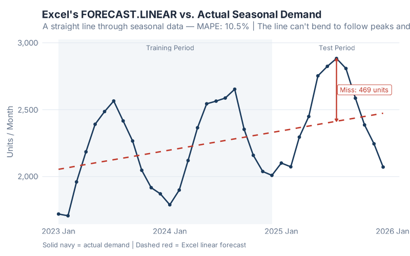
See that red dashed line? That’s Excel’s forecast. It cuts straight through the middle of every peak and every trough. In the summer months, when actual demand surges past 2,800 units, Excel says “about 2,400.” In winter, when demand drops below 1,800, Excel says “about 2,100.” The biggest single miss? 469 units in one month — that’s the difference between fulfilling your orders and calling your customers to apologize.
The MAPE (Mean Absolute Percentage Error) for this forecast? 10.5%. That might not sound catastrophic — until you realize that in supply chain forecasting, every percentage point of MAPE translates directly into excess inventory or lost sales. At 10.5%, you’re systematically overbuilding in winter and underbuilding in summer, every single year, and wondering why your service levels never hit target.
But here’s the part that really stings: the forecast looks reasonable on the chart. The line goes through the middle of the data. It trends upward. If you squint, you might even call it “conservative.” That’s what makes the spreadsheet trap so dangerous — it produces forecasts that are plausible enough to survive an S&OP meeting but wrong enough to cost you real money.
Six Lines of R That Would Have Saved My Quarter
What if I told you that the same data, fed through six lines of R code, would produce a forecast that captures the seasonality, quantifies its own uncertainty, and lets you compare three different models simultaneously?
Here’s what that looks like:
library(fpp3)
train |>
  model(
    ETS    = ETS(demand ~ error("A") + trend("A") + season("A")),
    ARIMA  = ARIMA(demand),
    SNAIVE = SNAIVE(demand)
  ) |>
  forecast(h = 12)
That’s it. Six lines. Three models. Explicit seasonal structure.
The ETS model (Error, Trend, Seasonality) decomposes your data into its component parts — here we specify additive error, additive trend, and additive seasonality, which tells R exactly how to capture that seasonal pattern Excel ignores. ARIMA finds the optimal autoregressive and moving average parameters — including seasonal differencing. And SNAIVE (Seasonal Naive) provides a sanity-check baseline that simply repeats last year’s values.
The result:
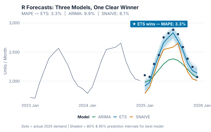
Look at those prediction intervals — the shaded bands around each forecast line. Excel doesn’t give you those. Excel gives you a point estimate and a prayer. R gives you a range that says: “we’re 80% confident demand will be between X and Y.” That’s the difference between placing a purchase order and placing a good purchase order.
Now let’s put them side by side:
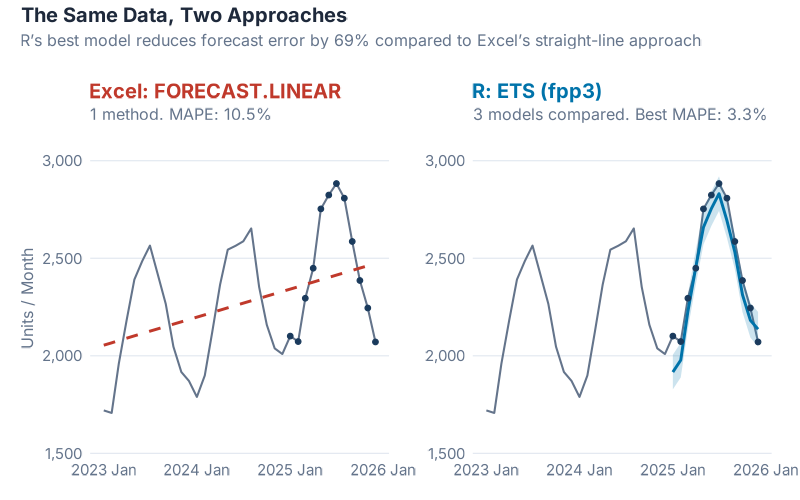
The numbers tell the story. Excel’s linear forecast: 10.5% MAPE. R’s best model (ETS with Holt-Winters): 3.3% MAPE. That’s a 69% improvement in forecast accuracy from six lines of code.
Let me translate that into money. If you’re forecasting demand for a product line worth EUR 10 million per year, cutting your MAPE from 10.5% to 3.3% means roughly EUR 300,000 to EUR 700,000 less in excess inventory and lost sales annually. The exact number depends on your cost structure, but the order of magnitude is real. I’ve seen it. I’ve lived it.
And here’s the part that should make every Excel forecaster uncomfortable: the Seasonal Naive model — which literally just copies last year’s numbers forward with zero intelligence — scores 8.1% MAPE, also beating Excel’s 10.5%. Even ARIMA comes in at 9.9%. Let that sink in. A method that requires no math, no modeling, no statistical knowledge of any kind, outperforms the forecasting tool that most supply chain teams rely on every single day.
The R Forecasting Ecosystem
The fpp3 package is just the starting point. R has an entire ecosystem of forecasting tools built specifically for the kinds of problems supply chain professionals deal with daily. Here’s a map of the territory:
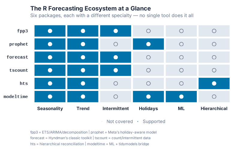
| Package | What It Does | Supply Chain Use Case |
|---|---|---|
| fpp3 | Tidy time series framework: ETS, ARIMA, decomposition, accuracy metrics | General demand forecasting, model comparison, S&OP support |
| prophet | Trend + seasonality + holidays, built for business data with irregular patterns | Promotional demand, holiday-driven products, new product launches |
| forecast | Classic forecasting toolkit (pre-fpp3), dozens of methods including TBATS | Established codebases, specialized models, complex multi-seasonal patterns |
| tscount | Count time series with Poisson/NegBin distributions | Intermittent demand, slow-moving spare parts, MRO items |
| fable | Hierarchical and grouped time series reconciliation via reconcile() |
Multi-level forecasting (region > warehouse > SKU), top-down/bottom-up/optimal |
| modeltime | Machine learning forecasting with tidymodels integration | XGBoost/Random Forest demand models, ML competition benchmarks |
Every single one of these is free. Open source. Peer-reviewed. And backed by an active community of statisticians and practitioners who actually answer questions on Stack Overflow — usually within hours.
Try getting that kind of support for your Excel FORECAST.LINEAR.
Getting Started: R + RStudio in 15 Minutes
I know what you’re thinking. “This looks great, but I’m not a programmer. I don’t have time to learn a new tool. My organization won’t support it.”
I’ve heard every version of this objection, and I had the same ones myself. Let me address them directly.
“I’m not a programmer.” You don’t need to be. If you can write an Excel formula, you can write R code. The syntax is different, but the mental model is the same: take data in, transform it, get answers out. The six-line example above is not simplified for this blog post — that’s genuinely what the code looks like.
“The learning curve is too steep.” Our experience — across multiple teams and organizations — is that about 3 months of daily practice (1-2 hours per day) gets a supply chain professional to the point where they’re adding real value with R. You won’t become a data scientist in 3 months. But you’ll be able to load your data, run a forecast, generate a chart, and make better decisions than you were making with Excel. That’s a worthwhile trade.
“I don’t know where to start.” Here’s your 15-minute setup:
- Download R from CRAN (the Comprehensive R Archive Network) — it’s free, runs on Windows, Mac, and Linux
- Download RStudio from Posit (formerly RStudio, Inc.) — the free desktop version is all you need. RStudio is to R what a cockpit is to a jet engine. You can fly without it, but you really shouldn’t.
- Install the fpp3 package — open RStudio, type
install.packages("fpp3")in the console, hit Enter. Done. - Run the example — paste the six-line code block from this post, swap in your own data, and watch what happens.
That’s it. No IT ticket. No procurement process. No license fee. No approval chain. You can have a working forecasting environment on your laptop before your next coffee break.
“My organization won’t support it.” Here’s a secret: you don’t need permission to install free software on your work laptop and run a forecast. Start small. Run R alongside Excel for one SKU family. When your R forecast outperforms the existing one — and it will — show your manager the results. Data talks. Nobody has ever been fired for producing a more accurate forecast.
And if you’re worried about being the lone R user in your department, consider this: the best approach is to form a cross-functional team that pairs domain experts (you, the supply chain professional who understands the business) with people who have coding experience. You don’t need to do everything yourself. But you do need to understand enough to ask the right questions and evaluate the answers.
What’s Coming in April
This post is the starting gun. April is Forecasting Month on inphronesys.com, and every week we’re going deeper:
- Week 2 — fpp3 Deep Dive: We’ll take a real multi-SKU dataset through the full fpp3 workflow: data cleaning, decomposition, model fitting, cross-validation, and accuracy comparison. You’ll walk away with a template you can apply to your own data immediately.
- Week 3 — Prophet for Supply Chain: Meta’s Prophet library handles holidays, promotions, and structural breaks in ways that classical methods can’t. We’ll benchmark it against ETS and ARIMA on supply chain data with irregular events — and the results might surprise you.
- Week 4 — The Weird SKUs: Intermittent demand, lumpy demand, slow movers — the items that make your ERP cry and your safety stock calculations meaningless. We’ll cover Croston’s method, TSB, and the tscount package for count data.
- Week 5 — Head-to-Head Showdown: Same dataset, every method we’ve covered, one winner. No opinions, no favorites — just accuracy metrics on a blind test set. The forecasting equivalent of a cage match.
Every post includes full R code (copy-paste ready), interactive dashboards you can use on your own data, and no black boxes. If you can’t see how the forecast was made, it’s not a forecast — it’s a guess.
Interactive Dashboard
Explore the data yourself — adjust parameters and see the results update in real time.
Interactive Dashboard
Explore the data yourself — adjust parameters and see the results update in real time.
Your Next Steps
Don’t just read this and nod. Do something today:
- Install R and RStudio — right now, before you close this tab. It takes 10 minutes and costs nothing.
- Export one SKU’s demand history from your ERP — 24 to 36 months of monthly data is enough. CSV format, two columns: date and quantity. That’s your starting dataset.
- Try the dashboard above — plug in your numbers, compare the models, and see which one fits your demand pattern. No coding required.
- Bookmark the fpp3 textbook — Forecasting: Principles and Practice by Rob Hyndman and George Athanasopoulos is free online and it’s the single best resource for learning time series forecasting with R.
- Come back next week — we’re just getting started. Forecasting Month has four more weeks of progressively deeper content, and each post builds on this foundation.
If you’ve ever sat in an S&OP meeting where the forecast was a straight line through seasonal data — or worse, where nobody could explain how the forecast was generated at all — April is for you.
And if there’s a forecasting problem that’s been keeping you up at night — a SKU that defies every model, a demand pattern that makes no sense, a forecast that your operations team has given up on — drop it in the comments. The weirder, the better. I might just turn it into a post.
See you next week.
Show R Code
# =============================================================================
# Why R for Supply Chain Forecasting — Full Reproducible Code
# =============================================================================
# Install once: install.packages("fpp3")

library(fpp3)

set.seed(42)

# --- Generate 36 months of seasonal demand data ---
n_months <- 36
dates <- yearmonth(seq(as.Date("2023-01-01"),
                       as.Date("2025-12-01"), by = "month"))

time_idx <- 1:n_months
base <- 2000
trend <- 15 * time_idx

# Monthly seasonal profile: winter trough, summer shipping peak
seasonal_pattern <- c(-350, -300, -100, 100, 300, 400,
                       400, 300,  50, -100, -300, -400)
seasonal <- rep(seasonal_pattern, 3)
noise <- rnorm(n_months, mean = 0, sd = 40)

demand_data <- tsibble(
  month  = dates,
  demand = round(base + trend + seasonal + noise),
  index  = month
)

# --- Train/test split: 2 years training, 1 year test ---
train <- demand_data |> filter(year(month) <= 2024)
test  <- demand_data |> filter(year(month) == 2025)

# --- Excel's approach: linear regression (FORECAST.LINEAR) ---
train_df <- as_tibble(train) |> mutate(t = row_number())
excel_model <- lm(demand ~ t, data = train_df)
test_df <- as_tibble(test) |> mutate(t = 25:36)
test_df$excel_fc <- predict(excel_model, newdata = test_df)
excel_mape <- mean(abs((test_df$demand - test_df$excel_fc) / test_df$demand)) * 100
cat("Excel MAPE:", round(excel_mape, 1), "%\n")

# --- R's approach: fit 3 models, compare, pick the winner ---
fit <- train |>
  model(
    ETS    = ETS(demand ~ error("A") + trend("A") + season("A")),
    ARIMA  = ARIMA(demand),
    SNAIVE = SNAIVE(demand)
  )

fc <- fit |> forecast(h = 12)

# Compare accuracy on the test year
fc |> accuracy(demand_data) |> select(.model, MAPE)
# ETS wins with ~3.3% MAPE vs Excel's ~10.5%

# --- Visualize the winner ---
fc |>
  filter(.model == "ETS") |>
  autoplot(demand_data, level = c(80, 95)) +
  labs(title = "ETS Forecast vs Actual Demand",
       subtitle = "Holt-Winters captures both trend and seasonality",
       y = "Units / Month")

# =============================================================================
# Try It With Your Own Data
# =============================================================================
# Export one SKU's monthly demand history from your ERP as a CSV:
#
# my_data <- read.csv("my_demand.csv") |>
#   mutate(month = yearmonth(date)) |>
#   as_tsibble(index = month)
#
# fit <- my_data |>
#   model(
#     ETS   = ETS(demand),
#     ARIMA = ARIMA(demand)
#   )
#
# fit |> forecast(h = 12) |> autoplot(my_data)
References
- Hyndman, R.J., & Athanasopoulos, G. (2021). Forecasting: Principles and Practice, 3rd edition. OTexts. Available free online at otexts.com/fpp3.
- Taylor, S.J. & Letham, B. (2018). Forecasting at Scale. The American Statistician, 72(1), 37-45.
- Grabowski, J.-P. (2024). R For Purchasing Professionals (RFPP). A practical guide to using R for supply chain data analysis.
Leave a Reply