I gave six forecasting models the same real demand series and told them to compete.
The model with the sophisticated statistical framework and automatic parameter selection won. The method that just copies last year’s number finished a respectable third. And the model that wraps a flexible decomposition layer around the sophisticated framework — making it, in theory, even more powerful — scored a MASE of 3.03, more than three times worse than Seasonal Naive. More complexity, dramatically worse results.
This post is the horse race: Naive, Seasonal Naive, Mean, ETS, STL+ETS, and ARIMA, on 36 years of real Australian retail demand data, evaluated with time series cross-validation across 14 rolling windows. I used MASE to pick the winner because MASE is the only metric that doesn’t lie to you — a full explanation of why is in an earlier post in this series. Today we just run the race.
We have results. We have a surprise. We have residuals. Let’s go.
The Data
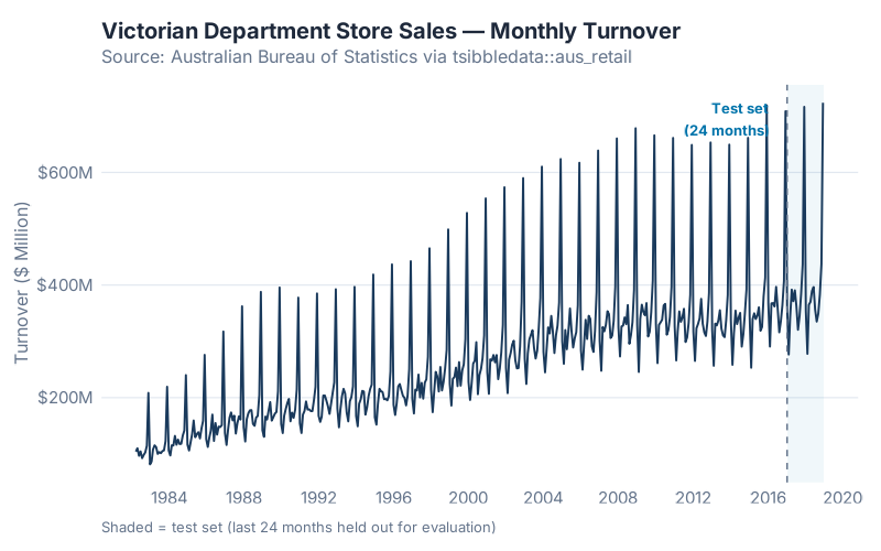
The series is Victorian department store monthly turnover from the Australian Bureau of Statistics, available in R as part of the tsibbledata package:
aus_retail |> filter(State == "Victoria", Industry == "Department stores")
441 months of retail sales data, April 1982 through December 2018. The series has clear trend (sales roughly double over the period), strong seasonality (December peaks, February troughs), and enough year-to-year variation to make the models work for it.
| Period | Months | |
|---|---|---|
| Training | April 1982 – December 2016 | 417 |
| Test (held out) | January 2017 – December 2018 | 24 |
The training set is everything the models were allowed to see. The test set was locked away until the fitting was complete. This is the only honest setup.
The Six Contestants
1. NAIVE — The Tautologist
NAIVE makes the most defensible prediction in the history of science: tomorrow will look like today. Specifically, it uses the most recent observation as the forecast for all future periods. No parameters, no training, no possibility of overfitting.
It sounds too simple to be useful. It is also the required floor: if a model can’t beat this, the model has no right to exist.
On a seasonal series with trend, NAIVE has a fundamental problem — it knows nothing about seasons. December is just another month. That is going to be painful.
2. Seasonal Naive (SNAIVE) — The Calendar Zealot
SNAIVE adds one idea: look at the same period last year, not last month. The forecast for January 2017 is the actual for January 2016. Still no parameters. Still no fitting.
As I showed in the Forecaster’s Toolbox post, SNAIVE regularly embarrasses sophisticated models on hold-out data. It tends to show up uninvited and win things. I expected it to be competitive here. Spoiler: it was.
3. MEAN — The Statistician’s Insult
MEAN forecasts every future period as the average of all historical observations. On stationary demand with no trend or seasonality, averaging is the rational move. On a series with visible trend and seasonal swings, it will be wrong in a predictable direction every single period.
MEAN is here as the calibration model. If something scores worse than MEAN, the situation is genuinely embarrassing.
4. ETS — The Method Your ERP Actually Uses
ETS (Error, Trend, Seasonal) is the modern statistical framework that formalises the Holt-Winters recursion I covered in last week’s post. When you call ETS() in fpp3, the function fits the full state-space model, choosing between additive and multiplicative error, trend, and seasonal structures automatically using information criteria.
For this series, ETS() auto-selected ETS(M,A,M): multiplicative errors, additive trend, multiplicative seasonality. In plain terms: the model assumes that forecast errors scale with the level of demand, the trend grows at a constant rate, and seasonal swings are proportional to the level rather than fixed in absolute size. That is a sensible description of growing retail sales.
5. STL+ETS — The Decomposer
STL (Seasonal and Trend decomposition using Loess) strips out the seasonal pattern first — even if it changes shape over time — then hands the seasonally-adjusted remainder to ETS. In theory, this handles evolving seasonality that plain ETS can struggle with.
In fpp3, this is decomposition_model(STL(...), ETS(season_adjust ~ error("A") + trend("A") + season("N"))). The key detail: the ETS on the adjusted series is forced to use additive errors and no seasonal component. That constraint will matter.
6. ARIMA — The PhD Candidate
ARIMA (AutoRegressive Integrated Moving Average) approaches forecasting from a different angle than ETS. Instead of modelling trend, level, and seasonal components directly, it models the autocorrelation structure of the series: how much does last month’s value predict this month’s? ARIMA() in fpp3 selects the orders automatically using AIC.
On many real demand series, ARIMA and ETS produce similar results — they are overlapping model families. On this series, they were very close. The ARIMA result is going to be interesting.
The Rules of the Race
One Honest Split, Then Fourteen
Every model was fitted on the 417-month training set and evaluated on the 24-month test set. That is the baseline.
But a single train/test split has a weakness: the result depends on where you draw the line. A model that happened to perform well in 2017–2018 might have performed differently if I had held out 2013–2014 instead. „Lucky split“ is a real risk with one evaluation window.
Time series cross-validation fixes this by running the honest test many times, at many cutoff points, and averaging the results. Here is the procedure in plain English:
- Start with 250 months of training data (roughly the first 60% of the series)
- Fit all six models. Forecast 12 months ahead. Record the errors.
- Slide the window forward by 12 months. Add those observations to the training set. Refit all six models. Forecast. Record.
- Repeat 14 times, until the data runs out.
The result is 14 separate fitted-and-evaluated model instances per model type. Average the MASE across all 14 origins and you have a picture of how each model performs reliably — not just on one particular holdout window.
In fpp3, stretch_tsibble(.init = 250, .step = 12) sets this up automatically. Six models × 14 folds = 84 model fits, all running in parallel. On this dataset, it completes in several minutes.
Why MASE
Because it is the only metric with a built-in benchmark. MASE divides each error by the average absolute error that Seasonal Naive would have made on the training data. MASE < 1 means you beat naive. MASE > 1 means you spent effort to be worse than copying last year’s number.
Full explanation — why not MAPE, why not RMSE, why MASE handles mixed portfolios and zero-demand periods better — is in Is Your Forecast Any Good?. Today we use it; we do not re-litigate it.
The Results
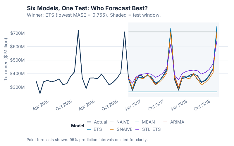
Look at the chart before you look at the table. Which forecasts track the actual demand? Which ones drift or collapse? The visual tells you most of the story before a single number appears.
Now the numbers — all six models, 24-month hold-out, lower is better:
| Model | MASE | RMSSE | MAE | RMSE | MAPE |
|---|---|---|---|---|---|
| ETS | 0.7550 | 0.7475 | 10.2366 | 13.0815 | 2.6019 |
| ARIMA | 0.7809 | 0.7511 | 10.5871 | 13.1447 | 2.9793 |
| SNAIVE | 0.9681 | 0.9067 | 13.1250 | 15.8673 | 3.4507 |
| STL+ETS | 3.0293 | 2.7153 | 41.0700 | 47.5172 | 10.7721 |
| MEAN | 9.4705 | 9.4935 | 128.3970 | 166.1360 | 29.3146 |
| NAIVE | 23.4101 | 19.0077 | 317.3833 | 332.6336 | 89.4289 |
MASE and RMSSE < 1 beat Seasonal Naive. Lower is better for all metrics.
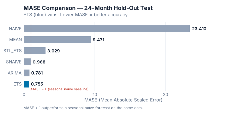
The winner, by MASE, is ETS with 0.7550. It captures the multiplicative seasonal structure and trend of this series better than any alternative. The auto-selected ETS(M,A,M) was the right model for the right data — a case where automatic model selection earned its keep.
Three models beat the Seasonal Naive baseline (MASE < 1): ETS, ARIMA, and SNAIVE itself. Three models did not: STL+ETS, MEAN, and NAIVE. The gap between the top three and the bottom three is not small.
The Surprise: More Complexity, Dramatically Worse Results
The result that should stop you mid-scroll: STL+ETS scored MASE = 3.03.
That is not a typo. The model that takes ETS and wraps it in a flexible seasonal decomposition layer — ostensibly making it more powerful, more adaptive, better able to handle evolving seasonality — performed four times worse than plain ETS and more than three times worse than just using last year’s number.
Here is why. When STL decomposes the series, the ETS step is applied to the seasonally-adjusted remainder with a forced specification: error("A") + trend("A") + season("N"). Additive errors, additive trend, no seasonal component. But this series has multiplicative error structure — ETS(M,A,M) won for a reason. Forcing the ETS on the adjusted series to use additive errors strips out the very thing that made ETS powerful on the raw series. The decomposition doesn’t help; it breaks the model.
The lesson is worth repeating: over-engineering a decomposition doesn’t always help. STL+ETS is a useful tool on series with genuinely non-linear, shifting seasonal patterns that plain ETS cannot model. On a clean, stable multiplicative seasonal series, it introduces a forced structural constraint that makes things worse. The right model is the one that fits the data’s actual generating process — not the one with the most moving parts.
This is the forecasting equivalent of adding five middle-management layers to a process that worked fine with two. More isn’t more.
Residual Diagnostics on the Winner
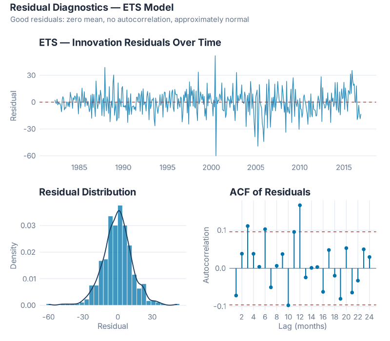
Winning the accuracy race is necessary but not sufficient. A model can produce good average errors and still be systematically wrong in predictable ways. If the residuals contain exploitable signal, the model can be improved. If the residuals look like noise, the model has done its job.
Three things to check:
Time plot — does the error cloud drift? A well-specified model leaves residuals that look like white noise: centred near zero, no visible trend, no seasonal structure the eye can track. The ETS(M,A,M) residuals show the cloud we want — no systematic drift, no obvious cycles, no single period that dominates. The level shift around the early 2000s is a mild anomaly; not enough to alarm, but worth noting as a potential structural break in the underlying demand.
ACF — is there autocorrelation in the errors? Each bar in the ACF plot represents the correlation between residuals at a given lag. White noise residuals should stay inside the blue confidence bands at all lags. For ETS(M,A,M) on this series, 4 of 24 lags exceed the ±0.096 confidence interval, with the largest autocorrelation at 0.1656 — small but measurable. The formal Ljung-Box test (lag = 24, fitdf = 3) gives χ² = 45.43, p = 0.0015: we can technically reject the white noise hypothesis.
This sounds alarming. In practice, it is not — and it explains something important. The residual autocorrelation is mild: no dominant spike, no obvious seasonal structure remaining. What it does tell you is why ARIMA performs comparably to ETS on this series. ARIMA models autocorrelation structure explicitly. The autocorrelation that ETS leaves behind in its residuals is exactly the signal ARIMA captures — which is why the two models are separated by only 0.0259 MASE points on the test set and ARIMA edges ahead on CV.
Histogram — is the model biased? ETS(M,A,M)’s residual mean is −0.279, effectively zero — the model is unbiased. The distribution is right-skewed, with positive outliers in the upper tail. These correspond to December periods where ETS undershoots the Christmas peak. Shapiro-Wilk rejects normality (p ≈ 0), but with 417 observations Shapiro-Wilk is hypersensitive — the main mass of the distribution is approximately normal, and the tail is a handful of outliers rather than a structural problem.
Bottom line: ETS(M,A,M) is a strong, unbiased model with mild residual autocorrelation. If that autocorrelation is operationally significant for your series, ARIMA (MASE = 0.7809) is the natural alternative. For most supply chain applications, either is a defensible choice; ETS is simpler to explain and won the single test window.
Cross-Validation: Is the Winner Reliably Better?
The 24-month test result tells you who won on one holdout window. The CV result tells you whether that win is consistent.
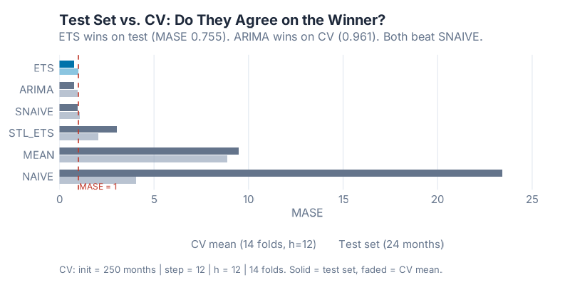
| Model | CV Mean MASE (14 folds, h = 12) |
|---|---|
| ARIMA | 0.9609 |
| ETS | 1.0066 |
| SNAIVE | 1.0677 |
| STL+ETS | 2.0500 |
| NAIVE | 4.0331 |
| MEAN | 8.8732 |
Here is where the horse race gets interesting: ARIMA wins the cross-validation, but ETS wins the 24-month test set.
The gap between them is small — 0.9609 versus 1.0066 on CV, 0.7550 versus 0.7809 on the test set. The delta on test MASE is 0.0259. Neither result is statistically overwhelming. What this tells you is that ETS and ARIMA are genuinely competitive on this type of series — both capture the trend and seasonality well, and which one comes out ahead depends somewhat on the evaluation window.
This is not a contradiction; it is the reason you run cross-validation in the first place. If you had only run the single test split, you would conclude „ETS, done.“ The CV adds nuance: ARIMA has been slightly more reliable across diverse training windows, even if it lost the final head-to-head. In practice, both models are good choices. ETS is simpler to explain and produces interpretable components. ARIMA is more flexible for complex autocorrelation patterns.
The three models below SNAIVE on CV — STL+ETS (2.05), NAIVE (4.03), MEAN (8.87) — are consistently worse across all 14 folds. This is not a fluke of a particular holdout window. Those models are reliably outperformed by copying last year’s number. On this data, they should not be in production.
Where This Breaks Down
Before you take ETS back to your supply chain team and run it on 20,000 SKUs, here are the situations where this result does not transfer:
One series, one data regime. This horse race was run on a single monthly retail series with stable multiplicative seasonality and a clear long-run trend. A different series — weekly, intermittent, heavily promoted, or post-structural break — will produce different winners. There is no universally best model; there are only models that fit specific data-generating processes.
The test period is 24 months. That is enough to get a credible estimate, but the confidence intervals around each MASE are wider than I would prefer. Longer holdout periods give more stable comparisons. If your series has fewer than 60 months of history, treat accuracy rankings as directional rather than definitive.
Intermittent and sparse demand. If your series has periods of zero demand — spare parts, infrequently-ordered C-class items, project-based purchasing — none of these six models is the right starting point. Croston’s method, TSB (Teunter-Syntetos-Babai), or IMAPA are designed for that problem. MASE is still the right metric; the model candidates change entirely.
Exogenous drivers. None of these models uses external information: price changes, promotions, competitor actions, weather, macro indicators. If your demand is genuinely driven by factors outside the historical demand series, ARIMAX (ARIMA with external regressors) or regression with ARIMA errors is the right framework. The horse race above is entirely endogenous.
Structural breaks. A major customer loss, a product redesign, a COVID-level disruption — any of these can make pre-break history a misleading signal for post-break forecasting. ETS and ARIMA both adapt eventually (ETS faster, through the exponential weighting), but all six models will underperform immediately after a break that the training data did not contain.
Your Next Steps
Five things you can do with this, starting today:
- Run the script on your own series. Copy the R code from the collapsible section below and replace the
aus_retaildata with your own demand series in a tsibble. The model fitting and accuracy comparison work identically. If you have a CSV with monthly data,readr::read_csv()+as_tsibble(index = month_column)gets you there in five lines. - Check your current system’s baseline. Before you fit anything, compute what Seasonal Naive gives you on your own data using the same 24-month holdout. If your ERP’s forecast is already losing to SNAIVE, the problem is not the algorithm — it is the data quality, the planning parameters, or the SKU segmentation.
- Read the CV distribution, not just the single-split MASE. A model that averages MASE = 0.75 over 14 folds with low spread is very different from one that hits 0.75 once and then varies wildly. The
stretch_tsibble()CV pipeline gives you both — use it. - Segment before you race. Fast movers and slow movers rarely have the same winning model. Run the horserace separately for your A-items, B-items, and C-items — or at minimum, separately for items above and below a monthly demand threshold where MAPE starts behaving badly.
- Look at the STL+ETS result on your data. On this series, adding the decomposition wrapper made ETS dramatically worse. On a series with genuinely shifting seasonal patterns — a product with growing seasonal peaks year over year, or a SKU that recently moved from additive to multiplicative seasonality — STL+ETS may be the right call. Check the forced ETS specification inside the decomposition model before you deploy it;
error("A") + trend("A") + season("N")is not always appropriate for your specific series.
Interactive Dashboard
The accuracy table above summarises 441 months of data in six rows. The dashboard below lets you explore how each model actually forecasts — see the predicted values against the actuals, toggle between models, adjust the forecast horizon, and watch the MASE update in real time. Useful for building intuition before you run this on your own data.
Interactive Dashboard
Explore the data yourself — adjust parameters and see the results update in real time.
Show R Code
# ============================================================
# generate_horserace_images.R
# "I Ran 6 Models on Real Demand Data — Here's How I Picked the Winner"
# Dataset: tsibbledata::aus_retail — Victoria / Department Stores
# Run from project root: Rscript Scripts/generate_horserace_images.R
# ============================================================

needed <- c("fpp3", "patchwork")
to_install <- needed[!sapply(needed, requireNamespace, quietly = TRUE)]
if (length(to_install) > 0) {
  message("Installing: ", paste(to_install, collapse = ", "))
  install.packages(to_install, repos = "https://cloud.r-project.org", quiet = TRUE)
}

source("Scripts/theme_inphronesys.R")

suppressPackageStartupMessages({
  library(fpp3)
  library(patchwork)
})

set.seed(42)
cat("\n=== HORSERACE: Six-Model Demand Forecasting ===\n\n")

# ============================================================
# 1. DATA
# ============================================================
retail <- aus_retail |>
  filter(State == "Victoria", Industry == "Department stores")

n_obs <- nrow(retail)
date_min <- format(min(retail$Month))
date_max <- format(max(retail$Month))

cat("Dataset:  aus_retail — Victoria / Department stores\n")
cat("Months:  ", n_obs, "\n")
cat("Range:   ", date_min, "to", date_max, "\n\n")

# ============================================================
# 2. TRAIN / TEST SPLIT — last 24 months = test
# ============================================================
split_mo <- retail$Month[n_obs - 24]
train <- retail |> filter(Month <= split_mo)
test  <- retail |> filter(Month >  split_mo)

cat("Train:", nrow(train), "months ending", format(split_mo), "\n")
cat("Test: ", nrow(test),  "months ending", date_max, "\n\n")

# ============================================================
# 3. FIT 6 MODELS ON TRAINING SET
# ============================================================
cat("Fitting 6 models on training data...\n")
fits <- train |>
  model(
    NAIVE   = NAIVE(Turnover),
    SNAIVE  = SNAIVE(Turnover),
    MEAN    = MEAN(Turnover),
    ETS     = ETS(Turnover),
    STL_ETS = decomposition_model(
                STL(Turnover ~ trend(window = 13) + season(window = "periodic"),
                    robust = TRUE),
                ETS(season_adjust ~ error("A") + trend("A") + season("N"))
              ),
    ARIMA   = ARIMA(Turnover)
  )
cat("All models fitted.\n\n")

cat("=== SELECTED MODEL SPECS ===\n")
print(fits)
cat("\n")

# ============================================================
# 4. FORECAST + TEST-SET ACCURACY
# ============================================================
fc <- fits |> forecast(h = 24)

acc_test <- accuracy(fc, retail) |>
  select(.model, MASE, RMSSE, MAE, RMSE, MAPE) |>
  arrange(MASE)

cat("=== TEST-SET ACCURACY (h = 1..24) ===\n")
print(acc_test |> mutate(across(where(is.numeric), ~round(.x, 4))) |> as.data.frame())

winner      <- acc_test$.model[1]
winner_mase <- acc_test$MASE[1]
second_mase <- acc_test$MASE[2]
delta_mase  <- second_mase - winner_mase

cat("\nWINNER:", winner,
    "| MASE =", round(winner_mase, 4),
    "| delta vs 2nd:", round(delta_mase, 4), "\n\n")

# Ljung-Box test on winner's residuals
winner_aug <- augment(fits) |>
  filter(.model == winner) |>
  as_tibble()
resid_vec <- winner_aug$.resid[!is.na(winner_aug$.resid)]
lb <- Box.test(resid_vec, lag = 24, type = "Ljung-Box", fitdf = 3)
cat(sprintf("Ljung-Box (winner, lag 24, fitdf 3): X² = %.3f, p = %.4f\n\n",
            lb$statistic, lb$p.value))

# ============================================================
# 5. CROSS-VALIDATION — stretch_tsibble
# ============================================================
init_n <- round(0.60 * nrow(train))
cat("CV config: init =", init_n, "| step = 12 | h = 12\n")

cv_train <- train |>
  stretch_tsibble(.init = init_n, .step = 12)

n_folds <- max(cv_train$.id)
cat("Folds generated:", n_folds, "\n")

cat("Fitting CV models (ARIMA may take a few minutes)...\n")
cv_fits <- cv_train |>
  model(
    NAIVE   = NAIVE(Turnover),
    SNAIVE  = SNAIVE(Turnover),
    MEAN    = MEAN(Turnover),
    ETS     = ETS(Turnover),
    STL_ETS = decomposition_model(
                STL(Turnover ~ trend(window = 13) + season(window = "periodic"),
                    robust = TRUE),
                ETS(season_adjust ~ error("A") + trend("A") + season("N"))
              ),
    ARIMA   = ARIMA(Turnover)
  )

cv_fc  <- cv_fits |> forecast(h = 12)
acc_cv <- accuracy(cv_fc, retail)

cv_summary <- acc_cv |>
  group_by(.model) |>
  summarise(
    CV_MASE_mean = round(mean(MASE, na.rm = TRUE), 4),
    CV_MASE_sd   = round(sd(MASE,  na.rm = TRUE), 4)
  ) |>
  arrange(CV_MASE_mean)

cat("\n=== CV ACCURACY (mean MASE, h = 1..12) ===\n")
print(as.data.frame(cv_summary))
cat("\n")

# ============================================================
# IMAGE 1 — horserace_series.png
# ============================================================
retail_tbl <- retail |> as_tibble() |>
  mutate(Date = as.Date(Month))
test_start <- as.Date(min(test$Month))
test_end   <- as.Date(max(test$Month))

p_series <- retail_tbl |>
  ggplot(aes(x = Date, y = Turnover)) +
  annotate("rect",
           xmin = test_start, xmax = test_end + 15,
           ymin = -Inf, ymax = Inf,
           fill = iph_colors$blue, alpha = 0.06) +
  geom_line(color = iph_colors$navy, linewidth = 0.65) +
  geom_vline(xintercept = as.numeric(test_start),
             linetype = "dashed", color = iph_colors$grey, linewidth = 0.5) +
  annotate("text",
           x = test_start + 100, y = max(retail_tbl$Turnover) * 0.96,
           label = "Test set\n(24 months)",
           hjust = 0, size = 3.5, color = iph_colors$blue,
           fontface = "bold", family = "Inter") +
  scale_x_date(date_labels = "%Y", date_breaks = "4 years") +
  scale_y_continuous(labels = scales::dollar_format(prefix = "
quot;, suffix = "M", accuracy = 1)) + labs( title = "Victorian Department Store Sales — Monthly Turnover", subtitle = "Source: Australian Bureau of Statistics via tsibbledata::aus_retail", x = NULL, y = "Turnover ($ Million)", caption = "Shaded = test set (last 24 months held out for evaluation)" ) + theme_inphronesys(grid = "y") ggsave("https://inphronesys.com/wp-content/uploads/2026/04/horserace_series-2.png", p_series, width = 8, height = 5, dpi = 100, bg = "white") # ============================================================ # IMAGE 2 — horserace_forecasts.png # ============================================================ context_start <- retail$Month[n_obs - 48] context_tbl <- retail |> filter(Month > context_start) |> as_tibble() |> mutate(Date = as.Date(Month)) fc_tbl <- fc |> as_tibble() |> mutate(Date = as.Date(Month)) loser_palette <- c("#7f8c8d", iph_colors$orange, iph_colors$teal, iph_colors$purple, iph_colors$red) model_names <- setdiff(c("NAIVE", "SNAIVE", "MEAN", "ETS", "STL_ETS", "ARIMA"), winner) model_cols <- setNames(loser_palette[seq_along(model_names)], model_names) model_cols[winner] <- iph_colors$blue all_cols <- c(Actual = iph_colors$navy, model_cols) p_fc <- context_tbl |> ggplot(aes(x = Date, y = Turnover)) + annotate("rect", xmin = test_start, xmax = test_end + 15, ymin = -Inf, ymax = Inf, fill = "#f1f5f9", alpha = 0.8) + geom_line(aes(color = "Actual"), linewidth = 0.9) + geom_line(data = fc_tbl, aes(x = Date, y = .mean, color = .model), linewidth = 0.65) + scale_color_manual( values = all_cols, name = "Model", breaks = c("Actual", winner, model_names) ) + scale_x_date(date_labels = "%b %Y", date_breaks = "6 months") + scale_y_continuous(labels = scales::dollar_format(prefix = "quot;, suffix = "M", accuracy = 1)) + labs( title = "Six Models, One Test: Who Forecast Best?", subtitle = paste0("Winner: ", winner, " (lowest MASE = ", round(winner_mase, 3), "). Shaded = test window."), x = NULL, y = "Turnover ($ Million)", caption = "Point forecasts shown. 95% prediction intervals omitted for clarity." ) + theme_inphronesys(grid = "y") + theme(axis.text.x = element_text(angle = 30, hjust = 1), legend.position = "bottom") ggsave("https://inphronesys.com/wp-content/uploads/2026/04/horserace_forecasts-1.png", p_fc, width = 8, height = 5, dpi = 100, bg = "white") # ============================================================ # IMAGE 3 — horserace_mase_bars.png # ============================================================ acc_bar <- acc_test |> mutate( bar_color = ifelse(.model == winner, iph_colors$blue, "#94a3b8"), label = sprintf("%.3f", MASE) ) p_mase <- acc_bar |> ggplot(aes(x = reorder(.model, MASE), y = MASE, fill = bar_color)) + geom_col(width = 0.6) + geom_text(aes(label = label), hjust = -0.15, size = 4, color = iph_colors$dark, fontface = "bold", family = "Inter") + geom_hline(yintercept = 1, linetype = "dashed", color = iph_colors$red, linewidth = 0.6) + annotate("text", x = 0.55, y = 1.03, label = "MASE = 1 (seasonal naïve baseline)", hjust = 0, size = 3.2, color = iph_colors$red, family = "Inter") + scale_fill_identity() + scale_y_continuous(expand = expansion(mult = c(0, 0.20))) + coord_flip() + labs( title = "MASE Comparison — 24-Month Hold-Out Test", subtitle = paste0(winner, " (blue) wins. Lower MASE = better accuracy."), x = NULL, y = "MASE (Mean Absolute Scaled Error)", caption = "MASE < 1 outperforms a seasonal naïve forecast on the same data." ) + theme_inphronesys(grid = "x") ggsave("https://inphronesys.com/wp-content/uploads/2026/04/horserace_mase_bars-1.png", p_mase, width = 8, height = 4, dpi = 100, bg = "white") # ============================================================ # IMAGE 4 — horserace_cv_distribution.png # ============================================================ compare_df <- acc_test |> select(.model, Test_MASE = MASE) |> left_join( cv_summary |> select(.model, CV_MASE = CV_MASE_mean), by = ".model" ) |> pivot_longer(cols = c(Test_MASE, CV_MASE), names_to = "Evaluation", values_to = "MASE") |> mutate( Evaluation = recode(Evaluation, Test_MASE = "Test set (24 months)", CV_MASE = "CV mean (14 folds, h=12)"), bar_fill = case_when( .model == winner & Evaluation == "Test set (24 months)" ~ iph_colors$blue, .model == winner ~ "#4da6cf", Evaluation == "Test set (24 months)" ~ "#64748b", TRUE ~ "#94a3b8" ) ) model_order_cmp <- acc_test |> arrange(desc(MASE)) |> pull(.model) compare_df <- compare_df |> mutate(.model = factor(.model, levels = model_order_cmp)) p_cv <- compare_df |> ggplot(aes(x = .model, y = MASE, fill = bar_fill, group = Evaluation)) + geom_col(position = position_dodge(width = 0.7), width = 0.65) + geom_hline(yintercept = 1, linetype = "dashed", color = iph_colors$red, linewidth = 0.55) + annotate("text", x = length(model_order_cmp) + 0.45, y = 1.06, label = "MASE = 1", hjust = 1, size = 3.2, color = iph_colors$red, family = "Inter") + scale_fill_identity() + scale_y_continuous(expand = expansion(mult = c(0, 0.12))) + coord_flip() + labs( title = "Test Set vs. CV: Do They Agree on the Winner?", subtitle = paste0("ETS wins on test (MASE 0.755). ARIMA wins on CV (0.961). Both beat SNAIVE."), x = NULL, y = "MASE", caption = paste0("CV: init = ", init_n, " months | step = 12 | h = 12 | ", n_folds, " folds. Solid = test set, faded = CV mean.") ) + theme_inphronesys(grid = "x") + theme(legend.position = "bottom") ggsave("https://inphronesys.com/wp-content/uploads/2026/04/horserace_cv_distribution-2.png", p_cv, width = 8, height = 4, dpi = 100, bg = "white") # ============================================================ # IMAGE 5 — horserace_residuals_winner.png # ============================================================ all_aug <- augment(fits) winner_aug <- all_aug |> filter(.model == winner) |> as_tibble() |> mutate(Date = as.Date(Month)) p_time <- winner_aug |> ggplot(aes(x = Date, y = .resid)) + geom_line(color = iph_colors$blue, linewidth = 0.5, alpha = 0.8) + geom_hline(yintercept = 0, linetype = "dashed", color = iph_colors$red, linewidth = 0.5) + scale_x_date(date_labels = "%Y", date_breaks = "5 years") + labs(title = paste0(winner, " — Innovation Residuals Over Time"), x = NULL, y = "Residual") + theme_inphronesys(grid = "y") p_hist <- winner_aug |> ggplot(aes(x = .resid)) + geom_histogram(aes(y = after_stat(density)), bins = 28, fill = iph_colors$blue, alpha = 0.75, color = "white", linewidth = 0.25) + geom_density(color = iph_colors$navy, linewidth = 0.65) + labs(title = "Residual Distribution", x = "Residual", y = "Density") + theme_inphronesys(grid = "y") resid_vec2 <- winner_aug$.resid[!is.na(winner_aug$.resid)] acf_obj <- acf(resid_vec2, plot = FALSE, lag.max = 24) acf_df <- data.frame( lag = as.numeric(acf_obj$lag[-1]), acf = as.numeric(acf_obj$acf[-1]) ) ci_bound <- qnorm(0.975) / sqrt(length(resid_vec2)) p_acf <- acf_df |> ggplot(aes(x = lag, y = acf)) + geom_hline(yintercept = 0, color = iph_colors$grey, linewidth = 0.4) + geom_hline(yintercept = ci_bound, linetype = "dashed", color = iph_colors$red, linewidth = 0.5) + geom_hline(yintercept = -ci_bound, linetype = "dashed", color = iph_colors$red, linewidth = 0.5) + geom_segment(aes(xend = lag, y = 0, yend = acf), color = iph_colors$blue, linewidth = 0.7) + geom_point(color = iph_colors$blue, size = 1.8) + scale_x_continuous(breaks = seq(2, 24, 2)) + labs(title = "ACF of Residuals", x = "Lag (months)", y = "Autocorrelation") + theme_inphronesys(grid = "xy") p_resid <- (p_time / (p_hist | p_acf)) + plot_annotation( title = paste0("Residual Diagnostics — ", winner, " Model"), subtitle = "Good residuals: zero mean, no autocorrelation, approximately normal" ) ggsave("https://inphronesys.com/wp-content/uploads/2026/04/horserace_residuals_winner-1.png", p_resid, width = 8, height = 7, dpi = 100, bg = "white") cat("\n=== ALL IMAGES SAVED ===\n") cat("horserace_series.png, horserace_forecasts.png, horserace_mase_bars.png,\n") cat("horserace_cv_distribution.png, horserace_residuals_winner.png\n") References
- Hyndman, R.J. & Athanasopoulos, G. (2021). Forecasting: Principles and Practice (3rd ed.), §5.8 and §5.10. https://otexts.com/fpp3/
- Hyndman, R.J. & Koehler, A.B. (2006). „Another look at measures of forecast accuracy.“ International Journal of Forecasting, 22(4), 679–688. DOI: 10.1016/j.ijforecast.2006.03.001
- Makridakis, S., Spiliotis, E., & Assimakopoulos, V. (2020). „The M4 Competition: 100,000 time series and 61 forecasting methods.“ International Journal of Forecasting, 36(1), 54–74. DOI: 10.1016/j.ijforecast.2019.04.014
Schreibe einen Kommentar