
The alert nobody reads
Last week your exception report flagged twenty SKUs. Nineteen were false alarms. The twentieth, the one that mattered, sat unread in the same red-font inbox as the noise.
Here’s how it got there. The alerts had been crying wolf for months. Same names every week, none ever a real problem, so the planner did the rational thing and stopped reading the report. Then a supplier quietly halved its shipments, and the one alert worth opening landed in an inbox nobody opens anymore. It went unread for a month. By the time anyone noticed, the stockout was already on the shelf.
This is not a discipline problem. It’s a math problem. The threshold that generates those alerts is lying about how often it will bother you, and once a planner learns the alerts are noise, no amount of "please read the report" will fix it. Cry wolf nineteen times and nobody hears the twentieth.
Let me be blunt about where this goes. Your exception threshold is not a statistics setting. It’s a staffing decision, and most reports get it backwards.
Why the ±3σ band fails
Here’s the standard recipe. Take a baseline window, compute the mean and the standard deviation, draw a band at plus or minus three sigma, and alarm whenever demand pokes outside it. The textbook even hands you a comforting number: three sigma catches only the extreme 0.27% of a normal distribution, so you’ll get one false alarm every few hundred days. Tidy. Reassuring. Wrong.
The problem is the word "frozen." A real demand series is not a fixed cloud of points around a flat mean. It trends. It breathes with the seasons. It has a weekly heartbeat, quiet Sundays and busy Fridays. The moment you freeze a band from one baseline window, you’ve told your monitor that demand will look forever like it did during those first few months.
It won’t.
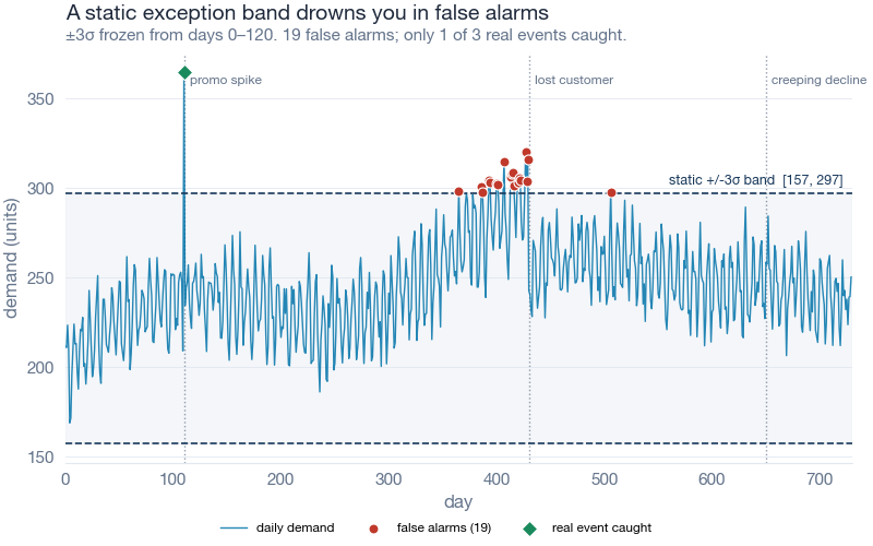
Look at where the red dots pile up. Not on the real events. On the ordinary seasonal peaks, where growth plus a good week pushes demand through a ceiling that was set months ago on smaller numbers. The band is too tight at the top of the cycle and too loose at the bottom. In a trending, seasonal series, a frozen band spends its whole life fighting the calendar instead of watching for trouble.
And the trouble walks right past it. In our simulation the band missed a persistent level shift entirely, the exact "lost a customer" pattern that should terrify a planner, because a demand drop of that size still landed inside a band stretched wide by two years of growth. The one event it did catch was a promo spike so violent that nothing could have missed it.
Monitor the surprise, not the number
Weather forecasters solved this problem decades ago, and the fix is a shift in what you measure.
When the forecast says "90% chance of rain" and it rains, that is not news. The forecaster expected it. When the forecast says "5% chance of rain" and you get soaked, that is a genuine surprise, the kind worth investigating. Same rain. Same puddles. Completely different information, because the surprise depends on what you predicted, not on how wet you got.
Apply that to demand. Instead of asking "is today’s number far from a frozen average," ask "how surprised should I be by today’s number, given everything I’ve learned about this SKU so far?" You run each day’s demand through a forecast’s predictive distribution and read off where it falls. A Tuesday in peak season that lands exactly where the model expected? Boring, no matter how high the raw number. A quiet-season Tuesday that comes in far below what the model was confident about? That’s your surprise, and that’s your alarm.
The statistical name for this is the probability integral transform. The intuition is simpler: score the shock, not the level.
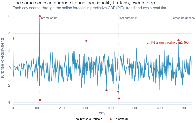
The chart above is the same SKU as before, redrawn as surprise. What jumped out at me is how boring most of it looks now. The trend is gone. The seasonal swell is gone. The weekly wiggle is gone. All the structure the model could predict has been subtracted away, and what’s left is a flat band hovering near zero, with a handful of spikes poking through the threshold. Three of them are the real events, caught cleanly. The detector also trips twice on ordinary noise, and once during its early warm-up before it had learned the pattern. Eight alarms, two of them false. That’s the same tally the head-to-head table reports below, and it’s honest work: a short list a planner can actually read.
For the forecast itself I used Peter Cotton’s timemachines package, a Python library of online forecasters that update one observation at a time. No seasonality to configure, no retraining schedule. You stream the series in, it learns the trend and the weekly rhythm as it goes, and it exposes exactly the quantity we need: where each new day fell inside its own predictive distribution.
The payoff: a threshold that keeps its promise
Now the part that makes this worth a planner’s afternoon. Once you’re scoring surprise, the alarm threshold becomes an honest dial. Set it to 1% and you’re saying "wake me for the most surprising 1% of days." That is a false-alarm budget, stated in plain language, and a calibrated detector keeps within it.
The frozen band does not. Here’s what happens when you ask each method for a given false-alarm rate and then measure what it actually hands back.
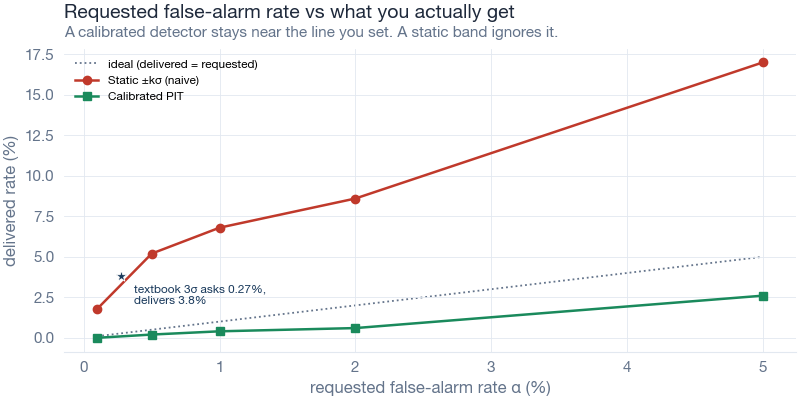
The dotted diagonal is the promise. It’s the line where "I asked for 1%" means "I got 1%." The calibrated line sits right on it or just below, so you get the budget you asked for or a little quieter. The static band floats well above it at every single setting, which means every time you dial in a rate, the frozen band quietly overrides you and sends more noise than you signed up for.
The headline case is the one everybody actually uses. Textbook three sigma promises a 0.27% false-alarm rate. On this trending, seasonal series it delivered 3.80%. That’s 14 times the noise you were promised, from the single most common exception rule in demand planning. You didn’t choose 3.80%. Nobody would. The band chose it for you and didn’t mention it.
The field test
I ran both detectors on the same simulated SKU: 730 daily observations, roughly two years, one growing product with a weekly and a mild yearly cycle. Then I injected three events a planner would genuinely want to know about. A one-day promo spike. A persistent level shift down, the lost-customer pattern. And a slow creeping decline over the final stretch, the kind that hides in plain sight because no single day looks alarming.
Everything below comes from that one simulation. Here’s the head-to-head.
| Metric | Static ±3σ band | Calibrated PIT (α = 1%) |
|---|---|---|
| Total alarms raised | 20 | 8 |
| False alarms | 19 | 2 |
| Real events caught (of 3) | 1 | 3 |
| Delivered false-alarm rate | 3.80% | 0.40% |
| False alarms per week | 0.266 | 0.028 |
| Lost-customer shift detected | never | same day |
Read the first two rows together. The static band raised twenty alarms and nineteen of them were false. Nineteen. That is a report a planner learns to ignore inside a month, and they’d be right to. The calibrated detector raised eight alarms, two false, and caught all three real events including the level shift it flagged the same day it happened.
The naive band cried wolf 9.5 times more often (19 false alarms versus 2), and while it was busy crying wolf at the seasonal peaks, the actual wolf, the lost customer, strolled in unnoticed and stayed. It never detected that shift at all.
There’s the trade laid bare. It isn’t that the static band is a little noisier. It’s that the noise and the misses are the same disease. A band stretched wide enough to survive the seasonal peaks is, by construction, too loose to feel a real drop. You can’t tune your way out of that with a frozen number.
Where this breaks
I’m not going to oversell it, because a monitor you trust blindly is just a prettier way to get burned.
Calibration is a promise about the average, not a guarantee about any single day. If your demand has fat tails, sudden regime changes, or long gaps of intermittent zeroes, the online forecaster’s predictive distribution can be miscalibrated too, and then "1%" drifts just like the frozen band did. The fix isn’t faith. It’s the same check you’d run on any forecast: hold out a stretch of history, count how often the alarm actually fired, and confirm the delivered rate matches the rate you asked for. If it doesn’t, the model’s distribution is wrong for that SKU, and you swap the forecaster before you trust the alarms.
The method also needs history. An online forecaster spends its first weeks learning the trend and the weekly cycle, and during that warm-up its surprise scores are shaky. For a brand-new SKU with forty days of life, you have bigger problems than exception thresholds. And none of this decides what to do once an alarm fires. It buys you a clean, short, honest list. A human still has to work it.
One more honest note on scope. Peter Cotton’s own package benchmarks report much larger accuracy gains on established anomaly-detection datasets, but those are the author’s numbers on the author’s test sets. The figures in this post are from one synthetic SKU I built to make the seasonality problem visible. Treat them as an illustration of the mechanism, not a universal effect size.
Interactive Dashboard
Explore the trade yourself. Slide the false-alarm budget up and down and watch both detectors respond in real time: how many alarms each raises, how many are false, and which of the three real events survive the cut.
Interactive Dashboard
Explore the data yourself — adjust parameters and see the results update in real time.
Your next steps
Five things you can do this week, in order of effort.
-
Rank your exception report by signal-to-noise, not by SKU value. Pull last quarter’s alerts, and for each rule count how many flags led to a real action. Start your fix with the worst offender, the rule that fired the most and helped the least. That’s where a planner’s trust is bleeding out fastest.
-
Install the toolkit and stream one series through it. Run
pip3 install timemachines, take a single SKU with a clear trend or season, and push its daily history through alaplaceskater one observation at a time. You’ll have surprise scores in a few lines of code. The full script is in the collapsible block below. -
Pick your α as an attention budget, not a statistics ritual. Multiply your target false-alarm rate by the days in a year, then by the number of SKUs you monitor. That product is roughly how many alerts you’re signing up to review. Set α to the review capacity you actually have, not to a number you read in a textbook.
-
Backtest the promise before you trust it. Hold out six months, run the alarm, and count. If you asked for 1% and got 4%, the forecaster’s distribution is wrong for that SKU. Fix the model, not the threshold.
-
Retire the frozen band on your worst-behaved series first. The SKUs with the strongest trend and seasonality are exactly where a static ±3σ band lies the most. Those are your highest-value swap. Leave the flat, stable, boring SKUs for last, since a frozen band barely hurts you there.
If your exception report has trained your planners to ignore it, the report is the thing that’s broken. Fix the math, and the trust comes back.
Show Python Code
"""
generate_alert_images.py
========================================================================
"Your Exception Report Is Lying to You"  (inphronesys.com, 2026-07-14)

Simulates two years of daily demand for one SKU with trend + weekly and
yearly seasonality, injects three labelled events (a promo spike, a lost-
customer level shift, and a creeping decline), then compares two exception
detectors:

  Detector A (naive)      -- a static +/-3 sigma band, mean & sd frozen from a
                             120-day baseline window. This is the band a
                             planner actually configures in an exception report.

  Detector B (calibrated) -- the REAL timemachines v2 `laplace` online
                             forecaster. Each day's demand is pushed through the
                             skater's predictive CDF (the probability integral
                             transform, PIT, that laplace exposes in
                             state["pit"]), turned into a two-sided p-value, and
                             alarmed when p < alpha. Setting alpha sets the
                             false-alarm budget directly.

Outputs (Images/, prefix alert_):
  alert_static_band.png      demand + static band + alarms (false ones cluster)
  alert_surprise_transform.png  the same series in calibrated surprise space
  alert_alarms_per_week.png  false alarms/week, naive vs calibrated
  alert_calibration.png      requested alpha vs delivered false-alarm rate

Also writes Dashboards/data/alert_explorer_data.json for Charlie's dashboard.

Run from project root:
    python3 Scripts/generate_alert_images.py
"""

from __future__ import annotations

import json
import os
import sys
import warnings
from math import erf, sqrt

import numpy as np
import matplotlib.pyplot as plt

warnings.filterwarnings("ignore")

# Make the local theme importable whether run from root or Scripts/
sys.path.insert(0, os.path.dirname(os.path.abspath(__file__)))
from theme_inphronesys import (  # noqa: E402
    apply_theme, style_axes, save_fig, IPH_COLORS, FONT_IN_USE, FONT_IS_FALLBACK,
)

from timemachines import laplace  # noqa: E402  (real v2 API)

# --- paths (relative to project root; no hardcoded absolutes) ---
ROOT = os.path.dirname(os.path.dirname(os.path.abspath(__file__)))
IMG_DIR = os.path.join(ROOT, "Images")
DATA_DIR = os.path.join(ROOT, "Dashboards", "data")
os.makedirs(IMG_DIR, exist_ok=True)
os.makedirs(DATA_DIR, exist_ok=True)

apply_theme(base_size=13)


# ======================================================================
# 1. Helpers
# ======================================================================
def norm_cdf(x: float) -> float:
    return 0.5 * (1.0 + erf(x / sqrt(2.0)))


def norm_ppf(p: float) -> float:
    """Inverse standard-normal CDF via bisection (no scipy dependency)."""
    lo, hi = -12.0, 12.0
    for _ in range(200):
        mid = 0.5 * (lo + hi)
        if norm_cdf(mid) < p:
            lo = mid
        else:
            hi = mid
    return 0.5 * (lo + hi)


# ======================================================================
# 2. Simulate two years of daily demand for one SKU
# ======================================================================
SEED = 42
N = 730                       # ~2 years of daily observations
BASE = 200.0                  # base demand, units/day
TREND = 0.18                  # +0.18 units/day  (~+131 over 2 years, growing SKU)
WEEKLY_AMP = 18.0             # weekly seasonality amplitude (day-of-week effect)
YEARLY_AMP = 22.0             # mild yearly seasonality amplitude
NOISE_SD = 9.0                # daily noise sd

SPIKE_DAY = 110               # (a) one-day promo / panic-buy spike
SPIKE_MAG = 140.0
SHIFT_DAY = 430               # (b) persistent level shift down (lost customer)
SHIFT_MAG = 45.0
DRIFT_START = 650             # (c) gradual creeping decline near the end
DRIFT_MAG = 45.0

TRAIN = 120                   # baseline window the planner uses to set the band
ALPHA = 0.01                  # headline false-alarm budget = 1%
SIGMA_K = 3.0                 # headline static band width

rng = np.random.default_rng(SEED)
t = np.arange(N)

trend = TREND * t
weekly = WEEKLY_AMP * np.sin(2 * np.pi * (t % 7) / 7) + 0.5 * WEEKLY_AMP * np.cos(2 * np.pi * (t % 7) / 7)
yearly = YEARLY_AMP * np.sin(2 * np.pi * t / 365.25)
noise = rng.normal(0, NOISE_SD, N)

demand = BASE + trend + weekly + yearly + noise
demand[SPIKE_DAY] += SPIKE_MAG
demand[SHIFT_DAY:] -= SHIFT_MAG
demand[DRIFT_START:] -= np.linspace(0, DRIFT_MAG, N - DRIFT_START)
demand = np.round(demand, 1)

# Event windows: a real event counts as "caught" if any alarm lands inside.
spike_win = set([SPIKE_DAY, SPIKE_DAY + 1])              # allow 1-day reporting lag
shift_win = set(range(SHIFT_DAY, SHIFT_DAY + 30))        # 30-day detection window
drift_win = set(range(DRIFT_START, N))
event_days = spike_win | shift_win | drift_win

# Fair evaluation window: after the baseline warm-up, excluding event windows.
# Both detectors need history before they can judge "normal", so neither is
# scored on days it effectively used to calibrate.
eval_days = set(i for i in range(TRAIN, N) if i not in event_days)
N_EVAL = len(eval_days)
WEEKS_EVAL = N_EVAL / 7.0


# ======================================================================
# 3. Detector A -- static +/-3 sigma band (frozen from baseline window)
# ======================================================================
mu = float(demand[:TRAIN].mean())
sd = float(demand[:TRAIN].std(ddof=1))
band_up = mu + SIGMA_K * sd
band_lo = mu - SIGMA_K * sd

# Implied per-day two-sided p-value under the frozen normal model (for the JSON /
# surprise view): p = 2 * (1 - Phi(|z|)), z = (y - mu) / sd.
zA = (demand - mu) / sd
pA = np.array([2.0 * (1.0 - norm_cdf(abs(z))) for z in zA])
alarm_A = np.where((demand > band_up) | (demand < band_lo))[0]


# ======================================================================
# 4. Detector B -- calibrated PIT surprise via timemachines laplace
# ======================================================================
skater = laplace(k=1)          # 1-step-ahead online Bayesian forecaster
state = None
pit = np.full(N, np.nan)
for i, y in enumerate(demand):
    _, state = skater(float(y), state)
    p = state.get("pit")
    if p and p[0] is not None:
        pit[i] = p[0]

# PIT ~ Uniform(0,1) when calibrated -> two-sided p-value and a z-surprise.
# Both stay NaN until the 1-step PIT has matured (day 0 has no prior forecast).
pB = 2.0 * np.minimum(pit, 1.0 - pit)
zB = np.array([np.nan if np.isnan(p) else norm_ppf(min(max(p, 1e-9), 1 - 1e-9))
               for p in pit])  # signed surprise
alarm_B = np.where(pB < ALPHA)[0]


# ======================================================================
# 5. Metrics (every division shown explicitly)
# ======================================================================
def false_alarms(alarm_idx):
    return sorted(i for i in alarm_idx if i in eval_days)


def events_caught(alarm_idx):
    aset = set(int(i) for i in alarm_idx)
    return {
        "spike": bool(aset & spike_win),
        "shift": bool(aset & shift_win),
        "drift": bool(aset & drift_win),
    }


def ttd_shift(alarm_idx):
    hits = sorted(i for i in alarm_idx if i in shift_win)
    return int(hits[0] - SHIFT_DAY) if hits else None


faA = false_alarms(alarm_A)
faB = false_alarms(alarm_B)
caughtA = events_caught(alarm_A)
caughtB = events_caught(alarm_B)

rateA = len(faA) / N_EVAL
rateB = len(faB) / N_EVAL
textbook_3sigma = 2.0 * (1.0 - norm_cdf(3.0))     # 0.0027 (0.27%)

metrics = {
    "A": {
        "total_alarms": int(len(alarm_A)),
        "false_alarms": len(faA),
        "false_per_week": len(faA) / WEEKS_EVAL,
        "delivered_fa_rate": rateA,
        "events_caught": sum(caughtA.values()),
        "caught_detail": caughtA,
        "ttd_shift_days": ttd_shift(alarm_A),
    },
    "B": {
        "total_alarms": int(len(alarm_B)),
        "false_alarms": len(faB),
        "false_per_week": len(faB) / WEEKS_EVAL,
        "delivered_fa_rate": rateB,
        "events_caught": sum(caughtB.values()),
        "caught_detail": caughtB,
        "ttd_shift_days": ttd_shift(alarm_B),
    },
}

# --- calibration sweep: requested alpha vs delivered false-alarm rate ---
sweep_alphas = [0.001, 0.005, 0.01, 0.02, 0.05]
calibration = []
for a in sweep_alphas:
    k = norm_ppf(1.0 - a / 2.0)
    iA = np.where((demand > mu + k * sd) | (demand < mu - k * sd))[0]
    iB = np.where(pB < a)[0]
    dA = len(false_alarms(iA)) / N_EVAL
    dB = len(false_alarms(iB)) / N_EVAL
    calibration.append({"alpha": a, "k_sigma": k, "A_delivered": dA, "B_delivered": dB})

# ---- console report (Bravo's evidence trail) ----
print("=" * 68)
print("FONT IN USE:", FONT_IN_USE, "(fallback)" if FONT_IS_FALLBACK else "(exact)")
print("=" * 68)
print(f"N={N} base={BASE} trend={TREND}/day  end-60-day mean={demand[-60:].mean():.1f}")
print(f"events: spike d{SPIKE_DAY}(+{SPIKE_MAG}) shift d{SHIFT_DAY}(-{SHIFT_MAG}) "
      f"drift d{DRIFT_START}..{N-1}(-{DRIFT_MAG} ramp)")
print(f"eval window: days {TRAIN}..{N-1} minus events = {N_EVAL} days = {WEEKS_EVAL:.2f} weeks")
print("-" * 68)
print(f"A static +/-{SIGMA_K:.0f} sigma  baseline mu={mu:.2f} sd={sd:.2f} band=[{band_lo:.1f}, {band_up:.1f}]")
print(f"  total={metrics['A']['total_alarms']}  false={len(faA)}  "
      f"rate={len(faA)}/{N_EVAL}={rateA:.5f} ({100*rateA:.2f}%)  "
      f"= {rateA/textbook_3sigma:.1f}x textbook {100*textbook_3sigma:.2f}%")
print(f"  false/week={len(faA)}/{WEEKS_EVAL:.2f}={metrics['A']['false_per_week']:.3f}  "
      f"events={metrics['A']['events_caught']}/3 {caughtA}  TTDshift={metrics['A']['ttd_shift_days']}")
print(f"B laplace PIT  alpha={ALPHA}")
print(f"  total={metrics['B']['total_alarms']}  false={len(faB)}  "
      f"rate={len(faB)}/{N_EVAL}={rateB:.5f} ({100*rateB:.2f}%)")
print(f"  false/week={len(faB)}/{WEEKS_EVAL:.2f}={metrics['B']['false_per_week']:.3f}  "
      f"events={metrics['B']['events_caught']}/3 {caughtB}  TTDshift={metrics['B']['ttd_shift_days']}")
print("-" * 68)
print("calibration sweep (requested alpha -> delivered false-alarm rate):")
for c in calibration:
    print(f"  alpha={c['alpha']:.3f} k={c['k_sigma']:.3f}  "
          f"A={100*c['A_delivered']:.2f}%  B={100*c['B_delivered']:.2f}%")
print("=" * 68)


# ======================================================================
# 6. Charts
# ======================================================================
C = IPH_COLORS
EVENT_LABELS = {SPIKE_DAY: "promo spike", SHIFT_DAY: "lost customer", DRIFT_START: "creeping decline"}


def _mark_events(ax, y_top):
    for day, lab in EVENT_LABELS.items():
        ax.axvline(day, color=C["grey"], linestyle=":", linewidth=1.0, alpha=0.7, zorder=1)
        ax.annotate(lab, xy=(day, y_top), xytext=(4, -2), textcoords="offset points",
                    fontsize=8.5, color=C["grey"], rotation=0, ha="left", va="top")


# ---- Chart 1: static band + alarms (800x500) ----
fig, ax = plt.subplots(constrained_layout=True)
ax.plot(t, demand, color=C["blue"], linewidth=1.0, alpha=0.85, zorder=2, label="daily demand")
ax.axhline(band_up, color=C["navy"], linestyle="--", linewidth=1.2, zorder=3)
ax.axhline(band_lo, color=C["navy"], linestyle="--", linewidth=1.2, zorder=3)
ax.axhspan(band_lo, band_up, color=C["lightgrey"], alpha=0.35, zorder=0)
ax.annotate(f"static +/-3σ band  [{band_lo:.0f}, {band_up:.0f}]",
            xy=(N, band_up), xytext=(-6, 4), textcoords="offset points",
            fontsize=9, color=C["navy"], ha="right", va="bottom")
# false alarms (red) vs real-event catches (green)
fa_mask = np.array([i in eval_days for i in alarm_A])
ax.scatter(alarm_A[fa_mask], demand[alarm_A[fa_mask]], s=42, color=C["red"], zorder=5,
           edgecolor="white", linewidth=0.8, label=f"false alarms ({len(faA)})")
ax.scatter(alarm_A[~fa_mask], demand[alarm_A[~fa_mask]], s=54, color=C["green"], zorder=6,
           marker="D", edgecolor="white", linewidth=0.8, label="real event caught")
_mark_events(ax, demand.max())
ax.set_xlim(0, N)
style_axes(ax,
           title="A static exception band drowns you in false alarms",
           subtitle=f"±3σ frozen from days 0–{TRAIN}. {len(faA)} false alarms; "
                    f"only {metrics['A']['events_caught']} of 3 real events caught.",
           xlabel="day", ylabel="demand (units)")
ax.legend(loc="lower left", ncol=3, fontsize=8.5)
save_fig(fig, os.path.join(IMG_DIR, "alert_static_band.png"), 8, 5)

# ---- Chart 2: surprise space (800x500) ----
fig, ax = plt.subplots(constrained_layout=True)
ax.plot(t, zB, color=C["blue"], linewidth=0.9, alpha=0.8, zorder=2, label="calibrated surprise z")
ax.axhline(0, color=C["grey"], linewidth=0.8, alpha=0.6)
zthr = norm_ppf(1 - ALPHA / 2)
ax.axhline(zthr, color=C["red"], linestyle="--", linewidth=1.1, zorder=3)
ax.axhline(-zthr, color=C["red"], linestyle="--", linewidth=1.1, zorder=3)
ax.annotate(f"α={ALPHA:.0%} alarm threshold (±{zthr:.2f}σ)",
            xy=(N, zthr), xytext=(-6, 4), textcoords="offset points",
            fontsize=9, color=C["red"], ha="right", va="bottom")
ax.scatter(alarm_B, zB[alarm_B], s=48, color=C["red"], zorder=5, edgecolor="white", linewidth=0.8,
           label=f"alarms ({len(alarm_B)})")
_mark_events(ax, zB[~np.isnan(zB)].max())
ax.set_xlim(0, N)
style_axes(ax,
           title="The same series in surprise space: seasonality flattens, events pop",
           subtitle="Each day scored through the online forecast's predictive CDF (PIT); "
                    "trend and cycle read flat.",
           xlabel="day", ylabel="surprise (σ-equivalent)")
ax.legend(loc="upper left", ncol=2, fontsize=8.5)
save_fig(fig, os.path.join(IMG_DIR, "alert_surprise_transform.png"), 8, 5)

# ---- Chart 3: false alarms per week (800x400) ----
fig, ax = plt.subplots(constrained_layout=True)
labels = ["Static ±3σ\n(naive)", "Calibrated PIT\n(α = 1%)"]
vals = [metrics["A"]["false_per_week"], metrics["B"]["false_per_week"]]
colors = [C["red"], C["green"]]
bars = ax.bar(labels, vals, color=colors, width=0.55, zorder=3)
for b, v in zip(bars, vals):
    ax.annotate(f"{v:.2f}/week", xy=(b.get_x() + b.get_width() / 2, v),
                xytext=(0, 4), textcoords="offset points", ha="center", va="bottom",
                fontsize=11, fontweight="bold", color=C["dark"])
ax.set_ylim(0, max(vals) * 1.25)
style_axes(ax,
           title="False alarms per week: the attention tax of a naive band",
           subtitle=f"Over {WEEKS_EVAL:.0f} weeks, {len(faA)} false alarms vs {len(faB)}: "
                    f"the naive band cries wolf {len(faA)/len(faB):.1f}x more often.",
           ylabel="false alarms / week", grid="y")
save_fig(fig, os.path.join(IMG_DIR, "alert_alarms_per_week.png"), 8, 4)

# ---- Chart 4: calibration (800x400) ----
fig, ax = plt.subplots(constrained_layout=True)
xs = [100 * c["alpha"] for c in calibration]
ax.plot(xs, xs, color=C["grey"], linestyle=":", linewidth=1.3, zorder=1,
        label="ideal (delivered = requested)")
ax.plot(xs, [100 * c["A_delivered"] for c in calibration], marker="o", color=C["red"],
        linewidth=1.8, zorder=3, label="Static ±kσ (naive)")
ax.plot(xs, [100 * c["B_delivered"] for c in calibration], marker="s", color=C["green"],
        linewidth=1.8, zorder=3, label="Calibrated PIT")
# headline 3-sigma point
ax.scatter([100 * textbook_3sigma], [100 * rateA], s=70, color=C["navy"], zorder=5,
           marker="*", edgecolor="white", linewidth=0.6)
ax.annotate(f"textbook 3σ asks 0.27%,\ndelivers {100*rateA:.1f}%",
            xy=(100 * textbook_3sigma, 100 * rateA), xytext=(10, -6),
            textcoords="offset points", fontsize=8.5, color=C["navy"], va="top")
style_axes(ax,
           title="Requested false-alarm rate vs what you actually get",
           subtitle="A calibrated detector stays near the line you set. A static band ignores it.",
           xlabel="requested false-alarm rate α (%)", ylabel="delivered rate (%)", grid="xy")
ax.legend(loc="upper left", fontsize=8.5)
save_fig(fig, os.path.join(IMG_DIR, "alert_calibration.png"), 8, 4)


# ======================================================================
# 7. JSON export for the dashboard (client-side alpha slider)
# ======================================================================
def event_label_for(day):
    if day == SPIKE_DAY:
        return "promo spike"
    if day == SHIFT_DAY:
        return "lost customer (level shift)"
    if day == DRIFT_START:
        return "creeping decline (drift)"
    return None


export = {
    "meta": {
        "title": "Your Exception Report Is Lying to You",
        "seed": SEED,
        "n_days": N,
        "detector_B": "timemachines v2 laplace PIT (real package)",
        "font_in_use": FONT_IN_USE,
        "train_window": TRAIN,
        "headline_alpha": ALPHA,
        "sigma_k": SIGMA_K,
    },
    "band": {"mu": mu, "sd": sd, "k": SIGMA_K, "upper": band_up, "lower": band_lo},
    "events": [
        {"day": SPIKE_DAY, "label": "promo spike", "type": "spike",
         "window": [SPIKE_DAY, SPIKE_DAY + 1]},
        {"day": SHIFT_DAY, "label": "lost customer (level shift)", "type": "level_shift",
         "window": [SHIFT_DAY, SHIFT_DAY + 29]},
        {"day": DRIFT_START, "label": "creeping decline (drift)", "type": "drift",
         "window": [DRIFT_START, N - 1]},
    ],
    "eval": {"train": TRAIN, "n_eval_days": N_EVAL, "weeks_eval": WEEKS_EVAL},
    "series": [
        {
            "day": int(i),
            "demand": float(demand[i]),
            "p_static": float(pA[i]),                                  # detector A p-value
            "z_static": float(zA[i]),
            "p_calibrated": (None if np.isnan(pB[i]) else float(pB[i])),  # detector B p-value
            "z_calibrated": (None if np.isnan(zB[i]) else float(zB[i])),
            "is_event": bool(i in event_days),
            "event_label": event_label_for(i),
        }
        for i in range(N)
    ],
    "metrics": metrics,
    "calibration": calibration,
    "textbook_3sigma_rate": textbook_3sigma,
}

json_path = os.path.join(DATA_DIR, "alert_explorer_data.json")
with open(json_path, "w") as f:
    json.dump(export, f, indent=None, separators=(",", ":"))

print(f"\nWrote images to {IMG_DIR}/alert_*.png")
print(f"Wrote dashboard data to {json_path} "
      f"({os.path.getsize(json_path)/1024:.1f} KB)")


# ======================================================================
# 8. Apply to Your Own Data
# ======================================================================
# Replace the simulation in section 2 with your own daily series and reuse
# everything below it unchanged:
#
#   import pandas as pd
#   df = pd.read_csv("my_sku.csv", parse_dates=["date"]).sort_values("date")
#   demand = df["units"].to_numpy(dtype=float)
#   N = len(demand); t = np.arange(N)
#
#   # Detector B needs no seasonality spec -- laplace learns trend & weekly
#   # cycle online. Just stream your series through it:
#   skater = laplace(k=1); state = None
#   pit = np.full(N, np.nan)
#   for i, y in enumerate(demand):
#       _, state = skater(float(y), state)
#       p = state.get("pit")
#       if p and p[0] is not None:
#           pit[i] = p[0]
#   pB = 2 * np.minimum(pit, 1 - pit)
#   alpha = 0.01                      # your false-alarm budget: alarms/day you can action
#   alarms = np.where(pB < alpha)[0]  # the days worth a planner's attention
#
# Pick alpha as an attention budget, not a statistical ritual: alpha * (days
# per year) is roughly how many alarms per SKU per year you are signing up to
# review. Tune it to the review capacity you actually have.
References
- Cotton, P. timemachines: A collection of online forecasting functions with a common interface (v2.1.0). GitHub: github.com/microprediction/timemachines · Documentation: timemachines.microprediction.org · Skater gallery: skaters.microprediction.org · PyPI: pypi.org/project/timemachines
- Dawid, A. P. (1984). "Statistical Theory: The Prequential Approach." Journal of the Royal Statistical Society, Series A, 147(2), 278–292. The probability integral transform and calibration as a test of predictive distributions.
- Gneiting, T., Balabdaoui, F., & Raftery, A. E. (2007). "Probabilistic forecasts, calibration and sharpness." Journal of the Royal Statistical Society, Series B, 69(2), 243–268.
- Related reading on this blog: the Bullwhip Effect series (why upstream signals distort), and the Time Series decomposition post (separating trend and seasonality from noise).
Leave a Reply