Maybe you have encountered a similar problem: You know you have to drastically improve your cash flow position to stay competitive. To do this, the biggest improvement will be to get rid of the capital invested in your inventories.
Data science tools offer a wide range of data visualization possibilities. These visualization tools will show you, with very little effort, where your biggest leverage is, for improving your inventory situation.
Here, we will introduce a visualization which is made by using the data science software R with the libraries tableplot and ggridges (basically an extension of ggplot).
First, we will show an example of how a tableplot can help identify inventories, that have a very high monetary value and at the same time, very large on hand quantities. Concentrating on large on hand quantities can help you save storage cost.
A tableplot is basically a visualization of large datasets. Each column represents a variable and each row bin is an aggregate of a certain number of records.
To be able to use a tableplot for inventory management, we are using three variables:
- On Hand Inventory Levels – in our example: „Months_Inventory“
- The Monetary Value of the Inventory – in our example: „Value_Inventory“
- The Amount of Inventory – in our example : „Stock_On_Hand“
After tidying the data and running the necessary code, you will be presented with the following visualization:
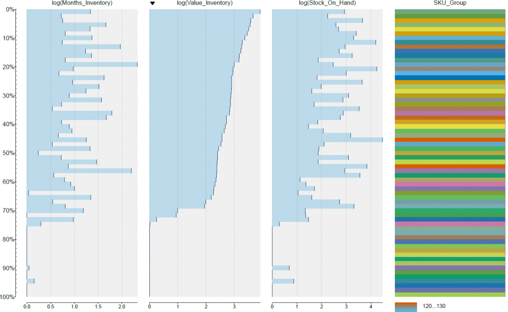
You will be provided of an immediate picture, which shows you where you have the greatest leverage to improve you inventory cost.
Here, you can „pick“ the area that you would like to improve the most. By concentrating on inventories that have a high value of „Stock_On_Hand“ you would be able to optimize the storage space used by your inventories. Starting improvements where you have a high „Value_Inventory“ number, should give you quick improvements in the areas of cash flow and liquidity.
You will also have the possibility of further drilling down on your data to get more details and understanding of your inventory situation.
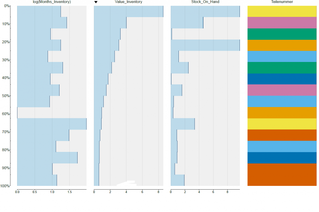
Another great way of finding extreme inventory values, is by using boxplots. Below is an example with the same data, but this time in boxplots:
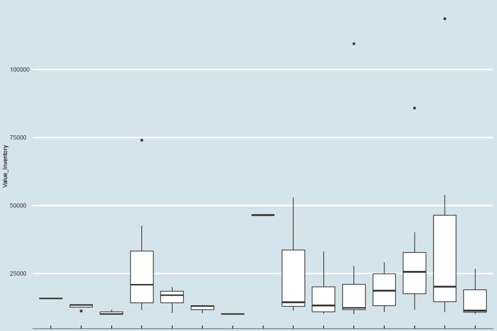
Boxplots are a great way of finding extreme values (outliers) and to understand the distribution of your data within defined groups.
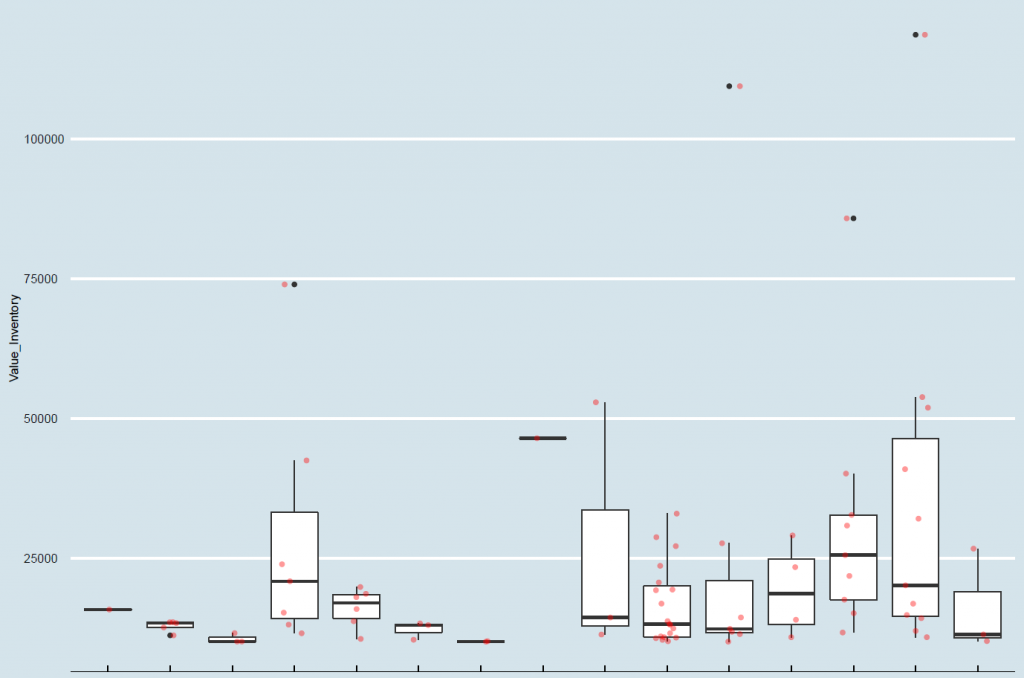
By adding the actual data points to the boxplot, you will get a better understanding of how boxplots show distribution:
Yet another possibility of analyzing, where you will have the biggest impact by lowering your inventory leveles, is by using density ridges:
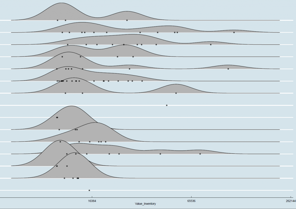
Please not, that the distribution of the inventory values was very high, so a log scale was necessary to show the distribution.
By using data visualization, you will be able to easily identify where your biggest leverage is, for improving your inventory levels.

Schreibe einen Kommentar