Last time I gave one agent one decision. This week I asked 3,000 disruptions a harder question.
Last week I handed an AI agent the reorder button and watched it rebuild the bullwhip effect from scratch. One SKU, one decision, one simulation. The lesson was tidy: a system that reacts too fast manufactures its own volatility.
But that was a model I built. I controlled the demand, the lead time, the seed. A fair question came back: what actually happens when real disruptions hit real firms, and what separates the ones that shrug them off from the ones that bleed?
So this week I pulled a bigger lever. I took 3,000 disruption events and asked a blunt question of all of them at once. What predicts the damage?
The answer surprised me, because it argues against most of what gets bought in the name of resilience.
Here is the claim I’ll defend for the rest of this post: the things teams buy to feel safe barely move the outcome. The dual-source checkbox, the thicker mitigation playbook, the count of approved alternates. Near-zero. What moves the outcome is something you can’t purchase in a single quarter. Call it resilience maturity, the slow climb from reacting to adapting.
What the data is, and what it is not
First, the honest part. The dataset is xpertsystems/mfg006-sample: 3,000 synthetic supply-chain disruption events across 113 columns, published by xpertsystems under a CC-BY-NC-4.0 license. You can pull it yourself from Hugging Face.
Synthetic matters. This is not a measurement of the real world. It is a structured simulation that lets you reason about relationships and self-assess your own posture against a coherent model. Every number below describes patterns inside that simulation. Treat them as association, never as proof of cause. Nobody ran a controlled experiment where firms were randomly assigned a resilience posture.
One more thing before any chart. Cost of disruption is brutally right-skewed. The median event costs $512,738. The mean is $1,912,836, roughly 3.7 times higher. The worst single event runs to $125,423,755. A handful of catastrophes drag the average into fantasy.
That gap is the whole reason I lead with medians. If I quoted means, a few freak tail events would write the headline and you’d learn nothing about the typical disruption. So whenever you see a number here, it’s a median unless I say otherwise. When a mean appears, I’ll flag the skew.
The ladder: one variable, three outcomes, all moving together
The dataset tags each event with the firm’s resilience posture going in, on a five-rung scale: reactive, aware, compliant, proactive, adaptive. Reactive firms fight fires. Adaptive firms have folded disruption response into how they operate.
I split all 3,000 events by that posture and looked at three outcomes at once: median cost, median days to full recovery, and median mitigation effectiveness on a 0 to 10 scale.
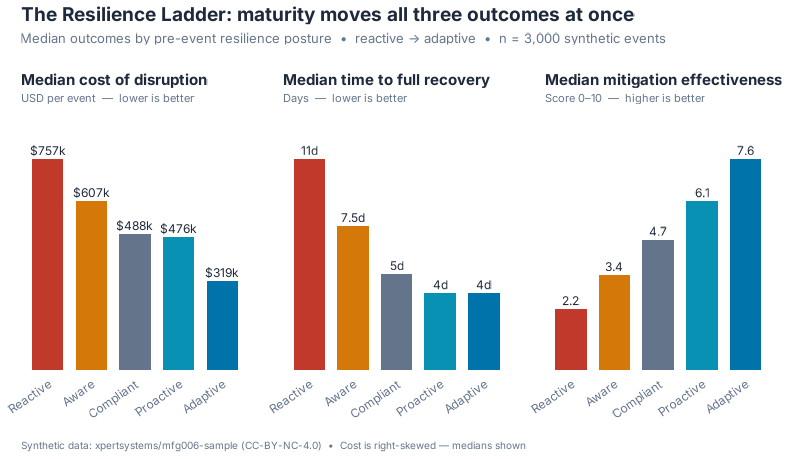
What jumped out at me was the cleanness of it. All three outcomes move in lockstep across the rungs, no zig-zag.
| Posture | n | Median cost | Median recovery (days) | Median mitigation effectiveness (0–10) |
|---|---|---|---|---|
| Reactive | 87 | $757,184 | 11.0 | 2.19 |
| Aware | 716 | $607,102 | 7.5 | 3.42 |
| Compliant | 1,428 | $487,578 | 5.0 | 4.69 |
| Proactive | 679 | $475,961 | 4.0 | 6.07 |
| Adaptive | 90 | $319,000 | 4.0 | 7.60 |
Read the top and bottom rows against each other. An adaptive firm’s median disruption costs about 58% less than a reactive firm’s ($319,000 versus $757,184). It recovers in 4 days instead of 11, roughly 2.75 times faster. Its mitigations land 3.47 times more effectively. Same shocks, wildly different bills.
A smaller comparison makes the point land harder. A reactive firm pays 1.59 times what a proactive firm pays for the median event. You don’t even have to reach the top rung. Just stop fighting every fire from cold.
The checkbox that doesn’t pay
Now the part that annoyed me, in a good way.
Ask a procurement team how they’re managing supplier risk and you’ll often hear a number: how many lines carry a dual-source flag. It’s the resilience metric everyone can produce on a slide. So I checked whether the flag actually buys anything.
It doesn’t.
| Dual source in place? | n | Median cost | Mean recovery (days) |
|---|---|---|---|
| No | 434 | $472,716 | 27.4 |
| Yes | 2,566 | $516,864 | 32.8 |
Look again. Events at firms with a dual-source flag carry a slightly higher median cost ($516,864 versus $472,716) and a slower mean recovery. The checkbox correlates the wrong way.
I don’t read that as “dual sourcing is bad.” My read is simpler: the flag is theater. It most likely gets bolted onto lines that were already risky, so it travels with trouble rather than preventing it. The presence of the checkbox tells you almost nothing about the outcome.
The count of alternates is no better. Correlation between the number of alternative suppliers and disruption cost: Pearson −0.011, Spearman +0.021. Both round to nothing. Stacking names on an approved-vendor list, by itself, does not predict a cheaper disruption.
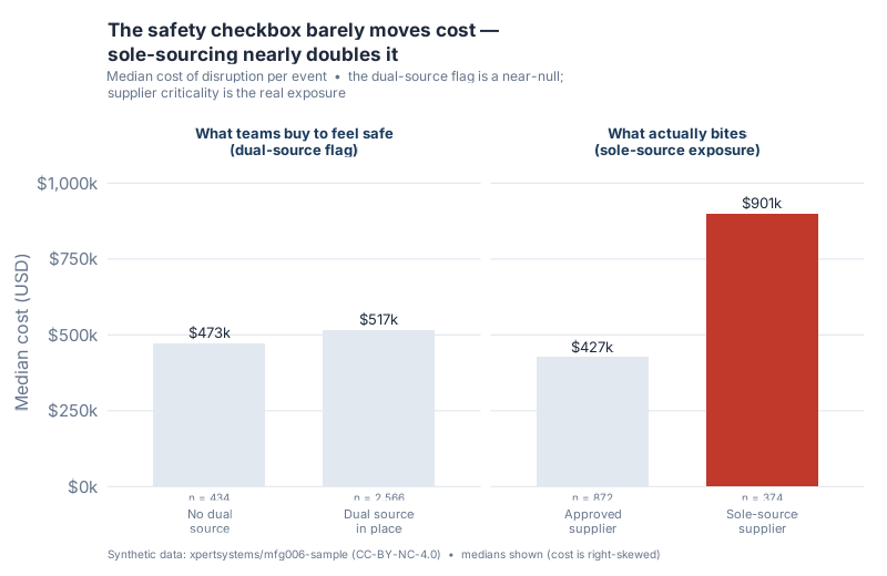
So is sourcing irrelevant? No. The error is measuring the wrong thing. A flag is binary theater. Who you depend on is the real exposure.
| Supplier criticality | n | Median cost |
|---|---|---|
| sole_source | 374 | $900,766 |
| conditional | 466 | $500,590 |
| preferred | 1,058 | $477,541 |
| strategic_partner | 230 | $475,657 |
| approved | 872 | $426,848 |
Sole-sourcing nearly doubles the median disruption cost. A sole-source event runs $900,766, which is 2.11 times the median for an approved supplier ($426,848) and 1.89 times that of a preferred supplier. Here’s the contrast that makes the whole post: a dual-source flag shifts cost by about $44k in the wrong direction, while who you source from swings it by roughly $474k. One is a slide metric. The other is your actual risk.
“But mature firms just get easier shocks”
Every honest analyst hears this objection coming, and it’s the right one to raise. Maybe adaptive firms simply face gentler disruptions. Maybe the ladder is an illusion created by severity, and all I’ve found is that calm companies live in calm waters.
I find that explanation tempting, which is exactly why I went after it.
First, the direct test. I re-ran the cost ladder inside each severity band, so reactive and adaptive firms are only ever compared against shocks of the same severity.
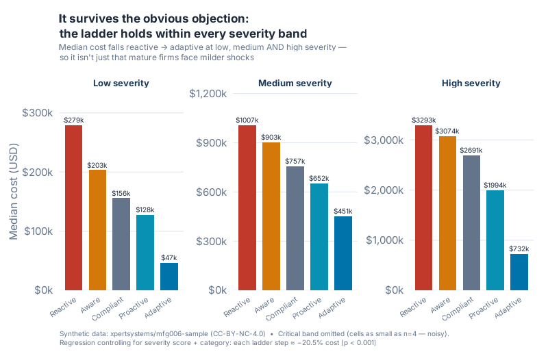
| Severity band | Reactive | Aware | Compliant | Proactive | Adaptive |
|---|---|---|---|---|---|
| Low | $279k | $203k | $156k | $128k | $47k |
| Medium | $1,007k | $903k | $757k | $652k | $451k |
| High | $3,293k | $3,074k | $2,691k | $1,994k | $732k |
The ladder holds in all three bands. Strictly decreasing, reactive to adaptive, at low, medium, and high severity. Maturity isn’t getting an easy ride. Hold severity fixed and it still pays.
A fair warning on where this breaks. In the critical band the ordering goes ragged, with adaptive firms posting a higher median than some lower rungs. But those cells are tiny, reactive at n=7 and adaptive at n=4. That’s small-sample noise, not a real reversal, so I left the critical band out of the chart rather than dress noise up as a finding.
Second, the part that flips the objection on its head. In this data, adaptive firms actually face more high-severity events (24.4% of their events are high severity) than reactive firms (11.5%). They’re swimming in rougher water and still paying less.
Third, the regression. I fit a log-cost model with resilience posture as an ordinal step from 1 to 5, then added controls for the severity score and the disruption category. With controls in, each rung up the ladder is associated with about a 20.5% lower disruption cost (coefficient −0.2297, p = 3.1×10⁻¹⁷, adjusted R² = 0.42) and about 5.8 fewer recovery days (p = 0.0015). Without the severity and category controls, the per-step effect was smaller, 18.7%. The posture effect got stronger once I held severity constant, not weaker. A severity artifact would have shrunk under controls. This one grew.
I’ll say the caveat one final time, because it’s the spine of the whole piece. This is observational, synthetic data. The pattern is association, not proof of cause. But it is not explained away by severity, and that is more than most resilience metrics can claim.
What it costs to bleed
Put the medians in business terms. Climbing from reactive to adaptive is associated with cutting the typical disruption bill by roughly $438,000 ($757,184 down to $319,000) and shaving a week off recovery. Across a portfolio of disruptions, that compounds into real money, and the recovery days are revenue you stop losing while you’re down.
Compare that to where most resilience budgets go. Dual-source flags. Longer approved-vendor lists. Both near-null in this data. The maturity climb is unglamorous and slow, and it’s the factor most strongly associated with lower cost here.
Interactive Dashboard
Find your own rung. Answer a few questions to land on a posture (or pick one directly), then see the median cost, recovery days, and mitigation effectiveness this synthetic model associates with that level, plus the P25 to P75 cost spread behind the median. A separate view shows how the cost ladder holds up within each severity band.
Interactive Dashboard
Explore the data yourself — adjust parameters and see the results update in real time.
Your next steps this week
- Stop counting dual-source flags. Start tagging sole-source dependencies. Pull your supplier master and flag every line where one vendor is the only qualified source. That list, not your dual-source coverage percentage, is your real exposure map.
- Score your own posture on the five rungs. For your top 10 spend categories, mark each as reactive, aware, compliant, proactive, or adaptive. Be honest about which ones only have a binder, not a behavior.
- Measure recovery time, not just cost. Find your last three disruptions and write down days to full recovery. Most risk dashboards track cost and stop there. If you aren’t tracking recovery, you can’t manage it.
- Audit one “resilience” line item for theater. Take a control you’ve already paid for and ask whether it changed an outcome or just produced a slide. The dual-source flag failed that test here.
- Run yourself through the dashboard. Answer the self-assessment, land on a posture, and read the median cost, recovery, and effectiveness the synthetic model ties to that level. Use the gap against your gut as a conversation starter, not a verdict.
Show R Code
# =============================================================================
# generate_resilience_ladder_images.R
# "The Resilience Ladder" — June Resilience Month, Week 1 Post 1
# Data: xpertsystems/mfg006-sample (3,000 SYNTHETIC disruption events, CC-BY-NC-4.0)
#       https://huggingface.co/datasets/xpertsystems/mfg006-sample
# Run from project root:  Rscript Scripts/generate_resilience_ladder_images.R
# =============================================================================

source("Scripts/theme_inphronesys.R")

suppressPackageStartupMessages({
  library(ggplot2)
  library(dplyr)
  library(tidyr)
  library(scales)
  library(patchwork)
  library(jsonlite)
})

df <- read.csv("Research/mfg006/mfg006_disruptions.csv", stringsAsFactors = FALSE)

posture_levels <- c("reactive", "aware", "compliant", "proactive", "adaptive")
posture_labels <- c("Reactive", "Aware", "Compliant", "Proactive", "Adaptive")
sev_levels     <- c("low", "medium", "high", "critical")

df$resilience_posture_pre_event <- factor(df$resilience_posture_pre_event,
                                          levels = posture_levels)
df$severity_level <- factor(df$severity_level, levels = sev_levels)

med <- function(x) median(x, na.rm = TRUE)
mn  <- function(x) mean(x, na.rm = TRUE)

posture_cols <- c(reactive  = iph_colors$red,
                  aware     = iph_colors$orange,
                  compliant = iph_colors$grey,
                  proactive = iph_colors$teal,
                  adaptive  = iph_colors$blue)

# --- CHART 1: the ladder, three outcomes as a small multiple ------------------
ladder <- df %>%
  group_by(posture = resilience_posture_pre_event) %>%
  summarise(
    n              = n(),
    median_cost    = med(cost_of_disruption_total_usd),
    median_recov   = med(time_to_full_recovery_days),
    median_mit_eff = med(mitigation_effectiveness_score),
    .groups = "drop"
  ) %>% arrange(posture)

ladder_long <- ladder %>%
  select(posture, median_cost, median_recov, median_mit_eff) %>%
  pivot_longer(-posture, names_to = "metric", values_to = "value")

# (panel helper + patchwork assembly: builds three bar panels sharing the
#  posture colour ramp, then stitches them with plot_annotation. Saved at
#  width = 8, height = 4.6, dpi = 100.)

# --- CHART 2: the dual-source null vs the sole-source exposure -----------------
dual <- df %>%
  group_by(grp = ifelse(dual_source_in_place == "True",
                        "Dual source\nin place", "No dual\nsource")) %>%
  summarise(median_cost = med(cost_of_disruption_total_usd),
            n = n(), .groups = "drop")

crit <- df %>%
  filter(supplier_criticality %in% c("sole_source", "approved")) %>%
  group_by(grp = ifelse(supplier_criticality == "sole_source",
                        "Sole-source\nsupplier", "Approved\nsupplier")) %>%
  summarise(median_cost = med(cost_of_disruption_total_usd),
            n = n(), .groups = "drop")

# (the two blocks are faceted side by side; sole-source highlighted in red)

# --- CHART 3: robustness, the ladder within severity bands --------------------
robust <- df %>%
  group_by(severity_level, posture = resilience_posture_pre_event) %>%
  summarise(median_cost = med(cost_of_disruption_total_usd),
            n = n(), .groups = "drop")

# Low / medium / high only; critical omitted (cells as small as n = 4).
robust_main <- robust %>% filter(severity_level %in% c("low", "medium", "high"))

# --- Regression behind the robustness claim -----------------------------------
df$posture_num <- as.integer(df$resilience_posture_pre_event)  # 1..5

# Model A: posture only
mA <- lm(log(cost_of_disruption_total_usd) ~ posture_num, data = df)

# Model B: + severity score + disruption category
mB <- lm(log(cost_of_disruption_total_usd) ~ posture_num +
           severity_score + factor(disruption_category), data = df)
# coef(mB)["posture_num"] = -0.2297  ->  exp(-0.2297) - 1 = -20.5% per step
# p = 3.1e-17, adj R^2 = 0.42

# Recovery model (+ controls): -5.79 days per step, p = 0.0015
mR <- lm(time_to_full_recovery_days ~ posture_num +
           severity_score + factor(disruption_category), data = df)

# Full plotting + ggsave() calls and the dashboard JSON export are in the
# repository script: Scripts/generate_resilience_ladder_images.R
References
- Sheffi, Yossi (2005). The Resilient Enterprise: Overcoming Vulnerability for Competitive Advantage. Cambridge, MA: MIT Press (paperback 2007, ISBN 978-0-262-69349-3). mitpress.mit.edu
- Christopher, Martin (2011). Logistics & Supply Chain Management, 4th ed. Harlow: Financial Times Prentice Hall. ISBN 978-0-273-73112-2.
- Lee, H.L., Padmanabhan, V., & Whang, S. (1997). “Information Distortion in a Supply Chain: The Bullwhip Effect.” Management Science, 43(4), 546–558. DOI 10.1287/mnsc.43.4.546. Cited here for the bullwhip framing of the prior post, not as a claim about disruption cost in this dataset.
- ISO 22301:2019. Security and resilience – Business continuity management systems – Requirements. Geneva: ISO, 2019. iso.org/standard/75106.html
- ISO 31000:2018. Risk management – Guidelines, 2nd ed. Geneva: ISO, 2018. iso.org/standard/65694.html
- Data: xpertsystems,
mfg006-sample(3,000 synthetic disruption events, CC-BY-NC-4.0). huggingface.co/datasets/xpertsystems/mfg006-sample
Leave a Reply