A dual-source flag moves the bill $44k. In the wrong direction.
Put a dual-source flag on a line in your supplier master and the median cost of a disruption tied to it shifts by about $44,000. The wrong way. Flagged lines in this data cost slightly more, not less.
Meanwhile, one variable nobody prints on a resilience slide nearly doubles the bill.
Last week I made a claim and promised to keep making it: the things teams buy to feel safe barely move the outcome of a disruption. The dual-source checkbox was Exhibit A in the resilience-ladder post, a near-null that happened to point the wrong way. A few readers pushed back, fairly. "Fine, the flag is weak. So what does move the cost?"
This post is the answer. It has a name, and it’s the oldest risk in procurement: the single point of failure. When a part is sole-sourced, its median disruption costs 2.11 times what an approved-supplier disruption costs. That’s the lever. The checkbox is theater.
Here’s the claim I’ll defend for the rest of the post. The dual-source flag and the sole-source dependency sound like the same conversation. They are not. One is a tickbox you can produce in a meeting. The other is the actual shape of your risk, and it swings the cost roughly ten times harder.
What the data is, and what it is not
The honest part first. The dataset is xpertsystems/mfg006-sample: 3,000 synthetic supply-chain disruption events across 113 columns, published by xpertsystems under a CC-BY-NC-4.0 license. You can pull it yourself from Hugging Face.
Synthetic matters. This isn’t a measurement of the real world. It’s a structured simulation that lets you reason about relationships and self-check your own posture against a coherent model. Every number below describes a pattern inside that simulation. Read it as association, never as proof of cause. Nobody ran a controlled experiment where firms were randomly assigned a sourcing strategy.
One thing before any chart. Cost of disruption is brutally right-skewed. Across all 3,000 events the median is $512,738, the mean is $1,912,836 (3.73 times higher), and the worst single event runs to $125,423,755. A handful of catastrophes drag the average into orbit.
That gap is why I lead with medians. Quote a mean here and a few freak tail events write your headline while you learn nothing about a typical disruption. So every number below is a median unless I say otherwise. When a mean shows up, I’ll flag the skew.
Sole-source is the lone outlier
The dataset tags every event with the supplier’s criticality: sole source, conditional, preferred, strategic partner, or approved. I split all 3,000 events by that tag and looked at the cost distribution behind each one.
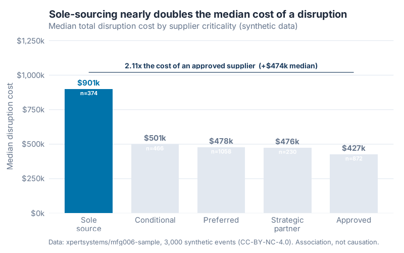
| Supplier criticality | n | Cost P25 | Median cost | Cost P75 |
|---|---|---|---|---|
| Sole source | 374 | $343,524 | $900,766 | $2,949,256 |
| Conditional | 466 | $157,150 | $500,590 | $1,683,988 |
| Preferred | 1,058 | $161,288 | $477,541 | $1,562,212 |
| Strategic partner | 230 | $183,668 | $475,657 | $1,670,359 |
| Approved | 872 | $153,902 | $426,848 | $1,389,365 |
What jumped out at me wasn’t a gradient. It was a cliff. Four of the five tiers bunch together between $426,848 and $500,590. Then sole-source sits alone at $900,766, more than $400k clear of the next tier up. This isn’t a smooth "more critical, more expensive" ramp. It’s sole-source versus everything else.
The headline number is blunt: a sole-source disruption costs 2.11 times the median of an approved-supplier disruption ($900,766 against $426,848). That’s a premium of about $474k, or +111%. Against a preferred supplier it’s 1.89 times ($900,766 against $477,541). Sole-sourcing nearly doubles the median cost of a disruption.
And look at the P25 column. Even the cheap quartile of sole-source events ($343,524) starts above where the other tiers sit at their lower quartile. The whole distribution is shifted up, not just the tail.
Why it costs more (and it’s not what I expected)
My first guess was that sole-source events drag on longer. One supplier, no backup, so recovery crawls. The data says no.
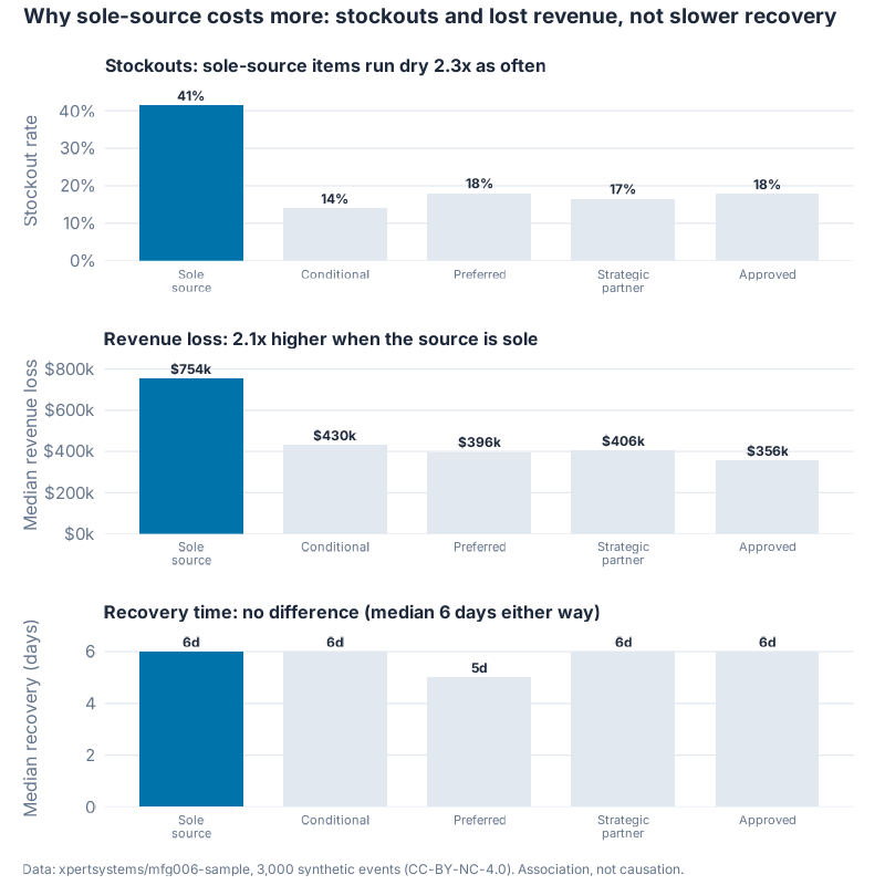
| Supplier criticality | n | Median recovery (days) | Median revenue loss | Stockout rate |
|---|---|---|---|---|
| Sole source | 374 | 6 | $753,782 | 41.4% |
| Conditional | 466 | 6 | $430,300 | 13.9% |
| Preferred | 1,058 | 5 | $396,497 | 18.1% |
| Strategic partner | 230 | 6 | $405,724 | 16.5% |
| Approved | 872 | 6 | $356,256 | 17.8% |
Median recovery for a sole-source event is 6 days. For an approved-supplier event it’s also 6 days. Identical. The cost premium isn’t a slower clock.
So where does it come from? Two places. Sole-source items run dry far more often: a 41.4% stockout rate against 17.8% for approved, roughly 2.3 times as often. And when they stop, the revenue walks: median lost revenue of $753,782 against $356,256, about 2.12 times more.
Here’s the one-liner I’d put on the slide. Sole-source doesn’t cost more because it takes longer to fix. It costs more because the line stops twice as often and twice the revenue walks out the door while it’s down. Same repair time, very different damage.
(Mitigation effectiveness barely moves: 4.38 for sole-source against 4.77 for approved on a 0 to 10 scale. A small dent, not the story.)
The contrast that makes the post
Now put the two sourcing metrics side by side. The one teams report, and the one that actually moves the number.
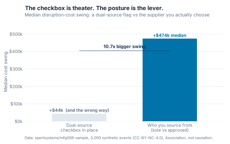
| Dual source in place? | n | Median cost |
|---|---|---|
| No | 434 | $472,716 |
| Yes | 2,566 | $516,864 |
The dual-source flag moves the median by $44,148. Worse, it moves it the wrong way: flagged lines cost slightly more. My read is that the flag gets bolted onto lines that were already risky, so it travels with trouble instead of preventing it. The presence of the checkbox tells you almost nothing about the outcome.
Now the other lever. Sole-versus-approved swings the median by $473,918.
Do the division. $473,918 against $44,148 is 10.7 times. Who you actually depend on moves the cost of a disruption almost eleven times harder than whether someone ticked the dual-source box. The checkbox is theater. The dependency is the lever.
"But sole-source just gets uglier shocks"
This is the objection a good analyst raises before you do, and it’s the right one. Maybe sole-sourced parts simply attract worse disruptions. Maybe the whole premium is severity wearing a sourcing costume.
I find that explanation tempting, which is exactly why I went after it.
First, the direct test. I recomputed the sole-versus-approved gap inside each severity band, so sole and approved are only ever compared against shocks of the same severity.
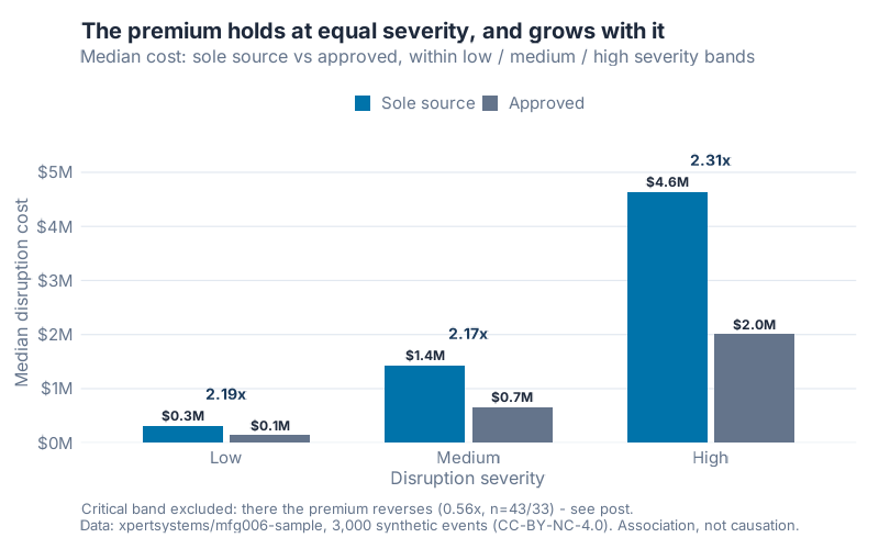
| Severity band | Sole source | Approved | Multiple |
|---|---|---|---|
| Low | $316,620 (n=134) | $144,702 (n=346) | 2.19× |
| Medium | $1,434,404 (n=139) | $660,547 (n=355) | 2.17× |
| High | $4,642,330 (n=58) | $2,007,989 (n=138) | 2.31× |
| Critical | $1,462,864 (n=43) | $2,614,120 (n=33) | 0.56× |
At low, medium, and high severity the premium not only holds, it grows: 2.19, 2.17, then 2.31 times. Hold the shock fixed and sole-sourcing still costs roughly double. That’s the opposite of what a severity artifact would do.
Now the honest part, because the table has a fourth row. In the critical band the premium flips. Sole-source events there run $1,462,864 against $2,614,120 for approved, a 0.56 multiple. And this isn’t small-sample noise: the cells hold 43 and 33 events. It’s a real reversal. My reading is that at catastrophic severity the disaster swamps everything, sourcing posture included. When the building is on fire, it stops mattering whether you had one water supplier or two. I left the critical band off the chart and put it here in plain sight instead, because hiding the one row that breaks your story is how you lose the reader who checks.
Second, the regression. I fit a log-cost model with a sole-source indicator. On its own, sole-source is associated with +108.2% higher cost. Then I added controls for the severity score and the disruption category. The effect shrinks to +67.5%, and it’s still there (p = 9.7×10⁻¹⁴, adjusted R² = 0.42).
That shrink is itself honest evidence. Sole-source events do skew toward worse shocks: 11.5% of them are critical severity against 3.8% for approved. Severity explains part of the raw gap. It does not explain most of it. After you account for how bad and what type the disruption was, a sole-sourced part is still tied to about 68% higher cost. The premium survives the controls.
I’ll say the caveat one more time, because it’s the spine of the piece. This is observational, synthetic data. The pattern is association, not proof of cause. But it isn’t explained away by severity, and that’s more than the dual-source checkbox can say.
One number to handle with care
A tempting follow-up: among sole-source items, do more listed backup suppliers help? The data says the opposite, and it’s a trap worth naming.
| Listed alternatives (sole-source items only) | n | Median cost |
|---|---|---|
| 0 alternatives | 72 | $739,320 |
| 1–2 alternatives | 152 | $810,388 |
| 3+ alternatives | 150 | $1,371,794 |
More names on the backup list tracks higher cost, not lower (Spearman +0.14 within sole-source). Don’t read this as "add alternatives to cut your bill." It’s confounded: the sole-source parts that carry a long alternates list are the high-stakes, hard-to-replace ones in the first place. The lesson isn’t "list more backups." It’s that a backup list is not a backup. A name on a spreadsheet you’ve never qualified, never ordered from, never pressure-tested is a comfort, not a supply.
What it costs to depend on one supplier
Put it in business terms. A sole-source dependency is associated with roughly $474k of extra cost on the median disruption, and the damage lands as stockouts and lost revenue, not as a longer repair. That’s per event, on the median. The tail is far worse: the P75 sole-source event clears $2.9M.
Compare that to where resilience attention usually goes. Counting dual-source flags. Lengthening approved-vendor lists. Both near-null in this data, one of them pointing the wrong way. The unglamorous work, finding the handful of parts where one vendor is your only qualified source, is the work that maps your actual exposure.
Interactive Dashboard
Find your own exposure. Pick a supplier-criticality tier (or compare two), and see the median cost, recovery days, revenue loss, and stockout rate this synthetic model ties to it, plus the P25-to-P75 spread behind each median. A second view holds severity fixed so you can watch the sole-source premium hold across low, medium, and high, then reverse at critical.
Interactive Dashboard
Explore the data yourself — adjust parameters and see the results update in real time.
Your next steps this week
- Build a sole-source register, not a dual-source coverage percentage. Pull your item master and flag every part where exactly one vendor is qualified to supply it. That list is your real exposure map. The dual-source coverage number on your scorecard isn’t.
- Sort that register by stockout impact, not by spend. The sole-source premium here is driven by lines going dry and revenue walking. Rank your single-source parts by what stops if they stop, and work the top of the list first.
- Stress-test one "alternative" supplier this week. Take a sole-source part that lists a backup and ask the hard question: have we ever actually ordered from that alternate at volume? If not, you have a name, not a source. Qualify it or strike it.
- Separate the flag from the dependency on your risk dashboard. If your report shows "dual-source coverage: 85%" and stops there, it’s measuring theater. Add a sole-source line. They are not the same metric, and only one predicted cost here.
- Run your top tiers through the dashboard. Compare the criticality levels you actually buy from and read the median cost, recovery, revenue loss, and stockout rate the synthetic model ties to each. Use the gaps to start the conversation about which single points of failure get attention first.
Show R Code
# =============================================================================
# generate_sole_source_images.R
# "Sole Source: the $900k median problem" / June Resilience Month, Week 1 Post 4
# Data: xpertsystems/mfg006-sample (3,000 SYNTHETIC disruption events, CC-BY-NC-4.0)
#       https://huggingface.co/datasets/xpertsystems/mfg006-sample
# Run from project root:  Rscript Scripts/generate_sole_source_images.R
# Derivation / QA companion script: Research/mfg006/analyze_sole_source.R
# =============================================================================

source("Scripts/theme_inphronesys.R")

suppressPackageStartupMessages({
  library(ggplot2)
  library(dplyr)
  library(tidyr)
  library(scales)
  library(patchwork)
  library(jsonlite)
})

df <- read.csv("Research/mfg006/mfg006_disruptions.csv", stringsAsFactors = FALSE)

crit_levels <- c("sole_source", "conditional", "preferred",
                 "strategic_partner", "approved")
sev_levels  <- c("low", "medium", "high", "critical")

df$supplier_criticality <- factor(df$supplier_criticality, levels = crit_levels)
df$severity_level       <- factor(df$severity_level,       levels = sev_levels)

med <- function(x) median(x, na.rm = TRUE)

# --- Cost is right-skewed: median $512,738, mean $1,912,836 (3.73x), max $125.4M
#     Lead with medians throughout.

# --- HERO: cost distribution by supplier criticality -------------------------
hero <- df %>%
  group_by(supplier_criticality) %>%
  summarise(
    n        = n(),
    p25      = quantile(cost_of_disruption_total_usd, 0.25, na.rm = TRUE),
    median   = med(cost_of_disruption_total_usd),
    p75      = quantile(cost_of_disruption_total_usd, 0.75, na.rm = TRUE),
    .groups  = "drop"
  ) %>% arrange(desc(median))
# sole_source median = $900,766 (n=374) vs approved $426,848 (n=872) -> 2.11x
# the four non-sole tiers bunch at $427k–$501k; sole is the lone outlier.

# --- WHY: decomposition (recovery flat; stockouts + revenue loss diverge) -----
# Median recovery = 6 days for sole AND approved (1.00x) -> cost is NOT a slower clock.
# Stockout rate 41.4% (sole) vs 17.8% (approved) ~ 2.3x.
# Median revenue loss $753,782 (sole) vs $356,256 (approved) ~ 2.12x.
# (Full per-criticality summary of recovery / revenue-loss / stockout columns and
#  the patchwork panel assembly live in the repository script.)

# --- CONTRAST: dual-source flag vs supplier criticality ----------------------
flag <- df %>%
  group_by(dual_source_in_place) %>%
  summarise(median = med(cost_of_disruption_total_usd), n = n(), .groups = "drop")
# No flag  (n=434):  median $472,716
# Yes flag (n=2,566): median $516,864   -> swing +$44,148, WRONG direction
# Sole-vs-approved swing +$473,918  ->  $473,918 / $44,148 = 10.7x

# --- ROBUSTNESS: sole vs approved within each severity band ------------------
robust <- df %>%
  filter(supplier_criticality %in% c("sole_source", "approved")) %>%
  group_by(severity_level, supplier_criticality) %>%
  summarise(median = med(cost_of_disruption_total_usd), n = n(), .groups = "drop")
# low 2.19x | medium 2.17x | high 2.31x  (premium holds and grows)
# critical REVERSES: sole $1.46M vs approved $2.61M = 0.56x (n=43 / n=33, real)
# Chart shows low/medium/high; the critical reversal is reported in caption + prose.

# --- REGRESSION: sole-source effect with controls ---------------------------
df$sole_source <- as.integer(df$supplier_criticality == "sole_source")

mA <- lm(log(cost_of_disruption_total_usd) ~ sole_source, data = df)
# coef = 0.7332 -> exp(0.7332) - 1 = +108.2%  (p = 2.8e-16, adj R^2 = 0.022)

mB <- lm(log(cost_of_disruption_total_usd) ~ sole_source +
           severity_score + factor(disruption_category), data = df)
# coef = 0.5158 -> exp(0.5158) - 1 = +67.5%   (p = 9.7e-14, adj R^2 = 0.42)
# Effect shrinks (sole faces more critical events: 11.5% vs 3.8%) but survives controls.

# Full ggsave() figure code (800px, bg="white", dpi=100) and the dashboard JSON
# export (Dashboards/sole_source_data.json) are in the repository script.
References
- Sheffi, Yossi (2005). The Resilient Enterprise: Overcoming Vulnerability for Competitive Advantage. Cambridge, MA: MIT Press (paperback 2007, ISBN 978-0-262-69349-3). Cited here for the single-point-of-failure framing, not as a source of any number in this post. mitpress.mit.edu
- Christopher, Martin (2011). Logistics & Supply Chain Management, 4th ed. Harlow: Financial Times Prentice Hall. ISBN 978-0-273-73112-2. Cited for supply-base risk and sourcing-strategy framing.
- ISO 31000:2018. Risk management – Guidelines, 2nd ed. Geneva: ISO, 2018. iso.org/standard/65694.html
- Data: xpertsystems,
mfg006-sample(3,000 synthetic disruption events, CC-BY-NC-4.0). Every number in this post derives from this dataset, not from the references above. huggingface.co/datasets/xpertsystems/mfg006-sample
Leave a Reply