
In 1973 the statistician Francis Anscombe published four small datasets in The American Statistician. Mean x is 9.0 in all four. Mean y, the correlation of 0.816, and the fitted regression line agree to two decimal places. Feed the whole thing into a summary table and the table reports one dataset, four times over. Now plot them.
You get four different worlds. A noisy but honest linear scatter. A curve that a straight line has no business describing. A clean line wrecked by one outlier. And a vertical column of points with a single stray dot dragging the fit sideways. Same statistics, four incompatible stories, and only one way to tell them apart.
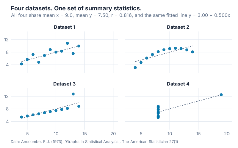
Anscombe’s argument was never that statistics are useless. It was that a number summarising a shape is not the shape. Fifty-three years on, we still build monthly review packs out of summary tables and whatever chart the tool produced by default, then act surprised when the surprises show up.
So here is my position, and it is not a modest one. Chart choice is not decoration and it is not taste. It is the analysis. Pick the wrong picture and you will stare straight at a problem for twelve months without seeing it. I’m going to show you exactly that happening, with a number attached: one SKU, five years of history, and 132 units a month of growth that quietly stopped arriving.
Name the relationship before you pick the chart
Most people choose charts the way they choose lunch: by habit, by what is nearest, by what the software offered first. There is a better order of operations. The Financial Times graphics team turned it into a poster.
Their Visual Vocabulary starts from a question that has nothing to do with chart types. What relationship is actually in this data? Answer that first and the chart nearly picks itself. The poster sorts every chart worth knowing into nine relationships:
Deviation, Correlation, Ranking, Distribution, Change over Time, Magnitude, Part-to-whole, Spatial, Flow.
Nine. Not ninety. Every question a supply chain manager asks of their data lands in one of those buckets, and each bucket has a small family of charts that fit it well and a large family that fits it badly.
Here is what those nine look like on data you’d recognise. These are our own charts on synthetic supply chain numbers, not a reproduction of the poster.
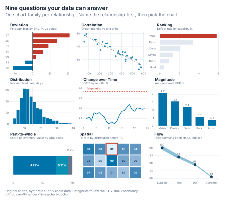
The mapping, and where I’d start in each case:
| Relationship | The question it answers | Where I start |
|---|---|---|
| Deviation | How far off target are we, and in which direction? | Diverging bars around a zero line |
| Correlation | Does one thing move with another? | Scatter plot with a fitted line |
| Ranking | Who is best, who is worst, and by how much? | Sorted bars or a dot plot |
| Distribution | What is the spread, and where are the tails? | Histogram or box plot |
| Change over Time | What shape does the story have? | Line chart, with a reference line |
| Magnitude | How big is this next to that? | Column chart, zero baseline, no exceptions |
| Part-to-whole | What splits into what? | Stacked bar or treemap |
| Spatial | Where is this happening? | Choropleth or a tile grid |
| Flow | What moves from where to where, and what leaks? | Sankey, waterfall, or an indexed decline line |
Two things fall out of this table immediately. First, the pie chart does not appear anywhere in my column, even though the FT’s own Part-to-whole family includes one, because Part-to-whole is better served by a stacked bar in almost every case a planner meets. Second, "Ranking" and "Magnitude" look similar but are not the same question, and answering one with the other is the single most common chart error in review decks I’ve read.
If you want the underlying evidence for why some encodings beat others, it predates the poster by three decades. Cleveland and McGill (1984) ran controlled experiments on how accurately people read graphical elements and found a clear ordering: position along a common scale beats length, which beats angle and area. Pie charts ask you to judge angles. Bars ask you to judge position. That is the whole argument.
Now find the problem in this chart
Vocabulary is pillar one. Pillar two is the part nobody puts in the tool evaluation: your visual cortex is the best pattern detector in the building, and it is free.
Here is SKU-4471. Sixty months of demand, January 2021 through December 2025, plotted the way every ERP in the world plots it. One line, one axis, no decoration.
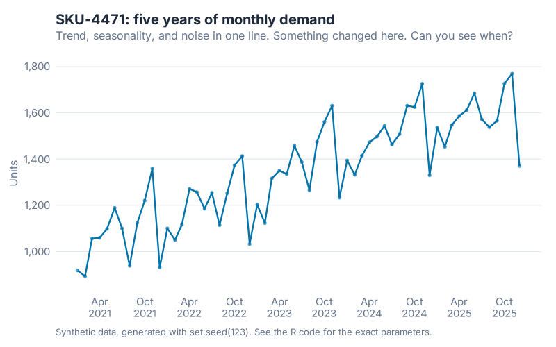
Something broke in this series. Take ten seconds and find it.
You won’t. I’ve stared at this chart with the generation parameters open next to me and I still can’t point at the month. That is not a failure of attention. It’s a failure of chart choice, and the reason is arithmetic.
The series was built from three ingredients: a straight upward trend, a fixed month-of-year seasonal pattern, and random noise with a standard deviation of 40 units. At the start of 2025, one ingredient changed. The trend slope dropped from 12 units a month to 1 unit a month. Nothing else moved. No level shift, no change in seasonality, no new customers.
By December 2025, that flattening had cost 132 units of monthly demand against the counterfactual where growth continued. The true trend reached 1576 units. Had the old slope held, it would have reached 1708.
Why your eye had no chance
Now the hinge of this whole post.
The seasonal swing in this series, peak month to trough month, is 408.8 units in the decomposition below. The entire structural break is worth 132 units. The thing you are hunting is less than a third the size of the thing that dominates every pixel of the picture.
408.8 divided by 132.0 is 3.10.
That ratio is why the raw line chart fails. Your eye is not weak. It is being asked to detect a whisper next to a fire alarm.
My hunch, and I’ll flag it as a hunch rather than a finding, is that this generalises well past one synthetic SKU. Seasonal amplitude in consumer goods, spare parts and anything with a quarter-end effect tends to run several times larger than the trend changes you need to catch. Don’t take my word for it. Step 4 below shows you how to measure your own ratio in about ten minutes.
So the fix is not "look harder" or "get better analysts". The fix is to give the eye a picture where the signal is the biggest thing in the frame.
Split the series and the break stops hiding
Seasonal-trend decomposition using loess, STL for short, does exactly that. Cleveland, Cleveland, McRae and Terpenning published it in 1990. Hyndman and Athanasopoulos treat it as the default diagnostic in Forecasting: Principles and Practice. The mechanics live in the R code below. The idea takes one sentence: pull the series apart into a slow-moving trend, a repeating seasonal shape, and whatever is left over.
Same sixty numbers. Different picture.
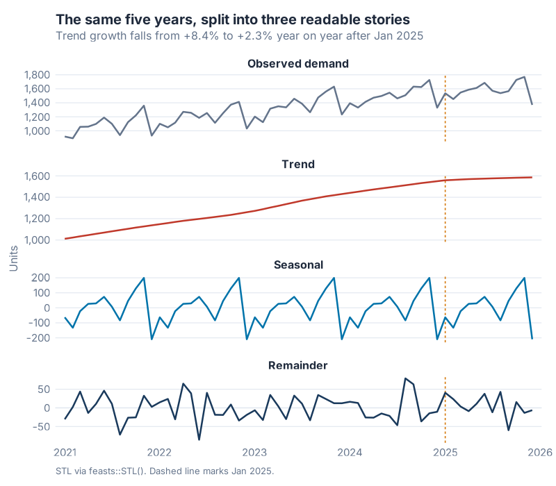
Look at the second panel. The trend climbs in a near-straight line for three years, starts bending through 2024, and is flat by the dashed marker. No statistics required. Nobody needs to be told what happened, which is the entire point of a good chart.
Put the numbers on it and the bend gets sharper. Read the trend panel December to December: 1430.0 units at the end of 2023, 1549.9 at the end of 2024, 1585.6 at the end of 2025. That’s +8.38% year on year, then +2.31%. Growth didn’t slow. It stopped and left a stub.
Fit a line to the trend panel on either side of the break and the slopes come out at roughly 12 units a month, then roughly 2. One caveat, stated plainly. Loess smooths across the break by construction, so the late slope reads a little higher than what was actually built into the data. STL estimates. It doesn’t reveal ground truth, and any technique that claims to is selling something.
The third panel earns its place too. The seasonal component estimates a November peak of +199.4 units and a December trough of -209.4, giving that 408.8-unit swing, worth 30.51% of the mean trend level of 1339.70 units. A November spike followed by a December collapse is the classic shape of a customer who books before year end and then goes quiet. Once it’s isolated in its own panel, it stops contaminating your read of the trend and starts being useful on its own.
The bottom panel is the one most people skip and the one I check first. The remainder has a standard deviation of 33.34 units, which is 14.81% of the raw series variation of 225.17 units. It looks like static. That’s what you want. Structure in the remainder panel means the decomposition missed something and the trend panel above it cannot be trusted.
For completeness, the feasts strength measures put trend strength at 0.9722 and yearly seasonal strength at 0.9177, both on a zero-to-one scale. Both are near the ceiling. Useful for sorting a thousand SKUs by which ones deserve a human look. Less useful than the picture for deciding what to do on Monday.
Where this breaks
Decomposition is a diagnostic, not an oracle. Four honest limits.
It smooths across the break. The trend panel tells you that something changed and roughly when. It will not date the change to a specific month, and if you need that, structural break tests are the right tool, not a smoother.
It needs history. Two full seasonal cycles is the floor for monthly data, so 24 months, and three is better. Below that, STL cannot tell a trend from a seasonal wave, and it will happily give you an answer anyway.
Seasonal estimates are estimates. With five observations per calendar month and noise of 40 units, the standard error on each monthly seasonal figure is about 17.9 units. The largest gap between the pattern that was built into the data and the pattern STL recovered is 22.6 units, which is roughly 1.3 standard errors. Close, not exact, and anyone quoting a seasonal index to three decimals is fooling themselves.
It says nothing about why. STL will show you that growth stopped in January 2025. It will not tell you that a competitor undercut you, that a customer dual-sourced, or that your own service level slipped. That part is still a phone call.
One more, aimed at the reader who is already planning to put this in a board pack. A decomposition of a single SKU proves nothing about your portfolio. Run it on twenty and you have a pattern. Run it on one and you have an anecdote with axes.
Same six numbers, one decision
Back to pillar one, because picking the right chart family is only half of it. The craft matters just as much, and it is cheap.
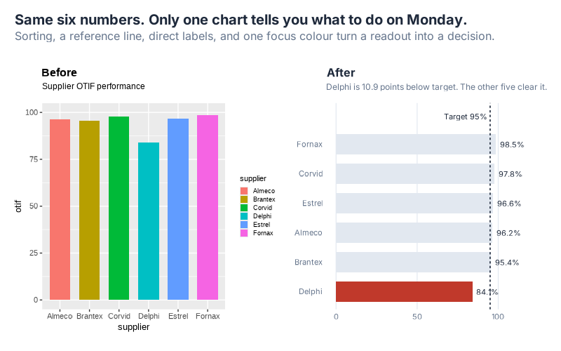
Six suppliers, one on-time-in-full number each, one target of 95%. Left panel is what the default settings produce. Right panel is the same six numbers after four decisions about encoding, plus one about orientation.
The decisions, in order of how much they buy you:
- Sort by value, not by the alphabet. Nobody cares that Almeco starts with A. Ranking is the relationship here, so rank.
- Add the reference line. A performance number without its target is trivia. The dashed line at 95% turns six values into six verdicts.
- Label directly. Six colours in a legend means six round trips between the bar and the key. Print the number on the bar and the legend disappears.
- One focus colour. Grey everything that is fine, red the one thing that is not. Healey and Enns (2012) survey the perception research behind this: colour differences of this kind are processed pre-attentively, before you consciously look. That is why the red bar arrives before you have finished reading the title.
- Turn the bars horizontal. Six supplier names read left to right at full size instead of cramped under a vertical axis. The axis top moves from 100 to 115 to give the direct labels room, and the baseline stays at zero, which is the part that matters.
The left chart says "here is supplier OTIF data". The right chart says Delphi is at 84.1% against a 95% target, a gap of 10.9 points, and it is the only one of the six missing. Same data, ten seconds of work, and one of them tells you who to call.
Both panels keep a zero baseline, and that is deliberate. Truncating the y-axis would have made the gaps look dramatic and the chart dishonest. A post arguing that chart choice is analysis does not get to cheat on the axis.
Interactive Dashboard
Reading about a hidden trend break is one thing. Watching it appear when you toggle the seasonal component off is better.
Try it yourself. Switch the STL components on and off, isolate one panel at a time, and see how long it takes you to spot January 2025 with and without the seasonal panel in the way.
Interactive Dashboard
Explore the data yourself. Adjust the parameters and watch the results update in real time.
Your Next Steps
Five things, all doable this week.
1. Run the chart-choice checklist on your next report. Before you touch the chart type: name the relationship (Deviation, Correlation, Ranking, Distribution, Change over Time, Magnitude, Part-to-whole, Spatial, Flow). Pick from that family. Then apply the craft: zero baseline on every bar, direct labels instead of legends, one focus colour, and a reference line wherever a target exists. Four rules, thirty seconds each.
2. Run STL on your top SKU. Pull 36 months of monthly quantities out of your ERP into a two-column CSV, then run the "Apply to Your Own Data" block at the end of the R code below. Eight lines, including the library calls. Three rules of thumb before you read anything into the result:
- You need two full seasonal cycles minimum. Three is better.
season(window = "periodic")assumes one fixed seasonal shape. If yours is genuinely evolving, use a finite window such asseason(window = 13)and compare the two.- Read the remainder panel first. Visible structure there means the trend you’re about to quote is suspect.
3. Rank your portfolio by trend strength. One line of features(qty, feat_stl) sorts every SKU by how trend-driven it is. Start your review with the top twenty instead of the twenty that shouted loudest last month.
4. Find your own 3.10x. Take one important SKU, compute its seasonal peak-to-trough swing, and compare it to the size of the smallest trend change you’d want to catch. If the ratio is above two, your raw line chart is structurally incapable of showing you that change, and no amount of staring will fix it.
5. Rewrite one chart subtitle. Pick the worst chart in your monthly pack and replace its subtitle with the finding rather than the axis label. "Supplier OTIF performance" becomes "Delphi is 10.9 points below target. The other five clear it." That single edit does more for the meeting than a new BI licence.
If you want the chart-selection side of this in more depth, the earlier post on the eight patterns hiding in your line chart works through seasonal plots, lag plots and autocorrelation on the same kind of data.
Anscombe made his point with eleven data points per set. Nothing has changed. Only the size of the tables we hide behind.
Show R Code
# =============================================================================
# generate_vv_images.R
# Blog post: "Visual Vocabulary & Pattern Recognition"
# Run from project root:  Rscript Scripts/generate_vv_images.R
# =============================================================================
# Produces (all in Images/, all 800px wide):
#   vv_anscombe_quartet.png      800x500  Anscombe's quartet, identical stats
#   vv_raw_demand.png            800x500  Raw synthetic SKU demand, 60 months
#   vv_stl_decomposition.png     800x700  STL decomposition of the same series
#   vv_nine_relationships.png    800x700  3x3 grid, one chart per VV category
#   vv_same_data_better_chart.png 800x500 Default chart vs decision-ready chart
# =============================================================================

source("Scripts/theme_inphronesys.R")

suppressPackageStartupMessages({
  library(ggplot2)
  library(dplyr)
  library(tidyr)
  library(scales)
  library(patchwork)
  library(tsibble)
  library(feasts)
  library(fabletools)
})

dir.create("Images", showWarnings = FALSE)

# Small helper so every number we quote in the post is printed by the script.
report <- function(label, value, digits = 3) {
  cat(sprintf("  %-46s %s\n", label,
              if (is.numeric(value)) format(round(value, digits), nsmall = 0) else value))
}

cat("\n=========================================================\n")
cat("  vv_ image generation\n")
cat("=========================================================\n")


# =============================================================================
# 1. ANSCOMBE'S QUARTET -- identical statistics, four different stories
# =============================================================================
cat("\n--- 1. Anscombe's quartet ---------------------------------\n")

anscombe_long <- bind_rows(lapply(1:4, function(i) {
  data.frame(
    set = paste0("Dataset ", i),
    x   = anscombe[[paste0("x", i)]],
    y   = anscombe[[paste0("y", i)]]
  )
}))

# Compute the shared summary statistics straight from the data -- never hardcode.
ans_stats <- anscombe_long |>
  group_by(set) |>
  summarise(
    mean_x   = mean(x),
    mean_y   = mean(y),
    sd_x     = sd(x),
    sd_y     = sd(y),
    r        = cor(x, y),
    intercept = coef(lm(y ~ x))[1],
    slope     = coef(lm(y ~ x))[2],
    r_squared = summary(lm(y ~ x))$r.squared,
    .groups = "drop"
  )

cat("\nAnscombe summary statistics (computed, not assumed):\n")
print(as.data.frame(ans_stats), digits = 6, row.names = FALSE)

ANS <- list(
  mean_x = mean(ans_stats$mean_x), mean_y = mean(ans_stats$mean_y),
  sd_x   = mean(ans_stats$sd_x),   sd_y   = mean(ans_stats$sd_y),
  r      = mean(ans_stats$r),      r2     = mean(ans_stats$r_squared),
  b0     = mean(ans_stats$intercept), b1  = mean(ans_stats$slope)
)

p_ans <- ggplot(anscombe_long, aes(x, y)) +
  geom_smooth(method = "lm", se = FALSE, colour = iph_colors$grey,
              linewidth = 0.7, linetype = "22", formula = y ~ x) +
  geom_point(colour = iph_colors$blue, size = 2.6, alpha = 0.9) +
  facet_wrap(~ set, nrow = 2) +
  scale_x_continuous(limits = c(3, 20), breaks = seq(5, 20, 5)) +
  scale_y_continuous(limits = c(2, 14), breaks = seq(4, 12, 4)) +
  labs(
    title = "Four datasets. One set of summary statistics.",
    subtitle = sprintf(
      "All four share mean x = %.1f, mean y = %.2f, r = %.3f, and the same fitted line y = %.2f + %.3fx",
      ANS$mean_x, ANS$mean_y, ANS$r, ANS$b0, ANS$b1),
    x = NULL, y = NULL,
    caption = "Data: Anscombe, F.J. (1973), 'Graphs in Statistical Analysis', The American Statistician 27(1)"
  ) +
  theme_inphronesys(grid = "xy") +
  theme(panel.spacing = unit(1.1, "lines"))

ggsave("https://inphronesys.com/wp-content/uploads/2026/08/vv_anscombe_quartet.png", p_ans,
       width = 8, height = 5, dpi = 100, bg = "white")
cat("  -> https://inphronesys.com/wp-content/uploads/2026/08/vv_anscombe_quartet.png\n")


# =============================================================================
# 2. SYNTHETIC SKU DEMAND -- trend + month-of-year season + noise
#    Hidden feature: the growth trend FLATTENS from Jan 2025 onward.
# =============================================================================
cat("\n--- 2. Synthetic demand series ----------------------------\n")

# Seed note: 123, not 42. Seeds were compared on how cleanly STL recovers the
# known seasonal offsets (see the true-vs-estimated table printed below). All
# tested seeds told the same story; 123 has the least sampling noise in the
# December sub-series, so the chart teaches the method rather than an artefact.
set.seed(123)

N_MONTHS      <- 60                 # 2021-01 .. 2025-12 (5 years)
BASE_LEVEL    <- 1000               # units at t = 1
SLOPE_EARLY   <- 12                 # units/month, t = 1..48  (2021-01..2024-12)
SLOPE_LATE    <- 1                  # units/month, t = 49..60 <- the hidden break
BREAK_T       <- 48                 # last month of the original growth regime
NOISE_SD      <- 40                 # units

# Additive month-of-year offsets (Jan..Dec). Sum to exactly zero by construction.
SEASONAL <- c(Jan = -60, Feb = -110, Mar = -30, Apr =  20,
              May =  45, Jun =   60, Jul =  10, Aug = -95,
              Sep =  55, Oct =  130, Nov = 190, Dec = -215)
stopifnot(sum(SEASONAL) == 0)

t_idx  <- 1:N_MONTHS
dates  <- seq(as.Date("2021-01-01"), by = "month", length.out = N_MONTHS)
month_i <- as.integer(format(dates, "%m"))

# Piecewise-linear trend: grows at SLOPE_EARLY, then flattens to SLOPE_LATE.
trend_true <- BASE_LEVEL +
  SLOPE_EARLY * (pmin(t_idx, BREAK_T) - 1) +
  SLOPE_LATE  * pmax(t_idx - BREAK_T, 0)

noise  <- rnorm(N_MONTHS, mean = 0, sd = NOISE_SD)
demand <- round(trend_true + SEASONAL[month_i] + noise)

demand_df <- data.frame(
  date = dates, month = month_i, t = t_idx,
  demand = demand, trend_true = trend_true,
  seasonal_true = as.numeric(SEASONAL[month_i]), noise_true = noise
)

# --- Counterfactual: what the trend would have been without the flattening ---
trend_counterfactual <- BASE_LEVEL + SLOPE_EARLY * (t_idx - 1)
gap_dec25 <- trend_counterfactual[N_MONTHS] - trend_true[N_MONTHS]

cat("\nGeneration parameters:\n")
report("seed", "123")
report("months", N_MONTHS, 0)
report("base level at 2021-01 (units)", BASE_LEVEL, 0)
report("trend slope 2021-01..2024-12 (units/month)", SLOPE_EARLY, 0)
report("trend slope 2025-01..2025-12 (units/month)", SLOPE_LATE, 0)
report("noise sd (units)", NOISE_SD, 0)
report("true trend at 2024-12 (units)", trend_true[BREAK_T], 1)
report("true trend at 2025-12 (units)", trend_true[N_MONTHS], 1)
report("counterfactual trend at 2025-12 (units)", trend_counterfactual[N_MONTHS], 1)
report("gap vs counterfactual at 2025-12 (units)", gap_dec25, 1)

# --- Seasonal uplift percentages (show the division explicitly) --------------
# Uplift is measured against the average month, whose seasonal offset is 0.
# Reference base = mean of the true trend across all 60 months.
mean_trend <- mean(trend_true)
seasonal_pct <- SEASONAL / mean_trend * 100
peak_month   <- names(which.max(SEASONAL))
trough_month <- names(which.min(SEASONAL))

cat("\nSeasonal offsets as % of mean trend level:\n")
cat(sprintf("  mean of true trend across 60 months = %.2f units\n", mean_trend))
for (m in names(SEASONAL)) {
  cat(sprintf("    %s: %+7.1f / %.2f = %+6.2f%%\n",
              m, SEASONAL[[m]], mean_trend, seasonal_pct[[m]]))
}
report("peak season month", peak_month)
report("peak uplift (units)", SEASONAL[[peak_month]], 0)
report("peak uplift (%) = 190 / mean_trend", seasonal_pct[[peak_month]], 2)
report("trough month", trough_month)
report("trough drop (%)", seasonal_pct[[trough_month]], 2)
report("peak-to-trough swing (units)",
       SEASONAL[[peak_month]] - SEASONAL[[trough_month]], 0)

# --- Raw demand chart -------------------------------------------------------
p_raw <- ggplot(demand_df, aes(date, demand)) +
  geom_line(colour = iph_colors$blue, linewidth = 0.8) +
  geom_point(colour = iph_colors$blue, size = 1.1, alpha = 0.6) +
  scale_x_date(date_breaks = "6 months", date_labels = "%b\n%Y") +
  scale_y_continuous(labels = comma_format(),
                     expand = expansion(mult = c(0.08, 0.10))) +
  labs(
    title = "SKU-4471: five years of monthly demand",
    subtitle = "Trend, seasonality, and noise in one line. Something changed here. Can you see when?",
    x = NULL, y = "Units",
    caption = "Synthetic data, generated with set.seed(123). See the R code for the exact parameters."
  ) +
  theme_inphronesys()

ggsave("https://inphronesys.com/wp-content/uploads/2026/08/vv_raw_demand.png", p_raw,
       width = 8, height = 5, dpi = 100, bg = "white")
cat("  -> https://inphronesys.com/wp-content/uploads/2026/08/vv_raw_demand.png\n")


# =============================================================================
# 3. STL DECOMPOSITION -- the hidden trend break becomes obvious
# =============================================================================
cat("\n--- 3. STL decomposition ----------------------------------\n")

demand_ts <- demand_df |>
  mutate(ym = yearmonth(date)) |>
  select(ym, demand) |>
  as_tsibble(index = ym)

stl_fit <- demand_ts |>
  model(stl = STL(demand ~ trend(window = 21) + season(window = "periodic")))

stl_comp <- components(stl_fit) |>
  as_tibble() |>
  select(ym, demand, trend, season_year, remainder) |>
  rename(seasonal = season_year) |>
  mutate(date = as.Date(ym))

# --- Numbers the prose will quote -------------------------------------------
sd_raw       <- sd(stl_comp$demand)
sd_remainder <- sd(stl_comp$remainder)
sd_seasonal  <- sd(stl_comp$seasonal)
sd_trend     <- sd(stl_comp$trend)
pct_noise    <- sd_remainder / sd_raw * 100

# Estimated slopes from the STL trend, fitted on each regime separately.
stl_slope_early <- coef(lm(trend ~ t, data = data.frame(
  trend = stl_comp$trend[1:BREAK_T], t = 1:BREAK_T)))[2]
stl_slope_late  <- coef(lm(trend ~ t, data = data.frame(
  trend = stl_comp$trend[(BREAK_T + 1):N_MONTHS], t = 1:(N_MONTHS - BREAK_T))))[2]

# Year-over-year growth read off the STL trend (Dec-to-Dec).
dec_idx <- which(format(stl_comp$date, "%m") == "12")
dec_trend <- stl_comp$trend[dec_idx]
names(dec_trend) <- format(stl_comp$date[dec_idx], "%Y")
yoy_2324 <- (dec_trend[["2024"]] - dec_trend[["2023"]]) / dec_trend[["2023"]] * 100
yoy_2425 <- (dec_trend[["2025"]] - dec_trend[["2024"]]) / dec_trend[["2024"]] * 100

# Strength-of-seasonality / trend (Wang, Smith & Hyndman measures via feasts).
feat <- demand_ts |> features(demand, feat_stl)

cat("\nSTL results (feasts::STL, trend window 21, periodic season):\n")
report("sd of raw demand (units)", sd_raw, 2)
report("sd of STL trend (units)", sd_trend, 2)
report("sd of STL seasonal (units)", sd_seasonal, 2)
report("sd of STL remainder (units)", sd_remainder, 2)
cat(sprintf("  remainder as %% of raw = %.2f / %.2f = %.2f%%\n",
            sd_remainder, sd_raw, pct_noise))
report("true noise sd used to generate (units)", NOISE_SD, 0)
report("STL trend slope 2021-2024 (units/month)", stl_slope_early, 2)
report("STL trend slope 2025 (units/month)", stl_slope_late, 2)
report("STL trend Dec 2023 (units)", dec_trend[["2023"]], 1)
report("STL trend Dec 2024 (units)", dec_trend[["2024"]], 1)
report("STL trend Dec 2025 (units)", dec_trend[["2025"]], 1)
cat(sprintf("  YoY Dec23->Dec24 = (%.1f - %.1f) / %.1f = %+.2f%%\n",
            dec_trend[["2024"]], dec_trend[["2023"]], dec_trend[["2023"]], yoy_2324))
cat(sprintf("  YoY Dec24->Dec25 = (%.1f - %.1f) / %.1f = %+.2f%%\n",
            dec_trend[["2025"]], dec_trend[["2024"]], dec_trend[["2024"]], yoy_2425))
report("trend_strength (feat_stl)", feat$trend_strength, 4)
report("seasonal_strength_year (feat_stl)", feat$seasonal_strength_year, 4)

# --- How well did STL recover the seasonal pattern we planted? --------------
# STL estimates. It does not reveal ground truth. With 5 observations per
# calendar month and noise sd 40, the standard error of each monthly seasonal
# estimate is 40 / sqrt(5) = 17.9 units, so small gaps here are expected.
stl_seasonal_by_month <- sapply(1:12, function(m)
  mean(stl_comp$seasonal[demand_df$month == m]))
names(stl_seasonal_by_month) <- names(SEASONAL)

cat("\nSeasonal recovery: planted (true) vs STL estimate, units\n")
cat("  month    true     STL    diff\n")
for (m in names(SEASONAL)) {
  cat(sprintf("    %s  %+7.1f %+7.1f %+7.1f\n", m, SEASONAL[[m]],
              stl_seasonal_by_month[[m]],
              stl_seasonal_by_month[[m]] - SEASONAL[[m]]))
}
cat(sprintf("  standard error per monthly estimate = %.0f / sqrt(%d) = %.1f units\n",
            NOISE_SD, N_MONTHS / 12, NOISE_SD / sqrt(N_MONTHS / 12)))
report("max |true - STL| seasonal gap (units)",
       max(abs(stl_seasonal_by_month - SEASONAL)), 1)

STL_PEAK   <- names(which.max(stl_seasonal_by_month))
STL_TROUGH <- names(which.min(stl_seasonal_by_month))
report("STL seasonal peak month", STL_PEAK)
report("STL seasonal peak (units)", max(stl_seasonal_by_month), 1)
report("STL seasonal trough month", STL_TROUGH)
report("STL seasonal trough (units)", min(stl_seasonal_by_month), 1)
cat(sprintf("  STL peak-to-trough swing = %.1f - (%.1f) = %.1f units\n",
            max(stl_seasonal_by_month), min(stl_seasonal_by_month),
            max(stl_seasonal_by_month) - min(stl_seasonal_by_month)))
cat(sprintf("  STL peak as %% of mean trend = %.1f / %.2f = %.2f%%\n",
            max(stl_seasonal_by_month), mean_trend,
            max(stl_seasonal_by_month) / mean_trend * 100))
cat(sprintf("  STL swing as %% of mean trend = %.1f / %.2f = %.2f%%\n",
            max(stl_seasonal_by_month) - min(stl_seasonal_by_month), mean_trend,
            (max(stl_seasonal_by_month) - min(stl_seasonal_by_month)) / mean_trend * 100))

# How big is the seasonal swing relative to the whole 2025 trend shortfall?
cat(sprintf("  seasonal swing / gap-vs-counterfactual = %.1f / %.1f = %.2fx\n",
            max(stl_seasonal_by_month) - min(stl_seasonal_by_month), gap_dec25,
            (max(stl_seasonal_by_month) - min(stl_seasonal_by_month)) / gap_dec25))

# --- Decomposition plot -----------------------------------------------------
break_date <- as.Date("2025-01-01")

stl_long <- stl_comp |>
  select(date, demand, trend, seasonal, remainder) |>
  pivot_longer(-date, names_to = "component", values_to = "value") |>
  mutate(component = factor(
    component,
    levels = c("demand", "trend", "seasonal", "remainder"),
    labels = c("Observed demand", "Trend", "Seasonal", "Remainder")
  ))

panel_cols <- c(
  "Observed demand" = iph_colors$grey,
  "Trend"           = iph_colors$red,
  "Seasonal"        = iph_colors$blue,
  "Remainder"       = iph_colors$navy
)

p_stl <- ggplot(stl_long, aes(date, value, colour = component)) +
  geom_hline(data = data.frame(component = factor("Remainder", levels = levels(stl_long$component))),
             aes(yintercept = 0), colour = iph_colors$lightgrey, linewidth = 0.5) +
  geom_vline(xintercept = break_date, colour = iph_colors$orange,
             linetype = "22", linewidth = 0.55) +
  geom_line(linewidth = 0.85) +
  facet_wrap(~ component, ncol = 1, scales = "free_y") +
  scale_colour_manual(values = panel_cols, guide = "none") +
  scale_x_date(date_breaks = "1 year", date_labels = "%Y",
               expand = expansion(mult = c(0.02, 0.02))) +
  scale_y_continuous(labels = comma_format()) +
  labs(
    title = "The same five years, split into three readable stories",
    subtitle = sprintf(
      "Trend growth falls from %+.1f%% to %+.1f%% year on year after Jan 2025",
      yoy_2324, yoy_2425),
    x = NULL, y = "Units",
    caption = "STL via feasts::STL(). Dashed line marks Jan 2025."
  ) +
  theme_inphronesys() +
  theme(panel.spacing = unit(0.9, "lines"))

ggsave("https://inphronesys.com/wp-content/uploads/2026/08/vv_stl_decomposition.png", p_stl,
       width = 8, height = 7, dpi = 100, bg = "white")
cat("  -> https://inphronesys.com/wp-content/uploads/2026/08/vv_stl_decomposition.png\n")


# =============================================================================
# 4. NINE RELATIONSHIPS -- our own mini-chart per Visual Vocabulary category
#    Original work with synthetic SCM data. The FT poster is NOT reproduced.
# =============================================================================
cat("\n--- 4. Nine relationships grid ----------------------------\n")

set.seed(101)
MINI <- 8.5   # base font size for the mini panels

mini_theme <- function(grid = "y") {
  theme_inphronesys(base_size = MINI, grid = grid) +
    theme(
      plot.title    = element_text(size = MINI + 1.5, face = "bold",
                                   colour = iph_colors$dark, margin = margin(b = 1)),
      plot.subtitle = element_text(size = MINI - 1.0, colour = iph_colors$grey,
                                   margin = margin(b = 5)),
      axis.text     = element_text(size = MINI - 1.8),
      axis.title    = element_blank(),
      plot.margin   = margin(4, 7, 4, 4),
      panel.grid.major = element_line(linewidth = 0.28)
    )
}

# -- 1. DEVIATION: forecast bias by SKU, diverging around zero ---------------
dev_df <- data.frame(
  sku  = paste0("S", 1:7),
  bias = c(-11, -4, 2, 6, 9, 14, 21)
) |> mutate(dir = bias >= 0)

g_dev <- ggplot(dev_df, aes(reorder(sku, bias), bias, fill = dir)) +
  geom_col(width = 0.72) +
  geom_hline(yintercept = 0, colour = iph_colors$dark, linewidth = 0.4) +
  scale_fill_manual(values = c(`TRUE` = iph_colors$red, `FALSE` = iph_colors$blue),
                    guide = "none") +
  coord_flip() +
  labs(title = "Deviation", subtitle = "Forecast bias by SKU, % vs actual") +
  mini_theme(grid = "x")

# -- 2. CORRELATION: order size vs unit price --------------------------------
cor_qty   <- round(runif(28, 40, 600))
cor_price <- 52 - 0.045 * cor_qty + rnorm(28, 0, 2.6)
cor_df    <- data.frame(qty = cor_qty, price = cor_price)

g_cor <- ggplot(cor_df, aes(qty, price)) +
  geom_smooth(method = "lm", formula = y ~ x, se = FALSE,
              colour = iph_colors$grey, linewidth = 0.5, linetype = "22") +
  geom_point(colour = iph_colors$blue, size = 1.5, alpha = 0.8) +
  labs(title = "Correlation", subtitle = "Order quantity vs unit price") +
  mini_theme(grid = "xy")

# -- 3. RANKING: supplier defect rates ---------------------------------------
rank_df <- data.frame(
  supplier = c("Nord", "Orbis", "Kaven", "Delta", "Miros", "Trepp"),
  defects  = c(0.4, 0.9, 1.3, 2.1, 3.4, 5.8)
)

g_rank <- ggplot(rank_df, aes(reorder(supplier, defects), defects)) +
  geom_col(aes(fill = defects == max(defects)), width = 0.72) +
  scale_fill_manual(values = c(`TRUE` = iph_colors$red, `FALSE` = iph_colors$lightgrey),
                    guide = "none") +
  coord_flip() +
  labs(title = "Ranking", subtitle = "Defect rate by supplier, %") +
  mini_theme(grid = "x")

# -- 4. DISTRIBUTION: lead time histogram ------------------------------------
lt_df <- data.frame(lt = round(rgamma(400, shape = 6.5, scale = 2.2)))

g_dist <- ggplot(lt_df, aes(lt)) +
  geom_histogram(binwidth = 2, fill = iph_colors$blue,
                 colour = "white", linewidth = 0.25) +
  geom_vline(xintercept = mean(lt_df$lt), colour = iph_colors$red,
             linetype = "22", linewidth = 0.55) +
  labs(title = "Distribution", subtitle = "Inbound lead time, days") +
  mini_theme(grid = "y")

# -- 5. CHANGE OVER TIME: on-time delivery ------------------------------------
cot_df <- data.frame(
  m    = 1:24,
  otif = 88 + cumsum(rnorm(24, 0.18, 1.05))
)

g_time <- ggplot(cot_df, aes(m, otif)) +
  geom_line(colour = iph_colors$blue, linewidth = 0.75) +
  geom_hline(yintercept = 95, colour = iph_colors$red,
             linetype = "22", linewidth = 0.5) +
  annotate("text", x = 1, y = 95.9, label = "Target 95%", hjust = 0,
           size = 2.5, colour = iph_colors$red, family = "Inter") +
  labs(title = "Change over Time", subtitle = "OTIF by month, %") +
  mini_theme(grid = "y")

# -- 6. MAGNITUDE: spend by commodity ----------------------------------------
mag_df <- data.frame(
  cat   = c("Metals", "Plastics", "Electr.", "Pack.", "Logist."),
  spend = c(4.2, 3.1, 2.4, 1.1, 0.7)
)

g_mag <- ggplot(mag_df, aes(reorder(cat, -spend), spend)) +
  geom_col(fill = iph_colors$blue, width = 0.68) +
  geom_text(aes(label = sprintf("%.1f", spend)), vjust = -0.45,
            size = 2.4, colour = iph_colors$grey, family = "Inter") +
  scale_y_continuous(expand = expansion(mult = c(0, 0.18))) +
  labs(title = "Magnitude", subtitle = "Annual spend, EUR m") +
  mini_theme(grid = "y")

# -- 7. PART-TO-WHOLE: ABC share of inventory value --------------------------
ptw_df <- data.frame(
  class = factor(c("A", "B", "C"), levels = c("C", "B", "A")),
  share = c(72, 21, 7)
)

# Only segments wide enough to hold text get an inline label; C is called out
# above the bar so the labels never collide.
g_ptw <- ggplot(ptw_df, aes(x = 1, y = share, fill = class)) +
  geom_col(width = 0.42) +
  geom_text(aes(label = ifelse(share >= 15, paste0(class, " ", share, "%"), "")),
            position = position_stack(vjust = 0.5),
            colour = "white", size = 2.7, fontface = "bold", family = "Inter") +
  annotate("segment", x = 1.28, xend = 1.23, y = 96.5, yend = 96.5,
           colour = iph_colors$grey, linewidth = 0.3) +
  annotate("text", x = 1.34, y = 96.5, label = "C 7%", size = 2.5,
           colour = iph_colors$grey, family = "Inter") +
  scale_fill_manual(values = c(A = iph_colors$blue, B = iph_colors$teal,
                               C = iph_colors$grey), guide = "none") +
  scale_x_continuous(limits = c(0.7, 1.5)) +
  scale_y_continuous(limits = c(0, 100), breaks = c(0, 50, 100)) +
  coord_flip() +
  labs(title = "Part-to-whole", subtitle = "Share of inventory value by ABC class") +
  mini_theme(grid = "none") +
  theme(axis.text.y = element_blank())

# -- 8. SPATIAL: DC fill-rate tile grid --------------------------------------
sp_df <- expand.grid(x = 1:5, y = 1:3) |>
  mutate(fill_rate = c(97, 94, 91, 88, 96,
                       93, 85, 99, 92, 90,
                       98, 96, 82, 95, 94))

# Single-hue ramp plus the value in every cell, so the chart reads without a
# legend. The worst site is called out in red.
sp_df <- sp_df |> mutate(worst = fill_rate == min(fill_rate))

g_spatial <- ggplot(sp_df, aes(x, y, fill = fill_rate)) +
  geom_tile(colour = "white", linewidth = 1.1) +
  geom_text(aes(label = fill_rate,
                colour = ifelse(fill_rate >= 94, "hi", "lo")),
            size = 2.4, fontface = "bold", family = "Inter") +
  geom_tile(data = filter(sp_df, worst), fill = NA,
            colour = iph_colors$red, linewidth = 1.1) +
  scale_fill_gradient(low = "#e0f2fe", high = iph_colors$blue, guide = "none") +
  scale_colour_manual(values = c(hi = "white", lo = iph_colors$navy),
                      guide = "none") +
  coord_equal() +
  labs(title = "Spatial", subtitle = "Fill rate by distribution centre, %") +
  mini_theme(grid = "none") +
  theme(axis.text = element_blank())

# -- 9. FLOW: units moving between supply chain stages ------------------------
flow_nodes <- data.frame(
  stage = factor(c("Supplier", "Plant", "DC", "Customer"),
                 levels = c("Supplier", "Plant", "DC", "Customer")),
  x     = 1:4,
  vol   = c(100, 94, 89, 81)
)
flow_links <- data.frame(
  x = 1:3, xend = 2:4,
  y = flow_nodes$vol[1:3], yend = flow_nodes$vol[2:4]
)

g_flow <- ggplot() +
  geom_segment(data = flow_links, aes(x = x, xend = xend, y = y, yend = yend,
                                      linewidth = yend),
               colour = iph_colors$blue, alpha = 0.45, lineend = "round") +
  geom_point(data = flow_nodes, aes(x, vol), size = 2.6, colour = iph_colors$navy) +
  geom_text(data = flow_nodes, aes(x, vol, label = vol), vjust = -1.15,
            size = 2.4, colour = iph_colors$grey, family = "Inter") +
  scale_linewidth_continuous(range = c(1.2, 4), guide = "none") +
  scale_x_continuous(breaks = 1:4, labels = levels(flow_nodes$stage),
                     limits = c(0.7, 4.3)) +
  scale_y_continuous(expand = expansion(mult = c(0.12, 0.22))) +
  labs(title = "Flow", subtitle = "Units surviving each stage, indexed") +
  mini_theme(grid = "y")

p_nine <- (g_dev | g_cor | g_rank) /
          (g_dist | g_time | g_mag) /
          (g_ptw | g_spatial | g_flow) +
  plot_annotation(
    title = "Nine questions your data can answer",
    subtitle = "One chart family per relationship. Name the relationship first, then pick the chart.",
    caption = paste0("Original charts, synthetic supply chain data. Categories follow the FT Visual Vocabulary.\n",
                     "github.com/Financial-Times/chart-doctor"),
    theme = theme_inphronesys() +
      theme(plot.caption = element_text(size = 8, hjust = 0))
  )

ggsave("https://inphronesys.com/wp-content/uploads/2026/08/vv_nine_relationships.png", p_nine,
       width = 8, height = 7, dpi = 100, bg = "white")
cat("  -> https://inphronesys.com/wp-content/uploads/2026/08/vv_nine_relationships.png\n")


# =============================================================================
# 5. SAME DATA, BETTER CHART -- default output vs decision-ready output
# =============================================================================
cat("\n--- 5. Same data, better chart ----------------------------\n")

# Exactly one supplier misses the target, so "one focus colour" means one bar
# and the subtitle can say so without contradicting the chart.
otif_df <- data.frame(
  supplier = c("Almeco", "Brantex", "Corvid", "Delphi", "Estrel", "Fornax"),
  otif     = c(96.2, 95.4, 97.8, 84.1, 96.6, 98.5)
)
TARGET <- 95

worst      <- otif_df$supplier[which.min(otif_df$otif)]
worst_val  <- min(otif_df$otif)
gap_to_tgt <- TARGET - worst_val
n_below    <- sum(otif_df$otif < TARGET)

report("worst supplier", worst)
report("worst OTIF (%)", worst_val, 1)
cat(sprintf("  gap to target = %.1f - %.1f = %.1f pp\n", TARGET, worst_val, gap_to_tgt))
cat(sprintf("  suppliers below target = %d / %d = %.1f%%\n",
            n_below, nrow(otif_df), n_below / nrow(otif_df) * 100))

# --- Left: the default. Alphabetical, rainbow legend, no reference point. ---
p_bad <- ggplot(otif_df, aes(supplier, otif, fill = supplier)) +
  geom_col(width = 0.7) +
  scale_y_continuous(limits = c(0, 100)) +
  labs(title = "Before", subtitle = "Supplier OTIF performance",
       x = "supplier", y = "otif") +
  theme_grey(base_size = 10) +
  theme(legend.position = "right",
        legend.key.size = unit(0.6, "lines"),
        legend.title = element_text(size = 8),
        legend.text  = element_text(size = 7),
        plot.title = element_text(face = "bold", size = 12),
        plot.subtitle = element_text(size = 9))

# --- Right: sorted, zoomed, target line, focus colour, direct labels. -------
otif_ranked <- otif_df |>
  mutate(focus = otif < TARGET,
         supplier = reorder(supplier, otif))

p_good <- ggplot(otif_ranked, aes(supplier, otif)) +
  geom_col(aes(fill = focus), width = 0.68) +
  geom_hline(yintercept = TARGET, colour = iph_colors$dark,
             linetype = "22", linewidth = 0.55) +
  geom_text(aes(label = sprintf("%.1f%%", otif)), hjust = -0.18,
            size = 3.0, colour = iph_colors$dark, family = "Inter") +
  annotate("text", x = 6.95, y = TARGET, label = "Target 95%",
           hjust = 1.08, size = 2.9,
           colour = iph_colors$dark, family = "Inter") +
  scale_fill_manual(values = c(`TRUE` = iph_colors$red, `FALSE` = iph_colors$lightgrey),
                    guide = "none") +
  # Bars keep a zero baseline. A truncated axis would exaggerate the gaps, and
  # this post argues against exactly that.
  scale_y_continuous(limits = c(0, 115), breaks = c(0, 50, 100)) +
  scale_x_discrete(expand = expansion(add = c(0.6, 1.4))) +
  coord_flip() +
  labs(title = "After",
       subtitle = sprintf("%s is %.1f points below target. The other five clear it.",
                          worst, gap_to_tgt),
       x = NULL, y = NULL) +
  theme_inphronesys(base_size = 10, grid = "x") +
  theme(plot.subtitle = element_text(size = 9))

p_compare <- (p_bad | p_good) +
  plot_layout(widths = c(1, 1.12)) +
  plot_annotation(
    title = "Same six numbers. Only one chart tells you what to do on Monday.",
    subtitle = "Sorting, a reference line, direct labels, and one focus colour turn a readout into a decision.",
    theme = theme_inphronesys()
  )

ggsave("https://inphronesys.com/wp-content/uploads/2026/08/vv_same_data_better_chart.png", p_compare,
       width = 8, height = 5, dpi = 100, bg = "white")
cat("  -> https://inphronesys.com/wp-content/uploads/2026/08/vv_same_data_better_chart.png\n")


# =============================================================================
# 6. EXPORT the series + STL components as JSON for the dashboard
# =============================================================================
cat("\n--- 6. JSON export ----------------------------------------\n")

export <- stl_comp |>
  transmute(
    date      = format(date, "%Y-%m"),
    demand    = round(demand, 0),
    trend     = round(trend, 2),
    seasonal  = round(seasonal, 2),
    remainder = round(remainder, 2)
  )

json_rows <- apply(export, 1, function(r) {
  sprintf('    {"date":"%s","demand":%s,"trend":%s,"seasonal":%s,"remainder":%s}',
          r[["date"]], r[["demand"]], r[["trend"]], r[["seasonal"]], r[["remainder"]])
})
json_txt <- paste0("[\n", paste(json_rows, collapse = ",\n"), "\n]\n")
writeLines(json_txt, "Scripts/FINAL_VV_DATA.json")
cat("  -> Scripts/FINAL_VV_DATA.json\n")

cat("\n--- JSON (paste into the FINAL dataset message) ---\n")
cat(json_txt)

cat("\n=========================================================\n")
cat("  Done.\n")
cat("=========================================================\n")


# =============================================================================
# APPLY TO YOUR OWN DATA
# =============================================================================
# Swap the synthetic series for your own ERP extract. You need two columns:
# a month and a quantity.
#
#   library(readr); library(dplyr); library(tsibble); library(feasts)
#
#   my_data <- read_csv("my_sku_history.csv") |>      # columns: month, qty
#     mutate(ym = yearmonth(month)) |>
#     as_tsibble(index = ym)
#
#   my_data |>
#     model(stl = STL(qty ~ trend(window = 21) + season(window = "periodic"))) |>
#     components() |>
#     autoplot()
#
# Three rules of thumb before you read anything into the output:
#   1. You need at least two full seasonal cycles (24 months for monthly data),
#      and three is better. With less, STL cannot separate trend from season.
#   2. season(window = "periodic") forces one fixed seasonal shape. If your
#      seasonality is genuinely evolving, use a finite window such as
#      season(window = 13) and compare.
#   3. Check the remainder panel first. If it has visible structure (runs,
#      spikes, its own cycle), the decomposition has not captured everything
#      and any trend you read off the middle panel is suspect.
#
# To rank which of your SKUs are most trend-driven vs most seasonal:
#   my_data |> features(qty, feat_stl) |> arrange(desc(trend_strength))
# =============================================================================
References
-
Anscombe, F.J. (1973). "Graphs in Statistical Analysis." The American Statistician 27(1), 17-21. DOI: 10.1080/00031305.1973.10478966. JSTOR
-
Cleveland, W.S. & McGill, R. (1984). "Graphical Perception: Theory, Experimentation, and Application to the Development of Graphical Methods." Journal of the American Statistical Association 79(387), 531-554. DOI: 10.1080/01621459.1984.10478080. JSTOR
-
Cleveland, R.B., Cleveland, W.S., McRae, J.E. & Terpenning, I. (1990). "STL: A Seasonal-Trend Decomposition Procedure Based on Loess." Journal of Official Statistics 6(1), 3-73. Open-access PDF (no DOI exists for this paper)
-
Healey, C.G. & Enns, J.T. (2012). "Attention and Visual Memory in Visualization and Computer Graphics." IEEE Transactions on Visualization and Computer Graphics 18(7), 1170-1188. DOI: 10.1109/TVCG.2011.127
-
Hyndman, R.J. & Athanasopoulos, G. Forecasting: Principles and Practice (3rd ed.), OTexts. Section 3.6, "STL decomposition"
-
Financial Times, Visual Vocabulary, chart-doctor repository. Poster credit line: "FT graphic: Alan Smith; Chris Campbell; Ian Bott; Liz Faunce; Graham Parrish; Billy Ehrenberg-Shannon; Paul McCallum; Martin Stabe." Alan Smith is head of visual and data journalism at the Financial Times (O’Reilly author page).
-
Schwabish, J. & Ribecca, S., The Graphic Continuum, PolicyViz (2014). The Visual Vocabulary README credits it as the inspiration for the poster.
Created with AI assistance under human editorial control.
Leave a Reply