
Eighty smooth products. That was the problem.
The demand-pattern chart in my planning dashboard put all 80 products in the same box: smooth demand. Every calculation was correct. Every product was wrong for the lesson the dashboard was supposed to teach.
No real factory has the tidy variety of a spreadsheet invented in a hurry. Mine had the opposite problem. The synthetic data generator had put positive demand in every month for every SKU. The chart’s average demand interval, or ADI, therefore had no gaps to detect. It reported exactly what the data said.
I think this is one of the most useful tests for an AI-assisted tool: can a domain expert look at a technically valid result and say, "I don’t believe this example"? In this case, that question changed the product.
The tool is Demand Genie, an offline supply-chain planning workbench I built with Codex and GPT-5.6 for OpenAI Build Week. This is the story of what it does, what failed, and how to try it yourself.
What a planner can do with it
Demand Genie is a single HTML file. Open it in a modern browser and the sample planning data, charts, spreadsheet reader, and precomputed forecast results are already inside. It needs no application server, account, API key, or network connection to run. The sample workbook is deterministic and synthetic. No row represents a real product, supplier, contract, or transaction.
There are seven views. They connect questions that often live in separate reports:
| View | The question it helps answer |
|---|---|
| Replenishment | Which net-flow positions need a planner’s attention, and why? |
| Forecast | Which model held up in backtesting, where is bias, and what is uncertain? |
| Spend | Where are purchasing volume, concentration, and contract exposure? |
| Portfolio | Which demand patterns and supplier categories need different treatment? |
| Execution | Which open supply lines or on-hand positions need follow-up? |
| Buffers | What approved settings produced a replenishment recommendation? |
| Data | What source facts and checks support the view? |
The point is a connected decision trail. A forecast may inform a buffer proposal. A buffer proposal may flag a purchase. But the dashboard does not release an order or book a saving. Those decisions stay with a person.
That boundary matters. A planning workbench should show its arithmetic and its assumptions before it offers a button that looks like authority.
Consider the first screen. Replenishment does not give the planner one heroic number and ask for trust. It ranks positions by net-flow status, then lets the reader open the evidence for an item: usable on-hand inventory, eligible open supply, qualified demand, buffer limits, and order rules. A proposed quantity is easier to challenge when the arithmetic is beside it. If a late receipt remains in eligible supply, that is an execution question to resolve, not a footnote to hide.
The Forecast view has a different job. It compares candidates on historical windows that move forward through time. Each test asks what a model would have predicted with only the information available at that point. The package holds 23,520 such predictions across 80 SKUs and seven candidates. That count is an audit trail, not a trophy. It gives a planner somewhere to start when a model wins overall but behaves badly on one part family.
The views belong together. Forecast accuracy alone does not tell you whether the proposed order is sensible. A low net-flow position alone does not tell you whether the underlying demand is steady or sporadic. Spend concentration alone does not tell you whether a supplier can be replaced. One sitting can cover all three questions.
The chart that sent me back to the data
Version 4 had already grown beyond a pretty prototype. It compared seven forecast candidates using rolling-origin tests, carried DDMRP calculations into replenishment, and checked whether uploaded data matched the packaged forecast artifacts. Its calculation audit passed. Then the demand-behavior view put all 80 SKUs in one quadrant.
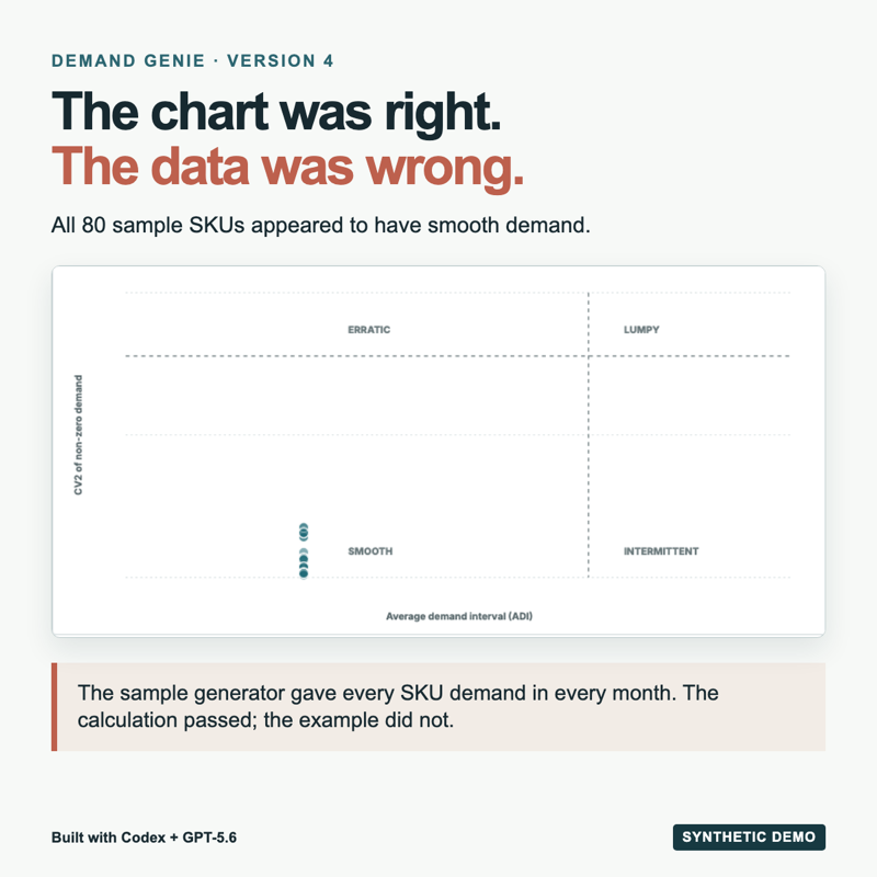
ADI is the number of periods divided by the number of periods with demand. There were no gaps. With 36 months and demand in all 36, ADI is 1.0. The Version 4 sample generator had produced that value for every SKU. A correct chart cannot rescue a sample that omits the phenomenon you want to study.
The fix was not to move dots around. I rebuilt the synthetic histories with different combinations of zero-demand periods and order sizes. Then I reran the forecasts, replenishment calculations, segmentation, and audit against the new workbook. Version 5 contains 30 smooth, 18 erratic, 17 intermittent, and 15 lumpy SKUs. Those are constructed examples. They are not estimates of any industry’s product mix.
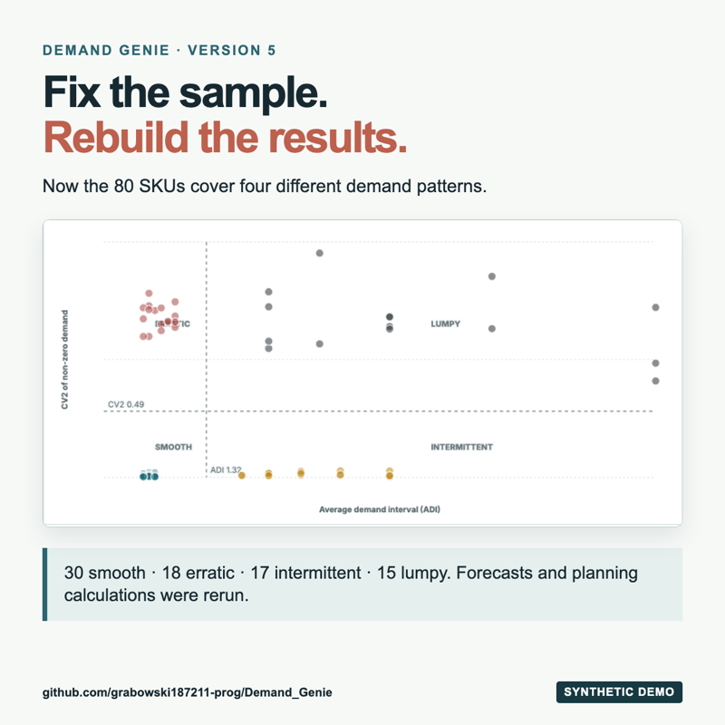
The contrast is visible without a statistics lesson. Version 4 had little to say. Version 5 gives a planner a reason to ask different questions of different items. A slow-moving spare part and a steady production component should not inherit the same forecast conversation just because they share a spreadsheet.
There is a second lesson. Rebuilding the sample meant rebuilding the downstream evidence too. A new demand history changes the backtest, the selected forecast, and potentially the buffer calculation. Keeping the old forecast package would have produced a more dangerous error than an empty quadrant: plausible numbers attached to the wrong workbook. A content hash prevents that mismatch for the bundled package.
What the numbers do, and do not, prove
The bundled Version 5 portfolio has 80 SKUs and 36 months of demand history. That is 2,880 SKU-month records. The forecast package compares seven candidates and records 23,520 out-of-sample predictions from rolling-origin evaluation. The independent audit passes 23 calculation controls across demand, buffers, spend, segmentation, forecasts, intervals, and file provenance.
That is an engineering check on this synthetic demonstration. It is not evidence that Demand Genie improves service levels, cuts inventory, or beats an existing planning system in a real company. Five warnings remain. The overall status is PASS_WITH_WARNINGS, and the machine-readable audit shows why.
The warnings are useful. One says late supply can still enter the net-flow position under an explicit planning policy, so a planner must review it in Execution. Another says a Kraljic category sits close to a quadrant boundary. A third says the synthetic contract commitments are implausibly low relative to spend. Each changes the conversation.
The spend control was generated from the same ledger. It proves reconciliation, not independent completeness. Three annual cycles also limit how much confidence to place in a seasonal decomposition. None of these is a failed arithmetic check. Each is a reason to keep a human in the loop.
There is another boundary. The packaged ARIMA, ETS, and TiRex2 results were computed outside the browser and embedded in the standalone file. Upload a different workbook and those models do not silently rerun. No silent model run. The dashboard uses clearly labeled browser benchmarks unless the workbook’s content hash matches the analyzed sample. I would rather have an honest baseline than a sophisticated label attached to somebody else’s data.
Try the dashboard
Start with the interactive dashboard linked below. It opens as its own page and already contains the synthetic demonstration, so there is no setup step.
Use it as a challenge, too. Pick a recommendation you disagree with and write down why before opening its detail panel. Then compare your objection with the displayed demand, supply, and buffer evidence. The exercise is valuable even if the proposed order turns out to be right. It makes the disagreement specific.
- Open Portfolio and select ADI / CV2. Compare the four demand patterns and the ranked exception list.
- Open Forecast. Look at the model comparisons, error measures, and uncertainty before choosing a favorite line.
- Open Replenishment. Select a flagged item and trace the net-flow position and buffer calculation behind the proposed order.
- Open Data. Check what was loaded, then inspect the source and audit if you want to follow a number back to its calculation.
If you want the code, the GitHub repository includes all five dashboard versions, the sample workbook, scripts, a timestamped build log, and the Version 5 audit. Open dashboard-v5.html from the repository directly in your browser. The published dashboard needs no R or Python installation. Rebuilding the analytical package does: the classical models use R and fpp3, while TiRex2 runs in Python with access to its model files. The README separates those paths.
If you plan to adapt this to your own data, begin with the questions rather than the model menu. Which dates are actual demand, and which are purchase orders? Which late receipts count as eligible supply? Who approves a buffer adjustment? What does a buyer need to see before treating a spend flag as an opportunity? Those choices shape the tool more than a prettier chart. The bundled workbook is useful for learning the workflow, but it cannot answer them for your operation.
My conclusion from this build is narrow and practical. AI made it feasible to connect several planning disciplines in one working day. The decisive improvement came when a planner challenged a result the code had computed correctly. Try that test yourself. Find the output that looks too neat, then trace the data that made it neat.
Interactive Dashboard
Explore the bundled synthetic portfolio. Change views, inspect recommendations, and challenge the assumptions before treating any output as a decision.
Interactive Dashboard
Explore the data yourself. Adjust the parameters and watch the results update in real time.
Created with AI assistance under human editorial control.
Leave a Reply